Uswds: Proposal for an accessible color system
Choosing appropriate, accessible colors can be a challenge and the Standards could help make this easier.
We currently support a very limited color palette (blue, red, gray, and a couple special states) by design. We intend to support only a baseline of color options and expect modifications to the standards will conform to Section 508 contrast guidelines, as tested with the many tools available for this purpose.
I propose that the Standards provide a fuller color palette, in combination with color guidance and sensible defaults, designed to allow a much broader expressive gamut with clear accessible combinations. This broader palette would be more useful design tool out of the box and provide a consistent pedagogy for understanding the contrast implications of color choices.
The broad framework for this palette is directly inspired by now a now-deprecated (I believe) [edit: not deprecated] [palette developed at IBM](https://www.ibm.com/design/language/resources/color-library).
- Distinct hues with descriptive names (like
blue,red, orviolet) - Numbered level (brightness) variants within the hue
- A color level scale that ranges from
0(#fffwhite) to100(#000black) in increments of 10 - Color combinations that differ by
40or more would achieve WCAG AA Large contrast - Color combinations that differ by
50or more would conform to the Section 508 contrast standard (WCAG AA); thus, values of50would be Section 508 conformant against pure white and pure black. - Color combinations that differ by
60or more would achieve WCAG AAA contrast - Vivid variants with suffix
vat some levels for a more complete expressive gamut (likeviolet-40v)
This results that colors that can be expressed like red-40, warm-gray-90, green-30v as variables ($red-40), tokens, elements of a utility classes (.bg-gray-90).
Benefits
This rubric would allow designers and developers to design with confidence, understanding by color name alone whether the contrast would be conformant (whether the combination is useful, practical or aesthetically appropriate is another matter).
This system would provide a strong baseline for design, and a clear baseline for explicit guidance.
How might this look in practice?
The following system of 27 named hues and 308 total colors is a proposal for how the above rubric could be implemented. I consider this proposal something between a proof of concept and a draft. It's a palette I've consciously designed, based on the existing Standards palette and other palettes used by sites developed on top of the Standards. It can still use some work. It is definitely a work in progress.
That said, I've used variants of this system and this palette for all my visual design work over the last year and it has proven a useful tool, worthy of exposing to a wider community.
Check my work at http://jxnblk.com/colorable/demos/text/ or help develop a tool to make this checking easier!

 thisisdano
All 20 comments
Please! Keep in mind that there are color perception issues as well so an indication that colors are susceptible to different conditions would be helpful. Creating one or more visualization palettes would also be nice feature.
 stphnwlkr
on 1 Dec 2017
stphnwlkr
on 1 Dec 2017
Good point! Working toward guidance for color perception ("color blindness") is an important next step.
thisisdano
on 1 Dec 2017
This palette is lovely. It feels like the other end of the complexity spectrum from the current Standards palette. What would a middle-range palette look like -- with fewer colors and more contrast between them?
 esgoodman
on 1 Dec 2017
esgoodman
on 1 Dec 2017
@esgoodman Thank you for showing up here! I wonder if a mid-range option _might_ look at lot like this one with the multiples of 20 removed! :)
That's cheeky, but it's also meant seriously. Do you think the system looks complicated? I guess I would say that it looks fine-grained. It has complexity (or nuance?), but perhaps, like good information design, can support that complexity/nuance with a certain structural/conceptual scaffolding. What I'd hope to accomplish with something like this is to provide something that, if not perfect, could get designers very close to their desired effect and capture a wide range of design decisions within the supported palette. And definitely not overwhelm.
I suppose, as a visual designer, I'm looking for expressiveness and tonal _correctness_, and as a systems designer I'm looking for the...mmmm...... _remixable discrete?_ — that is to say a sweet spot of discrete options that allows broad expressive gamut even with (relatively) immutable building blocks.
Further, I'm inclined to _start_ with a broader palette set and then highlight subset palettes that could be useful for specific applications. I _think_ it's better, easier, and more consistent (conceptually, and practically, for, like, naming) to start broad and subset than interpolate a finer grain retroactively.
That said, I'm working through all this, too. It's somewhat uncharted territory.
thisisdano
on 1 Dec 2017
Agree these look pretty. Do we have pain points of the current system (e.g. too restrictive) from user research? Perhaps some visual designers could provide input as well.
sensible defaults
What would they look like? Is it just the existing palette? The new palette can look daunting so a default palette would ease the overwhelm of not knowing what colors to choose or where to start.
- Numbered level (brightness) variants within the hue
- A color level scale that ranges from 0 (#fff white) to 100 (#000 black) in increments of 10
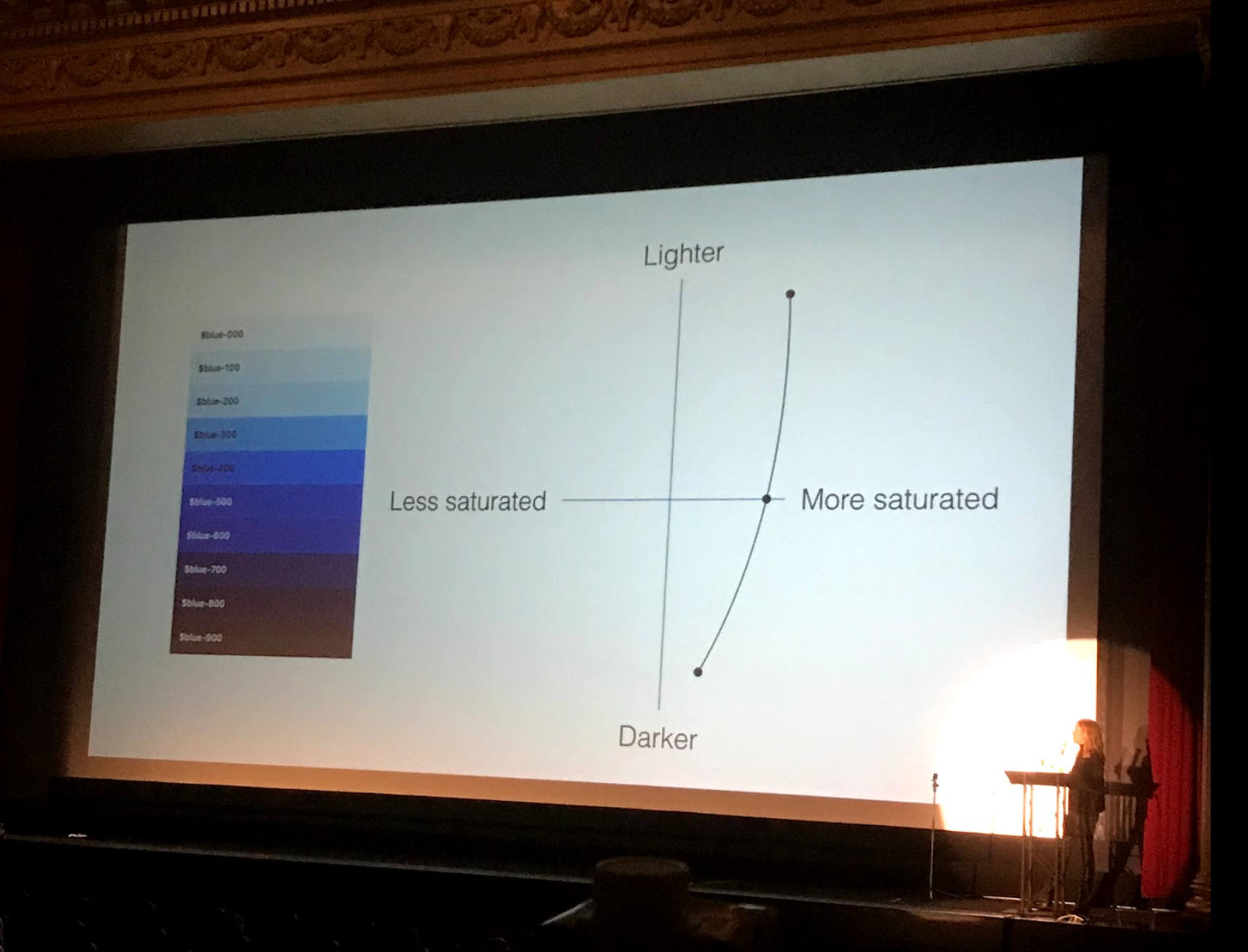
Difference in color is not just the lightness bc saturation plays a role in the perception of color difference as well. What's being changed to create the difference in color at each step? Is it using the lerp() function described here? Each color has a different curve of lightness and saturation.
Color names: blue and red are very clear and recognizable (and short), ultramarine and cerulean are less recognizable and more obscure (and harder to recall), we should stay on the simple and obvious end of the naming spectrum (no pun intended) as much as possible.
+1 on color blindness, greens and reds are problematic for folks with red/green color blindness (especially the lighter shades)
 maya
on 4 Dec 2017
maya
on 4 Dec 2017
I would say definitely yes the current color system (if you can call it that) is far too restrictive. Almost every USWDS project deviates from the default colors, and when it does deviate, the designer and implementer are on their own. A broad common palette like this one gives a deeper starting point, and a clear, useful palette of out-of-the box accessible options.
Defaults — probably organized something like the current semantic taxonomy of primary, secondary, tertiary, warning, success might hew relatively closely to our current palette — but could also provide some additional tonal starting points. Or with a focus on color-blindness for, say, dataviz or other areas where hue has significance. (Still, as guidance goes, we know not to assign unique significance to color, and should continue that practice.)
The steps are not created with a function, rather created manually and checked against the rubric. (Though I'm fascinated by the Programming Design Systems chapter you linked to @maya.) They _tend_ to be less saturated as they get darker, and more saturated as they get lighter, but I've chosen them manually to be sure to "hit" certain tones. The palette tends toward less saturated primaries for a more subdued experience, allowing for vivid variants with higher saturation.
I tend to agree with simple names, but we are clearly faced with the reality that color taxonomies tend not to be as sophisticated as color itself. Once we get past the common primaries and tertiaries secondaries, it is a more... expressive world and less systematized. But thinking through color names is a thoughtful, poetic enterprise, and one I'd be happy to continue.
thisisdano
on 4 Dec 2017
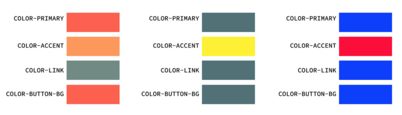
Thanks for your reply. Another naming system that's simple and semantic we may want to explore is the Vox color naming system. For example, it uses $color-primary and $color-accent, which could help with theming.
maya
on 4 Dec 2017
I like that — it makes sense, but maybe seems too simple for more complex theming? (Or maybe there are more than the 4 vars shown here...) The most interesting part of all of this wrt theming and scale is the interaction between the semantic system (what we might think of as the "settings") and the utility system, and how the utility palette is mapped onto the settings.
thisisdano
on 4 Dec 2017
I think I need some work on the cool-white and cool-gray hues. I want to make sure that these are good reliable grays, and that the white hues move smoothly into the gray hues. I think they're a little too cool right now.
thisisdano
on 4 Dec 2017
I tend to be a fan of not reinventing the wheel. Some nice work already done at Patternfly - https://www.patternfly.org/styles/color-palette/ - also a big fan of fluent https://www.microsoft.com/en-us/design/color and material https://material.io/guidelines/style/color.html#color-color-palette
stphnwlkr
on 4 Dec 2017
Unfortunately, I don't know if there's a (color) wheel that's an accepted, universal standard like the wheel wheel. But I know what you mean; the whole point of a design system is to build a class of remixable modular design decisions so designers can spend their time on decisions closer to user and business needs. That is, what _doesn't_ need to be reinvented every time to allow opportunity for more necessary inventions? So I try to look to what's needed and necessary in a tool for designing and building. What reduces non-focus effort? And to some degree I'm not particularly interested in arguing de gustibus — there's plenty to like and love about all kinds of palettes. But what particularly sets the IBM palette apart is the pedagogic rubric: 50 = AA, 60 = AAA, 40 = AA Large. This is what makes this system particularly _useful_ and more than an exercise in pure "aesthetics" (scare quotes added because taste and aesthetics are scary).
thisisdano
on 4 Dec 2017
👋 @thisisdano
The title of this issue (a "color system") is very spot on to guidance I crave from the existing USWDS, yet what you've outlined in your proposal I would consider to be a color palette. And yep, I'm gonna dig into those words with all my excitement 🤓
The difference I see between the two is that a color system tells me how to use color, no matter which color values I choose. What's a highlight? Where do my primary and secondary colors get used? Where do they not get used? What color relationships are used for alerts? etc.
So that no matter what variation of the _palette_ I choose, I'm implementing it consistently with how another visual designer at another agency might implement it, as long as we're following the prescribed _system_. I'd hope that if we outline a system of color use, we'd not only be decreasing the likelihood that designers choose inaccessible color combinations, we'd also be less likely to find applications that feel widely different because each designer has chosen to use/allocate their color palettes in different approaches.
An example of a design system that does this intentionally and well is Google Material Design's color system. Their color tool visualizes how to use the color system through demo-ing selected colors. (PS: I'm not trying to say we need something this advanced, but the core demonstration of _how to use colors_ is what I'm trying to point out.)
The palette you've outlined above seems mathematically sound (at first blush), gives a formula for combining colors accessibly, and speaks to nuanced needs through the vivid variances. I worry though that without guidance on how to structure our approach to using colors, a wide palette like this will broaden the visual differences we're already seeing—which is what I'm choosing to read as one possible concern behind @esgoodman 's comment above as well.
Thanks for inviting the feedback and for reading this far in, glad to keep discussing!
 jenniferthibault
on 5 Dec 2017
jenniferthibault
on 5 Dec 2017
@ericronne paraphrased ☝️ better :)
This seems like a great starting point: the raw materials for building out a system. But what would really help me in my work is to give a few color sets based on these, and show me how to plug & play them.
jenniferthibault
on 5 Dec 2017
@jenniferthibault — Thank you! I think you outline the next steps really really well. And I ++++100 on your ideas for them. This palette is just the raw material of the guidance system — a way to quantize the choices before digging deeper into just how to work with those choices. And that's where it starts to get more interesting :)
And this is one of the many places where I'd hope we could build more continuing guidance with input from visual designers — up-front guidance for sure, but _living_ guidance that could grow, change and extend as the system matures. This, I think, is part of the role of visual designers working in this system.
One of the specific pieces of guidance would be around color perception and avoiding unique significance. There should be other suggested palettes that achieve different goals. We _want_ to provide implementation guidance around this palette, but there's a bit of a chicken-and-egg problem. So I'm proposing we start with the egg and use it to build out the chicken.
So here's my big, overarching idea: the system provides a toolbox of quantized bits, building blocks, recombinable _units_ of... erm.... style. (In this instance, a color palette — but other examples might include whitespace scale, type scale, animations/interactions, and grid.) This toolbox will provide lots of choice, and allow a pretty wide expressive gamut, but it's the responsibility of the guidance to mold this palette into useful combinations.
This architecture choice (wide but _relatively_ fixed palette with living guidance) is one way — and I think a good way — to grow consistency and coherence while allowing and even encouraging necessary mutations and unforeseen solutions.
This seems like a great starting point: the raw materials for building out a system. But what would really help me in my work is to give a few color sets based on these, and show me how to plug & play them.
This is exactly it. (!) But this may be your responsibility at first (and that of other visual designers). This is the fun part. I am very excited about this, FYI.
thisisdano
on 5 Dec 2017
x-posting email feedback (@runemadsen) with permission:
If you're providing a color system to a large user base that may or may not know about color accessibility, I believe that the number one goal of the system is to lower the risk of bad color combinations. When you're expanding your palette so much, you have a much higher risk of this happening. You could write some really great documentation to explain which combinations would work, but experience tells me that it won't matter much: Designers/Developers will look at your color boxes and just pick the ones they like. One way to beat this is to build constraints into your system, just like you have with your existing one: Splitting up colors in "background" and "text" makes it much less likely for a user to mess up. I would agree with some of the comments in the discussion that there's a middle ground here. My first step would be to remove colors that look identical for people with impaired color vision. You can remove 90% of all problems by limiting your red-green color palette (choosing one or choosing both but in different lightnesses). From then on I would also cut some of the darker and lighter colors that blend into each other, or redistribute the color scales with less colors and thus more spacing.
I think this is a great start, and you don't need to over-simplify. But it might be a bit too general right now.
maya
on 12 Feb 2018
Updated palette

thisisdano
on 21 Mar 2018
I had the chance to try this palette out on a style tile builder I'm working on. The idea behind it is to choose a single color and output all your variants based off of this numeric system (e.g. 60, 70, 80 of all colors).
Some initial observations:
- It was very easy to swap out different colors from recall (red, orange, yellow, etc...) and I enjoyed doing that
- I tried to use "purple" and expected it to be there but it wasn't in the available choices
- I had a hard time remembering which colors had warm and cool variants
- Some of the ranges were a bit drab in my builder, so would like to find a consistent way to activate the vivid variants (it's a bit hard bc there's not a consistent range of vivid variants (i.e. no 60v, 70v, 80v across all colors)
- I think I found myself wanting a good default for each color that could be the basis of the custom color palette
I did not have this sheet above as a reference so perhaps it could have helped.
maya
on 21 Mar 2018
ROYGBIP, maybe?
thisisdano
on 22 Mar 2018

thisisdano
on 3 Apr 2018
This work is complete and will be part of USWDS 2.0
thisisdano
on 24 Jul 2018
Related issues
 yowill
·
6Comments
maya
·
4Comments
yowill
·
6Comments
maya
·
4Comments
 ericadeahl
·
4Comments
ericadeahl
·
4Comments
 WayneWhitten
·
4Comments
yowill
·
7Comments
WayneWhitten
·
4Comments
yowill
·
7Comments
Most helpful comment
👋 @thisisdano
The title of this issue (a "color system") is very spot on to guidance I crave from the existing USWDS, yet what you've outlined in your proposal I would consider to be a color palette. And yep, I'm gonna dig into those words with all my excitement 🤓
The difference I see between the two is that a color system tells me how to use color, no matter which color values I choose. What's a highlight? Where do my primary and secondary colors get used? Where do they not get used? What color relationships are used for alerts? etc.
So that no matter what variation of the _palette_ I choose, I'm implementing it consistently with how another visual designer at another agency might implement it, as long as we're following the prescribed _system_. I'd hope that if we outline a system of color use, we'd not only be decreasing the likelihood that designers choose inaccessible color combinations, we'd also be less likely to find applications that feel widely different because each designer has chosen to use/allocate their color palettes in different approaches.
An example of a design system that does this intentionally and well is Google Material Design's color system. Their color tool visualizes how to use the color system through demo-ing selected colors. (PS: I'm not trying to say we need something this advanced, but the core demonstration of _how to use colors_ is what I'm trying to point out.)
The palette you've outlined above seems mathematically sound (at first blush), gives a formula for combining colors accessibly, and speaks to nuanced needs through the vivid variances. I worry though that without guidance on how to structure our approach to using colors, a wide palette like this will broaden the visual differences we're already seeing—which is what I'm choosing to read as one possible concern behind @esgoodman 's comment above as well.
Thanks for inviting the feedback and for reading this far in, glad to keep discussing!