Uswds: Template for advancing through sections of a form
Objective
To provide guidance around navigation and indicating progress within long, complex forms
Initial research
Many of the form progress indicators we looked at fall into three categories:
Horizontal progress indicator
Example: myUSCIS N-400
Why: Dana Chisnell's research on ballot accessibility points out that folks with low literacy/English proficiency have a hard time staying on track when there’s a bunch of information presented side by side. The Anywhere Ballot design principles suggests presenting form fields and information in a single column, with a persistent top nav.
Vertical progress indicator
Example: vets.gov healthcare application
Why: The vertical progress indicator is functionally the same as the horizontal indicator but it's more flexible since it can contain any length of content. It gives a clear sense of the user's progress as they advance from top to bottom.
Simple text progress indicator, or no indicator
Example: gov.uk voter registration form
Why: GDS suggests that progress indicators may not be needed for simple interactions. If one is needed, they recommend adding the step or question number at the top of the page. They recommend against complex progress indicators because: "they’re rarely used, they take up valuable space, they don’t scale well on small screens, they can distract and confuse some people, it’s hard to write good labels for the steps, and it’s hard to handle conditional questions."
Additional questions
- Should the progress indicator also function as navigation? (We've heard pros and cons from folks who've done usability testing on both options.)
- Should the progress indicator indicate whether a user has completed a page or section, or simply indicate where they are in the form?
- What's the scope of this task? Should this be a standalone component or a set of page templates including form intro, navigation, and review?
Next steps
@bradnunnally @donjo and I discussed our options and decided:
- There are lots of different types of forms, and different kinds of navigation will work better for different forms. We can't support every option, so we'd like to offer some guidance around how to select what's appropriate.
- We'll start by designing for long forms — and we think they'll need either a horizontal or vertical progress indicator since there's so much content, and the number of questions will often vary.
- We'll start by prototyping a vertical progress indicator similar to the one on vets.gov, since we have a model that's already been integrated with the Standards. That will allow us to experiment with designs that address the "additional questions". A vertical progress indicator will also likely be easier to adapt to varying content.
- Eventually we'd like to test both the vertical indicator and the horizontal indicator with end users.
 ericadeahl
All 4 comments
x-posting @sawyerh's post from #2325:
So far we've done two rounds of user testing for the new HC.gov application. The format of the tests were InVision prototypes, so we haven't yet gotten a ton of results around the usability of the form fields themselves. There is one pattern that we've tested that we do have some preliminary results on, with secondary research, that have been encouraging and worth sharing:
Step list
We've been testing a "step list" pattern as a way to:
- Introduce a user to the application so they know what's coming up.
- Allow the user to navigate to previous sections of the application.
- Allow a user to see their current progress, at a high level, within the application.
This pattern was inspired by GOV.UK's Task list pages, and they have some additional research notes here.
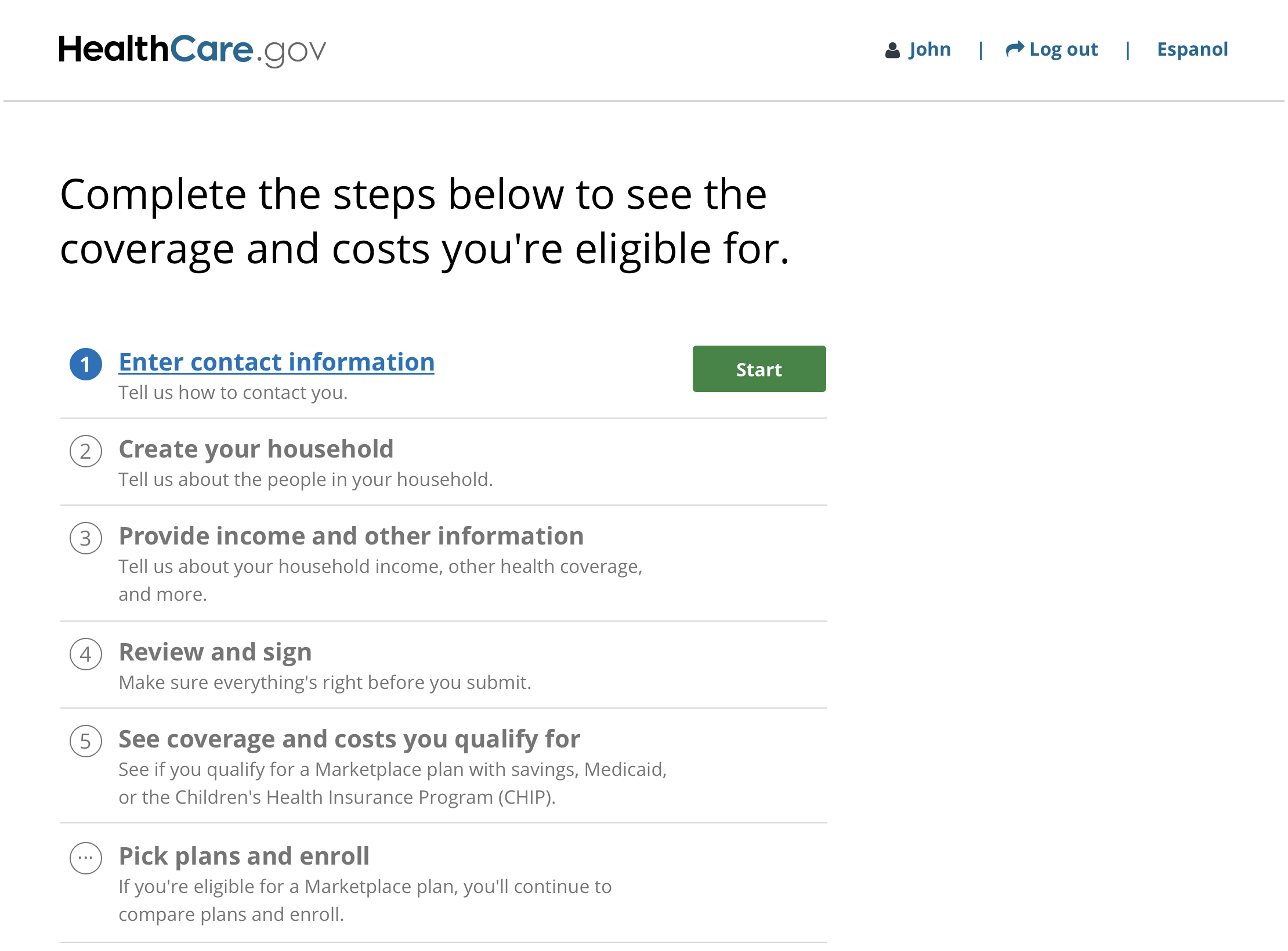
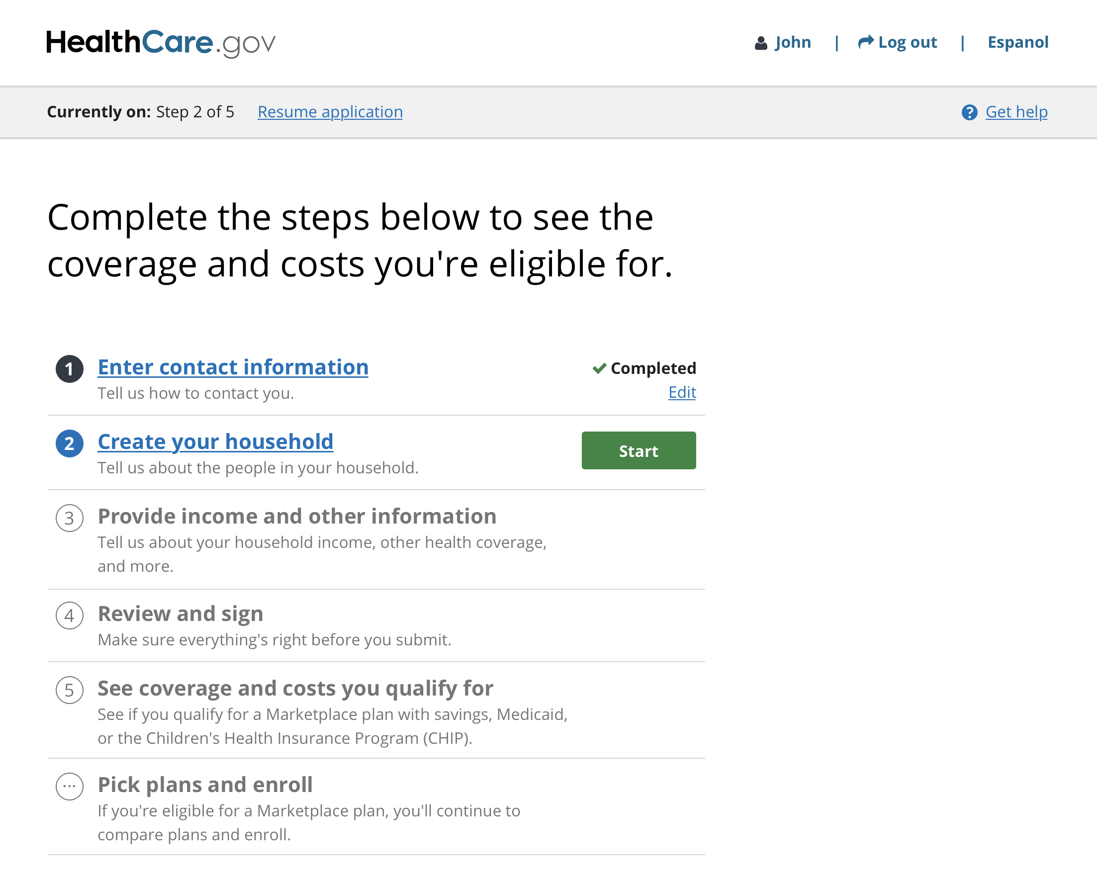
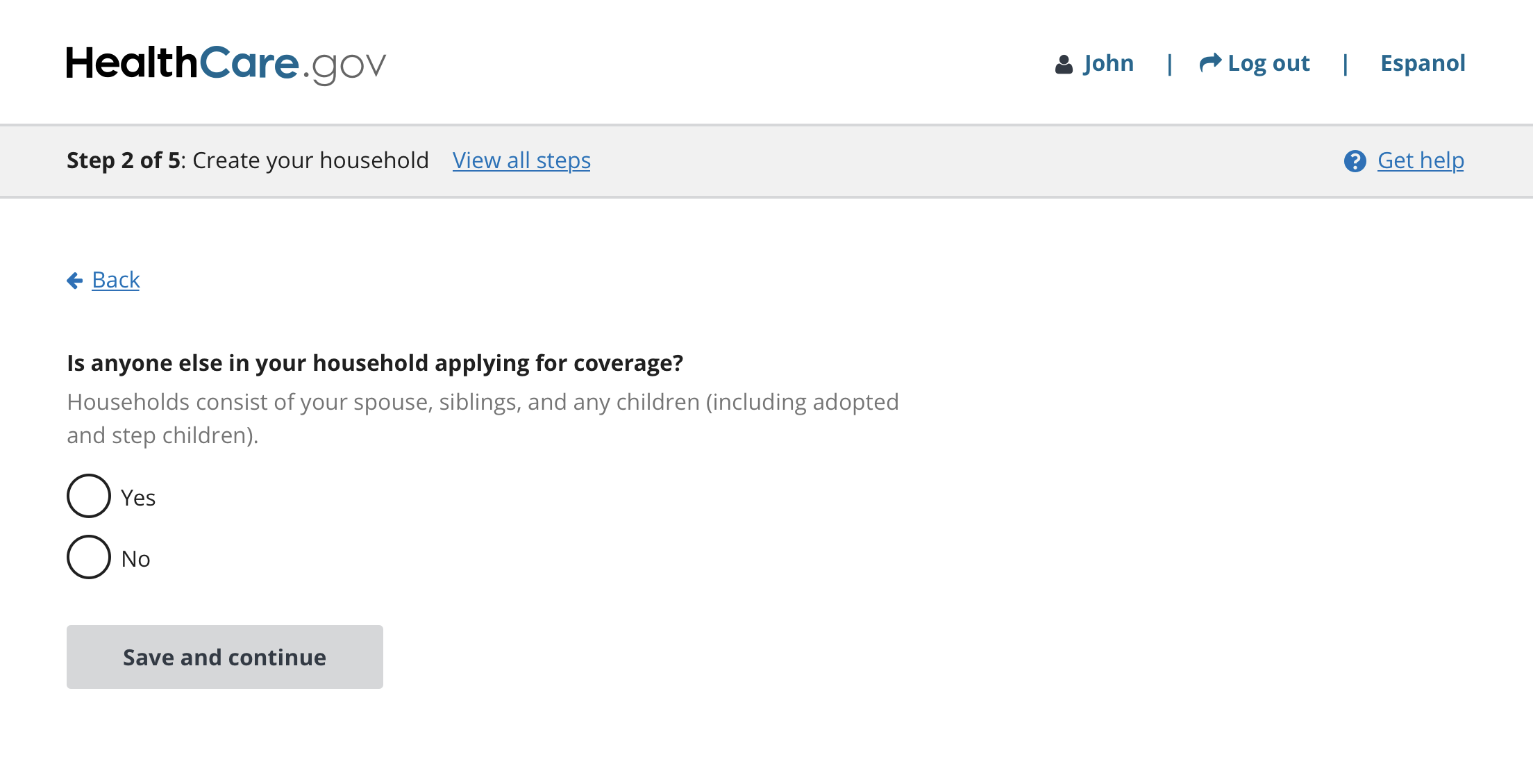
The first iteration we tested was this:
| Step 1 | After completing step 1 | Example form page with "View all steps" link |
| ------ | ------------------------ | -------------------- |
|  |
|  |
|  |
|
We tested this prototype with 9 participants and some of the findings were:
- Most users tended to click the green "Start" button right away, not reading the text on the page. For our case, this is actually fine, and showed that users were able to quickly identify how to start their application, and understood to start from the first step in the list.
- Some users commented about the green button, one of them saying:
> I like green, green means go - Users understood that grayed-out steps were disabled, and that they needed to complete the steps one at a time from top to bottom.
- In the design, the step titles were intended to be hyperlinks that would take the user to the same page as the "Start" button. The goal was to provide multiple ways for a user to proceed with their application, or navigate to previously completed step. However, this seemed to cause confusion for some users. Some users weren't sure where the title link would take them, and some thought it might take them to a page describing the step. Our takeaway here was to remove the link from the title in the next iteration.
- In the prototype, when a user is on a question page, they can click a "View all steps" link to navigate back to the task list to see their progress. If a user hadn't yet started the next step, the button would say "Start". This caused confusion for some users. When one user came back to the page and the "Start" button moved to the second step, there was some concern that it would Start another application, and he suggested it would be clearer if it said "Continue". In future iterations the CTA will say "Resume" for subsequent steps, even if they haven't been started yet.
- Users seemed to understand that to go back to a previous step, they would click the "Edit" link to the right of the step.
 maya
on 21 Mar 2018
maya
on 21 Mar 2018
A note about the Vets.gov progress indicator. We have two things going on.
The linked page has what we refer to as a _subway map_ outline of the overall process. Every form has a similar outline starting with preparation that links to eligibility, and highlights required pieces of data to minimize surprises in the form itself. It also talks about what happens after the Veteran submits the form. The subway map is orientation, not navigation or “you are here” type information.
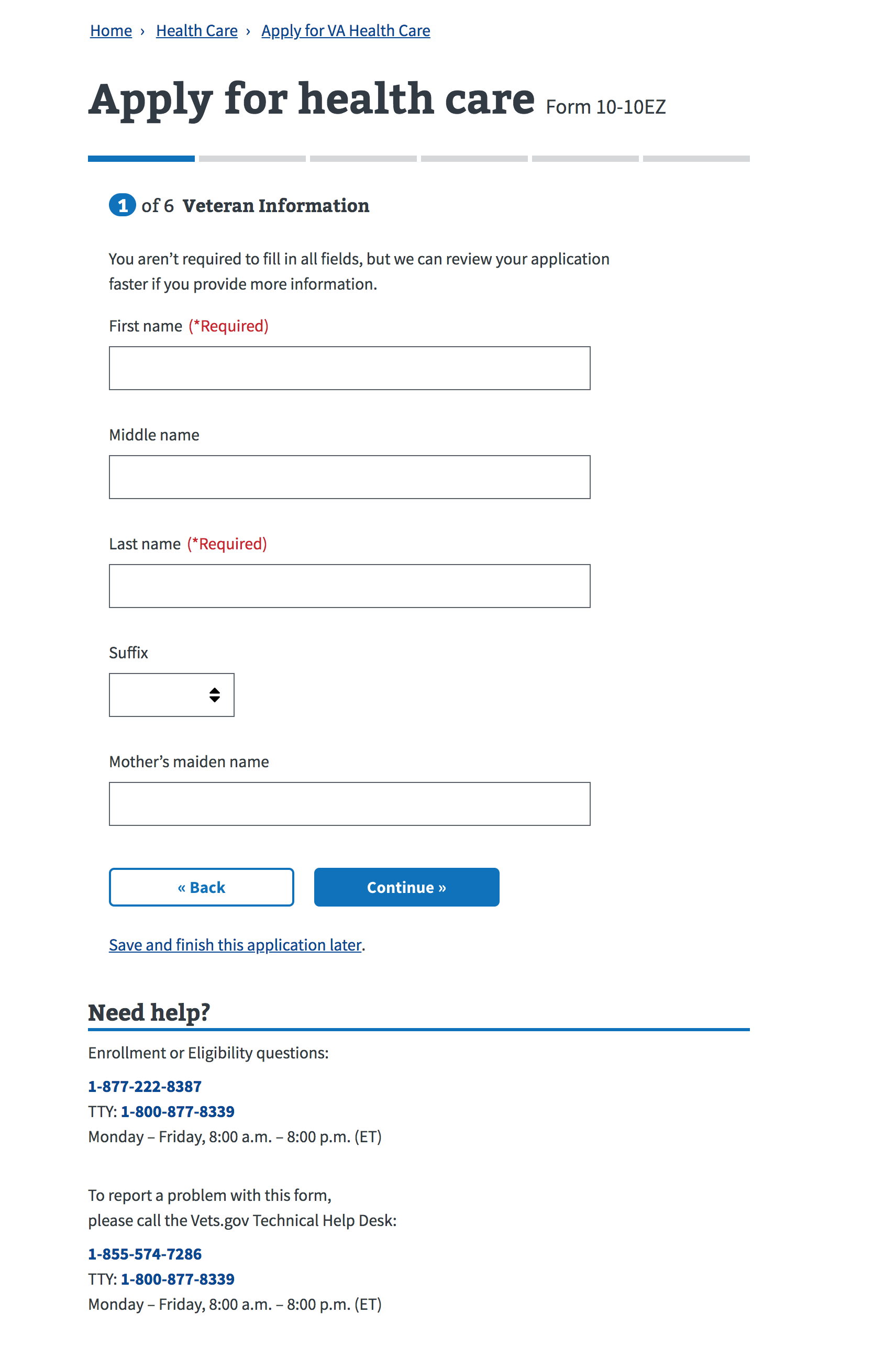
The “you are here” sense of progress is provided in the application form by a segmented horizontal bar. The segments turn blue (from grey) as you proceed through the chapters of the form.
- Our forms are all linear, there is no jumping around. The progress bar has no navigation function.
- Our forms are conditional. The number of screens in a given chapter can vary depending on answers provided. We only show progress by chapter so the number of steps doesn’t jump around.
- Our progress segments do not have labels. We are trying to provide a meaningful marker of proportional progress that works on small screens without taking up too much vertical screen real estate.
- Each screen has a chapter title immediately below the progress bar
X of Y Chapter Nameto orient the Veteran to the current step without worrying too much about what’s coming up. - We have reordered many of our forms to put hard, or high impact, questions early in the form. If there is a show stopper it comes before the Veteran has invested a lot of time. They can save progress and come back later.
- We have a review step at the end of every form where Veterans can drill into any chapter (accordion) to see each piece of data they entered and make edits inline.
Veteran feedback has been mostly positive. People appreciate the sense of progress and find it genrally understandable. There _are_ occasional questions about steps within a chapter. We use subheads to disambiguate in places where it seems like it will be helpful.
 goldenmeanie
on 21 Mar 2018
goldenmeanie
on 21 Mar 2018
Thanks @goldenmeanie, this is really useful. Adding a screenshot of the form indicator:
maya
on 22 Mar 2018
Your suggestion is appreciated, however it is not on the current product roadmap.
 el-mapache
on 17 Jul 2018
el-mapache
on 17 Jul 2018
Related issues
 zestyping
·
3Comments
zestyping
·
3Comments
 mariamarrero
·
3Comments
mariamarrero
·
3Comments
 DruidSmith
·
5Comments
DruidSmith
·
5Comments
 mollieru
·
4Comments
mollieru
·
4Comments
 yowill
·
6Comments
yowill
·
6Comments