Uswds: Public Sans: "j" has larger dot (tittle) than "i"
Description
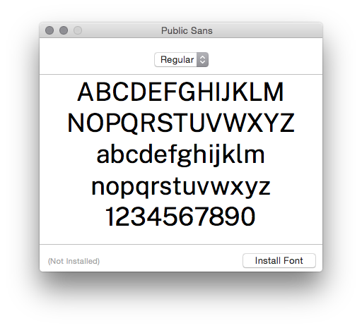
In the Public Sans font, the lowercase "j" has a taller dot than the lowercase "i".
I can think of no good reason for this. It looks sloppy and seems like a design or rendering error.
Steps to reproduce the issue
Using Chrome 73 on Mac OS 10.10, visit the Public Sans site and select one of the weights at the top of the page to view samples. I can see that the "j" has a noticeably larger dot than the "i" in weights 100, 200, 300, 400, 500, 600, 700, and 800. I can't tell if it has a larger dot in 900.








Or, download Public Sans Regular as a TTF and see that the "j" has a larger dot than the "i" when rendered by Font Book on Mac OS 10.10:
bug
 zestyping
👍3
All 3 comments
Yup — that's a mistake. I'll correct this.
 thisisdano
on 8 Apr 2019
thisisdano
on 8 Apr 2019
❤114
Thank you!
zestyping
on 8 Apr 2019
thisisdano
on 9 Apr 2019
Was this page helpful?
0 / 5 - 0 ratings
Related issues
 WayneWhitten
·
4Comments
WayneWhitten
·
4Comments
 DruidSmith
·
5Comments
DruidSmith
·
5Comments
 maya
·
5Comments
maya
·
5Comments
 yowill
·
7Comments
yowill
·
7Comments
 adborden
·
4Comments
adborden
·
4Comments
Most helpful comment
Yup — that's a mistake. I'll correct this.