EDIT: Replaced images with links to avoid older versions mistakenly getting used for workshop pages
-- aubergine10
As suggested by #51, we need a new logo. So, since I owned Photoshop and I was bored, I thought, "Hey, why don't I take a shot at this?" So I did! Here's some prototype logos. Please give me all your opinions, I'm ready to tweak this down to the last pixel!
Icon
iconfinder_43_277444
Text Logo
logo
Workshop Thumbnail
thumbnail
Workshop Preview
preview
Workshop Thumbnail Example
image
Workshop Preview Example
image
 FireController1847
All 20 comments
Love it. The icon works exactly as I'd hope, it really does stand out.
But ditch the underlines and hue changes on capital letters... users instinctively abbreviate, as they have done with existing logos.
There might be alternate fonts to try. Can you attach a zip of the traffic lights transparent png(s) to this issue?
 aubergine10
on 13 Feb 2019
aubergine10
on 13 Feb 2019
For future reference, here is site of the artist who made the traffic light icon:
aubergine10
on 13 Feb 2019
EDIT: Replaced images with links to avoid older versions mistakenly getting used for workshop pages
-- aubergine10
I made the color changes and the underlines to make the text stand out and give it kind of a unique look to it. However, as requested, here's the versions without the hue and underline, which don't look half bad. As for the font, I went with Roadgeek 2005 Transport Heavy this time, to fit with the theme of roads. Let me know your opinion on it, and if it should be changed again. (If it should, try describing what you're envisioning, like if it should be a bolder or thinner font, letters closer together or further apart)
Text Logo
logo2
Workshop Thumbnail
thumbnail2
Workshop Preview
preview2
Workshop Thumbnail Example
image
Workshop Preview Example
image
FireController1847
on 14 Feb 2019
Was going to suggest doing the logo for 1.10.16 milestone, but probably better to wait until we've got those pathfinder bugs fixed.
aubergine10
on 21 Feb 2019
Haha, I'm still searching for those bugs... 😄
 krzychu124
on 21 Feb 2019
krzychu124
on 21 Feb 2019
Alright. Let me know if you guys feel there should be any other changes. I recently got a student discount so I have Adobe Illustrator now too lol
FireController1847
on 22 Feb 2019
Hej @FireController1847,
great work, love the new logo and effort! I had a look at the terrible kerning (font/Roadgeek's fault) and did some test with changing the kerning to optical (in Illustrator) and looked for an alternative. Maybe we should take http://overpassfont.org/ in cosideration? It is a much more professional font and IMHO more true to the original Highway Gothic font.
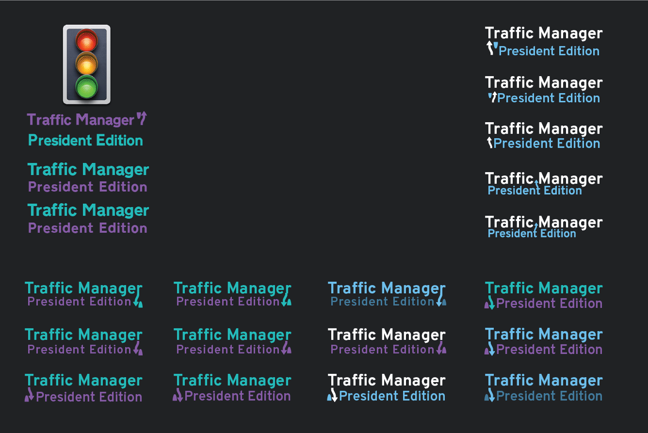
While at it, I also tried different colors, arrows and compositions 🎨 I think colorwise there could me more emphasis on TM than on PE.
EDIT: added up-arrow variations, don't know why I got stuck with all the arrows pointing down
...and here the Illustrator file:
logo_test_tomber_v2.zip
 1Tomber
on 1 Mar 2019
1Tomber
on 1 Mar 2019
@1Tomber I do like the look of the smaller "President Edition" text, it's a very good modification. When it comes to the icon, I experimented a ton with many different types of arrows and, like you can probably tell, they all look kind of out of place. The only one that somewhat fit was the original one (which, imo, looks the best). For the font, I was completely unaware the U.S. had an official one. Although, I'm not sure why they charge over 2,000$ for it, that doesn't make sense to me. Overpass looks like a great change! Finally, for the color combinations, I'm particularly fond of the blue on blue (dark blue below the lighter blue). I'll try and make a few modifications to some of these to see if I can make it look a little better.
FireController1847
on 1 Mar 2019
EDIT: Replaced images with links to avoid older versions mistakenly getting used for workshop pages
-- aubergine10
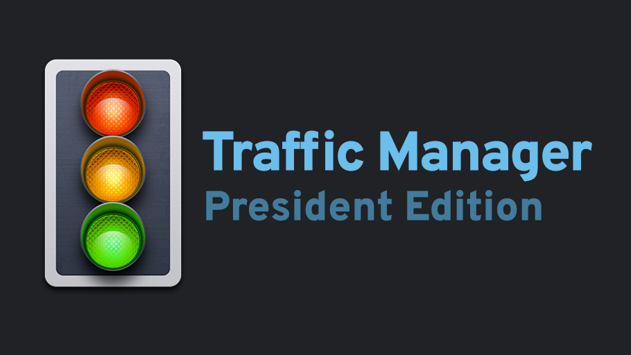
Okay, so I tried out your color combination and it looks great. The font also looks amazing. I upsized the top text and made the bottom text a little smaller, and I think it looks good centered. What do you think?
logo3
thumbnail3
preview3
image
image
Here's the photoshop files (still using Photoshop because it's far superior for text-based images)
Logo.zip
FireController1847
on 1 Mar 2019
Great work @1Tomber and @FireController1847 !
@1Tomber I do like that transition between letter and icon.
@FireController1847 Yup, now that font color looks great.
krzychu124
on 1 Mar 2019
I'm still not keen on that arrow thing (I don't even know what it means, something from USA I guess?) - maybe just remove the arrow thing? We have an international audience remember :)
For the thumbnail (shown in workshop summary pages) I'd suggest just the traffic light top-center with TM:PE underneath. Keep it super-simple.
On the mod detail page, the main panel will likely be populated with images depicting features (once we start reworking the UI etc) but yes would be nice to have a logo image in the short term.
For font, what about one of the RoadGeek typefaces - maybe Roadgeek 2005 Series B (Version 1.000 2) ?
aubergine10
on 1 Mar 2019
@aubergine10 Basically the arrow is a sign found in the U.S., and it's more of a warning sign that there is a median coming up and you should be to the right of it. (See http://trafficsigns.ntsigns.com/viewitems/traffic-signs-usdot-regulatory-signs/keep-right-of-median-signs-r4-7 ). For the thumbnail, isn't that what it currently is? The traffic light is in the top-center with TM:PE underneath. Also, we've been using the Roadgeek fonts in the original imagery, hence the notice of a change to the Overpass font which looks better imo
FireController1847
on 1 Mar 2019
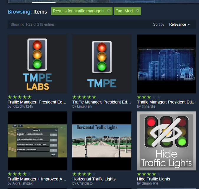
For thumbnail, I meant "TM:PE" rather than the somewhat-wordy "Traffic Manager President Edition"
aubergine10
on 1 Mar 2019
EDIT: Replaced images with links to avoid older versions mistakenly getting used for workshop pages
-- aubergine10
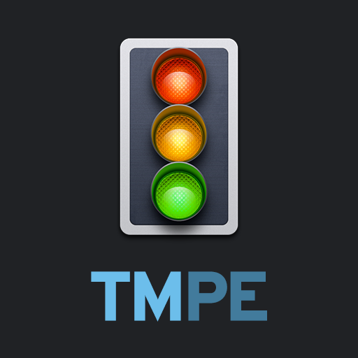
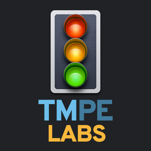
With the resurrection of the STABLE TM:PE and the rebranding of LABS TM:PE, I've come up with a new idea for the logos. I also removed the disliked road icon, and shortened the thumbnail down to "TMPE". It may look weird at first with the color difference, but the more I looked at it the more I thought it looked good. I also created a new color for "LABS". What do you guys think?
Thumbnails
Logos
Preview Thumbnails
Preview Logos
FireController1847
on 19 May 2019
I FREAKING LOVE THAT!!!!!!!
Dude, that's some god-tier gestalt right there! <3 <3 <3
LOVE IT!!!!!!!!!
Maybe a couple of very minor tweaks though:
- On the square "TMPE LABS" thumbnail image, maybe reduce the font size a little? Ideally the traffic light should be in same position on both thumbnails, and for that to happen the TMPE LABS text would need to be a little smaller. EDIT: Maybe the "TMPE" text could be shrunk until it's same width as the "LABS" text?
- On the larger rectangular images, left-align the "President Edition" with "Traffic Manager"; Centering the text like it currently is makes it look a little messy.
But overall I freaking love those new versions you did, they look really professional!
aubergine10
on 20 May 2019
- Maybe reduce the text/image content on the larger rectangular images to create more "breathing space" around the edge of the image content; make it look less crowded. I see you already have same padding around the image/text (great!) - just needs more padding imo.
aubergine10
on 20 May 2019
FINAL VERSIONS: USE IMAGES IN THIS COMMENT
Ask and you shall recieve!
Thumbnails
Note: It's really not possible to keep the image in the same place while adding on the "LABS" text without removing the centering; they will be off just by a little bit, but that should be okay. I did make the font size a bit smaller to give the thumbnails some more padding too.
Logos
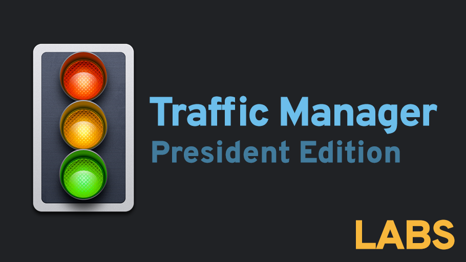
Thumbnails Preview
Logos Preview
FireController1847
on 20 May 2019
Perfect!
aubergine10
on 21 May 2019
Awesome. Just so we're all good, I will be marking the last posted ones as the final version. The following file is a zip file containing the icon and the psd file for the icon, as well as the logos and the corresponding psd files. Glad I was able to help out with this, it was a lot of fun and I'm very happy to see the outcome!
FireController1847
on 21 May 2019
Reopening until workshop pages are updated
aubergine10
on 21 May 2019
Related issues
 darthroe
·
249Comments
darthroe
·
249Comments
 kianzarrin
·
38Comments
aubergine10
·
39Comments
aubergine10
·
32Comments
aubergine10
·
33Comments
kianzarrin
·
38Comments
aubergine10
·
39Comments
aubergine10
·
32Comments
aubergine10
·
33Comments
Most helpful comment
Reopening until workshop pages are updated