Survey-library: Responsive matrix questions?
::: Feature request :::
Are there any plans to make the matrix style questions display well (nicely responsive) on small devices like mobile phones?
 SlowburnAZ
All 12 comments
@SlowburnAZ Do you have any proposal how to render matrix question on mobile devices?
Are you talking about matrix question/ the table of radio groups?
Thank you,
Andrew
 andrewtelnov
on 27 Jun 2017
andrewtelnov
on 27 Jun 2017
Yeah, I'm referring to the table of radio groups / matrix.
Not sure if I have any great solutions... other than wrapping the tables with a div.table-responsive in the Bootstrap versions. However, this just make it so that the table becomes scrollable horizontally. The "problem" with the matrix questions is their inherent horizontal size, really.
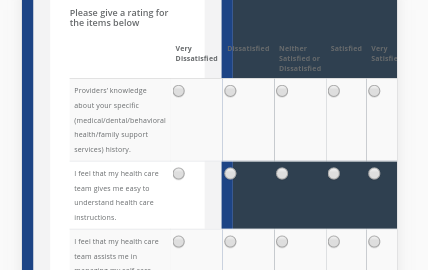
Here's an example of the default view of a matrix question on a simulated phone:
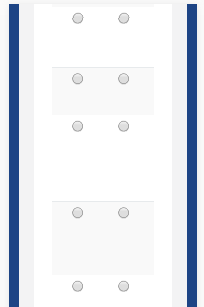
Here's that same example, but with the table wrapped in div.table-responsive:

Using the div.table-responsive around the table might work better if the first column's text were able to wrap so that the radio buttons could be seen, indicating to the user that they should be able to scroll over to the right to see more. This can be done by overriding Bootstrap's media query for .table-responsive to remove the "white-space: no-wrap" CSS:
@media screen and (max-width: 767px)
bootstrap.css:2263
.table-responsive > .table > thead > tr > th, .table-responsive > .table > tbody > tr > th, .table-responsive > .table > tfoot > tr > th, .table-responsive > .table > thead > tr > td, .table-responsive > .table > tbody > tr > td, .table-responsive > .table > tfoot > tr > td {
/* white-space: nowrap; */
}
...which results in the following:

Better, but it still poses a problem when the user scrolls down to answer questions in the matrix (there's no way for the user to really see what they're answering):
I was unsure if maybe I was missing something that you had already come up with.
There's also these potential solutions: https://www.sitepoint.com/responsive-data-tables-comprehensive-list-solutions/
I'm up for suggestions, too. :-)
SlowburnAZ
on 27 Jun 2017
@SlowburnAZ I don't know. Will the dropdown matrix question work for you?
Because dropdown matrix question with one dropdown column is basically a matrix question. However it takes less spaces. All you will need, is to solve the problem, but showing a large description as select option. It can be done by custom widget. There are some JavaScript libraries that allow to have a dropdown with customizable (template) for select options.
What do you think?
Thank you,
Andrew
andrewtelnov
on 28 Jun 2017
@andrewtelnov Not sure yet. I'm going to play around with the Matrix Dropdown a bit, and try to get some feedback/ideas from our design team as well. Thanks!
SlowburnAZ
on 29 Jun 2017
@andrewtelnov So, here's what I came up with... maybe if it looks good to you guys, you could do something similar in the code/CSS?
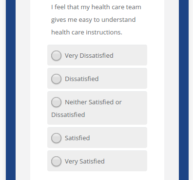
So, obviously I had to tweak a few things to get this to work.
First off was the CSS. I address some problems with both the Matrix questions and the Checkbox/Radio questions:
.matrix-vert {
  display: none;
  margin-left: 10px;
}

/* Fix for Survey Question checkboxes and radio buttons */
@media screen and (max-width: 767px) {
  div.question-margin div.radio label span,
  div.question-margin div.checkbox label span {
    margin-left: 23px !important;
  }
}

/* Styles for mobile devices */
@media only screen and (max-width: 480px) {
  div.question-margin table {
    display: block;
  }
  div.question-margin thead {
    display: none;
  }
  div.question-margin tbody,
  div.question-margin tr,
  div.question-margin td {
    display: block;
    margin: 5px 0;
    border-radius: 4px;
  }
  .table-striped > tbody > tr {
    background-color: #fff !important;
  }
  div.question-margin table tbody tr td:first-child {
    margin: 10px 0 5px !important;
    border-top: none;
  }
  div.question-margin table tbody tr td:not(:first-child) {
    background-color: #eee;
  }
  div.question-margin table tbody input[type=radio],
  div.question-margin table tbody input[type=checkbox] {
    margin: 0 0 0 5px !important
  }
  .matrix-vert {
    display: inline;
  }
}
The ".matrix-invert" class is used as such: In the onAfterRenderSurvey, I add an action that adds a span with that class after each input...
survey.onAfterRenderSurvey.add(function(sender) {
    // Let's add some things to the matrix questions that will only show on mobile devices
    var $inputs = $('div.question-margin table tbody tr td:not(:first) > input');
    _.each($inputs, function(el) {
        var $val = $(el).val();
        var html = '<span class="matrix-vert">' + $val + '</span>';
        $(el).after(html);
    });
});
As for those spans, I'm sure you could add those in the code itself, and then with the class definitions above, they would be normally hidden, but then show up on mobile devices.
Now, I don't use the Matrix Dropdown question type, so I'm not sure how this CSS would affect those, but it shouldn't be bad.
What do you think?
SlowburnAZ
on 1 Jul 2017
@SlowburnAZ It looks great to me. I think we should discuss questions for mobiles.
Thank you for sharing your code!
Thank you,
Andrew
andrewtelnov
on 1 Jul 2017
I tried above approach provided by @SlowburnAZ , but some how the newly added span element matrix-vert" < span class="matrix-vert" >' + $val + ' < / span > " gets vanished from DOM as soon as click event is triggered on the matrix.
Plunker URL : https://plnkr.co/edit/WLcEODfDEbdXhPrpkUpJ?p=preview
Could you please let me know if am missing out anything?
-Thanks
 alekhraut
on 24 Nov 2017
alekhraut
on 24 Nov 2017
@alekhraut I think I have just fixed this issue
Please try the next minor update that we will release in several days.
Thank you,
Andrew
andrewtelnov
on 13 Dec 2017
-Thanks @andrewtelnov, it seems to be working fine with this version.
alekhraut
on 19 Dec 2017
Hello again referring this ticket . I cant display responsive matrix questions. Even on your examples Link does not display responsive. And i cant find any explanation on your documentation about being responsive. pic1
 HarunKARATAS
on 11 Sep 2018
HarunKARATAS
on 11 Sep 2018
@HarunKARATAS We've impoved it via the c1e4206 Changes will be available in the next minor update (very likely today). Also please see https://github.com/surveyjs/surveyjs/issues/1323
 dmitrykurmanov
on 11 Sep 2018
dmitrykurmanov
on 11 Sep 2018
We've added responsive behaviour in 1.0.45.
 tsv2013
on 25 Sep 2018
tsv2013
on 25 Sep 2018
Related issues
 faso
·
4Comments
faso
·
4Comments
 nadialo
·
4Comments
dmitrykurmanov
·
3Comments
nadialo
·
4Comments
dmitrykurmanov
·
3Comments
 misamura
·
4Comments
misamura
·
4Comments
 halexiev-hedgeserv
·
4Comments
halexiev-hedgeserv
·
4Comments
Most helpful comment
@andrewtelnov So, here's what I came up with... maybe if it looks good to you guys, you could do something similar in the code/CSS?
So, obviously I had to tweak a few things to get this to work.
First off was the CSS. I address some problems with both the Matrix questions and the Checkbox/Radio questions:
The ".matrix-invert" class is used as such: In the onAfterRenderSurvey, I add an action that adds a span with that class after each input...
As for those spans, I'm sure you could add those in the code itself, and then with the class definitions above, they would be normally hidden, but then show up on mobile devices.
Now, I don't use the Matrix Dropdown question type, so I'm not sure how this CSS would affect those, but it shouldn't be bad.
What do you think?