Styled-components: How do I provide props to styled elements in Typescript?
I looked at the docs and other than creating a whole empty component purely for providing a definition of props I'm not sure of if it's possible to provide custom props to a styled element other than theme.
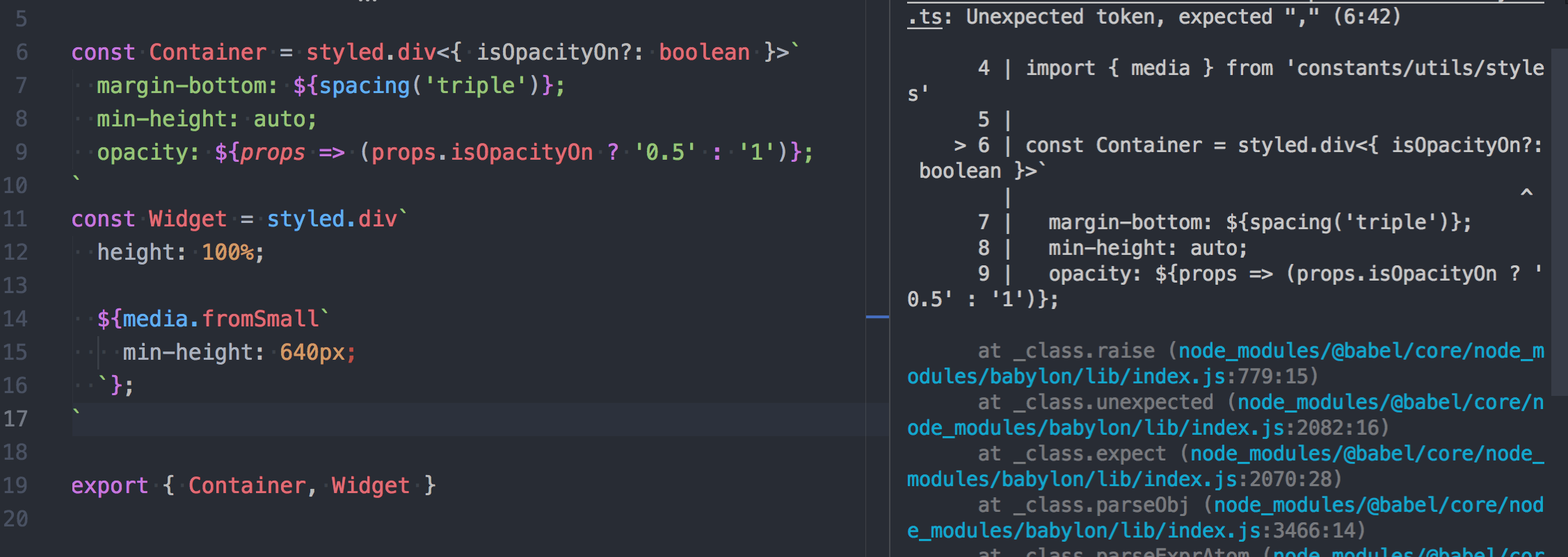
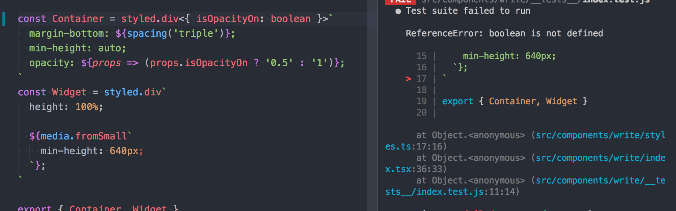
Example

For the above example I don't know how to make it not error.
 tal
tal
All 100 comments
@tal Assuming that TypeScript infers the generics correctly — Disclaimer :wink: I haven't used SC with TypeScript yet — you'll just need to type your interpolation argument:
const Input = styled.input`
border: ${(p: YourProps) => p.invalid ? 'red' : 'blue'};
`
 kitten
on 31 Mar 2017
kitten
on 31 Mar 2017
Unfortunately it also errors at call site. I need a way to put generics in
I think
On Thu, Mar 30, 2017 at 7:04 PM Phil Plückthun notifications@github.com
wrote:
@tal https://github.com/tal Assuming that TypeScript infers the
generics correctly — Disclaimer 😉 I haven't used SC with TypeScript yet
— you'll just need to type your interpolation argument:const Input = styled.input
border: ${(p: YourProps) => p.invalid ? 'red' : 'blue'};—
You are receiving this because you were mentioned.
Reply to this email directly, view it on GitHub
https://github.com/styled-components/styled-components/issues/630#issuecomment-290569741,
or mute the thread
https://github.com/notifications/unsubscribe-auth/AABJ2rxp8PI2i2qOGk_Ym6ZHqA4Lz4Xfks5rrDUEgaJpZM4Mu9JF
.
tal
on 31 Mar 2017
/cc @styled-components/typers any ideas?
 mxstbr
on 1 Apr 2017
mxstbr
on 1 Apr 2017
EDIT: Holdup. What I had just happened to fit my usecase.
This currently seems to be the best approach, albeit a bit wordy.
 jupl
on 2 Apr 2017
jupl
on 2 Apr 2017
@philpl 's approach worked for me
 giladaya
on 5 Apr 2017
giladaya
on 5 Apr 2017
I'm using v2 and found this way more convinient for plain containers:
function stuc<T>(El: string = 'div') {
type PropType = T & { children?: JSX.Element[], className?: string }
return (props: PropType) => <El className={props.className}>{props.children}</El>
}
const Container = stuc<{customProp?: boolean}>()
const StyledContainer = styled(Container)`
background: ${p => p.customProp ? 'red' : 'blue'};
`
 beshanoe
on 7 Jun 2017
beshanoe
on 7 Jun 2017
@beshanoe hopefully we'll have a way to do this in TS (see: https://github.com/Microsoft/TypeScript/issues/11947)
 patrick91
on 7 Jun 2017
patrick91
on 7 Jun 2017
Going to close this as there isn't much we can do right now about this, thanks for discussing!
mxstbr
on 30 Jun 2017
This is what I use at the moment:
import styled, { StyledFunction } from "styled-components"

interface YourProps {
  invalid: boolean
}

const input: StyledFunction<YourProps & React.HTMLProps<HTMLInputElement>> = styled.input

const Input = input`
  border: ${p => p.invalid ? 'red' : 'blue'};
`
 alloy
on 14 Jul 2017
alloy
on 14 Jul 2017
@alloy's solution worked great for me
I made a function wrapper for it that doesn't really do anything other than let typescript know of the types, but I think it makes the code a little more terse
import React from 'react'
import styled, { StyledFunction } from 'styled-components'

function styledComponentWithProps<T, U extends HTMLElement = HTMLElement>(styledFunction: StyledFunction<React.HTMLProps<U>>): StyledFunction<T & React.HTMLProps<U>> {
    return styledFunction
}

interface MyProps {
    // ...
}

const div = styledComponentWithProps<MyProps, HTMLDivElement>(styled.div)
 ghost
on 22 Jul 2017
ghost
on 22 Jul 2017
Extending @david-mk's method to get theme types as shown in https://www.styled-components.com/docs/api#typescript
// themed-components.ts
import * as styledComponents from 'styled-components';
import { ThemedStyledComponentsModule } from 'styled-components';

import { ITheme } from 'theme'; // custom theme

type StyledFunction<T> = styledComponents.ThemedStyledFunction<T, ITheme>;

function withProps<T, U extends HTMLElement = HTMLElement>(
  styledFunction: StyledFunction<React.HTMLProps<U>>,
): StyledFunction<T & React.HTMLProps<U>> {
  return styledFunction;
}

const {
  default: styled,
  css,
  injectGlobal,
  keyframes,
  ThemeProvider,
} = styledComponents as ThemedStyledComponentsModule<ITheme>;

export { css, injectGlobal, keyframes, ThemeProvider, withProps };
export default styled;
// component

import styled, { withProps } from 'themed-components';

interface IProps {
  active?: boolean;
}

const Container = withProps<IProps, HTMLDivElement>(styled.div)`
  height: 100%;
  padding-right: 52px;
  display: flex;
  justify-content: center;
  align-items: center;
  color: ${props => props.theme.colors.black4};
  background-color: ${props => props.active ? props.theme.colors.white : props.theme.colors.grey};
`;
 atfzl
on 22 Jul 2017
atfzl
on 22 Jul 2017
Another option which allows to bypass explicit element type specification, but looking a bit awkward:
import { ThemedStyledFunction } from 'styled-components';

export const withProps = <U>() =>
    <P, T, O>(
        fn: ThemedStyledFunction<P, T, O>
    ): ThemedStyledFunction<P & U, T, O & U> => fn;
so later:
interface ButtonProps {
    active: boolean;
}

//                                           / note () here
export const Button = withProps<ButtonProps>()(styled.div)`
  color: ${p => p.active ? 'red' : 'black'}
`;
 Igorbek
on 23 Jul 2017
Igorbek
on 23 Jul 2017
@Igorbek Have you noticed that vscode's typescript styled plugin seems to not work when using any of these syntaxes?
Edit:
In the mean time I've aliased styled to themed and then add props to each of the types I want to use. Could probably be optimized more to be less ugly:
import * as themed from 'styled-components';

//...

interface IHeadingProps {
  active?: boolean;
}

const styled = {
  div: withProps<IHeadingProps>()(themed.div)
};

//...

export const Heading = styled.div`
  font-size: 22px;
`;
Edit: Opened issue here: https://github.com/Microsoft/typescript-styled-plugin/issues/21
 jimthedev
on 18 Oct 2017
jimthedev
on 18 Oct 2017
Also @Igorbek do you have a full example of your Jul 23 post? TS keeps thinking the types are JSX on that one for me and complaining about implicit any.
EDIT: Nevermind, I rewrote it this way and it worked
function withProps<U>() {
    return <P,T,O>(
        fn: ThemedStyledFunction<P, T, O>
    ): ThemedStyledFunction<P & U, T, O & U> => fn
}
@Igorbek I needed to slightly change your withProps function after upgrading to TypeScript 2.6 with strict mode enabled
Reason: there's new "Strict function types" behavior in TS 2.6 which forbids returning fs function with type parameters extended in such a way (as it's unsound).
My solution was to explicitly cast fn to ThemedStyledFunction<P & U, T, O & U>:
const withProps = <U>() =>
    <P, T, O>(
        fn: ThemedStyledFunction<P, T, O>
    ) => fn as ThemedStyledFunction<P & U, T, O & U>;
Other option is to set strictFunctionTypes to false in tsconfig.json
 Lucasus
on 3 Nov 2017
Lucasus
on 3 Nov 2017
It seems this methods works too.
const Component = styled<Props, 'div'>('div')`
  color: ${color.primary}
`
And this provides better code-highlighting in code editors, babel-plugins display name supports.
 FourwingsY
on 19 Dec 2017
FourwingsY
on 19 Dec 2017
@FourwingsY I think the documentation mentions you'd want to avoid that
We encourage you to not use the
styled('tagname')notation directly. Instead, rely on thestyled.tagnamemethods likestyled.button. We define all valid HTML5 and SVG elements. (It's an automatic fat finger check too)
 seivan
on 19 Dec 2017
seivan
on 19 Dec 2017
@seivan I know, but then i need to wait until webstorm plugin and babel plugin OR styled-components itself supports for withProps methods.
FourwingsY
on 19 Dec 2017
@FourwingsY I wonder if this would work for you
interface SectionProps {
  // see https://github.com/Microsoft/TypeScript/issues/8588
  children?: React.ReactChild;
  className?: string;
}

class PlainButton extends React.PureComponent<SectionProps, {}> {
  render() {
    return (
      <button className={this.props.className}>
        {this.props.children}
      </button>
    );
  }
}
const Button = styled(PlainButton)`
    /* This renders the buttons above... Edit me! */

    border: 2px solid red;
    background : "red";
    color: palevioletred;

`
In other words, you could just build a regular component, and run it through styled-components to get what you want.
seivan
on 19 Dec 2017
@seivan Thanks, I've tried that.
when I tried to apply styled(component) for complex component - that should split nested fragments into another styled components - like this
class ComplexComponent extends Component<Props, State> {
  renderSomeComponent() {
    return (
      <SomeStyledComponent>
        {...}
      </SomeStyledComponent>
    )
  }
  render() {
    <div className={this.props.className}>
      {this.renderSomeComponent()}
      <OtherStyledComponent />
      {...otherFragments}
    </div>
  }
}
then I need to split SomeStyledComponent and OtherStyledComponent to React.Component which was just result of styled.div or something.
It drives me to make too much classes. What i want is styling with typed props, I do not want to split a component into several components just for this.
FourwingsY
on 19 Dec 2017
@FourwingsY I don't think I follow. Why does it matter how many you got, as you would have to define those smaller components anyway? Unless I'm missing something, nothing would change and it sounds like these are just internal tiny components that shouldn't get exported anyway.
But I am just getting started, so most likely I'm missing the point completely.
seivan
on 19 Dec 2017
@seivan Maybe it's my prefer code style... Yes I might re-think about my codes. Thanks anyway.
FourwingsY
on 19 Dec 2017
@FourwingsY Let me know if you figure it out. I still haven't figured out a nice way to pass props.
const Button = styled(PlainButton)`
    border: 2px solid red;
    background : red;
    color: palevioletred;
      ${props => props.primary && css`
          background: green;
          color: orange;
       `}
`
Anybody else running into some issues with @david-mk / @atfzl 's solutions above:
import * as styledComponents from 'styled-components';
// tslint:disable
import { ThemedStyledComponentsModule } from 'styled-components';

import { ThemeProps } from './theme';

export type StyledFunction<T> = styledComponents.ThemedStyledFunction<T, ThemeProps>;

function componentWithProps<T, U extends HTMLElement = HTMLElement>(
  styledFunction: StyledFunction<React.HTMLProps<U>>
): StyledFunction<T & React.HTMLProps<U>> {
  return styledFunction;
}

const {
  default: styled,
  css,
  injectGlobal,
  keyframes,
  ThemeProvider
} = styledComponents as ThemedStyledComponentsModule<ThemeProps>;

export { css, injectGlobal, keyframes, ThemeProvider, componentWithProps };
export default styled;
I'm getting this on the return styledFunction; line:
Type 'ThemedStyledFunction<HTMLProps<U>, ThemeProps, HTMLProps<U>>' is not assignable to type 'ThemedStyledFunction<T & HTMLProps<U>, ThemeProps, T & HTMLProps<U>>'.
  Type 'HTMLProps<U>' is not assignable to type 'T & HTMLProps<U>'.
    Type 'HTMLProps<U>' is not assignable to type 'T'.
Versions
- Typescript: 2.6.2
- React: 15.6.2
 goldcaddy77
on 3 Jan 2018
goldcaddy77
on 3 Jan 2018
@goldcaddy77 as @Lucasus pointed out, ts 2.6 introduced strict function types. So I did a function form of his
export function withProps<U>() {
    return <P, T, O>(
        fn: ThemedStyledFunction<P, T, O>
    ): ThemedStyledFunction<P & U, T, O & U> => fn as ThemedStyledFunction<P & U, T, O & U>
}
I think styled-components have to decide one of this withProps methods and officially support it.
For Other 3rd party plugins(editors, or editor plugins, etc.) to support code highlighting.
FourwingsY
on 19 Jan 2018
I will just leave this here https://github.com/jacob-ebey/styled-components-ts
 andrewl913
on 19 Jan 2018
andrewl913
on 19 Jan 2018
Relatively new to TS, and learning the ropes of when / where / why to to augment JS libs has been giving me some grief. Thanks for the examples @david-mk @andrewl913 !!
 mattyfresh
on 19 Jan 2018
mattyfresh
on 19 Jan 2018
small issue with styled-components-ts, should be addressed according the author, see issues
andrewl913
on 22 Jan 2018
Why not keep it simple? TypeScript doesn't help with StyledComponents, so why not just cast it to any?
const View = styled.div`
  text-decoration: underline;
  color: blue;
  cursor: pointer;
` as any;

export default class GridCell extends React.Component<Props, State> {
  render() {
    return (
      <View isLink={!!this.props.value.onClick}>
        {this.props.value.label}
      </View>
    );
  }
}
 vitalybe
on 26 Feb 2018
vitalybe
on 26 Feb 2018
Everyone who means it with TypeScript has checks for not using any enabled so your suggestion would be causing errors.
 FredyC
on 26 Feb 2018
FredyC
on 26 Feb 2018
@FredyC I am not sure which checks you mean, --noImplicitAny wouldn't be a problem in my code as you explicitly cast it to any.
I was wrong however about the benefits of typescript in this case. With typescript the type of the props you use inside the styled-component can be validated, which is nice.
vitalybe
on 27 Feb 2018
I have been getting around this via attrs(), which allows you to set the props.
styled.div.attrs<Props>({})``;
styled(SomeComponent).attrs<Props>({})``;
Works well but is a bit verbose
 ryall
on 21 Mar 2018
ryall
on 21 Mar 2018
The solutions mentioned here work fine for simple expressions like
interface ButtonProps {
    alert?: boolean;
}

const Button = withProps<ButtonProps>()(styled.button)`
    background: ${(p) => p.alert ? 'red' : 'green'}
But I am not able to use the css function:
const Button = withProps<ButtonProps>()(styled.button)`
    ${(props) => props.alert && css`
        background: red;
        color: red:
    `}
This yields a ts error that a property concat is missing somewhere. Any ideas?
 pre-martin
on 31 Mar 2018
pre-martin
on 31 Mar 2018
@planetrenner-martin I suggest you to use className instead. I had much better experience using it instead of the embedded css or props, for example, in your case I'd do:
const Button = styled.button`
    background: white;
    color: black;

     &.alert {
        background: red;
        color: red:
    }
Then in your render function you can do:
<Button className={this.props.isAlert ? "alert" : ""} />
Or preferably using the classnames library:
<Button className={classnames({"alert": this.props.isAlert})} />
I've switched all my styled components usage to this and it makes much cleaner code. The only reason to use props is to truly dynamic stuff, e.g when you have a dynamic color that you can't specify with a class.
vitalybe
on 1 Apr 2018
This is why I'm hesitant to use TypeScript: It starts out nice, but then you have to go back to ancient programming styles just to appease TypeScript, fixing non-problems.
Embedding css is awesome, especially if you define the css in a theme so that it can provide its own interpolation, which means you can use a common component and extend it with project-specific attributes.
 wmertens
on 1 Apr 2018
wmertens
on 1 Apr 2018
@wmertens The thing is, at least in my opinion, the problems TypeScript solves (type safety, compile-time code checking, interface definitions, highly improved intellisense) outweigh the problems it creates. And there's almost always the option to any cast if a specific area is being problematic.
The more libs that adopt TS, the less of a problem it's going to be. Early adopters are always going to face more issues with tech but I believe TS represents the future in many ways. I have considered dropping it several times due to annoyances like this but always have found myself worse off afterwards and have quickly re-adopted it.
ryall
on 3 Apr 2018
@planetrenner-martin I believe your issue comes from the fact that you're using &&, which isn't supported in styled components due to it not handling falsy values like React does. Instead use the ternary operator. The css operator should work fine embedded. I use it all the time.
ryall
on 3 Apr 2018
@ryall actually, we do handle boolean values and are filtering them appropriately, but I think the typings are a little flawed (PRs welcome) https://github.com/styled-components/styled-components/blob/master/typings/styled-components.d.ts#L21
Regarding this entire thread, @imranolas has recently jumped onto a TypeScript project that requires styled-components to be set up correctly and has found a nicer workaround for the issue of tagged template-literal generics.
@ everyone btw: We'll probably expand the docs on that, please refrain from commenting unrelated TypeScript questions/issues, and instead open new issues, so they have a chance to be properly resolved :wink:
@vitalybe Regarding your workaround, I find this to be interesting, but if anyone else is looking into this, I'll have to strongly hint at @wmertens comment here. Basically, don't compromise on typings. Heck, type to any and cast to a component (horrible, I know) but the classname approach undermines the entire idea of interpolations in styled-components 😢
kitten
on 3 Apr 2018
It's almost there! https://github.com/Microsoft/TypeScript/pull/23430
beshanoe
on 16 Apr 2018
Though, until it lands, I would use the solution I came up with recently:
// styped.ts
import styled, {
  ThemedStyledFunction,
  StyledComponentClass,
} from 'styled-components'

type ThemedStyledComponentFactories<T, Props> = {
  [TTag in keyof JSX.IntrinsicElements]: ThemedStyledFunction<
    JSX.IntrinsicElements[TTag] & Props,
    T
  >
}

interface ThemedBaseStyledInterface<T, Props>
  extends ThemedStyledComponentFactories<T, Props> {
  <P, TTag extends keyof JSX.IntrinsicElements>(
    tag: TTag
  ): ThemedStyledFunction<P & Props, T, P & JSX.IntrinsicElements[TTag]>
  <P, O>(component: StyledComponentClass<P, T, O>): ThemedStyledFunction<
    P & Props,
    T,
    O
  >
  <P extends { [prop: string]: any; theme?: T }>(
    component: React.ComponentType<P>
  ): ThemedStyledFunction<P & Props, T>
}

type StypedFn = <P, T = {}>() => <G>(
  fn: (styled: ThemedBaseStyledInterface<T, P>) => G
) => G

export const styped: StypedFn = () => fn => fn(styled)
Usage:
// my-component.ts
import { styped } from './styped'

const RedBox = styped<{ textColor?: string }>()(
  styled =>
    styled.div`
      backgroud-color: red;
      color: ${props => props.textColor}
    `
)
I like it, because the IDE support(highlighting and formatting) is preserved
beshanoe
on 17 Apr 2018
@vitalybe @kitten
After reading through everyone's ideas (some of them blown my head with complexity)...
I came up with a way to keep using props in a clean & typed manner without the undesired use of any/attrs or trying to 'bypass' TypeScript.
And it's as simple as that 😄 :
import * as React from "react";
import styled, { css } from "styled-components";

interface CustomStyles {
  color: string;
}

const View = styled.div`
  ${(props: CustomStyles) => {
    return css`
      //your styles here
      color: ${props.color};
    `;
  }};
`;
// your component
interface State {}
interface Props {}
export default class MyComponent extends React.Component<Props, State> {
  render() {
    return (
      <View color="blue">
          //children
      </View>
    );
  }
}
 Amiryy
on 23 Apr 2018
Amiryy
on 23 Apr 2018
@Amiryy this is brilliant 😄
I don't know why nobody came up with it before, I remember trying something like this myself some time ago, but apparently, it didn't work well somehow
beshanoe
on 23 Apr 2018
@Amiryy, @beshanoe, I do the same. It is simple and works well, but is repetitive and verbose.
I believe the point of this thread is to have the props inferred from the style - not by declaring an interface each and every time.
 elektronik2k5
on 23 Apr 2018
elektronik2k5
on 23 Apr 2018
@elektronik2k5 the cool thing is that it's just enough to mention props type once and in every other place inside your styled-component's CSS you will have typed props:
const propsType = <T>() => (_: T) => '' // little utility function

interface Props {
  bgColor?: string
  disabled?: boolean
}

const Box = styled.div`
  ${propsType<Props>()};
  background: ${props => props.bgColor || 'red'};
  opacity: ${props => (props.disabled ? 0.4 : 1)};
`
Looks like it's the only way how props can be inferred from the style. I think the point of the thread is to find a convenient way of passing type or interface of the props to SC. And until 2.9 released the latest approach seems more concise than others so far.
PS. It's also very hacky and doesn't work good enough
beshanoe
on 23 Apr 2018
@beshanoe you get the same only without the hacky part just by declaring the interface for any of the interpolations:
interface Props {
bgColor?: string
disabled?: boolean
}
const Box = styled.div`
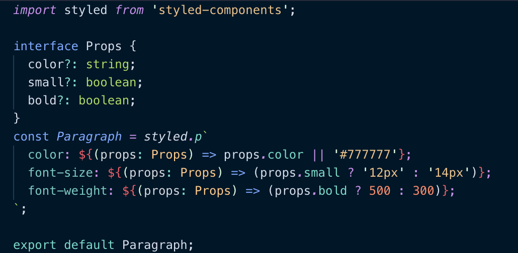
background: ${(props: Props) => props.bgColor || 'red'}; // With interface
opacity: ${props => (props.disabled ? 0.4 : 1)}; // Without interface, but still applies
`
What I would really like is for this
type BgColor = { bgColor?: string }
type Disabled = { disabled?: boolean }

const Box = styled.div`
  background: ${({ bgColor, }: BgColor) => bgColor || 'red'};
  opacity: ${({ disabled, }: Disabled) => (disabled ? 0.4 : 1)};
`
to infer typeof Box to BgColor & Disabled.
elektronik2k5
on 23 Apr 2018
@elektronik2k5 I also really like this pattern, but it gets broken when used together with dynamic styles composition... I'm looking for any ideas why?
// This works in JS but gives some typeerrors
// 'large' doesn't get inferred on button & 'small' apparently doesn't exist on ThmedStyledProps
// No problems at all without dynamic composition...

interface IDynamicColor {
  color?: string
}

const dynamicColor = ({ color }: IDynamicColor) =>
  css`
  color: ${color};

interface IButton {
  large?: boolean
  small?: boolean
}

export const Button = styled.button`
  ${dynamicColor}
  background-color: hotpink;
  ${({ large }: IButton) => large && css`
    padding: 20px;
  `}
  ${({ small }) => small && css`
    padding: 5px;
  `}
`;
On the quest for the Perfect TypeScript Styled Component™, the best I could came up is something like this.
interface IDynamicColor {
  color?: string
}

const dynamicColor = ({color}: IDynamicColor) =>
  css`
  color: ${color};
  `

interface IButton {
  large?: boolean
  small?: boolean
}

export const PerfectButton = styled.button`
  ${({large, small}: IButton) => css`
      ${dynamicColor}
      background-color: hotpink;
      padding: 10px;
      ${large && `
        padding: 20px;
      `}
      ${small && `
        padding: 5px;
      `}
  `}
`;
Any suggestions? I'm quite new at this 😄
 vadistic
on 26 Apr 2018
vadistic
on 26 Apr 2018
After reading everyone's answers, this is the best I could come up with to provide type info within the styled component template string and from an outside user of the component.
// Center.tsx

import React from "react";
import styled from "styled-components";

interface ICenterProps {
    width: string;
}

const StyledCenter = styled<ICenterProps, any>("div")`
    width: ${(props) => props.width};
    margin: 0 auto;
`;

export default class Center extends React.Component<ICenterProps, any> {
    public render() {
        return <StyledCenter {...this.props} />;
    }
}
 g-harel
on 15 May 2018
g-harel
on 15 May 2018
@g-harel Nice! This wasn’t possible before, glad to see that something changed (presumably in the styled-components typings or maybe newer TS?) 👍
alloy
on 18 May 2018
Unfortunately, you will lost types on a call site with a solution provided by @g-harel.
I came up with a slightly different solution.
const StyledGroup = styled<RadioGroupProps & { type?: 'row' | 'column' }>(Radio.Group)`
  flex-direction: ${props => props.type};
`;

<StyledGroup
  type="row"
  value={field.value}
  onChange={e => form.setFieldValue(name, e.target.value)}
>
The key is to make your additional props optional.
With this, anything other then row or column for type will raise an error. Also, you will have all the types from Radio.Group.
I find out that for now, making a props optional, is the best compromise between verbosity and strong type checking.
 deftomat
on 29 May 2018
deftomat
on 29 May 2018
I've been using the way @Amiryy mentioned before. But I decided to apply @g-harel 's way. I think it is more intuitive to be read and looks simpler. Thanks guys! This thread was really helpful.
 yellowgg2
on 30 May 2018
yellowgg2
on 30 May 2018
FYI, with new TypeScript 2.9 it is now possible to pass props directly:
styled.div<{ color?: string }>`
  color: ${p => p.color || 'red'}
`;
@Igorbek this is not working with typescript 2.9.1 and styled-components 3.3.0
atfzl
on 31 May 2018
@atfzl most likely it will be fixed in 2.9.2 https://github.com/Microsoft/TypeScript/issues/24449
beshanoe
on 31 May 2018
right... so will be waiting for a patch. styled-components do not support TS 2.9 yet anyway.
Also we can make a fix that removes non-generic overload.
Igorbek
on 1 Jun 2018
type StyledFunction<T> = StyledComponents.ThemedStyledFunction<T, ITheme>

const withProps = <T, U extends HTMLElement = HTMLElement>(
  styledFunction: StyledFunction<T & React.HTMLProps<U>>
): StyledFunction<T & React.HTMLProps<U>> => styledFunction
 shura-v
on 21 Jun 2018
shura-v
on 21 Jun 2018
@Igorbek thanks your clean solution works great with my ts 2.9.2!
Unfrotunetllty it's appeared that it breaks my tests... Does anyone run into the similiar issue?
with ?
without ?
    "babel-core": "7.0.0-bridge.0",
    "babel-jest": "23.2.0"
    "jest-styled-components": "5.0.1",
    "styled-components": "3.3.3"
    "typescript": "2.9.2",
    "@types/jest": "23.1.4",
 deployAt
on 8 Jul 2018
deployAt
on 8 Jul 2018
@nzbiegien It looks more like syntax issues. I am not familiar with approach through Babel (overkill imo), I am using ts-jest.
  transform: {
    '^.+\\.jsx?$': 'babel-jest',
    '^.+\\.tsx?$': 'ts-jest'
  },
This works with @3.3.3
type StyledFunction<T> = StyledComponents.ThemedStyledFunction<T, ITheme>

const withProps = <T, U extends HTMLElement = HTMLElement>(
  styledFunction: StyledFunction<React.HTMLProps<U>>
): StyledFunction<T & React.HTMLProps<U>> => styledFunction as any as StyledFunction<T & React.HTMLProps<U>>
Though you have to provide second generic. And use like this:
withProps<TItemProps, HTMLDivElement>(styled.div)
Maybe we'll have some common solution?
shura-v
on 9 Jul 2018
@nzbiegien i'm having the exact same issue. I created a separate ticket before finding this thread: https://github.com/styled-components/styled-components/issues/1841
 borisonr
on 11 Jul 2018
borisonr
on 11 Jul 2018
I've noticed that a few of these solutions do work great, specifically @Igorbek and @alloy , however I'm using webStorm with the styled-components plugin that gives me type completion for css inside the js - but I loose that feature when using either of those solutions.
My hack around this currently is:
interface IMyImageProps {
  border?: string,
  children?: any
}

const MediumButton = styled.button`
  background: aliceblue;
  color: snow;
  border: 4px solid ${(p:IMyImageProps)  => p.border ? 'red' : 'blue'};
  `
 spencersmb
on 13 Jul 2018
spencersmb
on 13 Jul 2018
@spencersmb This works for me, thanks! Hoping we can just past them directly to the styled-component eventually.
 lucasnorman
on 20 Jul 2018
lucasnorman
on 20 Jul 2018
This works for me with TypeScript 2.9.2 and Styled Components 3.3.0
interface IMyImageProps {
  border?: string,
  children?: any
}

const MediumButton = styled.button<IMyImageProps>`
  background: aliceblue;
  color: snow;
  border: 4px solid ${p  => p.border ? 'red' : 'blue'};
 benweiser
on 21 Jul 2018
benweiser
on 21 Jul 2018
@benweiser - Well, if you mean 2.9.2, then I cannot get it to work.
Apologies, had to bump the styled-components version.
 karthikiyengar
on 23 Jul 2018
karthikiyengar
on 23 Jul 2018
@karthikiyengar I got compilation errors with benweiser's method aswell on TS 2.9.2, but then I realised that VS Code doesn't necessarily use the Typescript version of the project. To change this, it's in the action bar on the bottom right corner, you'll be able to select the option 'Use workspace version'.
Hope this helps!
 JLWalsh
on 27 Jul 2018
JLWalsh
on 27 Jul 2018
None of the solutions here allowed for Webstorm autocompletion to work while using the component.
The docs mention a caveat:
To stateless components and have typechecking for the props you'll need to define the component alongside with its type. This is not special to styled-components, this is just how React works
Creating an additional functional component like suggested is a bit cumbersome, so I've written a helper function:
const component: <Props>(Tag: string) => React.SFC<Props & { className?: string }> = Tag => props => <Tag className={props.className}>{props.children}</Tag>;
which allows me to create styled components like so:
import styled, { css } from 'styled-components';

interface Props {
  color?: string;
}

const MyComponent = styled(component<Props>('div'))`
  ${props => props.color && css`
    color: ${props.color};
  `};
`;
and WebStorm autocomplete works for me.
Hope it helps someone.
 mattleonowicz
on 8 Aug 2018
mattleonowicz
on 8 Aug 2018
I just stump upon this issue, and this one work for me:
type StyledMyComponentProps = { mainColor: string, subColor: string }
const StyledMyComponent = styled(MyComponent).attrs<StyledMyComponentProps>({})`
  color: white;
  .main { color: ${p => p.mainColor}; }
  .sub { color: ${p => p.subColor}; }
`
const Input = styled.input.attrs<{ invalid: boolean }>({})`
  border: ${p => p.invalid ? 'red' : 'blue'};
`
Basically, you just attached empty attributes object to your styled component, and give it a type
 Toanzzz
on 4 Nov 2018
Toanzzz
on 4 Nov 2018
This works for me with TypeScript 2.9.2 and Styled Components 3.3.0
interface IMyImageProps {
  border?: string,
  children?: any
}

const MediumButton = styled.button<IMyImageProps>`
  background: aliceblue;
  color: snow;
  border: 4px solid ${p  => p.border ? 'red' : 'blue'};
But lint error in TS3.1 & styled-components 4.
 ctsin
on 19 Nov 2018
ctsin
on 19 Nov 2018
Tried every possible way of using this. Still no props validation when I try to use styled-component with attached type to it. Was hopping to use styled-components-ts but not supporting v4 right now.
ghost
on 20 Nov 2018
@karolfalkiewicz, someone submited a PR I accepted.
 jacob-ebey
on 26 Nov 2018
jacob-ebey
on 26 Nov 2018
@karolfalkiewicz can you give an example of what you used? maybe a simple repository reproducing it?
Igorbek
on 1 Dec 2018
The examples on the doc won't work anymore. And after inspecting the typing and its test. Finally get working with latest styled component v4
versions:
"@types/react": "^16.7.6",
"@types/react-dom": "^16.0.9",
"@types/styled-components": "^4.1.0",
"styled-components": "^4.1.1",
"typescript": "^3.1.6"
I can only get it working via the following way:
interface IStyledInput {
  type: string;
  status: ValueOfValidationStatus;
  onChange?: Function;
}

const StyledInput = styled('input')<IStyledInput>`
    ${({ theme, status }) => {
      // Now you get the theme and status( from IStyledInput)
      }
    }};
` as React.FC<IStyledInput>;
You must cast it to React.FC at last, otherwise TS will complain it doesn't have render when you use JSX to render this component.
And this cast makes me wonder something is not right here.
Maybe some issue to the typing or I miss something.
After figuring out why, will happy to submit a PR. There are actually multiple cases needs to be clear.
The downside is you lose the CSS intellisense in VSC which is a pain...
 Albert-Gao
on 5 Dec 2018
Albert-Gao
on 5 Dec 2018
@Albert-Gao Your code isn't working for me (i copy pasted it)
I get the following errors:
[ts] Operator '>' cannot be applied to types 'boolean' and 'string'. [2365]
[ts] Type 'boolean' cannot be converted to type 'FunctionComponent<IStyledInput>'. [2352]
[ts] 'IStyledInput' only refers to a type, but is being used as a value here. [2693]
My packages:
"@types/react": "^16.7.10",
"@types/react-dom": "^16.0.11",
"@types/styled-components": "^4.1.2",
"styled-components": "^4.1.2",
"typescript": "^3.2.1"
 borisyordanov
on 7 Dec 2018
borisyordanov
on 7 Dec 2018
Vscode: 1.29.1
Typescript:

Without types it works fine but typescript complains if i try to pass or use props

With types

IntelliSense and other features still work, but no highlighting
 Dudeonyx
on 8 Dec 2018
Dudeonyx
on 8 Dec 2018
But this works

and allows me to pass the open prop.
eg. <StyledSideDrawer open={true} />
Dudeonyx
on 9 Dec 2018
@Dudeonyx I'm assuming that you are using VSCode.
See https://github.com/styled-components/vscode-styled-components/pull/101 as it is a vscode plugin issue.
deftomat
on 9 Dec 2018
This works for me with TypeScript 2.9.2 and Styled Components 3.3.0
interface IMyImageProps {
  border?: string,
  children?: any
}

const MediumButton = styled.button<IMyImageProps>`
  background: aliceblue;
  color: snow;
  border: 4px solid ${p  => p.border ? 'red' : 'blue'};
But lint error in TS3.1 & styled-components 4.
I used this, but as you mentioned there is a lint error with styled-components 4.
This worked for me for styled-components 4:
 supergoat
on 12 Dec 2018
supergoat
on 12 Dec 2018
Most of the examples here make me lose the syntax highlighting on Webstorm/Phpstorm, so I've found this fix:
interface ImyComp {
  active: boolean
  small: boolean
}

const MyComp = styled.div`
  ${(p: ImyComp) => ``}; // HACK HERE!!!
  display: ${p => p.active ? 'block' : 'none'};
`
 microcipcip
on 4 Jan 2019
microcipcip
on 4 Jan 2019
@microcipcip
Why not in a single line?
const MyComp = styled.div`
  display: ${(p: ImyComp)  => p.active ? 'block' : 'none'};
`
This works for all following occurrences of p
 kuuup-at-work
on 25 Jan 2019
kuuup-at-work
on 25 Jan 2019
@kuuup-at-work It has a big disadvantage if you later decide to remove that property, you have to move that "hack" to some other property. For this reason, @microcipcip's workaround is kinda better.
FredyC
on 25 Jan 2019
@FredyC
You're right but this hacky line still disturbes me.
For now I'll stay with:
const MyComp = styled.div`
    ${(p: ImyComp) => `
        // use p here ....
    `};
`;
What would I do when consuming styled-components that are written in JS in my typescript files? The props are not recognized..
 hegelstad
on 31 Jan 2019
hegelstad
on 31 Jan 2019
For intellisense inside CSS and outside for consumers I did this

 OzairP
on 12 Feb 2019
OzairP
on 12 Feb 2019
After spending a few hours trying to figure out why props was any in interpolated functions, I figured out that I needed this in my tsconfig.json:
"moduleResolution": "node"
I'm not sure why this fixes the issue, but maybe it will save someone else some time.
 jmeyers91
on 22 Feb 2019
jmeyers91
on 22 Feb 2019
I really struggled with this for a while too, but got it working with some changes to the above solutions.
My versions:
{
  "@types/styled-components": "^4.1.12",
  "styled-components": "^4.1.3",
  "typescript": "^3.3.3333"
}
Custom typed helpers:
// utils/styled-components.ts
import * as styledComponents from 'styled-components';
import { ThemedStyledFunction } from 'styled-components';

import { Theme } from './theme';

const {
  default: styled,
  css,
  createGlobalStyle,
  keyframes,
  ThemeProvider,
} = styledComponents as styledComponents.ThemedStyledComponentsModule<Theme>;

function withProps<U>() {
  return <
    P extends keyof JSX.IntrinsicElements | React.ComponentType<any>,
    T extends object,
    O extends object = {}
  >(
    fn: ThemedStyledFunction<P, T, O>,
  ): ThemedStyledFunction<P & U, T, O & U> =>
    (fn as unknown) as ThemedStyledFunction<P & U, T, O & U>;
}

export { css, createGlobalStyle, keyframes, ThemeProvider, withProps };

export default styled;
Example implementation:
// components/link.tsx
import { Link } from 'react-router-dom';

import styled, { withProps } from '../../lib/styled-components';

interface LinkStyleProps {
  inverse?: boolean;
}

export default withProps<LinkStyleProps>()(styled(Link))`
  color: ${props =>
    props.inverse
      ? props.theme.colors.primaryContrast
      : props.theme.colors.primary} !important;
`;
And an example where you don't pass the custom style props down to the underlying component:
import { Link } from 'react-router-dom';

import styled, { withProps } from '../../lib/styled-components';

interface LinkStyleProps {
  inverse?: boolean;
}

export default withProps<LinkStyleProps>()(
  styled(({ inverse, ...props }) => <Link {...props} />),
)`
  color: ${props =>
    props.inverse
      ? props.theme.colors.primaryContrast
      : props.theme.colors.primary} !important;
`;
 ctrlplusb
on 18 Mar 2019
ctrlplusb
on 18 Mar 2019
Can do simply:
border: ${(p: {YourProps?: any}) => p.YourProps ? 'red' : 'blue'};
 vertexlabs
on 2 Jun 2019
vertexlabs
on 2 Jun 2019
The styled wrapper can be passed in a type like so:
interface SomeInterface {
  awesome: boolean
}

const WrappedText = styled<SomeInterface>(Text)`
  color: ${({awesome}) => awesome ? "green" : "black"}
`
 ni3t
on 7 Jun 2019
ni3t
on 7 Jun 2019
@ni3t Is that a recent thing? When I try that with an interface type I get:
ERROR in [at-loader] ./src/components/InverterAnalysis.tsx:153:32
    TS2344: Type 'InverterAnalysisProps' does not satisfy the constraint '"symbol" | "object" | "a" | "abbr" | "address" | "area" | "article" | "aside" | "audio" | "b" | "base" | "bdi" | "bdo" | "big" | "blockquote" | "body" | "br" | "button" | "canvas" | ... 155 more ... | ComponentClass<...>'.
  Type 'InverterAnalysisProps' is not assignable to type 'ComponentClass<any, any>'.
    Type 'InverterAnalysisProps' provides no match for the signature 'new (props: any, context?: any): Component<any, any, any>'.
 CMCDragonkai
on 18 Jun 2019
CMCDragonkai
on 18 Jun 2019
Can confirm that @ni3t 's recommendation worked just fine for me.
 yasso1am
on 18 Jun 2019
yasso1am
on 18 Jun 2019
Thanks @ni3t 🎈
 hypeofpipe
on 28 Jun 2019
hypeofpipe
on 28 Jun 2019
Thanks @ni3t. That helped a lot.
@CMCDragonkai I think you tried something like styled<MyExtraProps>.button to get that error. You need to use styled.button<MyExtraProps>.
To summarize:
// Some properties that we use in our styles,
// but are not part of the underlying component's props.
type MyExtraProps = {
    anExtraProp: WhateverType
};

// For basic HTML elements:
const MyStyledComponent = styled.button<MyExtraProps>`
    ... ${props => props.anExtraProp } ...
`;

// For extending components that support the className prop:
const MyStyledComponent = styled<MyExtraProps>(AStyleableComponent)`
    ... ${props => props.anExtraProp } ...
`;
(P.S. The versions in my package.json are styled-components@^4.2.0, @types/styled-components@^4.1.16, and typescript@^3.3.4000.)
 joshuatshaffer
on 5 Jul 2019
joshuatshaffer
on 5 Jul 2019
Based on the above comment and my experience using styled-components with React Native, it seems that styled<SomeInterface>(Text) in @ni3t's answer should be styled.Text<SomeInterface>.
 paulmelnikow
on 11 Jul 2019
paulmelnikow
on 11 Jul 2019
Ah I've never tried it using the built-in styled.Whatever.
Thanks for the feedback!
ni3t
on 25 Jul 2019
I came across this issue today and found something that worked for my use-case.
I wanted to:
- Define my own props that I could pass into my React Functional Component
- Use "React.FC" interface so that my functional component uses the correct interface
- Use styled-components to change a style based on a prop that I pass down
Here is how I solved it:
import React from "react";
import styled from "styled-components";

interface LayoutProps {
  padding?: string;
}

const LayoutContainer = styled.div<LayoutProps>`
  display: flex;
  padding: ${props =>
    props.padding !== "undefined" ? props.padding : "0 20px"};
  align-items: center;
  justify-content: center;
  flex: 1;
  flex-direction: column;
`;

const Layout: React.FC<LayoutProps> = props => {
  return <LayoutContainer {...props}>{props.children}</LayoutContainer>;
};

export default Layout;
Hope this helps people
 openkalki
on 28 Aug 2019
openkalki
on 28 Aug 2019
So, I had this:
const Foo = styled.span.attrs(props => ({ className: "button" }))`
`
Which was fine, but when I tried to add a prop type:
const Foo = styled.span<IFooProps>.attrs(props => ({ className: "button" }))`
`
Then I get a TypeScript error, because it doesn't recognize attrs anymore.
Is there a workaround here I'm missing?
 noelrappin
on 30 Aug 2019
noelrappin
on 30 Aug 2019
@noelrappin Try this:
const Foo = styled.span.attrs<IFooProps>(props => ({ className: "button" }))`
`
What's happening is that the <IFooProps> is you passing a type argument to a generic function.
See https://www.typescriptlang.org/docs/handbook/generics.html
joshuatshaffer
on 31 Aug 2019
For those that find this issue via google, here's the answer in the documentation:
https://www.styled-components.com/docs/api#using-custom-props
Example:
interface TitleProps {
  readonly isActive: boolean;
};

const Title = styled.h1<TitleProps>`
  color: ${props => props.isActive ? props.theme.colors.main : props.theme.colors.secondary};
`
 glenwinters
on 29 Oct 2019
glenwinters
on 29 Oct 2019
i was solving button styled component and this one worked for me
import styled, { StyledComponent } from "styled-components"
const ButtonContainer: StyledComponent<"button", any, {}, never>= styled.buttonyour code here
 mayowDev
on 8 Nov 2019
mayowDev
on 8 Nov 2019
@glenwinters solution breaks vscode-styled-components syntax highlighting, any ideas on how to fix this?
 Kelbie
on 13 Feb 2020
Kelbie
on 13 Feb 2020
Hmmm, file a bug with the syntax highlighting.
paulmelnikow
on 13 Feb 2020
Related issues
 probablyup
·
68Comments
probablyup
·
68Comments
 ticky
·
56Comments
ticky
·
56Comments
 Nemsae
·
65Comments
Nemsae
·
65Comments
 nkbt
·
48Comments
nkbt
·
48Comments
 gajus
·
46Comments
gajus
·
46Comments
Most helpful comment
This is what I use at the moment: