Spreed: Better UI for calls with more than 5 people
When in a group call, there’s too much whitespace between the videos. When there’s 4, 5 or more participants, we don’t really need any whitespace and should just show them all directly next to each other.
 jancborchardt
All 11 comments
@jancborchardt can you upload a photo of the drawing we did at the conf? Or is it on @Ivansss desk?
 nickvergessen
on 7 Dec 2018
nickvergessen
on 7 Dec 2018
Here it is:
 Ivansss
on 7 Dec 2018
nickvergessen
on 11 Jan 2019
Ivansss
on 7 Dec 2018
nickvergessen
on 11 Jan 2019
The controls on the video might also become a problem when the video becomes smaller, might be good to put them in an overflow menu on the video and also hide the label when the video gets small and only show it on mouse over.
 Peterede
on 30 Jan 2019
Peterede
on 30 Jan 2019
The controls on the video might also become a problem when the video becomes smaller, might be good to put them in an overflow menu on the video and also hide the label when the video gets small and only show it on mouse over.
This would be an issue with touch interfaces and also when you want to quickly mute and unmute. The controls should always be directly visible.
The video will not become infinitely smaller, it’s already not the case now. :)
jancborchardt
on 13 Feb 2019
On touch interfaces you can long click the video to trigger the mouse over event and show the menu. An overflow menu would also support adding other controls to the video window like promote to moderator and remove participant.
Peterede
on 13 Feb 2019
Some input how others do it:
https://jitsi.org/news/new-feature-brady-bunch-style-layout/
I think we need an option for different cases:
- What we planned currently is mostly suitable for big calls
- We need the option to have something like the following too:
<= 4             <= 9
█ █              █ █ █
█ █              █ █ █
                 █ █ █
cc @nextcloud/designers-talk
nickvergessen
on 24 Mar 2020
As said in the other issue:
We could also have this, with the toggle "Grid view"/"Speaker view" being in the 3-dot action menu next to the call button when a call is active.
Grid view should also always be possible, not have any limit. I’ve seen people do grid view even with 20+ participants just cause it’s nice to see everyone, or even to just take a screenshot of the call and everyone in it.
We only need to make sure that the current speaker is highlighted via e.g. a primary-color border so you can identify who it is that is talking.
jancborchardt
on 24 Mar 2020
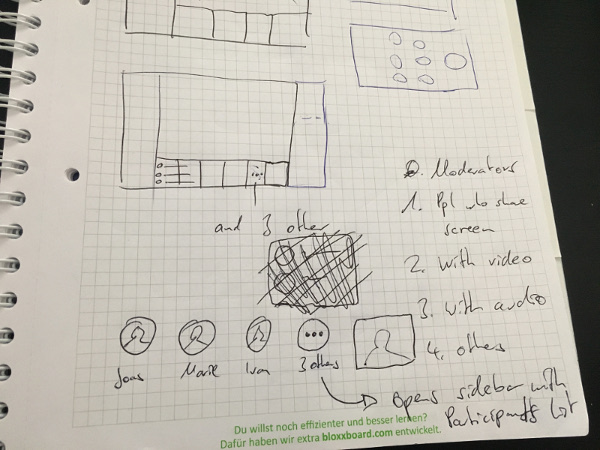
Since there was no spec added with the mockup, here it is:
The basic idea is to have the mechanism as now, with the speaking person being promoted. But the main issue is that it breaks with lots of participants. So:
- When there are more than 4 other people, the 4th spot is replaced with a 3-dot icon stating "2 others"
- On click, this opens the sidebar with the participants list
- The people shown directly on the bottom are prioritized in this order: Moderators, pople who share screen, people who have video enabled, people who have audio enabled, and lastly all others.
- Depending on the width of the screen or if the sidebar and app navigation is visible or not, this number of 4 others shown can be increased or decreased.
- Your own video stays in the bottom right corner with the controls on it like now.
jancborchardt
on 26 Mar 2020
Some other solutions have a function to hide non-video participants which often also reduces the number of items to be displayed.
 wiswedel
on 28 Apr 2020
wiswedel
on 28 Apr 2020
Related issues
nickvergessen
·
3Comments
 jospoortvliet
·
3Comments
jospoortvliet
·
3Comments
 llamallama
·
4Comments
llamallama
·
4Comments
 jakobroehrl
·
4Comments
jakobroehrl
·
4Comments
 georgehrke
·
3Comments
georgehrke
·
3Comments
Most helpful comment
Here it is: