Spreed: "New conversation..." should be changed to "Search or start a new chat"
"New conversation..." should be changed to "Search or start a new chat", and it should also allow to search for existing chats/groups in the list.
This is especially useful when the list of chats gets longer.

Compare: Whatsapp or Telegram
 mathiasconradt
All 12 comments
Currently the search dropdown is overlaping the conversations list.
I guess we should rethink the sidebar here, and combine the room list + new suggestions into one view, or we need to add padding to the room list, so if we filter it and you need the first item, you can still see it.
@jancborchardt any suggestion?
 nickvergessen
on 13 Jul 2018
nickvergessen
on 13 Jul 2018
Yeah, agree with Mathias: Let's do it like WhatsApp in their web interface, and based on thaf we can improve.
 jancborchardt
on 15 Jul 2018
jancborchardt
on 15 Jul 2018
Hello,
This is my proposal for a new component and user flow. I have prepared a first use case "Create new 1:1 conversation" to explain the functionality.
What I was considering:
- There are now 1:1 conversations.
- The search bar can be more separated from the conversation list.
- A click on the "+" button should allow you to create a group conversation.
There are some other design changes (Message Bar, Side Bar) that can be ignored. The redesign of the navigation looks like this:

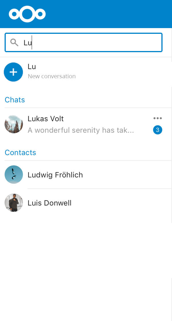
Use Case: Create new 1:1 conversation
Daniela wants to contact Luis
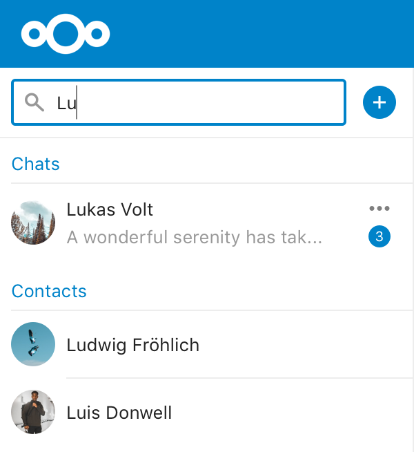
- She clicks in the input field "Search for contacts or groups"

- As she wants to contact Luis, she starts typing "Lu"
Immediately suggestions are shown; We can discuss the order. I choose - Existing Chats
- Contacts
- Existing Groups (if the title of the group matches the search query)
- (Maybe messages, etc.)
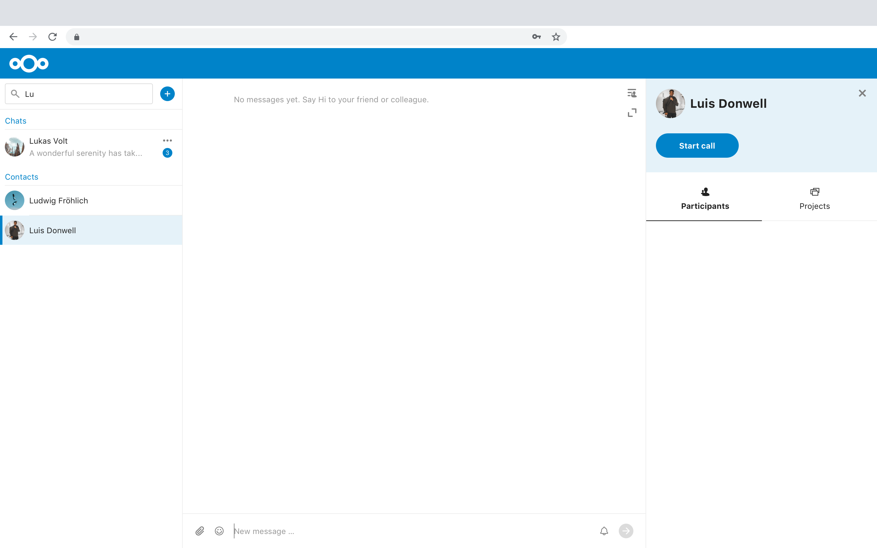
- After she chooses Luis from the list, a chatroom appears, which is not yet created.
She can type and send a message or leave the preview if she changes her mind
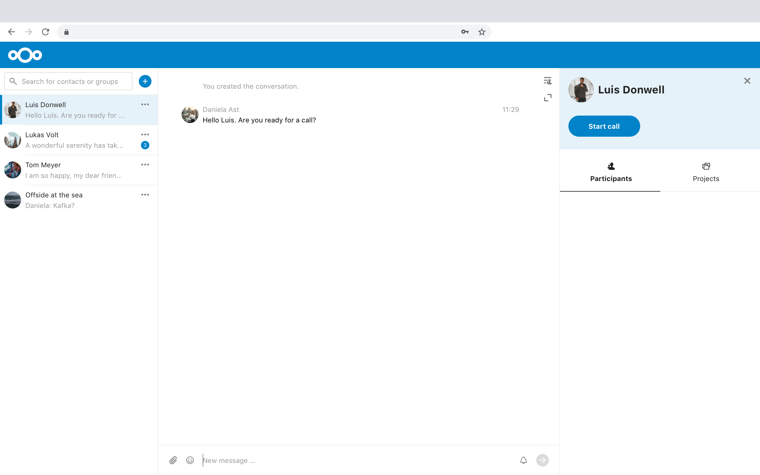
- After she successfully sent her message, the chatroom is finally created and appears on the list in the navigation
Luis gets a notification
What is still missing is the creation of a group conversation. I started the design, but it's not final yet. I am happy to hear your thoughts about my solution.
 jenniferpiperek
on 4 Sep 2019
jenniferpiperek
on 4 Sep 2019
I think this is infact the way to go. You are not creating so many new conversations that the creation field should be so prominent (at least after your initial connections have been build).
I'm not sure about delaying the creation of the conversation, because it increases the complexity on the UI side of things. But the rest looks good.
nickvergessen
on 4 Sep 2019
Thanks for feedback!
I think this is infact the way to go. You are not creating so many new conversations that the creation field should be so prominent (at least after your initial connections have been build).
Which part feels too prominent for you? The blue "+" button?
Otherwise, I would argue that the search bar could be a helpful main interaction component (not only for browsing existing chats or messages, but also for creating 1:1 conversations) and therefore it's okay to increase the affordance. There may also be constantly new friends, colleagues etc. that you have not yet contacted.
_Now that I have a look again. In the 1. Step, after clicking the Search Bar, there could already be suggestions like people you frequently contact, etc. But just another thought._
I'm not sure about delaying the creation of the conversation, because it increases the complexity on the UI side of things. But the rest looks good.
I understand your point, and perhaps this could be discussed in a new issue. What I thought was that you might be able to search for someone you want to contact, but you don't want a chat room to be created immediately after selecting the contact from the list. This process could also prevent chat rooms from being created accidentally (which unfortunately happens very often to me as a new talk user). I can open a new issue if I need to?
jenniferpiperek
on 4 Sep 2019
Which part feels too prominent for you?
The old way, because a lot people thing its a search while it always creates a new conversation (apart from ont-to-one, because we can check for duplicates there) ;) I think the new proposel with the explicit + and first bringing up your chats is exactly what we need :)
nickvergessen
on 4 Sep 2019
Looks really good 👍 Thanks @jenniferpiperek :)
 Ivansss
on 4 Sep 2019
Ivansss
on 4 Sep 2019
I think this is awesome, sorry for creating a double/duplicate item about it ;-)
Just a thought on the creation of a new chat - would it make sense to show the 'create new conversation' as an item in the 'search results' section instead? Here is how my phone does it:
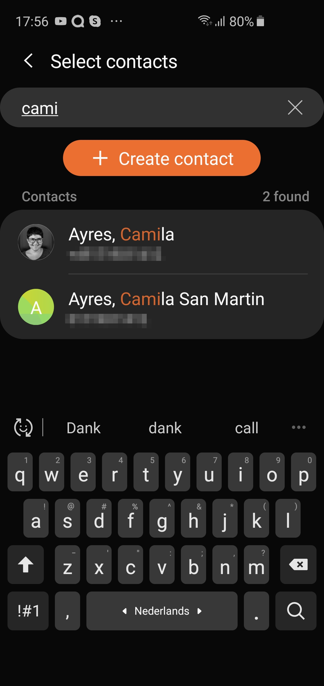
I would have expected the item on the bottom or top of the results with a + icon, but perhaps making it more obvious like they do in the screenshot is better.
I'm just not sure the + icon on the right of the field is clear enough, that's why I propose it this way. I took the pretty pic from @jenniferpiperek and made something - you mgiht want TWO items, one public and one private, but - pffff, my gimp skills are minimal.
 jospoortvliet
on 4 Sep 2019
jospoortvliet
on 4 Sep 2019
@jospoortvliet this is what we actually have right now ;) And it’s a bit confusing. I think @jenniferpiperek’s mockup is the way to go and also the way others like Telegram (and a bit differently WhatsApp) are doing it.
What we could do is below the "Contacts" and "Messages" suggestions also have a last entry saying "New conversation" – so in addition. But not as the only way of creating new conversations. :)
jancborchardt
on 4 Sep 2019
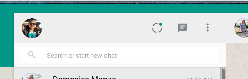
@jancborchardt that's not what we have right now. What we have is a popup, rather than just filtering in the bar below. That is, in my opinion, the issue: you can't search for existing conversations, only start new ones from the top bar. You always have to search manually as the search is just showing contacts and groups.
Try it - go and find the marketing room you are a member off by using the search. You won't find it. You can create a new one when you type marketing, of course - but not find the existing one.
The mockups from Jenifer fix that (no more popup that obscures the existing list, and I presume it is meant to filter that list). How you then start a new conversation, either with a plus or a slightly larger item below like the samsung UI I showed - that doesn't matter too much.
jospoortvliet
on 22 Oct 2019
@jospoortvliet I merely answered to your only comment in this thread, saying:
Just a thought on the creation of a new chat - would it make sense to show the 'create new conversation' as an item in the 'search results' section instead? Here is how my phone does it:
Which is what we have already:
The other parts and all of @jenniferpiperek’s mockups I agree with as I commented above and since we had a bunch of calls and design discussions on them together. ;)
jancborchardt
on 22 Oct 2019
Fixed with #2354
nickvergessen
on 28 Oct 2019
Related issues
 FramboisePi
·
3Comments
FramboisePi
·
3Comments
 brylie
·
3Comments
nickvergessen
·
3Comments
brylie
·
3Comments
nickvergessen
·
3Comments
 cbacit
·
3Comments
cbacit
·
3Comments
 danxuliu
·
3Comments
danxuliu
·
3Comments
Most helpful comment
Hello,
This is my proposal for a new component and user flow. I have prepared a first use case "Create new 1:1 conversation" to explain the functionality.
What I was considering:
There are some other design changes (Message Bar, Side Bar) that can be ignored. The redesign of the navigation looks like this:
Use Case: Create new 1:1 conversation
Daniela wants to contact Luis
Immediately suggestions are shown; We can discuss the order. I choose
She can type and send a message or leave the preview if she changes her mind
Luis gets a notification
What is still missing is the creation of a group conversation. I started the design, but it's not final yet. I am happy to hear your thoughts about my solution.