Signal-ios: Choose Contact color in conversation settings
Hello folks, I’d love to be able to change the color of the circular contact icon in the conversation overview. Like you can in Android. Thank you very much!
 fooness
All 23 comments
Hello,
I'd like to get involved in development for Signal iOS. If an issue is labeled help wanted, then it's settled that it can be implemented?
 pawel-jurczyk
on 7 Nov 2016
pawel-jurczyk
on 7 Nov 2016
then it's settled that it can be implemented?
That's correct. Since this provides some interface change, we need to ensure we're on the same page design wise. Signal-Android, which already has this feature, would be a good place to start.
Color palette is defined at https://github.com/WhisperSystems/Signal-iOS/blob/master/Signal/src/UIColor+OWS.m#L70
 michaelkirk
on 7 Nov 2016
michaelkirk
on 7 Nov 2016
Can I find designs for android somewhere? Or some screenshots at least. Do I need to install android studio to see how it looks there? I don't own an Android phone unfortunately. I would be glad if someone posted me a screenshot here.
pawel-jurczyk
on 8 Nov 2016
There are some screenshots on the Play Store page of Signal for Android.
https://play.google.com/store/apps/details?id=org.thoughtcrime.securesms
 sauberfred
on 8 Nov 2016
sauberfred
on 8 Nov 2016
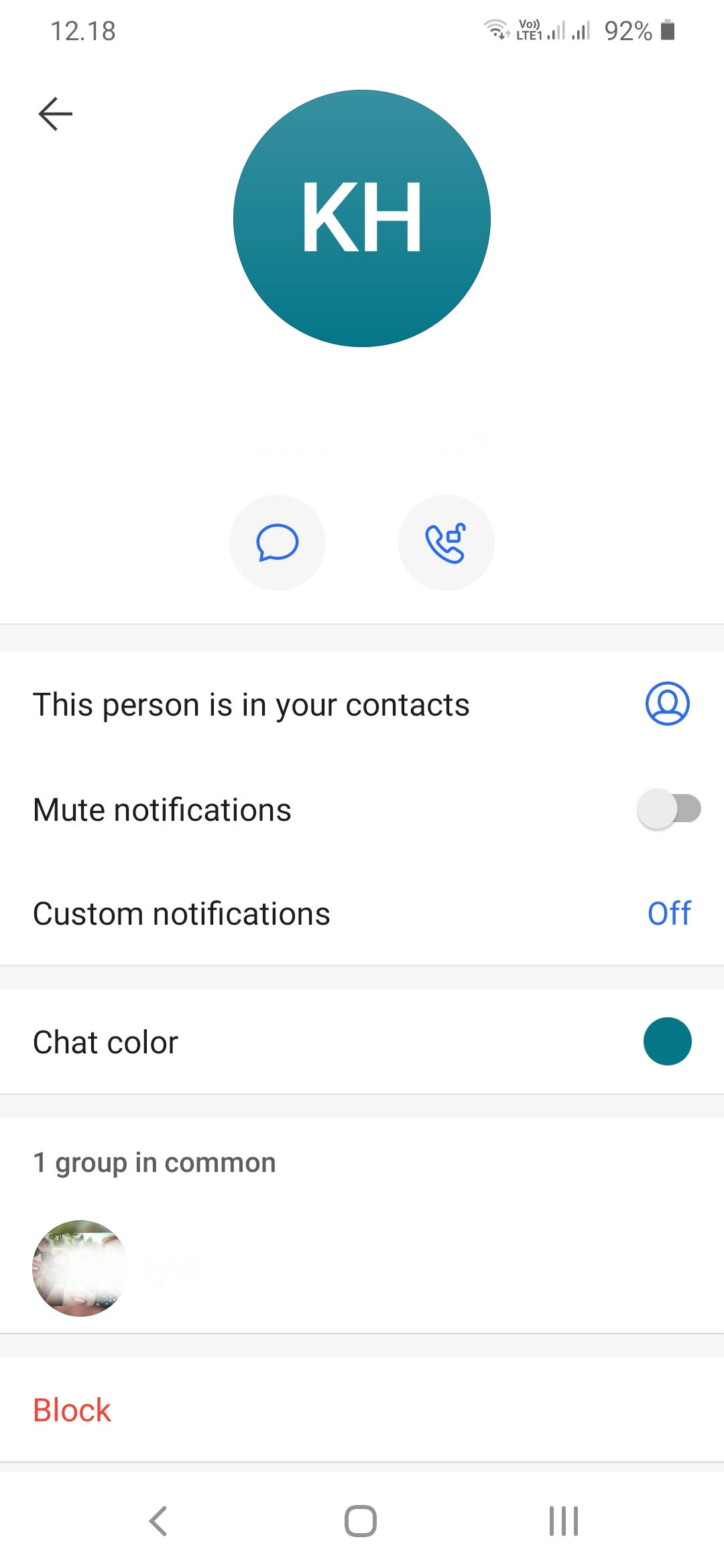
So my understanding of this is that on Android in the upper right hand corner in addition to the phone call icon which we have on iOS it also shows 3 dots that go to conversation settings.

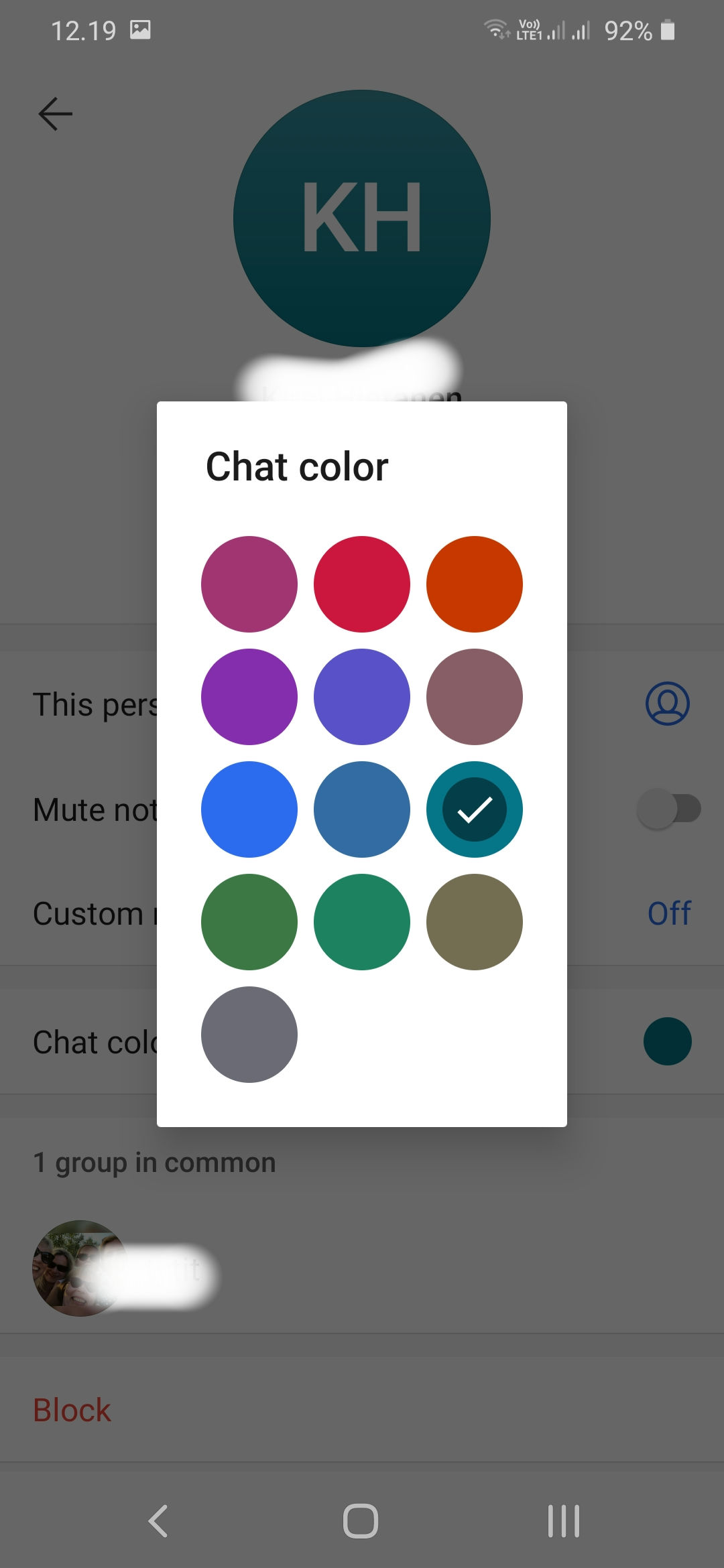
Conversation settings on Android has many conversation specific settings such as Mute conversation, Notification sound, vibrate, Block, etc, as well as the Color (Color for this contact) option that opens a little color picker modal.
Convo Settings Android:

Color Picker Modal Android:

Since the only design direction mentioned is to copy android, should we add the 3 dots that open a Conversation Settings screen and then have 1 option for Color (Color for this contact) that opens a color picker modal, and we can see about the other options in the future or is there discussion about Conversation Settings elsewhere?
 naomihimley
on 14 Nov 2016
naomihimley
on 14 Nov 2016
Thanks for the screenshots @naomihimley. On iOS currently, conversation settings are accessible via tapping on the contacts name (there's currently much less there than on Android).
Finding conversation settings needs to be more obvious, but I would leave that for a separate PR.
Otherwise, I think that flow looks good. Reminder that our iOS color palette is different from Android and can be found here: https://github.com/WhisperSystems/Signal-iOS/blob/master/Signal/src/UIColor+OWS.m#L70
michaelkirk
on 15 Nov 2016
Ooh yep never have been into Conversation Settings. Ok that does bring up one other question to me now. On iOS we have icons on the left side of the cell. Android doesn't have that, but on the android cell they show a circle on the right side of the cell with the current selected color for this contact. For iOS do we want a new icon for color selection or how does a circle on the left side of the cell with the current color sound? @michaelkirk
iOS example:

naomihimley
on 15 Nov 2016
For iOS do we want a new icon for color selection or how does a circle on the left side of the cell with the current color sound?
I'm actually not sure. The icon on the left would probably be pretty redundant informationally, but aesthetically it might be weird against our otherwise monochromatic icons.
A mockup might clear it up. Thanks for putting forward some design proposals @naomihimley
michaelkirk
on 15 Nov 2016
Yep, happy to build it, I'm not a designer, but if we get an icon let me know.
naomihimley
on 15 Nov 2016
Yep, happy to build it, I'm not a designer, but if we get an icon let me know.
I just mean happy that you're thinking about it first.
For icon's I've been using https://material.io/icons/
e.g. https://material.io/icons/#ic_palette
They are unfortunately heavy stroked. I'm open to alternatives.
michaelkirk
on 15 Nov 2016
I used https://material.io/icons/#ic_brush for this mockup because it felt more lightweight then the palette. For the actual selection a UIPopoverPresentationController could be used with the view inside similar to the Android color picker above. But it would also look nice to slide in (from the top) a new cell presenting the available colors.

Differing from the monochromatic icons is somewhat strange.

IMHO omitting the icons looks somewhat cleaner. + It is closer to the Android version

 abcdev
on 5 Dec 2016
abcdev
on 5 Dec 2016
IMHO omitting the icons looks somewhat cleaner. + It is closer to the Android version
I agree that it looks cleaner, but the icons do serve a purpose. In particular, the iconography for the disappearing messages, the stopwatch, is the same symbols that you see when using this feature in the conversation view.
E.g. Say you have no idea that this feature exists. When the other person enables disappearing messages, you will see the clock appear in your conversation navbar as a mode indicator.
- "What's this clock?"
- Tap on it.
- Be taken to settings.
- See the clock next to the "disappearing messages" settings
For the actual selection a UIPopoverPresentationController could be used with the view inside similar to the Android color picker above.
I agree that popover would be appropriate for the color picker.
Thanks for clearing the waters with these mocks @abcdev.
michaelkirk
on 5 Dec 2016
Anyone working on this bad boy? IMHO it will sognificantly improve the group conversation UX.
 sjauld
on 10 Jun 2017
sjauld
on 10 Jun 2017
It's on the roadmap, but not currently at the top of the list. Just follow this issue to get any progress updates.
Any implementation would need to sync the the changes to desktop, as android does when picking colors.
Also, please don't bump or +1 issues. It spams all repository subscribers with an email that says only and unhelpfully "+1". Repository subscribers by and large don't care that you "+1".
We developers do care though. And you can more effectively show us which issues are important by using GH's built in reaction feature, which allows us to tally our most supported issues, all without spamming these poor souls.
michaelkirk
on 14 Jun 2017
Quite a few months ago i read that this feature was going to be coming back to iOS. I'm curious if there's a timeline? It's been a while without an update on this issue, and as someone who has switched from Android to iOS recently, i'm really missing my per-contact colours! Sorry to be a bother, i love your work 🙌
 toothbrush
on 9 May 2019
toothbrush
on 9 May 2019
Any news on this feature?
 herrfisk
on 10 Mar 2020
herrfisk
on 10 Mar 2020
The lack of this feature is the main thing preventing me from buying an iphone.
 jessebett
on 23 Jul 2020
jessebett
on 23 Jul 2020
This is 100% needed. I've brought all my friends over and those with same initials is impossible to differentiate consider they haven't added pictures yet. Given this was last brought up in 2017, can we get some screenshots of existing Android so we can see what needs to be built for iOS to match Android?
 terencechow
on 8 Jan 2021
terencechow
on 8 Jan 2021
Would these be of any help:
 inokani
on 9 Jan 2021
inokani
on 9 Jan 2021
I think many people would, since ever, like to leave Telegram, WhatsApp, et cetera in favor of Signal … if Signal would improve their interface in simple ways like this.
fooness
on 9 Jan 2021
I have recently switched from Whatsapp to Signal. I hav iOS development experience and I would be happy to implement this in the app. Would I just open a PR when I implement it?
 rvaidun
on 10 Jan 2021
rvaidun
on 10 Jan 2021
Is there an update on when IOS users will get coloured messages?
 bangsluke
on 11 Jan 2021
bangsluke
on 11 Jan 2021
@rvaidun i think you could just make a PR. We need this.
 Ge0rges
on 13 Jan 2021
Ge0rges
on 13 Jan 2021
Related issues
 fracture-point
·
3Comments
fracture-point
·
3Comments
 zero77
·
3Comments
zero77
·
3Comments
 gonzalezb
·
5Comments
gonzalezb
·
5Comments
 loki187
·
3Comments
loki187
·
3Comments
 mxmerz
·
5Comments
mxmerz
·
5Comments
Most helpful comment
It's on the roadmap, but not currently at the top of the list. Just follow this issue to get any progress updates.
Any implementation would need to sync the the changes to desktop, as android does when picking colors.
Also, please don't bump or +1 issues. It spams all repository subscribers with an email that says only and unhelpfully "+1". Repository subscribers by and large don't care that you "+1".
We developers do care though. And you can more effectively show us which issues are important by using GH's built in reaction feature, which allows us to tally our most supported issues, all without spamming these poor souls.