Shoelace: Drawer `close-button` part not accessible with CSS parts
Describe the bug
Docs list the close-button CSS part of the drawer however I am unable to style it the way it works with other drawer parts for example title
To Reproduce
// this works
    .drawer::part(title) {
        /* in line with brand */
        padding: 0;
    }
// this doesn't work
    .drawer::part(close-button) {
        /* in line with title, brand and hamburger icon behind */
        padding: 0;
    }
Expected behavior
Ability to hit the close-button part with .drawer::part(close-button)
Screenshots
This is how the rendered drawer header DOM looks like
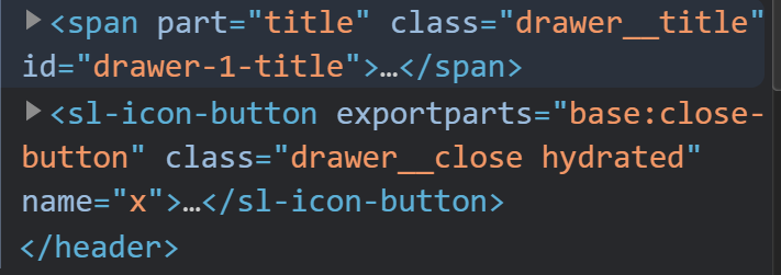
It appears that the close-button part is not correctly exposed as part of the header part.
SL version: latest from cdn
 brgrz
brgrz
All 8 comments
Inner Part base is exposed as close-button to the <sl-drawer> (and <sl-dialog> too).
See example in my screen for color and font-size.

Hope this will help 😉
 trailsnail
on 11 Apr 2021
trailsnail
on 11 Apr 2021
@trailsnail Yes I see that, it's the same for me but my CSS styles don't get applied. How does your CSS rule looks like?
brgrz
on 11 Apr 2021
sl-drawer::part(close-button) {
  fancy-rule: here;
}
Exactly like in my Screenshot...
trailsnail
on 11 Apr 2021
@brgrz
Maybe you can show an example of your HTML and CSS?
trailsnail
on 12 Apr 2021
So after further deep dive into this I discovered the CSS does get applied but at the icon level. Since I was applying padding which is also applied at drawer__close class I missed that. The padding indeed got applied at the icon level but obv not at the drawer__close level since I didn't target it and this is the padding I kept seeing and couldn't remove). There it goes, my bad.
brgrz
on 12 Apr 2021
I'm reopening this bc I'm currently unable to target the drawer__close element which has padding applied (besides padding being applied on the button icon and being able to target it with ::part(close-button)
I tried all kinds of rules but they don't get through to the shadow DOM. (and the ::shadow and deep selectors are now deprecated)
brgrz
on 12 Apr 2021
The spacing is handled by a custom property, so you can override it like this:
sl-drawer::part(header) {
  --sl-spacing-large: 0;
}
Fiddle: https://jsfiddle.net/9p6ktnsq/
But considering this is a common use case, it will probably be better to turn header, footer, and body padding into separate tokens for more reliable styling.
 claviska
on 12 Apr 2021
claviska
on 12 Apr 2021
Starting in beta.38, you'll be able to change header, footer, and body spacings more reliably with --header-spacing, --footer-spacing, and --body-spacing.
claviska
on 12 Apr 2021
Related issues
trailsnail
·
4Comments
 oliveratgithub
·
5Comments
claviska
·
5Comments
claviska
·
3Comments
oliveratgithub
·
5Comments
claviska
·
5Comments
claviska
·
3Comments
 kevnk
·
6Comments
kevnk
·
6Comments
Most helpful comment
Starting in beta.38, you'll be able to change header, footer, and body spacings more reliably with
--header-spacing,--footer-spacing, and--body-spacing.