Shoelace 2.0 is on the horizon! ☀️
I'm just a few weeks away from releasing the next major version of Shoelace. This is a complete rewrite of the library with a huge shift in the underlying technology.
In 2.0, every component is a web component built using Stencil. That means a few things:
- Components are first-class HTML elements with their own tags (e.g.
<sl-button>) - Components have encapsulated styles and scripts so nothing leaks out and nothing leaks in
Web components are supported by all evergreen browsers _without polyfills_. Many companies including Apple, Amazon, Porsche, and Microsoft are already using them in production in some capacity. Shoelace aims to be one of the first mainstream, open source, professionally-designed libraries of UI web components.
I know not everyone is familiar with web components, so here are a few interesting facts that will sell you on them:
- They work with all frameworks and even basic HTML+JS (React needs a bit of help, but there are utilities for that)
- They're easy to use (no build, no runtime, just import a script and add them to your HTML)
- They're future proof (this tech is standard and built into the browser; it will be around for many years to come)
Using 2.0
Here's another awesome thing about this approach. Unless you're _developing_ Shoelace components, you'll never need to build the project. Ever. With Shoelace 2.0, you can:
- Import the library from a CDN (or locally if you prefer)
- Customize every component with CSS (no preprocessor required)
- Use them in any framework
There is a tiny learning curve involved with using web components, but it's nothing you haven't done in a framework before (e.g. slots, special selectors for styling things). The good news is these are _standard browser features_, not framework-specific things. They're not going away and once you learn them, you won't have to _relearn_ them.
Components
Here's what's coming in the first beta release:
- [x] Alert
- [x] Avatar
- [x] Button
- [x] Checkbox
- [x] Color Picker
- [x] Details
- [x] Dialog
- [x] Drawer
- [x] Dropdown
- [x] Form
- [x] Icon (with over 1000+ icons)
- [x] Input
- [x] Menu
- [x] Menu Divider
- [x] Menu Item
- [x] Menu Label
- [x] Progress Bar
- [x] Progress Ring
- [x] Radio
- [x] Range
- [x] Select
- [x] Spinner
- [x] Switch
- [x] Tab Group
- [x] Tab
- [x] Tab Panel
- [x] Tag
- [x] Textarea
- [x] Tooltip
You're also getting a brand new, Docsify-powered website with interactive examples, click-to-copy code samples, search, and detailed API docs explaining every prop, method, event, and more.
I'm not trying to get everything _perfect_ for the initial release, but I do have a few important things left to polish off and finish up (mostly related to the docs and supporting infrastructure).
Sponsorships 💖
This is an ambitious, cutting edge project and I'm excited to give it to the world. My first commit was way back in January, and I've spent _a lot_ of my spare time building this. Probably way too much.
That said, I really enjoy doing this kind of work and I'd like to maintain the project much more actively than I've been able to do with version 1.
To help support this effort, I'm opening up the project to sponsorships through GitHub. Here's my profile page:
https://github.com/sponsors/claviska
If this sounds exciting to you and you want to be a GROUNDBREAKER sponsor, follow the link above and start sponsoring today! (I'll also be looking for folks to help improve on the docs and with other efforts after the release if you'd rather contribute that way. Leave a comment below if you're interested!)
New Emoji 🥾
Oh, one more thing. The official emoji of this project is changing from 👟 to 🥾. The tennis shoe was cute, but 2.0 uses a hiking boot to symbolize all the places web components are about to take you.
See you in a few weeks for the release! ✌️
 claviska
All 5 comments
I love this!
My project, emberclear.io is in ember, and I can't wait to reduce the amount of classes in my markup! :heart:
Will there still be utility classes for us to use, or do we roll our own? (I'm fine with either answer, esp with the popularity of utility first tools, like tailwind)
 NullVoxPopuli
on 6 Jul 2020
NullVoxPopuli
on 6 Jul 2020
Utility classes are not provided by design. This keeps the library light and gives you the ability to choose your favorite tool. (Tailwind works great with Shoelace 2.0.)
claviska
on 6 Jul 2020
How will themeing work?
Right now I have different sets of css variables that I swap between. same deal?
NullVoxPopuli
on 6 Jul 2020
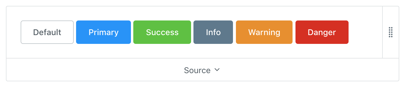
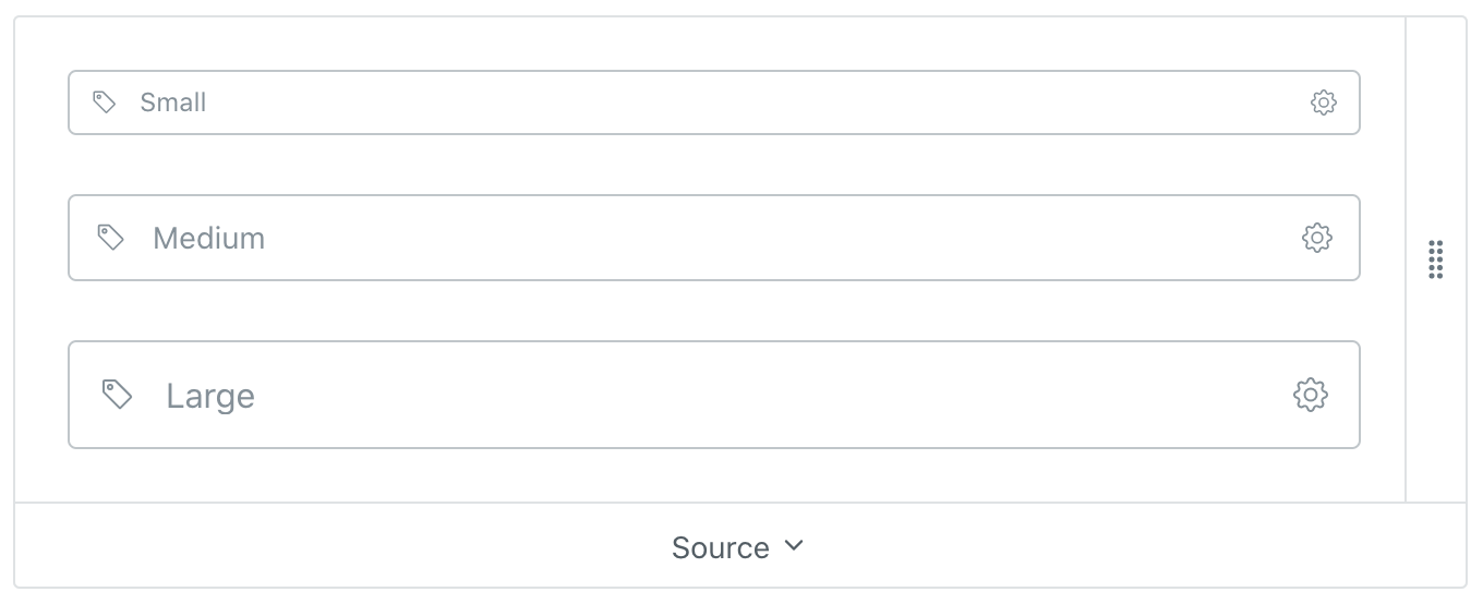
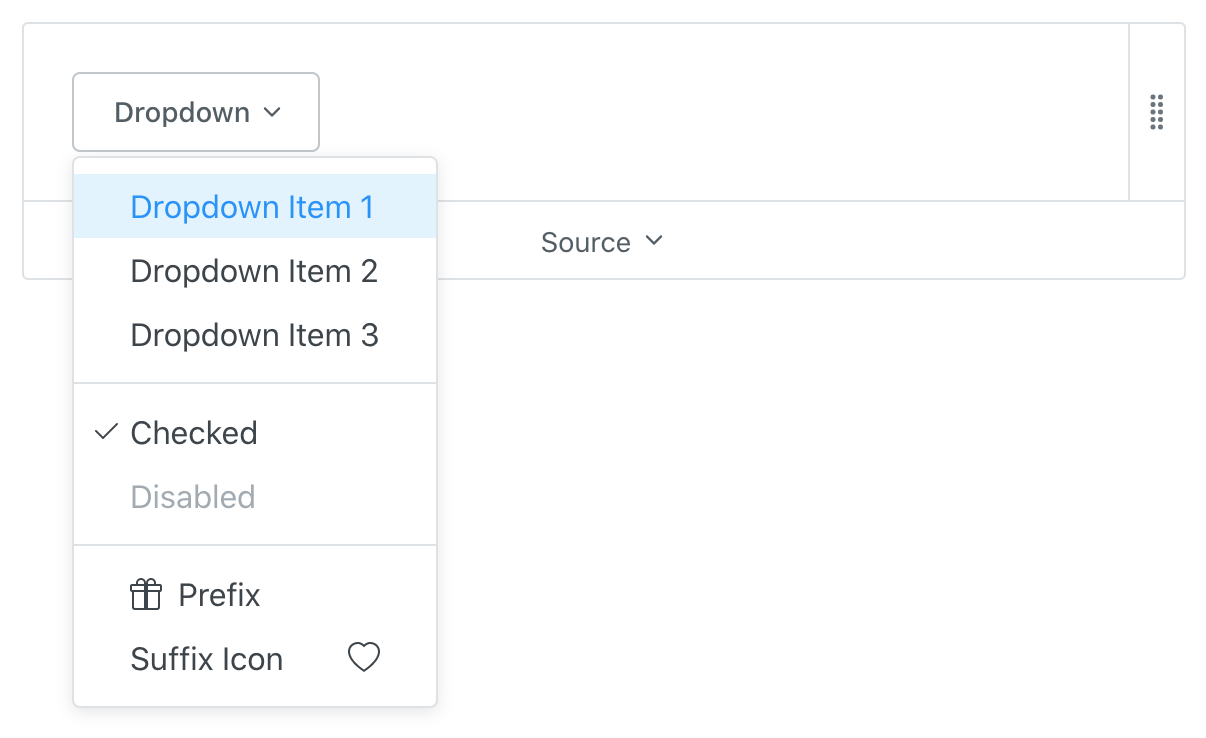
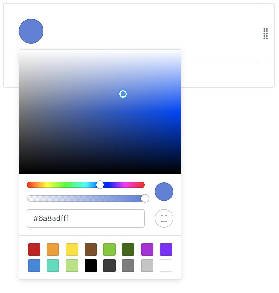
Some teasers:
Button
Input
Dropdown
Color Picker
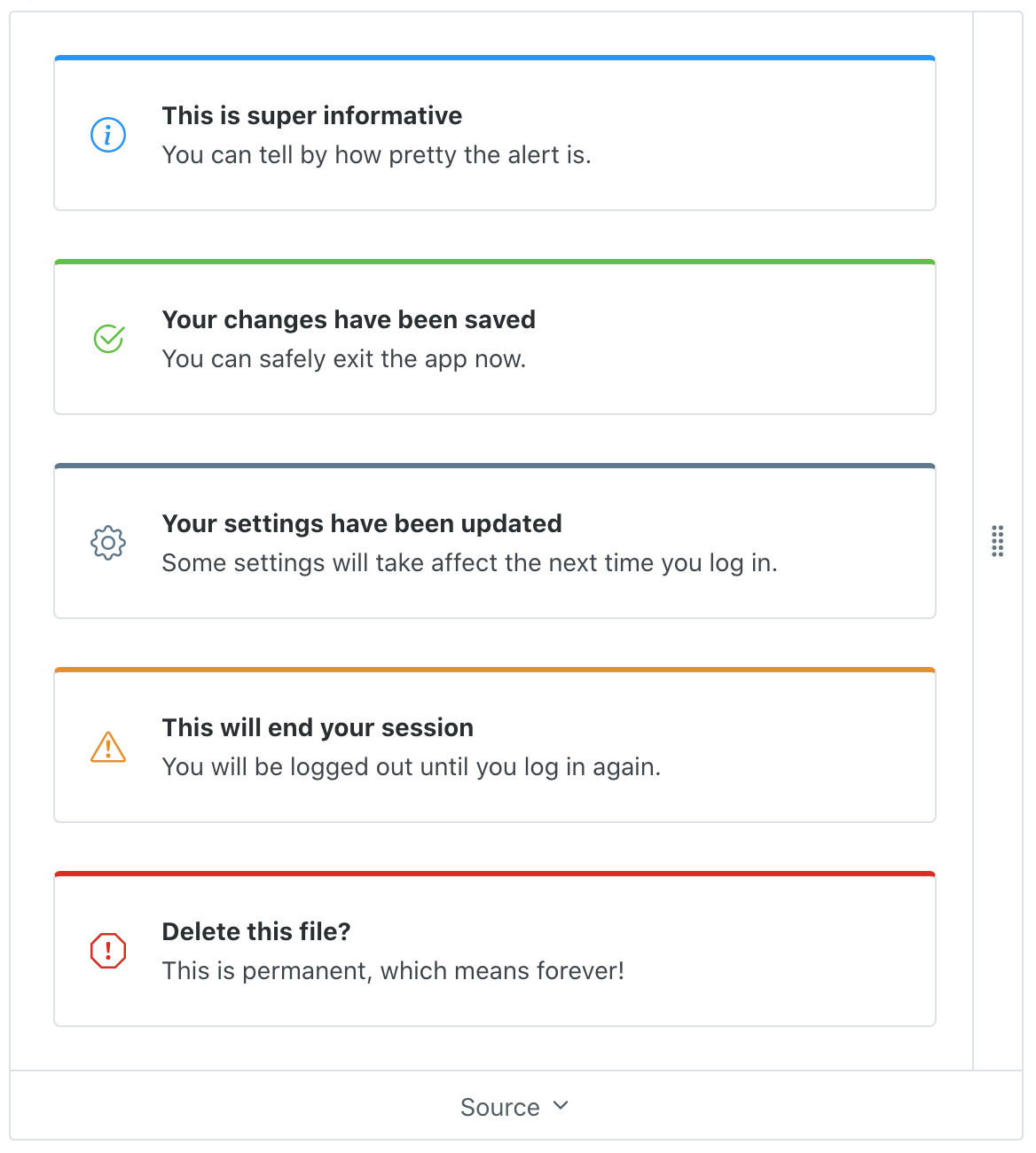
Alert
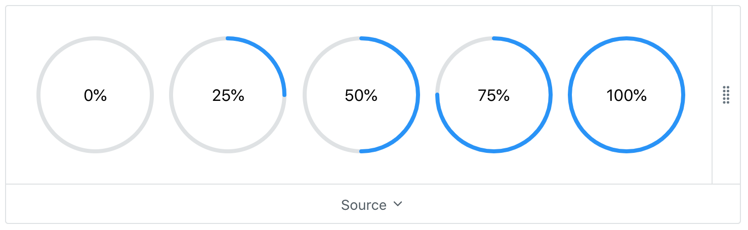
Progress Ring
claviska
on 6 Jul 2020
How will themeing work?
Right now I have different sets of css variables that I swap between. same deal?
There's a default stylesheet that provides a set of design tokens (i.e. CSS variables) that influence component styles. These are used by all components for consistency (e.g. spacing, theme colors, elevation).
A theme creator can modify any of the design tokens for global theme changes. Components can be further customized through the use of CSS parts that are strategically exposed.
claviska
on 6 Jul 2020
Related issues
 brgrz
·
8Comments
brgrz
·
8Comments
 igorvanoostveen
·
4Comments
igorvanoostveen
·
4Comments
 tmladek
·
3Comments
tmladek
·
3Comments
 SheepFromHeaven
·
7Comments
SheepFromHeaven
·
7Comments
 lamplightdev
·
7Comments
lamplightdev
·
7Comments
Most helpful comment
Utility classes are not provided by design. This keeps the library light and gives you the ability to choose your favorite tool. (Tailwind works great with Shoelace 2.0.)