Hey!
I just made a quick Application Icon.
Feel free to use it if you like...

 vinilanzoni
All 46 comments
Awesome! I love it. Little nitpicky thing - there's a little cutout stop on the bottom corners. Would you be able to fix that?

 Jason-Morcos
on 19 Jun 2020
Jason-Morcos
on 19 Jun 2020
I like this icon better! I agree with the nitpick.
 corecoding
on 19 Jun 2020
corecoding
on 19 Jun 2020
Here, fixed! Sorry I missed that...

vinilanzoni
on 19 Jun 2020
Awesome! I love it! Would you be able to provide the vector original so I can make the .icns set in full res? Also, would you want to take a stab at the file icon as well for the various file types ace opens? It could be simpler and just have an ace, or have the full icon, or really whatever you think looks best!

Jason-Morcos
on 19 Jun 2020
@Jason-Morcos, could you send me the link where I can get the the generic icon? Or is it a PNG with 1024px x 1024px?
vinilanzoni
on 19 Jun 2020
I just found the one in macOS following this stack overflow haha https://stackoverflow.com/questions/3454201/mac-os-x-document-icon-template
Jason-Morcos
on 19 Jun 2020
@vinilanzoni Once I have the vector original version of the icon you made, I can go ahead and create the .icns slices to change the app icon! I think right now it makes sense to target the new icon for the planned 2.1.0 release.
Jason-Morcos
on 21 Jun 2020
@vinilanzoni let me know if you haven't skills / time for making it in curves. I can do that tonight.
 stychos
on 22 Jun 2020
stychos
on 22 Jun 2020
Here's my two cents. Sequel Ace Icon.zip
stychos
on 22 Jun 2020
Hey guys, I opened an Issue before this. I would provide a more modern Icon than the last once for Sequel Pro. The current draft is absolutely great work, but looks for me very similar to the old once.
In my opinion with this fork it is the time for a new, more modern once.
More in the direction of the official HIG from Apple https://developer.apple.com/design/human-interface-guidelines/macos/icons-and-images/app-icon/
…or more of something from this gallery here https://www.macosicongallery.com/
In my opinion it should like getting more in the direction of the current macOS Catalina style with a rounded flat icon (I know apple released currently a new skeuomorphic style for macOS Bug Sur 😉 )
Here is a very good Figma template.
https://www.figma.com/community/file/780065166063854971
 greenchapter
on 22 Jun 2020
greenchapter
on 22 Jun 2020
In general, I would love a new icon (and new file image icons as well). The current icon is the MVP I could throw together to escape copyright of Sequel Pro's icon.
Perhaps we could let @vinilanzoni finish his icon and @greenchapter and any others make icons as well and then solicit input from the community as to a preferred icon and any suggested changes?
Jason-Morcos
on 22 Jun 2020
Hey @Jason-Morcos, sorry for the late response, weekend are difficult to work for me. Is what @stychos did that you needed?
@greenchapter, enhancements are always welcome! Send us your contribution and let's make a great app! I did what was on my possibilities, based on the Sequel Pro icon, and I wasn't pleased with the current app icon.
vinilanzoni
on 22 Jun 2020
Hey @Jason-Morcos, sorry for the late response, weekend are difficult to work for me. Is what @stychos did that you needed?
@greenchapter, enhancements are always welcome! Send us your contribution and let's make a great app! I did what was on my possibilities, based on the Sequel Pro icon, and I wasn't pleased with the current app icon.
Hey @vinilanzoni please don’t get me wrong I really like your Icon 🙌.
I had the same problem, it was really difficult to me to work on the weekend.
I will try to contribute this week my idea, because I want the same as all of us, building a great app.
greenchapter
on 22 Jun 2020
In general, I would love a new icon (and new file image icons as well). The current icon is the MVP I could throw together to escape copyright of Sequel Pro's icon.
Perhaps we could let @vinilanzoni finish his icon and @greenchapter and any others make icons as well and then solicit input from the community as to a preferred icon and any suggested changes?
Yes of course, sounds like a great idea.
greenchapter
on 22 Jun 2020
I don't wanna go against folks here, I know the sequel icon is very well known - but especially in latest events like new UI for macOS - would it be possible to make this icon flat and modern instead of plastic and "3D" like ti was on old Sequel Pro?
I already have Big Sur installed and all new icons on new macOS are now different, and I think we should follow the trend and style. :)
For reference: https://developer.apple.com/design/human-interface-guidelines/macos/overview/whats-new-in-macos/
 Kaspik
on 23 Jun 2020
Kaspik
on 23 Jun 2020
I don't think the icon should be based on a beta, unreleased product's interface guidelines. It should align with what is mainstream. Most people don't use betas.
corecoding
on 23 Jun 2020
Human Interface Guidelines won't change. We can either have something 3D now and get back to this covnersation in 4 months again, or we can have something more modern universal that will fit into current version and future version and do it only once. It has nothing to do with beta. :)
Anyways it was just a proposal, I'll leave it up to most of the users opinion.
Kaspik
on 23 Jun 2020
@vinilanzoni / @greenchapter Hey! Any update here? We are thinking about another submit to the AppStore so it would be nice to create a visual brand of this app. :) Thanks!
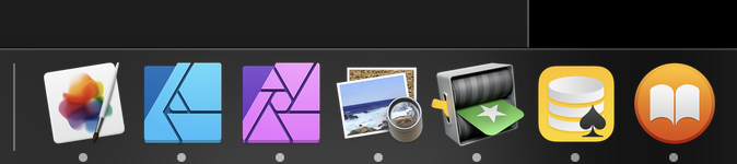
Also - the Human Interface Guidelines are outdated for MacOS right now (https://developer.apple.com/design/human-interface-guidelines/macos/icons-and-images/app-icon/) so for reference - here is screenshot of my Dock - you can notice all system apps are now square too - as on iOS :)

Kaspik
on 24 Jun 2020
@vinilanzoni / @greenchapter Hey! Any update here? We are thinking about another submit to the AppStore so it would be nice to create a visual brand of this app. :) Thanks!
Also - the Human Interface Guidelines are outdated for MacOS right now (https://developer.apple.com/design/human-interface-guidelines/macos/icons-and-images/app-icon/) so for reference - here is screenshot of my Dock - you can notice all system apps are now square too - as on iOS :)
Hey @Kaspik under the week I had currently no time hopefully I will finish my draft on sunday.
Regarding your Screenshot, you showing a screenshot from macOS Big Sur which is coming in Fall. Means the official HIG from Apple is currently not outdated!
The latest version of macOS is currently Catalina, this software should and have to orientated at the currently public available version of MacOS!
Means we are starting the discussion around a Big Sur Icon again short before Bug Sur would be released!
…and I think there is a little bit more as only the squared icons „like iOS“
greenchapter
on 27 Jun 2020
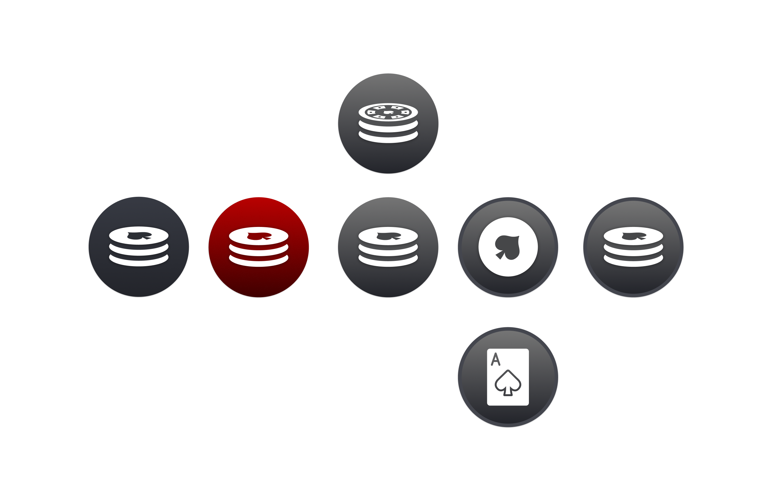
Currently I'm thinking in a direction something like that…
greenchapter
on 27 Jun 2020
@vinilanzoni / @greenchapter Hey! Any update here? We are thinking about another submit to the AppStore so it would be nice to create a visual brand of this app. :) Thanks!
Also - the Human Interface Guidelines are outdated for MacOS right now (https://developer.apple.com/design/human-interface-guidelines/macos/icons-and-images/app-icon/) so for reference - here is screenshot of my Dock - you can notice all system apps are now square too - as on iOS :)
Hey @Kaspik under the week I had currently no time hopefully I will finish my draft on sunday.
Regarding your Screenshot, you showing a screenshot from macOS Big Sur which is coming in Fall. Means the official HIG from Apple is currently not outdated!
The latest version of macOS is currently Catalina, this software should and have to orientated at the currently public available version of MacOS!Means we are starting the discussion around a Big Sur Icon again short before Bug Sur would be released!
…and I think there is a little bit more as only the squared icons „like iOS“
I think there is miss-understanding. :) until now, there was recommended format, but not rules, every icon then looked different - via screenshot: Spark, old XCode, Fantastical, SourceTree, Messenger, ... there was a template, but it didn’t say “it has to be circle” - it just was. What I was proposing is make ot square already - but make it so it fita into Catalina and also “almost” (or fully) fots into Big Sur. We would avoid “rebranding” again after 4 months on Mac AppStore. :)
Also, HIG already has info about that - https://developer.apple.com/design/human-interface-guidelines/macos/overview/whats-new-in-macos/
I like where you going with your idea, I just don’t think it has to stay circle. Nothing else :)
Kaspik
on 27 Jun 2020
Hi Guys,
Thinking of new macOS design, I made quick changes using the new square format for macOS Big Sur:

I chose yellow for background because of the old SequelPro icon.
And for document I think is best to maintain only the ace icon:

What do you think?
vinilanzoni
on 28 Jun 2020
I like it! But it might be a tiny bit too yellow/light?
Jason-Morcos
on 28 Jun 2020
What if we try to:
- use the red color that @greenchapter has on his idea image, or try something like that
- use darker yellow so the white doesn't "disappear"
- and also use different shape of Ace and put it on top again as greenchapter tried? I liked that ace on top!
Kaspik
on 28 Jun 2020
@vinilanzoni I really like the idea of honouring Sequel Pro with the yellow thing, but here some things that I would recommend to you:
- Don't work with Photoshop to draw Icons. 1. it is Pixel based 2. It is not precise enough to draw good looking Icons 🙏🏻 please work vector based for icons
- For professional drawing please use Figma or Sketch (industry standard and you can precisely draw icons)
- Please check again the sizing inside the square, because it looks to big in relation to the square
- As mentioned from @Kaspik please change the contrast of the content to the square itself.
- Please check you Icon in detail against the idea of neumorphism
In general, your idea is good and I like but you should draw with more precision.
@Kaspik a squared icon doesn't mean it is ready for Big Sur! It is around 5% of the todo for a new branding, and come on changing an icon is 2-3 minutes thing.
I also think you should read the specifications of Big Sur a little bit more in detail. Because the icon is only a small thing of the new upcoming UI, especially the square. You should more have your eyes on the ui itself, because currently there is nothing Big Sur ready or "branded"
Only some small things for you:
- Use SF Icons instead the customs sequel pro icons or draw custom Big Sur icons
- Define App Accents colors which is very important for the Big Sur
- Change toolbar icons to Big Sur look-a-like
- Adjust the views, especially tables are getting some big changes
- Change Typography to SF Pro and use the variable font feature
I think there are many more todo to bring that to Big Sur as a squared icon. The overall, and not only the icon makes a good UI and App in the end.
For some guys who worked longer with Apples UI is that nothing new. iOS 7 introduced an UI design that was called skeuomorphism. The lates version of macOS reuses that idea and is since more than a year called neumorphism. So UI wise nothing new, but in a new way adapted from Apple. In the end, would you draw a nice icon for the upcoming macOS Big Sur you have to know about the idea of neumorphism.
That here was before Bug Sur https://neumorphism.io/#55b9f3
An some more context to the whole https://uxdesign.cc/neumorphism-in-user-interfaces-b47cef3bf3a6
My idea was to bring in exactly that idea of neumorphism and generate a first class icon for sequel ace.
Cheers guys ✌️
greenchapter
on 28 Jun 2020
Only some small things for you:
- Use SF Icons instead the customs sequel pro icons or draw custom Big Sur icons
- Define App Accents colors which is very important for the Big Sur
- Change toolbar icons to Big Sur look-a-like
- Adjust the views, especially tables are getting some big changes
- Change Typography to SF Pro and use the variable font feature
Off-topic - but believe me, I have a branch for that already in progress as it needs some refresh after all that years... it will first need some infra changes tho. But thanks for the tips! :)
Kaspik
on 28 Jun 2020
Guys I make the change you ask, and @greenchapter, don't get me wrong, but I based on the guides from Apple to make the icon, as you can see below:

vinilanzoni
on 28 Jun 2020
I really like the last one Ace icon style.
Kaspik
on 28 Jun 2020
I decreased the size of the icon to fit inside the circle:

vinilanzoni
on 28 Jun 2020
I really like that, @vinilanzoni! To @greenchapter's point, is this icon in a vector format? I personally hype Affinity Designer all day - like illustrator but no satanic subscription (I hate the Adobe model)
Also, @greenchapter is very much right. There's a lot more to do than just an icon to prepare for Big Sur. However, the current icon totally sucks (I can say so, I made it) so this is definitely in my mind a higher priority than the rest of the Big Sur updates. I also do like the concept of updating the icon now in a forward-thinking way that doesn't require changing it again in three months.
Jason-Morcos
on 28 Jun 2020
About the color: why we don't use the blue or the orange of MySQL?


vinilanzoni
on 28 Jun 2020
I like the orange! I feel like every single app on my Mac is blue so I certainly wouldn't mind if this one _wasn't_ blue lol
Jason-Morcos
on 28 Jun 2020
Here's my crazy idea: what about black background and red ace?
stychos
on 28 Jun 2020
I'm not a big fan of black background (tried on my local device)...
@greenchapter Hey! Would you mind sharing your vector images please? You send the "ideas" you have here (https://github.com/Sequel-Ace/Sequel-Ace/issues/31#issuecomment-650564829) and the ace on top of that was a great idea, vinilanzoni tried to reuse it and the final version here (https://github.com/Sequel-Ace/Sequel-Ace/issues/31#issuecomment-650798834) looks great with the yellow from MySQL (and makes sense), but he doesn't have vector data for that (based on https://github.com/Sequel-Ace/Sequel-Ace/pull/136).
Do you think you could help us move further here?
Or of course if you could spend some time on this and prepare it for us, we would appreciate that!
Kaspik
on 29 Jun 2020
I like the look of the icon with the ace on top, but I don't like the orange (sorry, @Jason-Morcos :) ). It feels a little bit warm / aggressive as opposed to cool / user-friendly. In addition, when we get into updating for Big Sur, as was mentioned above, we'll need to pick an accent color. It would make sense to use a color from our icon, but orange would be difficult to use as an accent color because it doesn't have good contrast with light backgrounds. I think we should think about accent colors and icon colors together.
I don't mind the blue above (but if others don't like blue, we could look at other cooler / less vibrant colors). I like @stychos' thought that we could have a neutral color for the background, and a different color for the ace. It might be worth playing around with. I don't know if black is the right background color, because it wouldn't have any contrast for a Mac in dark mode... So many variables.
What about a dark blue or green background with a slightly lighter blue or green ace?
I agree with the above that it needs to be vector to be fully versatile.
 samuelbradshaw
on 3 Jul 2020
samuelbradshaw
on 3 Jul 2020
I like the look of the icon with the ace on top, but I don't like the orange (sorry, @Jason-Morcos :) ). It feels a little bit warm / aggressive as opposed to cool / user-friendly. In addition, when we get into updating for Big Sur, as was mentioned above, we'll need to pick an accent color. It would make sense to use a color from our icon, but orange would be difficult to use as an accent color because it doesn't have good contrast with light backgrounds. I think we should think about accent colors and icon colors together.
I don't mind the blue above (but if others don't like blue, we could look at other cooler / less vibrant colors). I like @stychos' thought that we could have a neutral color for the background, and a different color for the ace. It might be worth playing around with. I don't know if black is the right background color, because it wouldn't have any contrast for a Mac in dark mode... So many variables.
What about a dark blue or green background with a slightly lighter blue or green ace?
I agree with the above that it needs to be vector to be fully versatile.
@samuelbradshaw I don't want another blue icon on my dock lol. Every single app is blue, nah.
My leading color choice would be red. Color is really easy. The best way to see how a color would look it to spec out the icon. Changing colors is incredibly easy.
I mostly made a vector version of the previously provided icon. It may need tweaking, but if you have Affinity Designer you can edit and alter and make a PR.
https://github.com/Sequel-Ace/Sequel-Ace/blob/dev/Artwork/Icon%202.afdesign
Additionally, let's stop talking about Big Sur relating to this icon thing. Currently Sequel Ace has a ton of bugs on Big Sur, let alone on future architectures. Let's get an icon out that fits the world today (we can use the Big Sur icon shape, sure) and if we have to tweak it later so be it.
Jason-Morcos
on 3 Jul 2020
How about dark red with a black ace – something like this?

I was able to convert @vinilanzoni's pixel-based ace to vector using an online tool, plus some tweaking. Here's a new Affinity Designer file based on the one created by @Jason-Morcos.
Sequel Ace vector icon.afdesign.zip
samuelbradshaw
on 4 Jul 2020
I liked very much of @samuelbradshaw idea. But this red reminds me Microsoft SQL Server.

I stand with @Jason-Morcos with the orange one. Reminds me much more of MySQL's logo

What about we should try the ace icon blueish and the background orange? Both MySQL's colors.
vinilanzoni
on 4 Jul 2020
Here:

This time I did with a vector shape of spade =)
vinilanzoni
on 4 Jul 2020
I was thinking red and black because playing cards (with aces) are red and black. Red and black are generic enough colors that I don't think SQL Server's logo would be an issue.
The orange and blue you're using match the MySQL logo exactly (by design). It's an interesting concept, but I don't think it's a good idea to match the MySQL logo too closely, for these reasons:
1) Sequel Ace supports both MySQL and MariaDB (and maybe others in the future?).
2) Potential trademark infringements with MySQL.
3) If MySQL changes their logo, Sequel Ace will start looking obsolete pretty quickly.
4) (this one is just a personal opinion) I don't like the colors very much, especially the orange.
I think we could get away with orange OR blue if we wanted to (instead of both), which would avoid 1, 2, and 3, but my personal preference would be to use other colors.
samuelbradshaw
on 4 Jul 2020
Give this a look, folks https://github.com/Sequel-Ace/Sequel-Ace/releases/tag/2.1.1-rc1
Jason-Morcos
on 4 Jul 2020
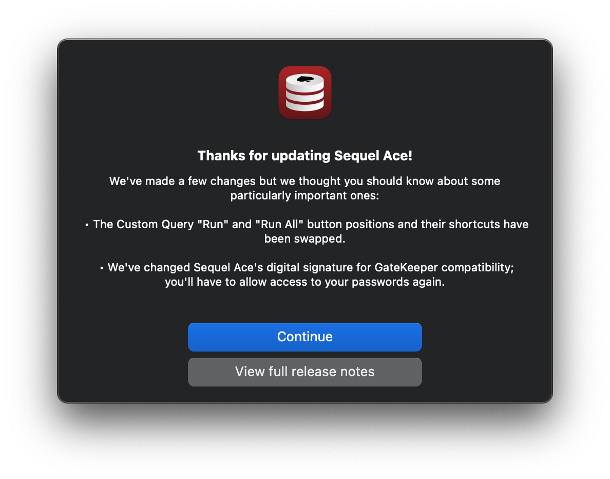
It's @samuelbradshaw's icon with some very minor tweaks. Notably the correct shape (99% sure) for Big Sur. I really love the file icons.


Jason-Morcos
on 4 Jul 2020
I like it! :) (but I'm biased)
By the way, I didn't use an exact Apple "squircle" shape for the mask in the Affinity Designer file – so those rounded corners may need to be adjusted (maybe you already fixed that).
samuelbradshaw
on 4 Jul 2020
I like it! :) (but I'm biased)
By the way, I didn't use an exact Apple "squircle" shape for the mask in the Affinity Designer file – so those rounded corners may need to be adjusted (maybe you already fixed that).
Yup, fixed that! Used a Figma template that seemed correct lol
Jason-Morcos
on 4 Jul 2020
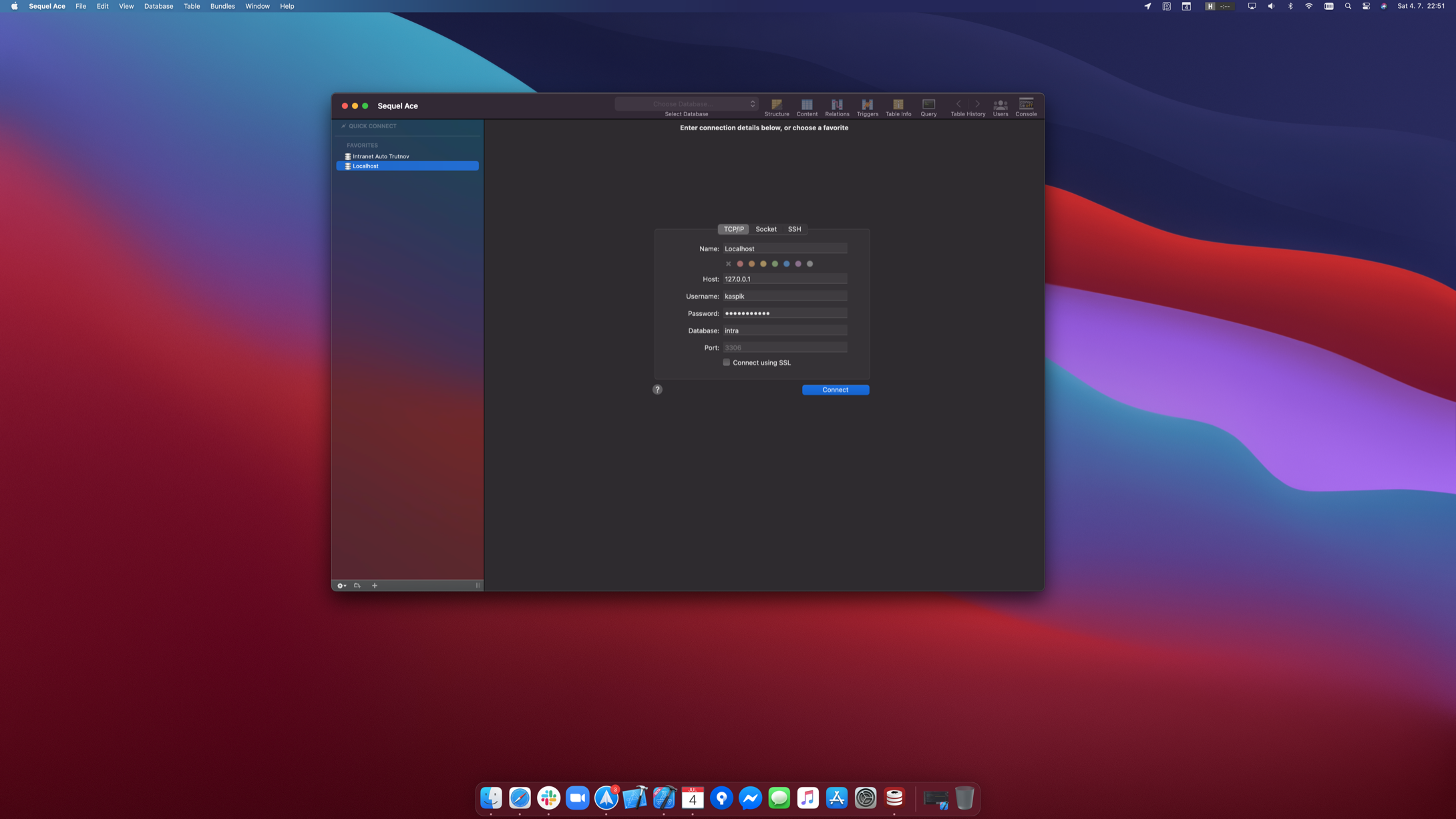
I use the new wallpaper on Big Sur so it's a similar colo,r but I like it, ship it! 🚢
Kaspik
on 4 Jul 2020
Awesome, guys! Anxious for the release of the update on the Mac App Store!
vinilanzoni
on 5 Jul 2020
Related issues
stychos
·
6Comments
 vuon9
·
4Comments
vuon9
·
4Comments
 categoryshell
·
5Comments
categoryshell
·
5Comments
 lphilps
·
7Comments
lphilps
·
7Comments
 gms8994
·
6Comments
gms8994
·
6Comments
Most helpful comment
It's @samuelbradshaw's icon with some very minor tweaks. Notably the correct shape (99% sure) for Big Sur. I really love the file icons.