Scout: general report- pdf not working well
in fam 20101
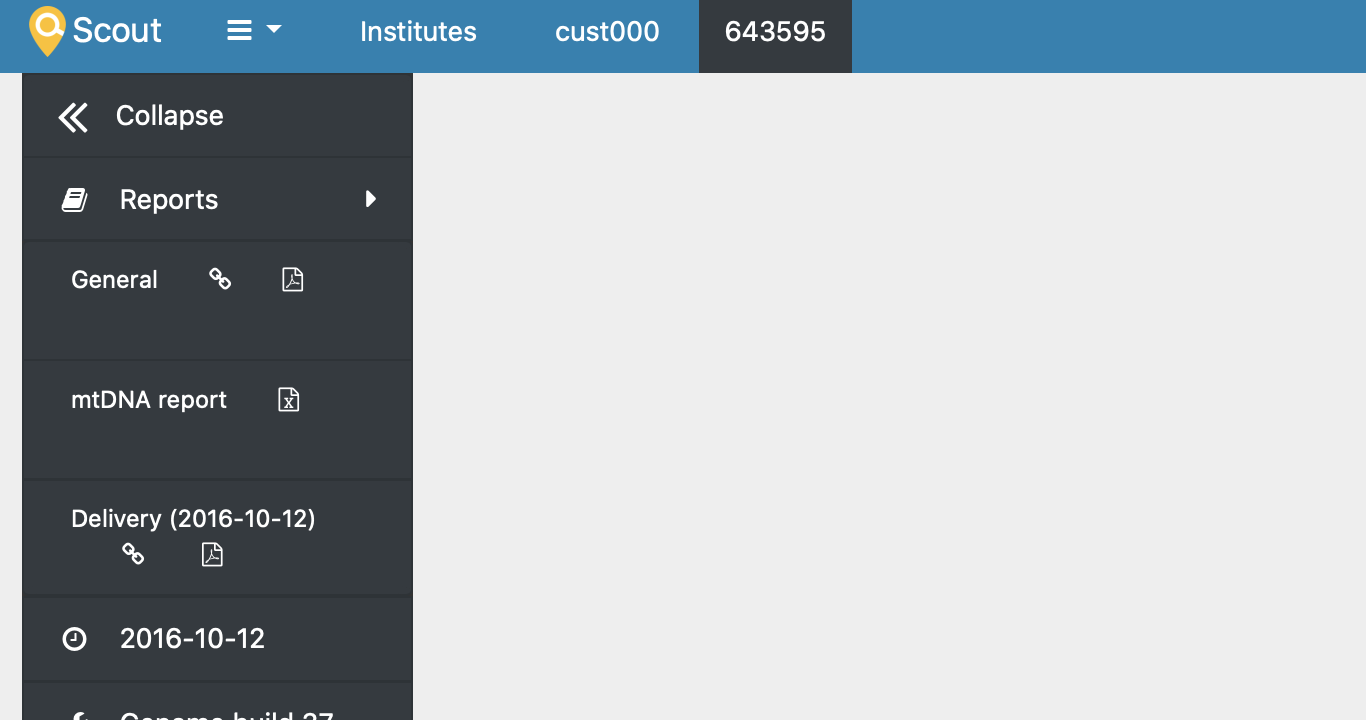
the online page look like this (the table goes slightly outside the margin
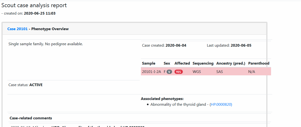
the pdf format is even worse. EDIT - try for yourself.
 4WGH
4WGH
All 32 comments
Can you supply browser version and operating system? Did you use any unusual screen or window size?
It looks good on my end, but that's also an N=1. 😸
 dnil
on 25 Jun 2020
dnil
on 25 Jun 2020
But, yeah, the pdf is not in a good state. At least a local lib issue. Let's check and see if it affects more reports, and if it persists in different envs. Thanks!
dnil
on 25 Jun 2020
It is perhaps not my place to make the judgement between patient confidentiality and urgency of this issue, but may I suggest again that you provide either a toy example or send reports such as this, that lean more towards the Solna instance, as tickets to the support system. This is free to read for all of Internet.
dnil
on 25 Jun 2020
good point!!!!
thanks
How can I remove the pdf?
4WGH
on 25 Jun 2020
Fixed! 😊
(There are like three little dots on the top right of the messages. They trigger a dropdown. Select edit from that, and you can change your post.)
dnil
on 25 Jun 2020
the browser is Firefox, no idea how to check version
Window 7 operating system
4WGH
on 25 Jun 2020
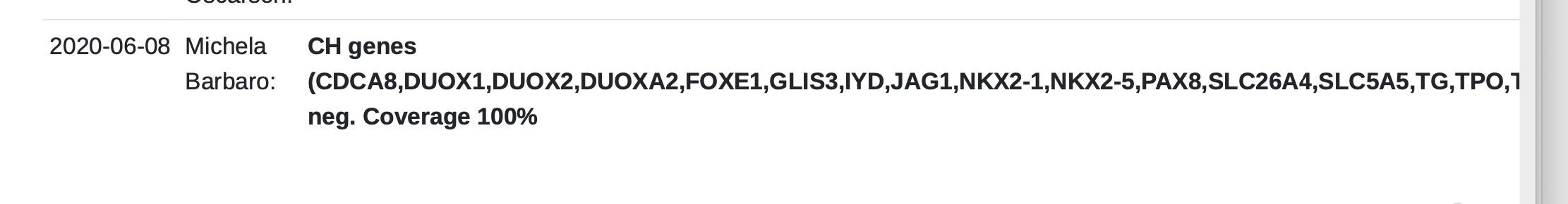
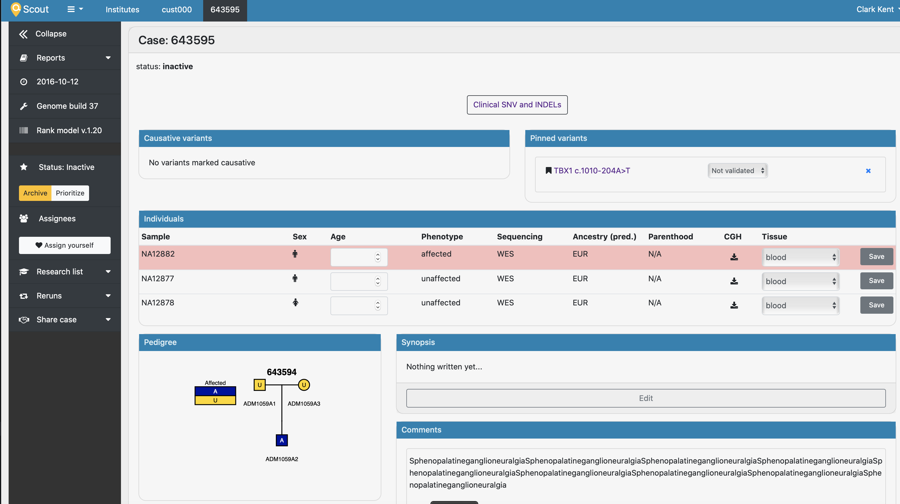
PDF version looks ugly also on Chrome. I strongly suspect it's this long list of genes, separated by commas but no space that might be causing it.
 northwestwitch
on 25 Jun 2020
northwestwitch
on 25 Jun 2020
Generally you will find versions on GUI tools by selecting the "About" menu item. LabIT can help you upgrade if you have been left behind on updates (mine is on 77.0.1). I know someone @ klingen (HM?) had an issue with her Firefox not beeing kept up to date. Leave an issue in Navet, or go find your friendly neighbour sysadmin.
dnil
on 25 Jun 2020
And yeah, I think you are right @northwestwitch; the minimum width calculation could be based on word wrapping and not deal with long strings. Probably that then allows the family info to escape its bounding box, and not wrap on the "-" in the individual ids since there is suddenly some other item further to the right. That could definitely happen in latex, and I suspect the layout algorithm is similar: who wouldn't copy Knuth?
dnil
on 25 Jun 2020
and I suspect the layout algorithm is similar: who wouldn't copy Knuth?
I don't know the guy but in that case the fix is easy!
northwestwitch
on 25 Jun 2020
Right - fingers crossed!
No me neither, but his craft is solid. Still going strong at 10001 base 3 with updating his The Art of Computer Programming (https://sv.m.wikipedia.org/wiki/The_Art_of_Computer_Programming) it seems, although nowadays more people refer to StackOverflow than it. 😄
dnil
on 25 Jun 2020
nowadays more people refer to StackOverflow than it
Yeah I wonder why.. 😆 Anyway, the only complicated thing is to understand where to introduces spaces in users comment whenever they write a stream of consciousness.. I'll try to fix something
northwestwitch
on 25 Jun 2020
StackOverflow lists e.g. CSS "word-wrap: break-word;" and "overflow-wrap: break-word". I suppose the question becomes which ones the pdf renderer (and possibly our favourite browsers) support?
dnil
on 25 Jun 2020
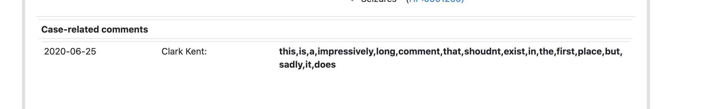
I was thinking introduce a space after every comma, whenever the space is missing. That way the text gets distributed over multiple lines. The only situation this is not working is where there is a super long unique word non separated by spaces
northwestwitch
on 25 Jun 2020
The problem I'm seeing in the code is that we have to fix not only the comments from cases, but also those from the variants, because the same thing could happen there as well.
northwestwitch
on 25 Jun 2020
Yep. If the text areas would get either of those classes in css, at least for the reports, that might be it, conditions as above.
dnil
on 25 Jun 2020
https://www.techrepublic.com/blog/web-designer/css3-new-properties-for-text-overflow-and-text-wrap/
"Word-wrap is probably not going to be the most widely used CSS3 property but it definitely has a practical use, for example, in controlling the styling of comment sections within blog posts or forms."
dnil
on 25 Jun 2020
I've drafted a fix, jinja-style
northwestwitch
on 25 Jun 2020
https://www.techrepublic.com/blog/web-designer/css3-new-properties-for-text-overflow-and-text-wrap/
I'm open to this solution as long as it doesn't cut the words in the sentence
northwestwitch
on 25 Jun 2020
I noticed while testing out that also the regular layout is somewhat sensitive to this. Try adding a very long word into comment boxes etc. cringe
dnil
on 25 Jun 2020
also the regular layout is somewhat sensitive to this
I know, I was pretending everything was fine! 😄
northwestwitch
on 25 Jun 2020
bootstrap has a class text-break that deals with this (adding browser specific word-break css)
https://getbootstrap.com/docs/4.3/utilities/text/#word-break
dnil
on 25 Jun 2020
One could just add text-break to the comment displaying boxes, and be done?
dnil
on 25 Jun 2020
Yes, let's try!
northwestwitch
on 25 Jun 2020
Looks like the text-break works fine!
northwestwitch
on 25 Jun 2020
Yes, it works like a charm for the main pages. And the comments box is just one component in the global utils, so a one-liner. Then there's the report.
dnil
on 25 Jun 2020
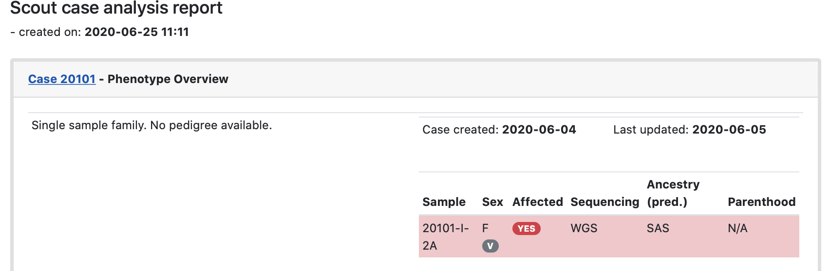
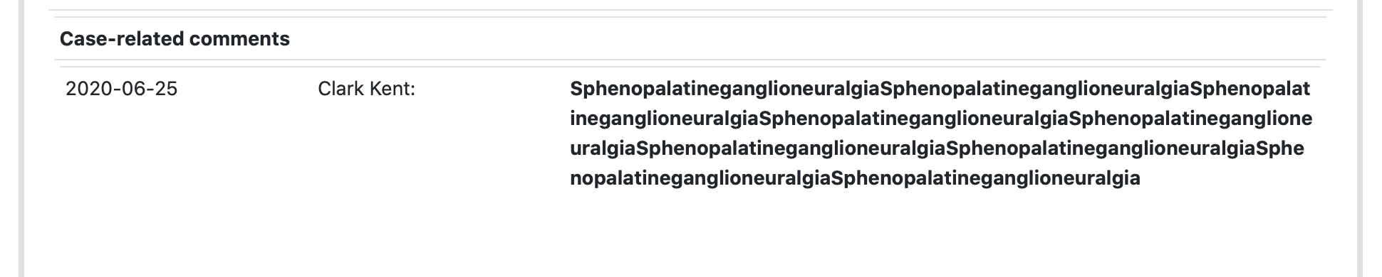
Before:
After:
😄
dnil
on 25 Jun 2020
Yes!
dnil
on 25 Jun 2020
I bet who writes a comment like that @dnil would also have a diagnosis..
northwestwitch
on 25 Jun 2020
🤣 Most likely..
dnil
on 25 Jun 2020
And thanks - I really like this way better! Starting to edit the input feels a little risky. This will be nicely supportive of different screen sizes, long words and what not.
dnil
on 25 Jun 2020
I really like this way better!
Me too! Thank you!
northwestwitch
on 25 Jun 2020
Related issues
 heronikdin
·
4Comments
heronikdin
·
4Comments
 hassanfa
·
4Comments
hassanfa
·
3Comments
hassanfa
·
4Comments
hassanfa
·
3Comments
 ViktorHy
·
4Comments
heronikdin
·
4Comments
ViktorHy
·
4Comments
heronikdin
·
4Comments