Safe-react: Show info for users opening safe react on mobile
What is this feature about? (1 sentence)
This feature will show an info message to users trying to open the safe react app on mobile and allow them download the native mobile app.
Why is it needed? What is the value? For whom do we build it?
- Safe react is not optimized for mobile.
- Our current strategy is, that we believe we can provide a better experience on mobile with a native app.
- We should let people on mobile know that there is a mobile app to raise awareness.
High-level overview of the feature
- When opening gnosis-safe.io/app/ on desktop, everything should remain as is.
- When opening gnosis-safe.io/app/ from a mobile device, there should be
- Info, that this app is not optimized for mobile
- Info, that they should check out the mobile apps.
- Link to the mobile apps (I suggest to https://gnosis-safe.io/#mobile)
- Link that allows the user to nevertheless use the desktop site on mobile.
 tschubotz
All 15 comments
Why not link directly to the app stores?
Does it make sense to leverage the "open in app" banner which refers to the app stores in case the user has not yet downloaded the app?

 lukasschor
on 19 Oct 2020
lukasschor
on 19 Oct 2020
Why not link directly to the app stores?
I thought it would be better to have the links just in 1 place for easier maintenance. But no strong opinion on that one.
Does it make sense to leverage the "open in app" banner which refers to the app stores in case the user has not yet downloaded the app?
🤔
tschubotz
on 19 Oct 2020
I did some research on the banner idea. On Safari on iOS and on Chrome on Android, there are so called "smart banners"
- https://developer.apple.com/library/archive/documentation/AppleApplications/Reference/SafariWebContent/PromotingAppswithAppBanners/PromotingAppswithAppBanners.html
- https://developers.google.com/web/fundamentals/app-install-banners/native
Problem is: This would not show up in the crypto in app browsers since those are custom browsers.
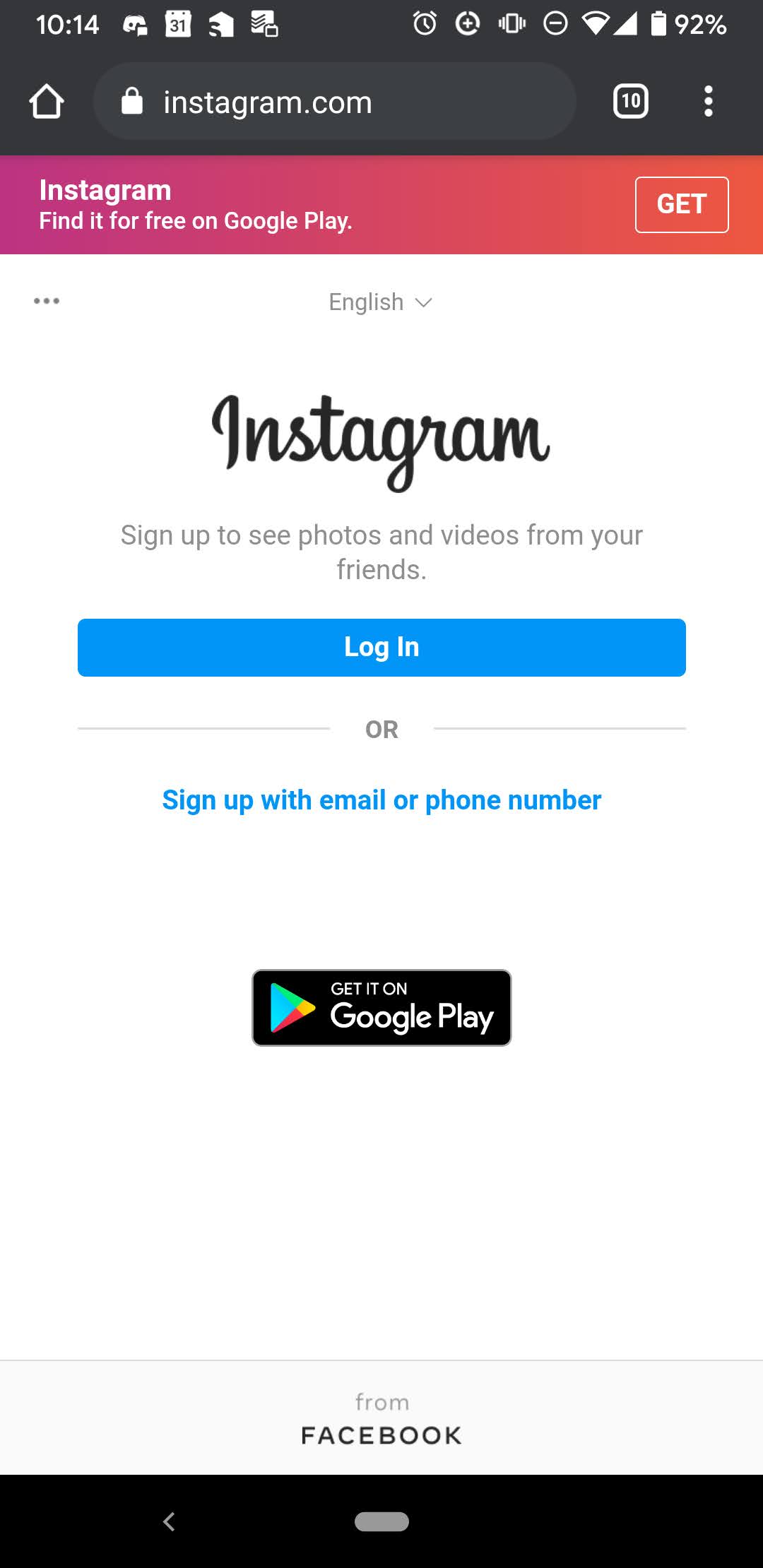
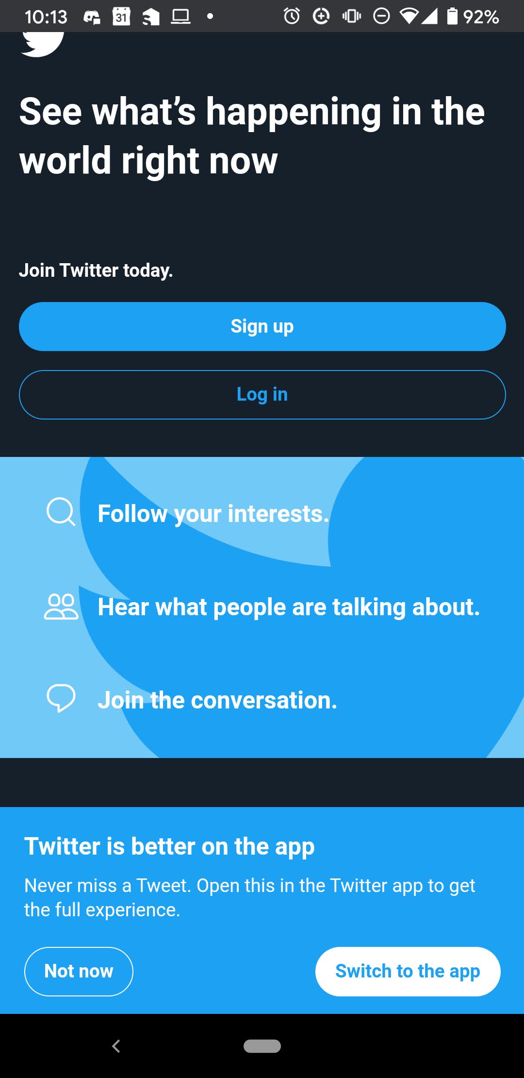
We could go with a banner like custom implementation though. Something like what Twitter / instram do:
tschubotz
on 20 Oct 2020
I like the Twitter solution. It's prominent enough that the user has to act and clearly advises to use the app, but does not completely prevent users from accessing the web app in the browser.
lukasschor
on 20 Oct 2020
@tschubotz check in GA how often users open the app on mobile.
tschubotz
on 21 Oct 2020
@posthnikova this is a ticket that might be added to the web release after the current one (current one is 2.15.0). Just as a heads up that this would require design.
tschubotz
on 4 Nov 2020
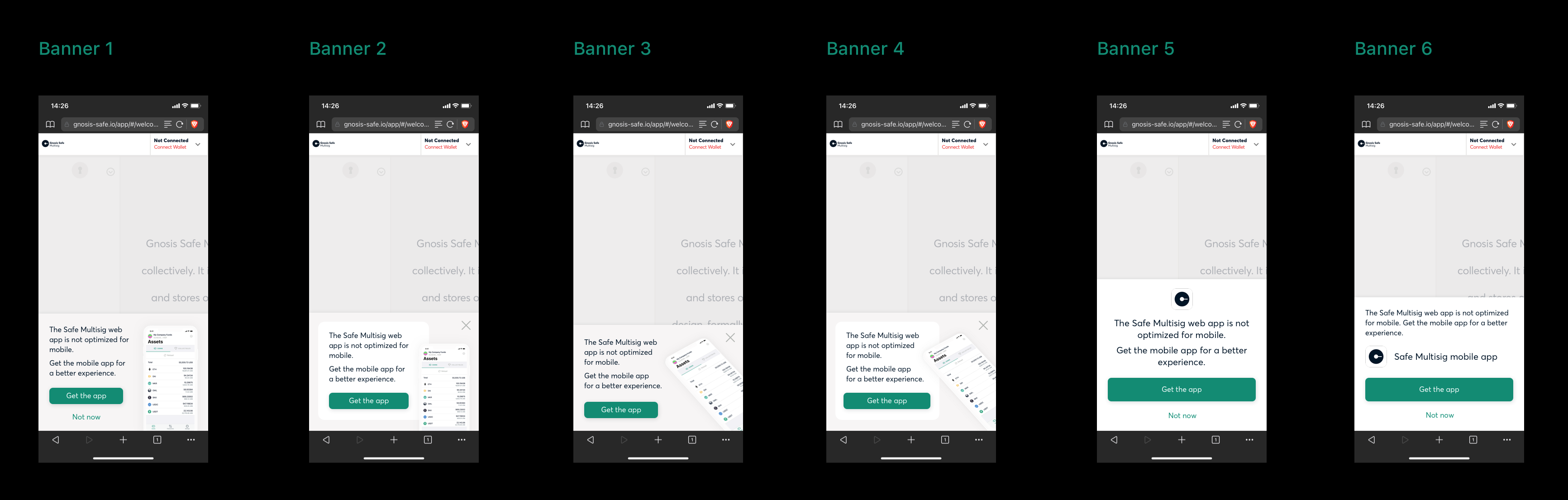
I have 6 versions. I personally like 1 and 2.
 posthnikova
on 11 Nov 2020
posthnikova
on 11 Nov 2020
I like the versions with screenshot more since that gives a hint at how it looks.
I like the versions with the "straight" screenshot more because they are better readable than the tilted version.
So 1 and 2 are my favorites. Slight preference for number 2 since it's less susceptible to fat fingers typing the wrong button.
I think the bar with "wallet not connected" should be greyed out as well.
tschubotz
on 11 Nov 2020
is this ready to be implemented? is there any definition missing? should we go with 2?
 nicosampler
on 17 Nov 2020
nicosampler
on 17 Nov 2020
is this ready to be implemented? is there any definition missing? should we go with 2?
We didn't add it to the 2.16.0 release, but i think this one is ready, yes. @posthnikova are you ok with number 2?
tschubotz
on 17 Nov 2020
I'm ok, zeplin: https://zpl.io/VOZQNn8
posthnikova
on 17 Nov 2020
I have a few questions, @posthnikova @tschubotz
- What is the breakpoint that we must consider to start showing the Mobile Start? We currently have in Safe a breakpoint for small devices at 480px (width).
https://www.loom.com/share/5c86443f21ae44cf85cdbd9040029ccf
Does the Mobile Start will be show in all screens? or just in welcome screen?
Should we save the user preferences (in local storage) to don't show again the Mobile Start when a user close the modal? cc @nicosampler
 alongoni
on 17 Dec 2020
alongoni
on 17 Dec 2020
What is the breakpoint that we must consider to start showing the Mobile Start? We currently have in Safe
a breakpoint for small devices at 480px (width).
Is it possible to detect that it's a mobile device? In horizontal mode on the phone the interface is also unusable and some phone have large width (>1000).
Does the Mobile Start will be show in all screens? or just in welcome screen?
On all screens.
Should we save the user preferences (in local storage) to don't show again the Mobile Start when a user
close the modal?
This I'm not sure about, Instagram and Twitter don't remember that you closed the banner and show it again.
posthnikova
on 17 Dec 2020
Is it possible to detect that it's a mobile device? In horizontal mode on the phone the interface is also unusable and some phone have large width (>1000).
It's, but seems like we need to check all posible values for navigator.userAgent||navigator.vendor||window.opera
window.mobileAndTabletCheck = function() {
  let check = false;
  (function(a){if(/(android|bb\d+|meego).+mobile|avantgo|bada\/|blackberry|blazer|compal|elaine|fennec|hiptop|iemobile|ip(hone|od)|iris|kindle|lge |maemo|midp|mmp|mobile.+firefox|netfront|opera m(ob|in)i|palm( os)?|phone|p(ixi|re)\/|plucker|pocket|psp|series(4|6)0|symbian|treo|up\.(browser|link)|vodafone|wap|windows ce|xda|xiino|android|ipad|playbook|silk/i.test(a)||/1207|6310|6590|3gso|4thp|50[1-6]i|770s|802s|a wa|abac|ac(er|oo|s\-)|ai(ko|rn)|al(av|ca|co)|amoi|an(ex|ny|yw)|aptu|ar(ch|go)|as(te|us)|attw|au(di|\-m|r |s )|avan|be(ck|ll|nq)|bi(lb|rd)|bl(ac|az)|br(e|v)w|bumb|bw\-(n|u)|c55\/|capi|ccwa|cdm\-|cell|chtm|cldc|cmd\-|co(mp|nd)|craw|da(it|ll|ng)|dbte|dc\-s|devi|dica|dmob|do(c|p)o|ds(12|\-d)|el(49|ai)|em(l2|ul)|er(ic|k0)|esl8|ez([4-7]0|os|wa|ze)|fetc|fly(\-|_)|g1 u|g560|gene|gf\-5|g\-mo|go(\.w|od)|gr(ad|un)|haie|hcit|hd\-(m|p|t)|hei\-|hi(pt|ta)|hp( i|ip)|hs\-c|ht(c(\-| |_|a|g|p|s|t)|tp)|hu(aw|tc)|i\-(20|go|ma)|i230|iac( |\-|\/)|ibro|idea|ig01|ikom|im1k|inno|ipaq|iris|ja(t|v)a|jbro|jemu|jigs|kddi|keji|kgt( |\/)|klon|kpt |kwc\-|kyo(c|k)|le(no|xi)|lg( g|\/(k|l|u)|50|54|\-[a-w])|libw|lynx|m1\-w|m3ga|m50\/|ma(te|ui|xo)|mc(01|21|ca)|m\-cr|me(rc|ri)|mi(o8|oa|ts)|mmef|mo(01|02|bi|de|do|t(\-| |o|v)|zz)|mt(50|p1|v )|mwbp|mywa|n10[0-2]|n20[2-3]|n30(0|2)|n50(0|2|5)|n7(0(0|1)|10)|ne((c|m)\-|on|tf|wf|wg|wt)|nok(6|i)|nzph|o2im|op(ti|wv)|oran|owg1|p800|pan(a|d|t)|pdxg|pg(13|\-([1-8]|c))|phil|pire|pl(ay|uc)|pn\-2|po(ck|rt|se)|prox|psio|pt\-g|qa\-a|qc(07|12|21|32|60|\-[2-7]|i\-)|qtek|r380|r600|raks|rim9|ro(ve|zo)|s55\/|sa(ge|ma|mm|ms|ny|va)|sc(01|h\-|oo|p\-)|sdk\/|se(c(\-|0|1)|47|mc|nd|ri)|sgh\-|shar|sie(\-|m)|sk\-0|sl(45|id)|sm(al|ar|b3|it|t5)|so(ft|ny)|sp(01|h\-|v\-|v )|sy(01|mb)|t2(18|50)|t6(00|10|18)|ta(gt|lk)|tcl\-|tdg\-|tel(i|m)|tim\-|t\-mo|to(pl|sh)|ts(70|m\-|m3|m5)|tx\-9|up(\.b|g1|si)|utst|v400|v750|veri|vi(rg|te)|vk(40|5[0-3]|\-v)|vm40|voda|vulc|vx(52|53|60|61|70|80|81|83|85|98)|w3c(\-| )|webc|whit|wi(g |nc|nw)|wmlb|wonu|x700|yas\-|your|zeto|zte\-/i.test(a.substr(0,4))) check = true;})(navigator.userAgent||navigator.vendor||window.opera);
  return check;
};
I've been working in this branch. Next step is implement something to detect mobile devices.
https://github.com/gnosis/safe-react/tree/feature/%231499-Add-Mobile-Start
alongoni
on 17 Dec 2020
Related issues
 fernandomg
·
4Comments
fernandomg
·
4Comments
 francovenica
·
6Comments
francovenica
·
6Comments
 rmeissner
·
3Comments
rmeissner
·
3Comments
 katspaugh
·
5Comments
rmeissner
·
6Comments
katspaugh
·
5Comments
rmeissner
·
6Comments
Most helpful comment
Is it possible to detect that it's a mobile device? In horizontal mode on the phone the interface is also unusable and some phone have large width (>1000).
On all screens.
This I'm not sure about, Instagram and Twitter don't remember that you closed the banner and show it again.