Powertoys: [PowerToys Run] Highlight color is too close to background color in dark mode
ℹ Computer information
- PowerToys version: 0.25
- PowerToy Utility:
- Running PowerToys as Admin: Yes
- Windows build number: Win10 1909 (18363.1198)
📝 Provide detailed reproduction steps (if any)
- Set PowerToys to dark mode
- Launch PT Run
✔️ Expected result
The current selection highlight color should be lighter.
❌ Actual result
The color for the current selection is too close to the background color, noticing the difference at a glance is difficult.
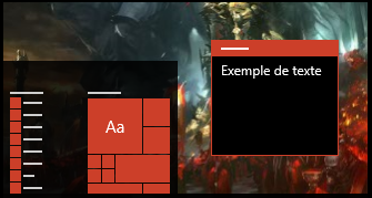
📷 Screenshots

 Sov3rain
All 8 comments
The highlight color is your accent color
 ghost
on 25 Nov 2020
ghost
on 25 Nov 2020
Clearly it's not:
It's a darker shade of the accent color maybe, but it's still too dark.
Sov3rain
on 25 Nov 2020
It is darker because you are using the dark theme
ghost
on 25 Nov 2020
Maybe it should be the opposite
ghost
on 25 Nov 2020
Is this not using the Accent colour with an opacity? I know its WPF and not UWP. The opacity should probably be something closer to 40-50% so it stands out better in both Light and Dark themes.
 mdtauk
on 25 Nov 2020
mdtauk
on 25 Nov 2020
Is this not using the Accent colour with an opacity? I know its WPF and not UWP. The opacity should probably be something closer to 40-50% so it stands out better in both Light and Dark themes.
Could be, yeah.
This issue has been reported before. We should maybe consider using the Accent brushes in ModernWPF. We can then also replace our own implementations of the UWP styling.
 niels9001
on 25 Nov 2020
niels9001
on 25 Nov 2020
Related to #4208, if I am not mistaken
 Jay-o-Way
on 25 Nov 2020
Jay-o-Way
on 25 Nov 2020
@Sov3rain
please add your comments to #4208, so we have only one issue tracking this problem.
Thanks.
 enricogior
on 26 Nov 2020
enricogior
on 26 Nov 2020
Related issues
enricogior
·
3Comments
 smz
·
3Comments
smz
·
3Comments
 amorenew
·
3Comments
amorenew
·
3Comments
 anish-94
·
3Comments
anish-94
·
3Comments
 seritools
·
3Comments
seritools
·
3Comments