Powerlevel10k: Scaling/Sizing of icons ...
When using UTF icons in powerline, I always found the icons small no matter what the terminal font. In 9k, I stumbled across a hack where I could inflate the size of the icon with the size of the font.
POWERLEVEL9K_CUSTOM_PSN="echo '\ue230'"
The trick was the ‘echo’ of the icon into the variable.
When converting to 10k, I’m now stuck with visually tiny icons.
Any thoughts or solutions?
Again, FANTASTIC work on your contribution to the zsh family!
 thigpen
All 13 comments
When converting to 10k, I’m now stuck with visually tiny icons.
The size of icons in prompt doesn't depend on Zsh theme. It only depends on the terminal font and the icon's Unicode codepoint. If the glyph for U+E230 in your terminal font is small, there is no trick that would allow you to print a large version of it. The trick you've described must be a mistake. If some icon got smaller upon the migration from powerlevel9k to powerlevel10k, it means that either the font or the icon's Unicode code point are now different.
If you want large icons, you need to use a non-monospace font. Here "non-monospace" refers to any font with glyphs wider than a single column, or wider than two columns for glyphs designated as "wide" in the Unicode standard. The easiest way to get a non-monospace terminal font is to download a ttf file without " Mono" in its name from https://github.com/ryanoasis/nerd-fonts/blob/master/patched-fonts/. For example, here's non-monospace regular Meslo from Nerd Fonts: Meslo LG S Regular Nerd Font Complete Windows Compatible.ttf.
Note that Nerd Fonts have two PlayStation logo glyphs: U+E230 and U+F913. The former is large in non-monospace fonts while the latter is always small.
To easily see how an icon looks like with the selected font, run the following command:
print -P '\uE230%K{red} %k'
In a monospace font the icon won't overlap the red block. In a non-monospace font it will.
If some glyph in the non-monospace font from Nerd Fonts is not large enough for you, you can fire up FontForge and scale it manually.
The best way to display a custom icon in powerlevel10k prompt is by defining a custom segment.
function prompt_my_psn_logo() {
  p10k segment -b black -f white -i $'\uE230'
}
Then add my_psn_logo to POWERLEVEL9K_LEFT_PROMPT_ELEMENTS or POWERLEVEL9K_RIGHT_PROMPT_ELEMENTS. You can customize the appearance of my_psn_logo the same way as any other prompt segment. For example, POWERLEVEL9K_MY_PSN_LOGO_FOREGROUND=red will set foreground color to red.
It's a good practice to use my_ prefix in user-defined prompt segments to avoid clashes with future versions of powerlevel10k.
It's not recommended to use the old API for defining custom segments. While custom_psn that you've used with powerlevel9k will still work with powerlevel10k, it's much slower than my_psn_logo and less flexible.
Type p10k help segment for documentation and example. There is another example in https://github.com/romkatv/powerlevel10k/#extensible and yet another in your ~/.p10.zsh (assuming you've ran p10k configure).
Please let me know if this doesn't solve your problem.
 romkatv
on 20 Mar 2020
romkatv
on 20 Mar 2020
I had a similar issue with P9K as well, and found that it depends on the version of nerd patch font that you use.
I found that using the non 'Mono' versions work well, eg using JetBrainsMono Nerd Font gives me icons with the right font size, while JetBrainsMono Nerd Font Mono give me small icons (reproduced on Linux under Arch and Debian Testing)
 Jubijub
on 23 Mar 2020
Jubijub
on 23 Mar 2020
@Jubijub I'm wondering if you've read my comment before posting yours. It seems to repeat the gist of this paragraph:
If you want large icons, you need to use a non-monospace font. Here "non-monospace" refers to any font with glyphs wider than a single column, or wider than two columns for glyphs designated as "wide" in the Unicode standard. The easiest way to get a non-monospace terminal font is to download a
ttffile without " Mono" in its name from https://github.com/ryanoasis/nerd-fonts/blob/master/patched-fonts/. For example, here's non-monospace regular Meslo from Nerd Fonts: Meslo LG S Regular Nerd Font Complete Windows Compatible.ttf.
By the way, I've released a new version of the recommended powerlevel10k font yesterday. It has better alignment of powerline glyphs and 44% larger icons (by area). iTerm2 users can upgrade by typing p10k configure. Users of other terminals can follow manual installation instructions.
Non-monospace fonts have so many issues that it's a good idea to avoid them. The new recommended font doesn't suffer from these issues and still has legible icons.
romkatv
on 23 Mar 2020
@romkatv The font seems nice, thanks. Icons are indeed bigger, than with DejaVu Nerd font - I was bothered by their size also.
I see a small issue with Kitty terminal on ArchLinux:
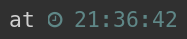
A clock icon is cut a little bit on the left
 igorepst
on 23 Mar 2020
igorepst
on 23 Mar 2020
That's the downside of larger icons -- buggy terminals start showing their bugs. I've tried to walk the middle ground where rendering artifacts in buggy terminals aren't to bad while icons are still of decent size. Maybe I'll shrink them a bit if more users complain.
By the way, zsh runs smoother in VTE-based terminals. Also fewer bugs.
romkatv
on 23 Mar 2020
Just curious, many times you've mentioned that a terminal has a bug or immediately guessed a terminal based on a bug report. What would you say is the _most_ supported terminal? (or I guess technically support-_ive_ since it's supporting p10k not the other way around...)
 extremepayne
on 23 Mar 2020
extremepayne
on 23 Mar 2020
Interesting, as Konsole has the same bug, but Gnome Terminal - being VTE based - does not
igorepst
on 23 Mar 2020
All terminals have bugs. I only know about bugs that affect prompt but even that subset is large. In my experience terminals based on VTE are the least buggy and they also produce the smoothest rendering with no flickering or blinking in Zsh prompt.
Konsole is the worst Linux terminal when it comes to icon rendering. It doesn't just cut icons from the left, like kitty, but also from the right. It's also unable to display double width Unicode glyphs (the only other popular terminal with this issue is console.js). These bugs of Konsole are the cause of conservative icon choice in powerlevel10k.
romkatv
on 23 Mar 2020
Timed out waiting for reply from @thigpen. Closing.
romkatv
on 24 Mar 2020
@Jubijub I'm wondering if you've read my comment before posting yours. It seems to repeat the gist of this paragraph:
I did see it, but I also see that with kitty as my terminal emulator, I have the opposite result as what you are describing :) :
- using
JetbrainsMono Nerd FontI got no issues with the icon size (which match more or less the text size) - using
JetBrainsMono Nerd Font Mono, the icons are quite tiny
what would be your recommended terminal ? I quite like kitty because it's nice to configure, and the multi window embedded means I don't have to use tmux
Jubijub
on 24 Mar 2020
@Jubijub I'm wondering if you've read my comment before posting yours. It seems to repeat the gist of this paragraph:
I did see it, but I also see that with
kittyas my terminal emulator, I have the opposite result as what you are describing :) :
- using
JetbrainsMono Nerd FontI got no issues with the icon size (which match more or less the text size)- using
JetBrainsMono Nerd Font Mono, the icons are quite tiny
Could you quote the part of my comment that contradicts this? Perhaps I've made a typo that reversed the meaning? I don't see.
Relative size of glyphs (including letters and numbers) doesn't depend on the application. It depends only on the font. If in some font X is twice as tall as :rofl:, this property will hold when you use this font in a terminal, in a text editor or in a web page rendered by a browser. So if icons are too small in some terminal, they'll be small in all terminals with the same font.
Mono in Nerd Font ttf file names means all glyphs in the font have been downsized to fit within a single column. More technically, each glyph has non-negative bearing and width not greater than advance. You can visually see horizontal span of a glyph with the following command:
print -P '%K{red} %k\uF179%K{red} %k'
Set font size to something very large for best results.
You can also use get_icon_names to print all icons used by Powerlevel10k with the same red blocks around them.
what would be your recommended terminal ? I quite like kitty because it's nice to configure, and the multi window embedded means I don't have to use tmux
Is this the same question as posted by @extremepayne above? If so, please see my reply.
romkatv
on 24 Mar 2020
Sorry I misread your original comment.
Jubijub
on 25 Mar 2020
Finally, circling back to this. Not using a mono font works fine.
Thanks for all your work.
thigpen
on 4 Aug 2020
Related issues
 maximbaz
·
7Comments
maximbaz
·
7Comments
 gigglearrows
·
4Comments
gigglearrows
·
4Comments
 debo
·
5Comments
debo
·
5Comments
 alex-popov-tech
·
4Comments
alex-popov-tech
·
4Comments
 barthalion
·
3Comments
barthalion
·
3Comments
Most helpful comment
Just curious, many times you've mentioned that a terminal has a bug or immediately guessed a terminal based on a bug report. What would you say is the _most_ supported terminal? (or I guess technically support-_ive_ since it's supporting p10k not the other way around...)