Polaris-react: Proposal: new guidelines for badge component
👉More rationale on this doc.
Badges
Status badges are used inconsistently throughout the admin because teams choose the badge that suits their specific context. Because of this, they can quickly get overwhelming for merchants. For a full content audit, see this doc.
We can improve the component and create an overarching strategy for badges to help merchants know what each badge means and prioritize their work.
Types of badges
We can categorize badges depending on the level of priority and task.
Default badges
Example | Purpose | Level of priority
-- | -- | --
 | Use for statuses that are a result of automated processes or expected by the merchant. | Low
The default badge is for statuses that act as “passive notifications.” They report a state where merchant action is not required or when these statuses are achieved automatically without any merchant input.
Feature indicator badge
Example | Purpose | Level of priority
-- | -- | --
Teal (nonexistent) | Use to highlight new features. | Low
These badges are for Shopify to highlight new features inside the admin only. They are _not_ a result of a process or merchant action.
Guidelines for feature badges:
- They should disappear once the merchant clicks on the new feature
- Explain the new feature through other components (e.g. banners or cards) instead of relying on badges
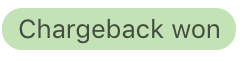
Success badge
Example | Purpose | Level of priority
-- | -- | --
 | Use to confirm user action or reassure the merchant of a desirable state (e.g.
 Active or Protected). | Medium
The success badge is for statuses that are _not_ the result of an automated process. They are a result of merchant input or help bring "relief" to merchants about a state. For example, states that are active like Connected in the domain page, or states that are desirable since they help their business like Protected order.
Actionable badge
Example | Purpose | Level of priority
-- | -- | --
 | Use when the merchant needs to take an action. | Medium/High
We need to have a distinct badge for statuses that require action. This will help merchants recognize what they should work on.
Guidelines for actionable badges:
- Guide the merchant towards more information about the required action, for example, in a banner
- Make it consistent with any other components related to the required action
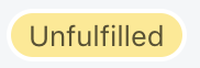
Critical badge
Example | Purpose | Level of priority
-- | -- | --
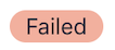 | Use when the merchant must take _immediate_ action to avoid potential damage to their business like losing money or sales. | High
A red badge ensures consistency across all critical messaging and removes the orange badge. It will help us align with the mental model merchants already have around these kinds of messages.
Guidelines for critical badges:
- Use only when the merchant needs to take immediate action.
- Place critical badges close to the source of the problem.
- Guide the merchant to more information about the problem and how to fix it.
- Do not use red badges as the only way to communicate a critical state. Make the problem visible in the admin, for example, in a banner.
Proposed content guidelines
Based on the audit results, I came up with recommendations for content guidelines. Note that some of the current Polaris guidelines are included here 👀
Grammar and mechanics:
- Use a single word to describe a status.
- Only use two words if a state is complex (for example,
Partially refunded), or when the status is not clear in context. - Use sentence case.
- Use the past tense when a status is completed.
- Use the present participle (-ing) to describe a process that is currently happening. For example, interim states like
Processing. This can help us specify that Shopify or a third-party is the one responsible for the action, and there is nothing that the merchant needs to do.
Terminology:
- Be consistent with the terms used in other areas of the admin.
- Do not use the same term for different concepts.
- Use terms that accurately describe the status. For example, don’t use
Errorif there is another term that describes the situation better. This can help us avoid ambiguous states likePendingin both desktop and mobile contexts.
Design:
- Be consistent with the color choice across different places in the admin. For example, use the same color in an order resource list and in the order show page.
- Use the same color for components that are related to the badge. For example, if the badge for a failed bill is red, the banner explaining to the merchant what to do about it should also be red.
For mobile contexts:
- Use two words for mobile contexts to clarify what the status is referring to when it is not clear in context. See this example.
👆Some badges are not displayed properly on mobile. Since the badge labels are dependent on the column header (which doesn’t appear on mobile), merchants looking at resource lists might not know what that badge means.
⚠️These are guidelines for the ideal case. It might not be possible to customize content depending on which device the user is on.
Icons
Icons can help us with accessibility since we are relying on colour to convey level of priority/what merchants need to work on. Icons (incomplete, partially complete, complete) inside the badge can help us convey the same patterns if used correctly. Icons should only be used when the merchant needs to take action.
@Shopify/product-content
 JimenaMartinezGerhard
All 11 comments
👋 Thanks for opening your first issue. A contributor should give feedback soon. If you haven’t already, please check out the contributing guidelines. You can also join #polaris on the Shopify Partners Slack.
![probot-shopify[bot] picture](https://avatars2.githubusercontent.com/in/10530?v=4&s=40) probot-shopify[bot]
on 14 Aug 2019
probot-shopify[bot]
on 14 Aug 2019
Update on this issue:
- @sarahill, @mirualves and I met with @JimenaMartinezGerhard to talk about next steps in creating guidelines for the Polaris style guide Patterns and guides section for her work on badges
- Goal is to create a patterns guide showing the different types of messaging urgency levels and how we use color, content, and components to communicate and convey the urgency and action a merchant needs to take. For example, we could have a case study for a specific merchant task where we need to communicate a high urgency message via a badge and banner, and we could do the same for each urgency level. Other goals include creating more detailed banner content guidelines with clear instructions on the types of messages that belong with specific colors, badge use as a way of teaching merchants status and what action they have to take next, and highlight common mistakes UXers make when implementing banners and badges, etc
- Adding this issue to the Polaris backlog because the team's priorities are Figma UI kit rollout and some other Polaris Back Office Platform (BOP) projects and the Polaris for Everyone project.
- It's estimate this documentation could take ~2 months if we have Sara, Miru, and Sadie dedicated to it as their main project. ~4 months if we all work on it on the side of our desks.
 selenehinkley
on 14 Aug 2019
selenehinkley
on 14 Aug 2019
FYI @yourpalsonja @StephPoce Sara and Miru to chat with you two about where this fits in the BOP priority list.
selenehinkley
on 14 Aug 2019
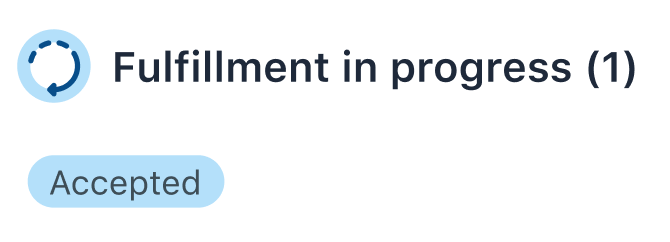
This is awesome and super necessary. I do have some questions/concerns, though. Going forward, fulfillment statuses are going to get a lot more granular, which obviously means there's going to be more of them. We've been making interim status badges blue in our mocks, mirroring the blue icon that will appear alongside the new "parent status" of Fulfillment in progress (which is going to hang out in between Unfulfilled and Fulfilled states). These states may be actionable or may indicate that no immediate action is required and the merchant/user is waiting on another party. Yellow isn't ideal for us, because we need to differentiate in-progress orders/fulfillments from those that haven't been acted on. @selenehinkley would you mind keeping me in the loop?
 caitlinmullen
on 14 Aug 2019
caitlinmullen
on 14 Aug 2019
That is a very interesting case! Maybe we could have a category for "active" statuses (could be blue!). It could be for those statuses that the merchant needs to know are ongoing/in process and that they will take action on, so it would exclude those statuses like Processing that are automated (no merchant action necessary - no need to call attention).
Will these statuses under Fulfillment in progress move to the next state automatically without merchant input or do they need the merchant to take action to move the next state?
JimenaMartinezGerhard
on 14 Aug 2019
@caitlinmullen added you as "assigned" so that this doesn't get lost in your GitHub notifications. When this becomes a project we'll include you as a collaborator so we can have the most recent fulfillment patterns included :)
selenehinkley
on 15 Aug 2019
@JimenaMartinezGerhard good question! It will depend on what fulfillment method the merchant is using. If they're fulfilling via 3PL, states will change without the merchant's intervention. If they're self-fulfilling, then they'll be moving an order/fulfillment through different states manually (for example, in the future, a merchant or their staff will be able to mark an in-store pickup order as 'Picked up', which would also bump it into the parent state of 'Fulfilled'). There's still a good bit of debate around what fulfilled really means, but that's a whole other can of worms.
I think what you said about differentiating actionable/soon-to-be-actionable states from purely informational interim states makes sense. As they'll appear alongside each other in certain contexts like the order show page, it would make sense to add some nuance to help clarify the type of information.
@selenehinkley thank you! :)
caitlinmullen
on 15 Aug 2019
Hello team! After getting some feedback, I rewrote the guidelines to fit the Polaris style and that way they are ready to ship!
Here is the link to the Google doc: https://docs.google.com/document/d/1pGSrrf7rRCajdbXS8y0DeBG-VMFzWNClD2S9SBqI7t4/edit#heading=h.jsh4hgfgrpwx
I will make sure the doc is available after next week (I don't know what they will do with the docs saved on my Drive after I leave).
JimenaMartinezGerhard
on 19 Aug 2019
Hi team! I saved everything on the Product Content drive to make sure nothing is lost. You can find all docs related to badges in this folder: https://drive.google.com/drive/folders/1pCuyt6MpnIji7OdUhu3caX_lptC1VjsC
JimenaMartinezGerhard
on 21 Aug 2019
This issue has been inactive for 180 days and labeled with Icebox. It will be closed in 7 days if there is no further activity.
probot-shopify[bot]
on 17 Feb 2020
This issue has been inactive for 180 days and labeled with Icebox. It will be closed in 7 days if there is no further activity.
probot-shopify[bot]
on 19 Aug 2020
Related issues
 danrosenthal
·
3Comments
danrosenthal
·
3Comments
 greghesp
·
3Comments
greghesp
·
3Comments
 vilav
·
3Comments
vilav
·
3Comments
 alex-page
·
3Comments
alex-page
·
3Comments
 andrewpye
·
3Comments
andrewpye
·
3Comments