Polaris-react: [Autocomplete][v1] A few bugs
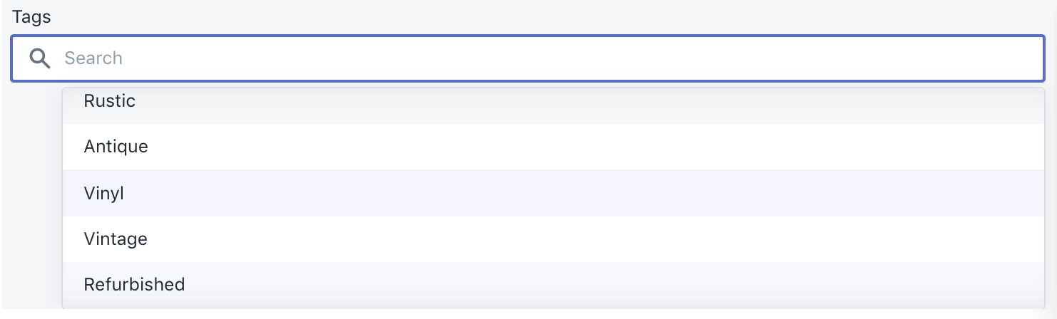
Elements below the fold in the popover do not emit onChange events
If I use "fold" throughout, I mean that these are not initially visible within the popover and must be scrolled into view.
Within the popover, it seems like only the elements that were originally visible before scrolling the popover will emit change events.
Repro:
- Visit https://polaris.shopify.com/components/forms/autocomplete
- Click on all the elements 1 by 1 for
Basic autocompleteexample - Notice they all work
Now, add these options to the end of the options list using the code editor, so that the popover has a scrollbar:
{value: 'foo', label: 'Foo'},
{value: 'bar', label: 'Bar'},
{value: 'fizz', label: 'Fizz'},
{value: 'buzz', label: 'Buzz'},
Repeating the steps above, you can see that these new elements don't seem to be clickable because onSelect isn't firing for them.
To rule out a re-render issue, you can insert these entries at the top/middle of the list, you will see they are clickable, but the elements near the bottom that were working previously no longer do.
Arrow keys don't work properly
- Starting from a fresh reload of https://polaris.shopify.com/components/forms/autocomplete, focus the input, and use the down arrow key
- Nothing happens. Expected: First element is selected
- Hit down arrow key
- 2nd element is selected as expected
It seems the first element was perhaps ghost-selected
The problem also exhibits similarly in reverse with up arrow key
Internal selected state should be updated(?)
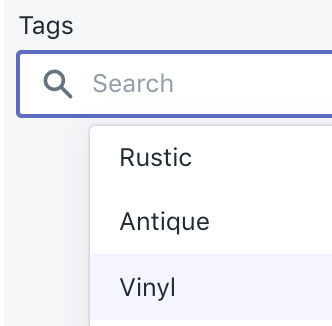
- Start from fresh reload of https://polaris.shopify.com/components/forms/autocomplete
- Select
Vinyl - Backspace
Vinylstill appears as selected, so in the example,this.state.selectedstill has it set.
This one may be kinda on the user of the Autocomplete to adjust state sanely. At the very least, perhaps this is a misleading example because in this case, you should avoid setting <Autocomplete>'s selected prop entirely. We could just adjust the example in the docs here?
There's a mental disconnect between the "selected" element wrt popover, and the text that appears in the TextField, this could tend to lead people to assume the element is "cleared" but still has an element selected.
Contrast is too low on selected/focused elements
Vinyl is selected, and Refurbished is my keyboard focus, and Rustic is my mouse :hover. I expect :focus/:hover to all be the same color, and probably having more "pop" than the selected styled. Perhaps the selected style should have a flat checkmark SVG to the left of it instead of a background color to facilitate :hover/:focus picking?
Enter key should automatically select first option for you
- Start from fresh reload of https://polaris.shopify.com/components/forms/autocomplete
- Start typing
A - Enter key
- I expect
Antiqueto be selected, but nothing happens
Tab key doesn't work
With all of the above issues, my next intuition as a user is to hit tab key. This just flashes the popover and doesn't seem to do much else, but I would kinda expect it to focus the popover innards for me to select something (if there are innards)
When the autocomplete is the last input element on the page, it seems to trap Tab key entirely, not allowing me to loop through the elements on the page anymore
Visual clipping on example with "Multiple tags autocomplete"
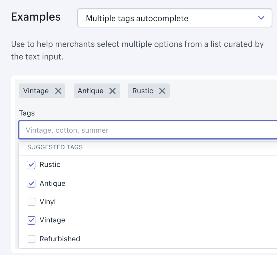
Clicking issue with multiple tags in autocomplete
Similar to above issue titled Elements below the fold in the popover do not emit onChange events, if you have multiple checkboxes below the fold in the Multiple tags autocomplete example, you require 2 clicks to activate or deactivate them
 qq99
qq99
All 13 comments
👋 Thanks for opening your first issue. A contributor should give feedback soon. If you haven’t already, please check out the contributing guidelines. You can also join #polaris on the Shopify Partners Slack.
![probot-shopify[bot] picture](https://avatars2.githubusercontent.com/in/10530?v=4&s=40) probot-shopify[bot]
on 26 Jun 2019
probot-shopify[bot]
on 26 Jun 2019
cc/ @dleroux
 AndrewMusgrave
on 26 Jun 2019
AndrewMusgrave
on 26 Jun 2019
I was thinking to create a SearchableSelect element in Polaris for use when:
- you have all your data in client side (ie no need to do network calls while typing)
- you want a
<select>element essentially, but you also want to allow users to quickly search & interact with it via keyboard - when blurred & invalid option, it clears the options / reverts back to your last selection
- the options filtering as you type happens for you automatically; this component requires you to manually filter your options as you type, which was a bit surprising to me at first, but I can see that it gives you more power in how to filter. I would build substring and L-distance into it as a default
qq99
on 26 Jun 2019
Oh, how about searchable prop added to <Select>? I could give that a shot
qq99
on 26 Jun 2019
Thanks for this thorough issue @qq99. We're actually just starting a project to redo the Autocomplete because of the issues you stated above and a few more.
I'm not sure a SearchableSelect is something we would do in Polaris just because of Autocomplete is very similar and I would think both would implement the Combobox aria specs in the same way.
That said don't let this stop you from doing this for your project if this is something you need. Version 4 of Polaris is just around the corner and this AutoComplete will most likely be a breaking change, therefore, won't make it in for a while. Was there something Autocomplete didn't do for you? If so maybe we can collaborate and see if it can be added in the next version.
 dleroux
on 27 Jun 2019
dleroux
on 27 Jun 2019
Was there something Autocomplete didn't do for you?
Well, mostly the bugs, otherwise it is _almost_ like SearchableSelect.
The key features for SearchableSelect imo are:
- I can upgrade any
<Select>to become searchable with just a single prop without having to recode things - I don't have to implement my own searching & filtering of
optionswithin my component. A simple search impl should be provided by component. Imagine if every<select>in admin had to implement their own filtering vs. the ease of just adding<Select options={[...]} searchable />. Adding the prop becomes a dead simple upgrade for everyselectelement (why would you not want it on every<select>?) - Keyboard controls need to be rock solid (like polaris-rails implementation). Enter key to select first element is key.
re Item 2: I can code up easily enough, and it's neat that I have the flexibility to search however I want. I can see that being powerful to search by aliases (e.g. "Canada" or "CA", "Japan" or "日本" or "JP"), hit the network to search for new options, etc. Being able to supply a lambda or something is something I'd wanna consider if I were to implement a searchable select
re Item 3: I think I _could_ add Enter to select first item onto the existing Autocomplete too, but it's another thing I kinda feel like should be part of a default behaviour
qq99
on 27 Jun 2019
This might be a good Polaris-next candidate and see how it gets used. Are you good with taking that approach?
dleroux
on 27 Jun 2019
Sounds good :) It might be some time before I get to building that, but the approach sounds great
qq99
on 27 Jun 2019
Hello! Thanks for issue. I had the same problems as “Clicking on a problem with multiple tags during auto-completion”. As I understood, we will not get a solution in the near future. So I use my own components for auto-complete. MB this will be useful for someone.
The gist here.
However, I have a problem with scroll on update list (load more, select item near the end of list). The list scroll to top on update. If you have a solution, please let me know!
 Julia-Lavrova
on 10 Jul 2019
Julia-Lavrova
on 10 Jul 2019
Autocomplete is currently being reworked as a part of the AutoComplete component project. Once we address this problem in the reworked component, we’ll close this issue.
dleroux
on 18 Jul 2019
This issue has been inactive for 180 days and labeled with Icebox. It will be closed in 7 days if there is no further activity.
probot-shopify[bot]
on 14 Jan 2020
We want to let this icebox? AFAIK the bugs are still present
qq99
on 23 Jan 2020
Yes, all the autocomplete bugs were Iceboxed last week while I was on holiday. They should be reopened.
We were tackling these as part of a project which is now on hold. We're in the process of sorting priorities and hoping these all get tackled sooner than later.
dleroux
on 23 Jan 2020
Related issues
 cgenevier
·
3Comments
cgenevier
·
3Comments
 greghesp
·
3Comments
greghesp
·
3Comments
 vilav
·
3Comments
vilav
·
3Comments
 danrosenthal
·
3Comments
danrosenthal
·
3Comments
 HYPD
·
3Comments
HYPD
·
3Comments