Polaris-react: Action prop for `Toast`
Feature request summary
Add an Action prop for Toast component.
Rationale
In the online-store rebuild, we have two use cases for that, one is a Toast for no internet connection, it would be useful to have an action Retry on this Toast.
Another use case is still on the rebuild, but in theme-editor where you can Undo actions on the success Toast.
🌟 Feature requests that are not yet planned will be closed. We then use the issue’s :+1: upvotes to track and set priorities. See the contribution guidelines for more information.
 MateusJabour
All 19 comments
Hi @MateusJabour! For the types of actions you're describing, we'd recommend using the Banner component, since it's scoped for notifying users of critical issues and could also be used to provide an Undo option for users.
The main issue with using Toast for issues that users need to act on is because they're easy to miss, and the action to retry or undo would need to be done before the message disappears. This has accessibility and usability implications.
For the connection error, this discussion about admin errors and Toast might be helpful: https://github.com/Shopify/polaris-ux/issues/182
 dpersing
on 6 Nov 2018
dpersing
on 6 Nov 2018
Closing this, since adding an action prop is not appropriate for Toast.
 solonaarmstrong-zz
on 7 Nov 2018
solonaarmstrong-zz
on 7 Nov 2018
I'd like to reopen this discussion as I feel it warrants further discussion.
I don't feel like rendering a banner component is always appropriate, and actually poses more UX challenges:
- In the case of actions triggered from a modal, where would you display a banner?
- What if there are already banners on the page or in the modal?
- Displaying a banner means you typically need to take the user out of context, for instance by scrolling the page all the way to the top so that the banner is visible.
Looking at the guidelines for when to use Banner, they should be used to display information about important changes or persistent conditions. Neither of these apply to intermittent connectivity issues in my opinion.
In contrast, here are the guidelines for Toast:
The toast component is a non-disruptive message that appears at the bottom of the interface to provide quick, at-a-glance feedback on the outcome of an action.
To your point, it is true that Toast actions are easy to miss, but I feel like there are other solutions to this problem. For instance, we could set guidelines for the minimum duration a Toast should be displayed if it is accompanied by an action, or add the ability to display permanent Toast messages that need to be manually dismissed.
Here is a use case for which I don't think any solution other than a Toast with an action would be appropriate. In the case of embedded apps (apps that are on a separate service, rendered in an iframe), while the iframe is loading, we render a skeleton and display a loader to give immediate feedback to the user that the page is loading.
If the page takes longer than 60 seconds to load, we render an error page informing the user that the page failed to load, with a call to action to retry.
It's difficult for us to distinguish if the page is taking long to load due to slow connectivity or if there is an issue with the service that renders the embedded app, so we would like to give the user actionable, non-disruptive feedback in the form of a Toast message to inform the user that the page is taking longer than usual to load, with the option to retry right away rather than having to wait for 60 seconds to get feedback. If the user knows they have a fast connection, they can retry right away. If they know they are on a slow network, they can decide to wait longer and ignore the flash message.
We feel like displaying a banner in this scenario would be disruptive and inappropriate.
 clauderic
on 7 Nov 2018
clauderic
on 7 Nov 2018
Hi @clauderic! Any new thoughts on this?
If the most critical part of the interaction is a "Retry" option, I'm wondering if another solution might be use a modal. Users could either "Retry" to reload the page (the primary action) or "Cancel" to let the page continue to try to do its thing (the secondary action).
(Any thoughts @sarahill?)
dpersing
on 20 Nov 2018
Hey @dpersing, I feel like a modal would be a bit too intrusive in this case, and potentially jarring should the page finish loading momentarily after the modal was displayed.
I still feel like a flash message with an action would be the least intrusive approach here.
clauderic
on 20 Nov 2018
Hey @clauderic, @danrosenthal and I discussed this for bit on Slack while I was Polaris ATC last week and I forgot to sum up his comments here:
This is a fairly common pattern in UIs. I think this is something we should strongly consider supporting. Online store web needs it, and they would be forced to fork Toast without us supporting it. Even if admin doesn’t support it yet, lots of other apps might want it. Forking Toast would be non-trivial, as it relies on Frame, Toast Manager, etc.
It's not on our roadmap at the moment, but PRs are welcome! If it's blocking you, adding the Blocking Web label as well as indicating the level of urgency via one of the Priority labels helps us ensure we know to prioritize the issue/request 😺
 chloerice
on 20 Nov 2018
chloerice
on 20 Nov 2018
☝️ I agree we should consider supporting this. Seems like something that generally would scale nicely for different cases in the admin.
Although, the modal could potentially work too. I could see it being similar to the interaction inside of a browser where if the page isn't loading you get a modal with the option to "Keep waiting" or "Cancel". Could you also enhance that experience by detecting if the page has loaded and then closing the modal automatically?
I do think we should consider the toast with actions but I would also want to be thoughtful about when this appropriate to use vs. banner, modal and why it's the better solution.
 sarahill
on 21 Nov 2018
sarahill
on 21 Nov 2018
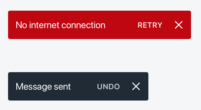
@MateusJabour How about something like this for the actions:
sarahill
on 4 Jan 2019
Here are a couple of options for the action hover state. Open to thoughts on both. The color contrast, especially on the red, is tough. Maybe we can get away with an underline and text color change.. we can play around with that a bit.

sarahill
on 4 Jan 2019
@sarahill What about the link without the border, but with a background hover state?
MateusJabour
on 4 Jan 2019
Yea, that's my preference. I was having trouble finding a good contrast that passed the 3.1:1 between the toast bg and button bg and a 4.5:1 contrast between button bg and text. The default toast contrast is fine it's just the red that's tough. I'll mess with the colors a bit more. @dpersing thoughts on this?

sarahill
on 4 Jan 2019
I think I will need to change the max-width of the Toast, currently it's on 400px, what value would you suggest?
MateusJabour
on 4 Jan 2019
The default toast contrast is fine it's just the red that's tough.
@sarahill I'm a fan of the outline on the control by default. I know that the all-caps-alone pattern is common for these types of calls to action, but we use all caps for other things in admin, such as <h3> subheadings. Since the text color is the same for the control and the static text, the outline feels like a safer choice. 👍
dpersing
on 4 Jan 2019
Sorry, for the delayed response to this!
I think I will need to change the max-width of the Toast, currently, it's on 400px, what value would you suggest?
☝️ is this because of space for message + action?
sarahill
on 8 Jan 2019
@sarahill That's it 👍
MateusJabour
on 8 Jan 2019
@MateusJabour
Ok, I did a little more exploration on this. The border on hover passes contrast. The background looks nice but it's hard finding a bg + color that gets contrast on all the levels. @ry5n do you have any thoughts on this?
I'm showing a max-width of 720px here.
Background on hover:
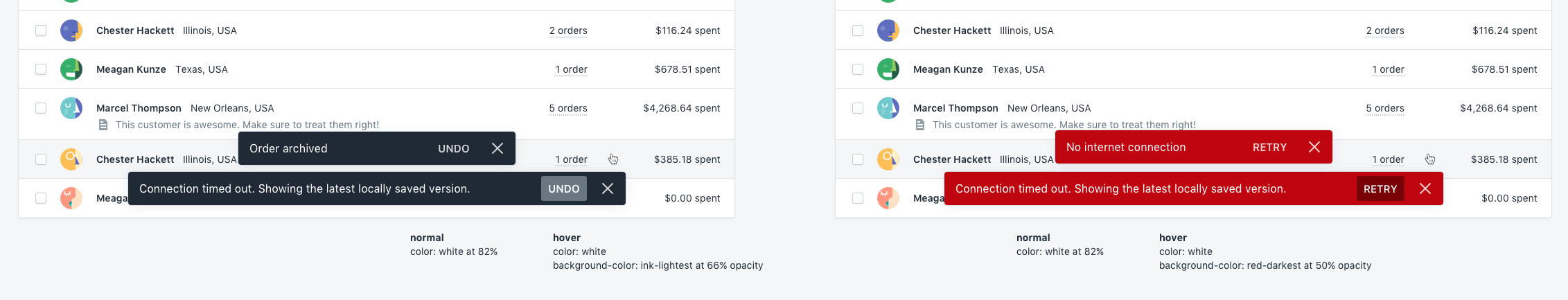
Border on hover:

sarahill
on 8 Jan 2019
I don’t mind adding secondary actions to toasts. We do have a couple solutions for colorized backgrounds (in banners, outline buttons and monochrome links). Have we tried those button styles here?
 ry5n
on 8 Jan 2019
ry5n
on 8 Jan 2019
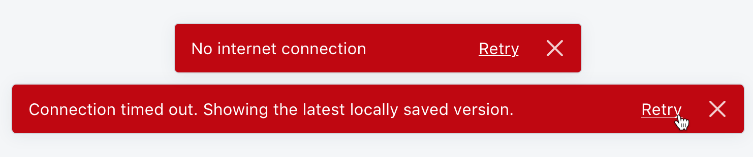
Outline buttons could work but I think we'd have to tweak the colors a bit to work against the different backgrounds.
Monochrome links are a good suggestion and I think that might be the best for accessibility. Keeps it straightforward too.
For reference @MateusJabour https://github.com/Shopify/polaris-react/pull/821
sarahill
on 9 Jan 2019
This sounds super cool and came looking for this feature request because todoist has a great toast with "undo" action.
 sam-cnet
on 25 Jan 2019
sam-cnet
on 25 Jan 2019
Related issues
 mbaumbach
·
3Comments
mbaumbach
·
3Comments
 greghesp
·
3Comments
greghesp
·
3Comments
 vilav
·
3Comments
vilav
·
3Comments
 cgenevier
·
3Comments
cgenevier
·
3Comments
 alex-page
·
3Comments
alex-page
·
3Comments
Most helpful comment
Outline buttons could work but I think we'd have to tweak the colors a bit to work against the different backgrounds.
Monochrome links are a good suggestion and I think that might be the best for accessibility. Keeps it straightforward too.
For reference @MateusJabour https://github.com/Shopify/polaris-react/pull/821