Polaris-react: Poor documentation result in Polaris is nice but hard to use
Issue summary
Poor documentation.
Expected behavior
Documentation must be improved with more working code examples, and how-to topics.
Actual behavior
Just a few issues.
There is no clear explanation to structure a page with Layout and Page components, should Layout contains Page?
I see forms are with white background in Shopify's apps but in the documentation, FormLayout is gray. Do I always need to wrap a FormLayout in a Card, or Card in a FormLayout? No information.
Regarding forms, there is no form tag in FormLayout at all so how do I submit a form? Although there is a Button type submit but submit what?
There are many actions in components' header/footer I can see only its content property? I'm questioned myself what happen if I click on these actions?
Regarding ColorPicker, what are Color and HSBAColor types? why aren't they linked to other pages so anyone can find out easily?
Specifications
- Polaris version: 1.8.2
 tiendq
All 18 comments
Hi @Tiendq, thanks for input! We are currently working on improving code examples and will be adding documentation for page structure. The improved examples should address your concerns with forms, content, and color.
 tmlayton
on 26 Oct 2017
tmlayton
on 26 Oct 2017
Sorry for commenting without any solution to the issue but I would like to add that components for EmbeddedApps are even more difficult to understand without a proper documentation (working app).
For example, I'm struggling with the Alert component since I cannot make it appear and I'm not sure if it is because its not running from within an EmbeddedApp or because I'm not using it appropriately.
 martosoler
on 1 Nov 2017
martosoler
on 1 Nov 2017
Here's another one:
How do I add onClick to a Polaris Page Component primaryAction button?
 tim-phillips
on 5 Dec 2017
tim-phillips
on 5 Dec 2017
Hey @babenzele, all actions take an onAction prop that handles click events (as well as tabbing to the action and pressing enter/return).
 chloerice
on 5 Dec 2017
chloerice
on 5 Dec 2017
Right, but where is that in the documentation?
tim-phillips
on 5 Dec 2017
Outside of the prop list for Action, it's not indicated anywhere. The nested properties of props that are objects are not currently documented, but this is definitely high priority. We're currently discussing the best way to document this missing context.
chloerice
on 5 Dec 2017
I had an idea while looking through src/types.ts (I was using it as documentation to learn about all the different action types). Since this library uses TypeScript, we could have the props section of the docs pages automatically generated from the types. Self-documenting code! That TYPE column could then link to types, and it would always be up to date.
Anyways, just an idea.
tim-phillips
on 30 Jan 2018
Thanks @babenzele, this is something we're currently looking into. Great minds 😃
 kaelig
on 30 Jan 2018
kaelig
on 30 Jan 2018
Good idea @babenzele! That's one of the things we're exploring right now via react-docgen-typescript
chloerice
on 30 Jan 2018
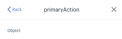
We’ve recently made some major improvements to the React props documentation on polaris.shopify.com. For example, on the page component you can now click on the primaryAction prop to see the shape of the object it expects.
We’ve also added some documentation that better explains the layout system: https://polaris.shopify.com/patterns/layout
We’re working to make this even better when it comes to showing complete code examples that compose many components together.
In the meantime here is a basic structure that gives a more complete idea of how composition typically looks in code, with several layers of components.
Check out this codesandbox example for a more detailed version of the same.
// AppProvider is required
<AppProvider>
  <Page title="Example settings page">
    <form onSubmit={() => { /* handle submit */}}>
      <Layout>
        <Layout.AnnotatedSection
          title="Selling and shipping"
          description="Manage products, pricing, shipping and customer notifications."
        >
          <Card sectioned title="Shipping">
            <FormLayout>
              <Checkbox />
              <TextField />
            </FormLayout>
          </Card>
        </Layout.AnnotatedSection>
      </Layout>
    </form>
  </Page>
</AppProvider>
 ry5n
on 2 Jun 2018
ry5n
on 2 Jun 2018
For example, on the page component you can now click on the primaryAction prop to see the shape of the object it expects
Something seems to be borked in Chrome Canary 70.0.3503.0, MacOS 10.13.6:
 jjt
on 26 Jul 2018
jjt
on 26 Jul 2018
Same thing in Firefox stable, just shows Object and not the shape of the object 🙃
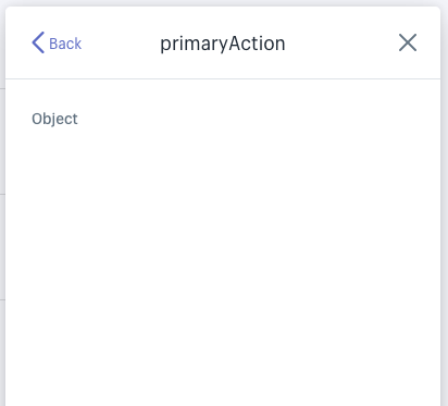
jjt
on 26 Jul 2018
@jjt Thanks for flagging this. @harbify Can you take a look?
ry5n
on 27 Jul 2018
@jjt thanks for finding this. @ry5n I'm on it!
 harbify
on 30 Jul 2018
harbify
on 30 Jul 2018
You're welcome, and thanks for responding to it in a timely manner :)
On 30 Jul 2018, 11:00 -0700, Dimitris Psaropoulos notifications@github.com, wrote:
@jjt thanks for finding this. @ry5n I'm on it!
—
You are receiving this because you were mentioned.
Reply to this email directly, view it on GitHub, or mute the thread.
jjt
on 30 Jul 2018
Unfortunately the problem has not been solved yet.
If you actually have the documentation,
you could simply attach it to the project on GitHub as a plain text file.
This would solve the problem by almost 100%.
 dead-drunk
on 2 Aug 2018
dead-drunk
on 2 Aug 2018
You’re right, it hasn’t been solved yet. The documentation for types is automatically generated, so I can’t point to a single spot for the example of the page component’s primaryAction prop. The good news is that this info is always present, complete and up to date in the source code. I can look in the page component for instance to see that primaryAction has the combined keys of DisableableAction and LoadableAction. Those are both described in the shared types file.
That’s not to say you should have to do this—you shouldn’t.
ry5n
on 14 Aug 2018
👋 Hey everyone! Thanks so much for all the input – as @ry5n mentioned we have done a lot to improve docs and, since the latest comments, the props explorer has been fixed. I’m going to close this issue, but new issues are definitely welcome for any specific areas where we can improve docs.
Taking a step back for a moment, I think it is worth mentioning our goal is to enable people to quickly craft high quality products for the Shopify platform and good documentation is an important part. If there is anything we can do documentation-wise, or otherwise, to speed up development we would love to hear your ideas. Thank you! 💜
tmlayton
on 16 Nov 2018
Related issues
 mbaumbach
·
3Comments
mbaumbach
·
3Comments
 pbojinov
·
3Comments
pbojinov
·
3Comments
 shahab65
·
3Comments
shahab65
·
3Comments
 danrosenthal
·
3Comments
danrosenthal
·
3Comments
 alex-page
·
3Comments
alex-page
·
3Comments
Most helpful comment
We’ve recently made some major improvements to the React props documentation on polaris.shopify.com. For example, on the page component you can now click on the primaryAction prop to see the shape of the object it expects.
We’ve also added some documentation that better explains the layout system: https://polaris.shopify.com/patterns/layout
We’re working to make this even better when it comes to showing complete code examples that compose many components together.
In the meantime here is a basic structure that gives a more complete idea of how composition typically looks in code, with several layers of components.
Check out this codesandbox example for a more detailed version of the same.