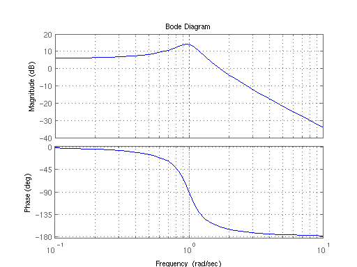
I wanted to create a bode plot using plotly.js (Awesome framework btw guys, thumbs up for that). Now I stumbled upon some problems. The main problem is, is that tickmode: 'array' does not work when the axis type of the plot is type: 'log'. As such, you cannot use tickvals and ticktext.
In my current plot the x-axis of the plot (log-scale) the labels are formatted as: 10, 20, 50, 100, 200, 500, 1000, this is chosen by Plotly. However, I only want the labels 1, 100 and 1000. This I can easily establish, via tickmode: 'linear' for instance. However, doing this will remove all the tick lines for 20, 50, 200 and 500. So I tried forcing the tick lines via setting tickmode: 'array' and as follows tickvals: [10,20,30,40,50,60,70,80,90,100,200,300,400,500,600,700,800,900,1000] and ticktext: ['10','','','','','','','','','','100','','','','','','','','','','1000']
So what I want to end up with, are only the labels + ticklines of multiple of 10 and the ticklines of 20,30,40...,100,200,300,...,1000 et cetera.

Codepen example: https://codepen.io/anon/pen/EpdqzQ
All 3 comments
Thanks for the report @WG-
Oddly enough it works if you don't tell it to use tickmode: 'array' but provide tickvals and ticktext anyway so the plot infers tickmode: 'array' https://codepen.io/alexcjohnson/pen/QBJdQV?editors=0010
But you're of course correct that this isn't the intended behavior!
(see also #903, which would be the better solution once we et around to implementing it)
Thanks @alexcjohnson for the workarround, and indeed #903 would indeed be a better solution.