Pfelk: Redesign the index template for Maps support
Is your feature request related to a problem? Please describe.
Currently, we cannot use Maps in dashboards, because the current index patterns stores the geo fields as float. Which is a problem, if one would want to create point-to-point or grid aggregation layers in Maps.
Describe the solution you'd like
We should use geo_point and/or geo_shape fields in the index pattern to have this ability.
 fktkrt
All 21 comments
I was not paying attention, using the GeoIP template could be almost all that is needed to achieve this. Testing a few functions, then I will update the README and any other relevant files. Finally, I will add a few Maps.
Alternatively we could add the geo_point fields without the index template, we can focus on that later, if needed.
fktkrt
on 19 Dec 2019
Yes, the original template is working.
A Maps panel is now added to the Suricata dashboard with 3 layers:
- DEST location as point/heatmap
- SRC location as point/heatmap
- SRC -> DEST point-to-point lines
It can be added to the to pfSense dashboard as well, but the reason I used it in the Suricata one is it looks better suited for fewer data points, especially the point-to-point visualization.
fktkrt
on 19 Dec 2019
Is this like the network map in the SIEM? with points and connecting lines?
If we are filtering the GeoIP lookup to exclude the src/dest when its private - does it still work?
 revere521
on 19 Dec 2019
revere521
on 19 Dec 2019
Yes, it is similar, although this way you can set up specific things with more flexibility. To have the full advantages of SIEM you have to use the "official" filebeat-to-suricata method.
fktkrt
on 22 Dec 2019
If I have more time, I will try to create a generic Maps visualization for testing purposes.
fktkrt
on 24 Dec 2019
This is a generic demo which visualizes the pf-* index in Maps format. It has the following layers:
- SRC as points (source.geo.location)
- DEST as heatmap (destination.geo.location)
- SRC -> DEST as point-to-point (source.geo.location -> destination.geo.location)
with the Road Map (EMS Basemaps) under these.
Be advised: it visualizes everything in pf-* by default, you can modify/filter it to your needs.
maps_demo_pf.zip
fktkrt
on 30 Dec 2019
Thats super cool! I already added it to my default dashboard and the snort dashboard to play with! Since its just pulling from the geohash tables, all i seemed to need to do for snort was set a KQL filter of "tags : snort" to get it to filter just the snort stuff on that dashboard (i saved it as a copy). For the main pf dashboard it picks up everything by default correctly.
Nice!
revere521
on 30 Dec 2019
Crap - i didn't mean to close this - it was a mis-click - I'm sorry about that
revere521
on 30 Dec 2019
I am glad that it seems useful to others as well. We should incorporate some default filtering for the main pf board, since it is just a showcase of features at the moment.
Also we should be notified by the changes caused by https://github.com/a3ilson/pfelk/issues/67
fktkrt
on 31 Dec 2019
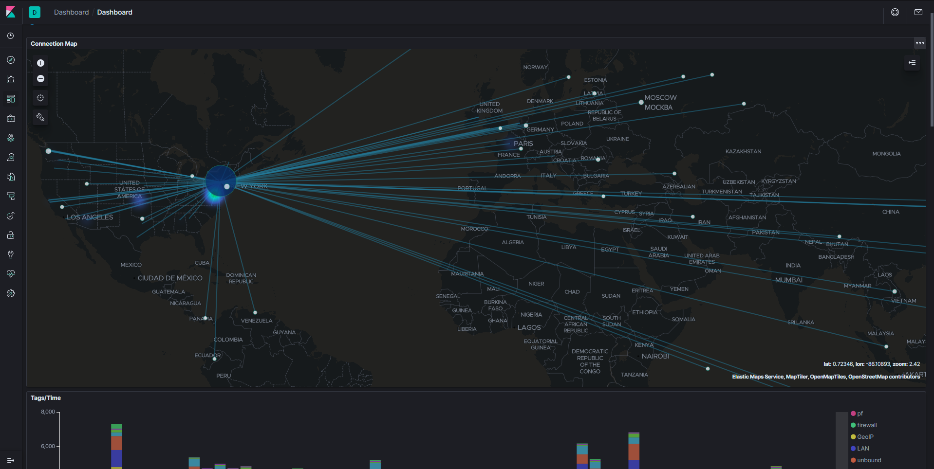
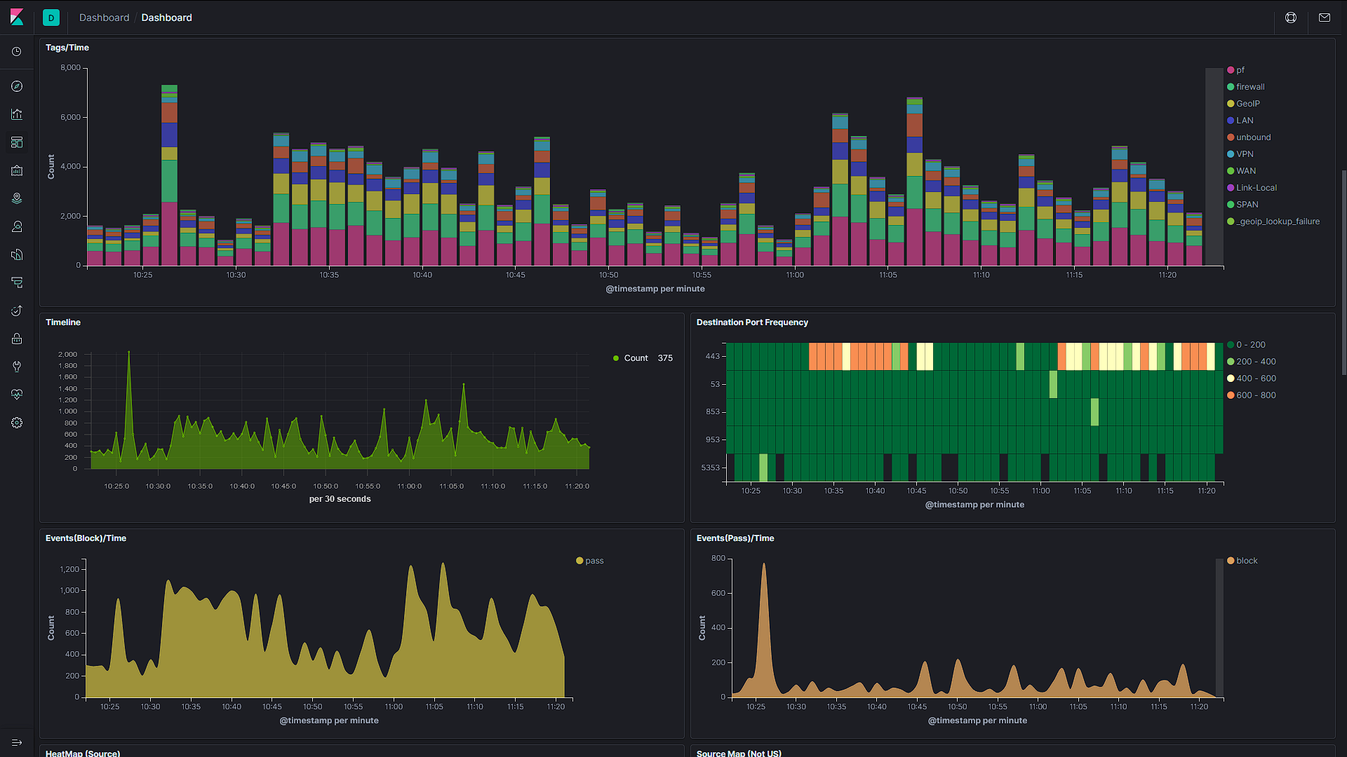
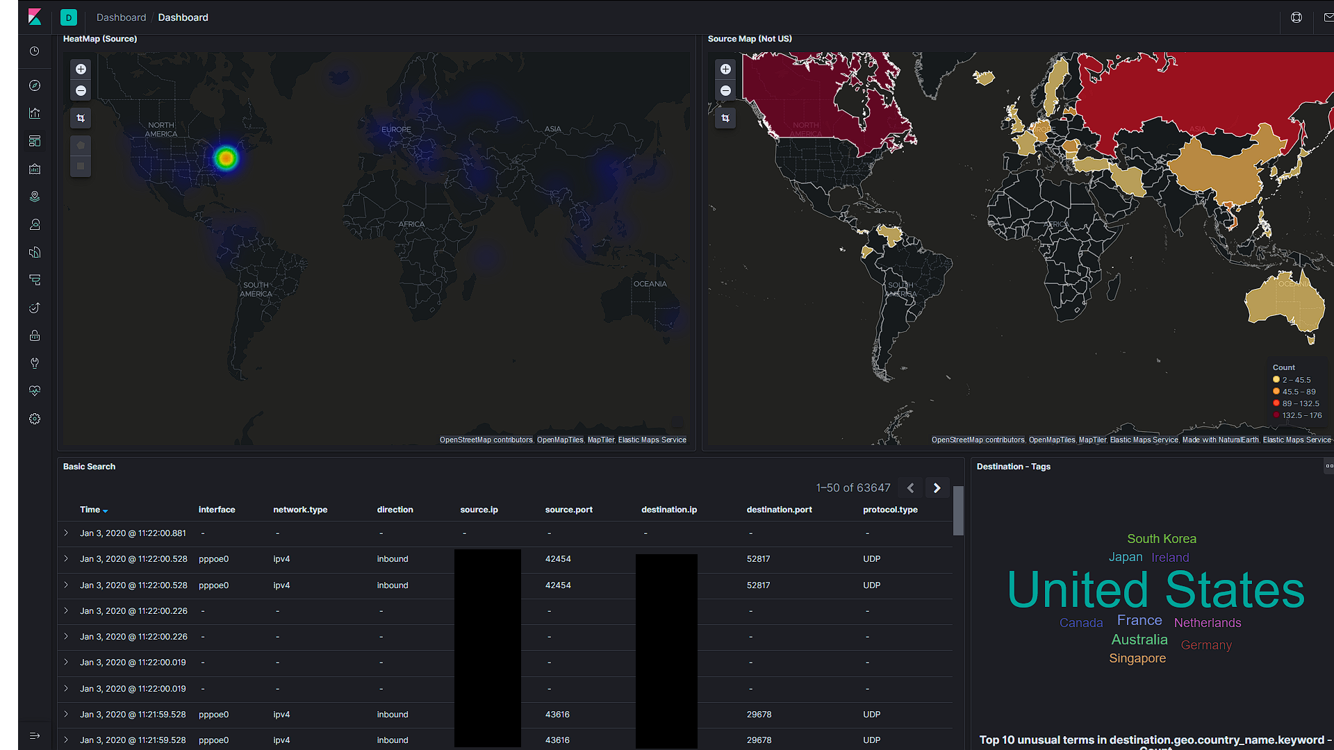
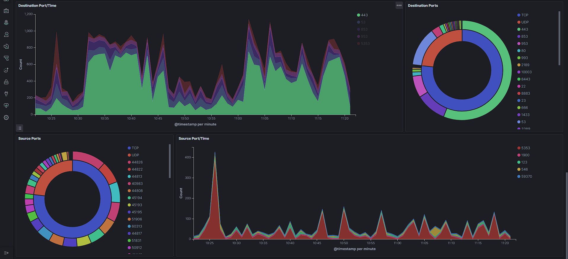
It seems to work great as is on the main dashboard. Been using it for a few days now and I really like it. I added it to the top of the board so it dominates the main view :)
Here is my layout (i kept the original maps as well for now)
revere521
on 3 Jan 2020
Nice!
Your 'Connection Map' seems quite clear. Are you filtering the pf index, or is this your actual traffic?
fktkrt
on 3 Jan 2020
I just renamed your panel to that to differentiate between this one and the one i added to my snort dash. The dashboard filters on pf-* by default, so i did nothing other than add the panel. for the snort dash, i filtered on tags : snort
I did reduce the thickness and opacity of the line connections - and this is 1 hr of traffic, more than that and it does start getting very full at this level, but you can really dive into it with the zoom
revere521
on 3 Jan 2020
So, should we include the Maps visualization in the main dashboard by default?
I can make a proposal for the main pf dashboard as well (the Suricata one already has it).
fktkrt
on 5 Jan 2020
Could not think of a better layout than posted above, so for now, here it is.
KibanaExport.zip
If it seems fine, I can commit it, then close this issue.
fktkrt
on 6 Jan 2020
That works for me just fine, once you do i can export my visually similar snort dashboard layout as well
revere521
on 6 Jan 2020
NewMap_KibanaExport(dark+geo).zip
NewMap_SnortDashboard(dark+geo).zip
I exported the view i posted above with your map and the similar snort one, if thats easier - up to you
revere521
on 8 Jan 2020
It is fine with me.
@a3ilson, since this is your dashboard originally, what do you think?
fktkrt
on 14 Jan 2020
I’m good and appreciate all the work and changes you all have made!
On Tue, Jan 14, 2020 at 03:52 fktkrt notifications@github.com wrote:
It is fine with me.
@a3ilson https://github.com/a3ilson, since this is your dashboard
originally, what do you think?—
You are receiving this because you were mentioned.
Reply to this email directly, view it on GitHub
https://github.com/a3ilson/pfelk/issues/65?email_source=notifications&email_token=AEA2HR3V5KYFZ5DH6TA2MNTQ5V4MPA5CNFSM4J4HHTAKYY3PNVWWK3TUL52HS4DFVREXG43VMVBW63LNMVXHJKTDN5WW2ZLOORPWSZGOEI3ZUIQ#issuecomment-574069282,
or unsubscribe
https://github.com/notifications/unsubscribe-auth/AEA2HR5XQZ7VMK23BXVURGTQ5V4MPANCNFSM4J4HHTAA
.
 a3ilson
on 14 Jan 2020
a3ilson
on 14 Jan 2020
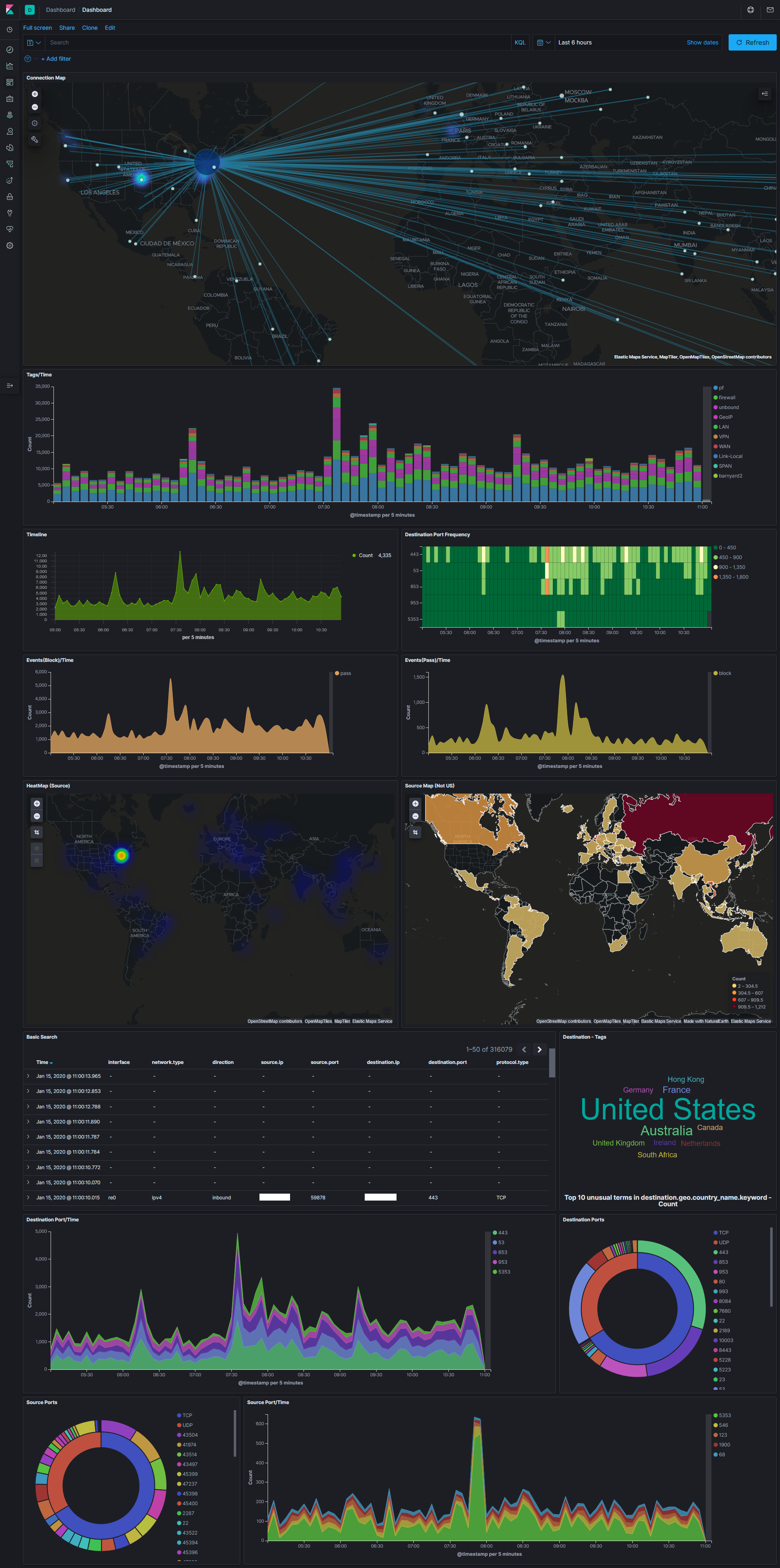
If someone can shoot a nice screenshot with the newly added Maps visualization, we can maybe switch the main image in README.
fktkrt
on 16 Jan 2020
how's this?
revere521
on 16 Jan 2020
That’s perfect!
On Thu, Jan 16, 2020 at 07:49 revere521 notifications@github.com wrote:
how's this?
[image: DashboardScreenCapture]
https://user-images.githubusercontent.com/23560313/72526439-6ad4b080-3834-11ea-97d2-2fcca31a151c.png—
You are receiving this because you were mentioned.
Reply to this email directly, view it on GitHub
https://github.com/a3ilson/pfelk/issues/65?email_source=notifications&email_token=AEA2HR4KETK5X2UUXCPDXRDQ6BJVRA5CNFSM4J4HHTAKYY3PNVWWK3TUL52HS4DFVREXG43VMVBW63LNMVXHJKTDN5WW2ZLOORPWSZGOEJD6HSY#issuecomment-575136715,
or unsubscribe
https://github.com/notifications/unsubscribe-auth/AEA2HRYB33WZS6BO6AKA6J3Q6BJVRANCNFSM4J4HHTAA
.
a3ilson
on 16 Jan 2020
Related issues
 rrosson
·
14Comments
rrosson
·
14Comments
 wylde780
·
12Comments
wylde780
·
12Comments
 geomaraugusto
·
13Comments
geomaraugusto
·
13Comments
 squirrelboot
·
12Comments
squirrelboot
·
12Comments
 collse
·
8Comments
collse
·
8Comments