Papirus-icon-theme: update icon ,photoshop,team fortress,wps office....
I respect this professional project and wish it more success
I have a note in some icons that it is disappointing and bad in terms of appearance, colors. I wish to make a greater effort to improve it
This is a list most icons required to change it from my point of view..
http://i.imgur.com/cT8bsgG.png
thank you team
 ramzydoni
All 34 comments
Hi, @ramzydoni .
What do you propose? Can you show us any new icon redesign you made? ;)
 jEsuSdA
on 25 Jul 2017
jEsuSdA
on 25 Jul 2017
@ramzydoni appearance can be subjective. But you can always raise a request to redesign things. I am up for some redesigning of icons that are not ageing gracefully.
About the colours we might have a palette change sometime in future. But for such a large project it might be a little time consuming.
Rest assured that we are working to make the project better each day :)
 azadaquib
on 25 Jul 2017
azadaquib
on 25 Jul 2017
jEsuSdA sorry I am not a designer of icons
but I would help if necessary
This simple suggestion is a usb icon
http://i.imgur.com/tcICOgG.png
Sometimes you can only change the appropriate color ..
ramzydoni
on 25 Jul 2017
I don't like this icons... ouh :)
Please fork and draw better.
 varlesh
on 25 Jul 2017
varlesh
on 25 Jul 2017
We not draw only circle or square icons.
Main HIG it's:
- warm color tone
- layering style (moving dark to light)
- light up stroke (10/20%) and down shadow (20&)
- pixel align
- mainly single size
- solid color filling (no gradients, no long shadow, no blur, no transparent, no glow effect)
varlesh
on 25 Jul 2017
varlesh! xd First I'm not a designer
2- This icon i am not designed I just changed the color :D
ramzydoni
on 25 Jul 2017
and what you want change?
varlesh
on 25 Jul 2017
Why not? The proposal is only for a designer
ramzydoni
on 25 Jul 2017
Ok... Moving on the list
popcorntime
what you don't like on this icon?
varlesh
on 25 Jul 2017
icon update also need to improve
ramzydoni
on 25 Jul 2017
it's all?
Original:

Papirus:

your suggestions?
varlesh
on 25 Jul 2017
just like paper is great !
ramzydoni
on 25 Jul 2017
But why you not use Paper if you like Paper?
I don't like this icon, because this icon have strange blue layer on background (maybe it's seat, i don't know)
varlesh
on 25 Jul 2017
Also light-beige color (popcorn) and white (on the box) merged with little icon size. It's spoil perception
varlesh
on 25 Jul 2017
I dont like paper icon is poor
papirus better than all icon but only this icon I liked
Can also delete blue background ?
ramzydoni
on 25 Jul 2017
yes you can, SVG-sources available:
https://github.com/snwh/paper-icon-theme/blob/master/src/bitmaps/apps/popcorn-time.svg
varlesh
on 25 Jul 2017
OK very good
In short these icons can only be modified
http://i.imgur.com/PKRjxkh.png
ramzydoni
on 25 Jul 2017
system-software-update and grsync updated:
https://github.com/PapirusDevelopmentTeam/papirus-icon-theme/commit/824cd8c912f57b069da72cfebc0ff121065922f5?short_path=7d938b9#diff-7d938b9ca5c8aca6843e2fdf38a3b55b
varlesh
on 25 Jul 2017
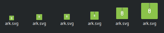
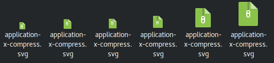
I don't know what you want change colors on this icons. All icons use warm tone and looks good... Maybe application-x-fictionbook need redesign (increase and remove some lines) Also not forgot, archive color (you don't like green?) icon used for mimes and this icons need change too.
For system-software-update and grsync i'm change only icon size (because visual icon have little size, but really size 40px). Colors not changed. Yellow and black - it's good combination.
varlesh
on 25 Jul 2017
If you really have idea, enhancement or want change style, color or etc.. PR's welcome!!!
draw/change icon on inkscape/gimp and show what you like
varlesh
on 25 Jul 2017
Sorry, we will not consider request "i don't like this icon - draw better". Need specific ideas and comments or mockups or preview
varlesh
on 25 Jul 2017
Some color icons are uncomfortable for the eye like the winrar
Green in this case the color is bad
http://i.imgur.com/chMTA0X.png
ramzydoni
on 26 Jul 2017
I just wanted to make the best of these suggestions. I might be wrong
ramzydoni
on 26 Jul 2017
Ok we will decide change color for archive or not
@jEsuSdA @azadaquib @SmartFinn what you think?
varlesh
on 26 Jul 2017
Yes color change would be better archive
ramzydoni
on 26 Jul 2017
I like the green. Previously I used Faenza icons where archives are green too. I don't like the Paper color, nor the Numix color for archives.
Paper color
Numix color
Papirus (a little darker)

 SmartFinn
on 26 Jul 2017
SmartFinn
on 26 Jul 2017
The green problem is uncomfortable for the eye
Why not try the color of numix i think it good?
ramzydoni
on 26 Jul 2017
I agree with @SmartFinn Paper icon faded and for light GTK Themes not good looking.
Like this or

this
Initialy Papirus create for KDE and main archive app Ark use beige-brown color, maybe it's better variant:

varlesh
on 26 Jul 2017
I prefer green too.
@ramzydoni, I think that if you want to do changes, please DO THEM. Saying to others doing changes it is not the same to do the work. As Linus Torvalds says when anyone suggest a change in the Linux kernel: "show me the code".
jEsuSdA
on 26 Jul 2017
The brown color looks very poor with compared to more colorful icons
SmartFinn
on 26 Jul 2017
ok, use darker green
varlesh
on 26 Jul 2017
varlesh
on 26 Jul 2017
jEsuSdA Next time I will design some icon
And put it in the group
ramzydoni
on 26 Jul 2017
thanks for listening all
That 's my mistake. I did not explain much how the icons look
ramzydoni
on 26 Jul 2017
Related issues
 mrceephax
·
6Comments
mrceephax
·
6Comments
 serovar
·
5Comments
serovar
·
5Comments
 fotonmoton
·
5Comments
fotonmoton
·
5Comments
 rauldipeas
·
5Comments
rauldipeas
·
5Comments
 Tichy
·
3Comments
Tichy
·
3Comments
Most helpful comment
Sorry, we will not consider request "i don't like this icon - draw better". Need specific ideas and comments or mockups or preview