Osu-web: Add a clear distinction for filter headers

Currently the filter headers Variant and Show blend into other filter options and it's not obvious which one is not the option.
 TPGPL
TPGPL
All 10 comments
Still working on it. Working on Search headers which will be related to it.
 arflyte
on 18 Jun 2020
arflyte
on 18 Jun 2020
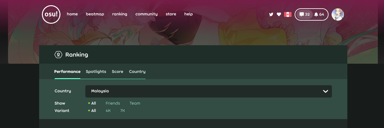
New filters, based on new beatmap filter designs.
arflyte
on 23 Jun 2020
Would be useful if it could be collapsed, because it looks just massive for me
 lmnyx
on 23 Jun 2020
lmnyx
on 23 Jun 2020
Agree that it is quite big. Actual page content will be only about 25% of the screen on certain aspect ratio devices, which feels pretty weird.
 peppy
on 23 Jun 2020
peppy
on 23 Jun 2020
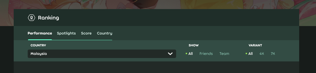
Tried a different layout, slightly different than beatmap filters (might need to update that one too). Less tall and compact.
arflyte
on 23 Jun 2020
So I guess that the filter in the beatmap discussions page needs a similar re-design (although it's understandable that it's the header):

There's also this one in the friends page, but it's slightly different:

 Gabixel
on 26 Jun 2020
Gabixel
on 26 Jun 2020
Tried a different layout, slightly different than beatmap filters (might need to update that one too). Less tall and compact.
I interested to implement this. Is this the final design?
 gagahpangeran
on 6 Jul 2020
gagahpangeran
on 6 Jul 2020
I think that is a safe assumption
peppy
on 6 Jul 2020
@gagahpangeran are you working on this?
 notbakaneko
on 14 Jul 2020
notbakaneko
on 14 Jul 2020
@notbakaneko still wip in my local, because I'm not sure If I should only change like the design (have a little hack) or modified the Sort component entirely (change the title position to top and the sort item at bottom). The last one will change all of Sort component in other page.
gagahpangeran
on 14 Jul 2020
Related issues
 TicClick
·
5Comments
TicClick
·
5Comments
 venix12
·
3Comments
venix12
·
3Comments
 Lyawi
·
4Comments
peppy
·
4Comments
Lyawi
·
4Comments
peppy
·
4Comments
 Xinnoh
·
4Comments
Xinnoh
·
4Comments
Most helpful comment
Tried a different layout, slightly different than beatmap filters (might need to update that one too). Less tall and compact.