Could it be toggleable between seeing your friends in a long list or one view on https://osu.ppy.sh/home/friends ? Like having a button above the headline or in settings how you would like to see them
Same exists on old site:
https://osu.ppy.sh/p/friends (long)
https://osu.ppy.sh/forum/ucp.php (one view)
I think people (including me) prefer the second since you don't have to scroll a lot. Won't be a valid reason but yeah, people (including me here again) often look at their friends list for whatever reasons cough
 Lyawi
Lyawi
All 14 comments
Backburner, but might be something worth considering.
 peppy
on 10 Oct 2018
peppy
on 10 Oct 2018
ah. another reason would be finding friends faster, you know? in the long list you need more time to find someone you search for if you're not using the search function right now. in one view it's way faster finding someone.
Lyawi
on 12 Oct 2018
this page also performs pretty poorly for me (probably because of how many cards are loading in?), I can make my browser freeze for a few seconds by scrolling down to the bottom
on Chrome 69.0.3497.100 on two different computers, if that's relevant
 cl8n
on 12 Oct 2018
cl8n
on 12 Oct 2018
Should be considered on redesign in #4232.
 Joehuu
on 25 Apr 2019
Joehuu
on 25 Apr 2019
lemme bump this quickly, i did a poorly image to imagine
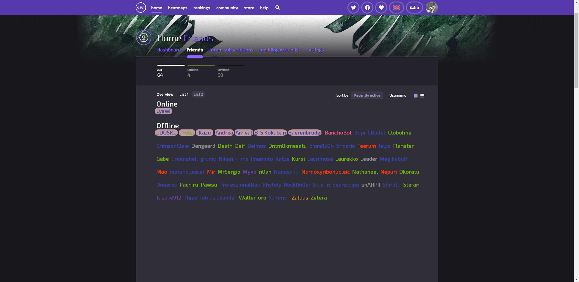
there are "buttons" to choose between first list and the second above the list so everyone could decide what they want to look at
current friendlist looks cool, but its not worth scrolling it all down to look for someone's name (i know search function exist but this isnt the same) or uh..just looking at them? that's why i said "in one view"
please also add the mutual thing behind the names so you could directly see it
Lyawi
on 21 Aug 2019
As a compromise, how do you feel about changing list view to something like this? Is this compact enough for you?

(and with a bit of redesign, we can fit mutual status in the list view too)
 nekodex
on 22 Aug 2019
nekodex
on 22 Aug 2019
if the idea is to get the whole list on one page, you could probably drop the country, supporter badge and online status to save a lot of space
cl8n
on 22 Aug 2019
What is the use case for wanting "everything on one page"?
peppy
on 22 Aug 2019
@peppy the new friendslist doesn't have any use for me anymore because its just big. i used to click my friend's profiles there and having a view of seeing who mutualed me and who doesn't
Lyawi
on 22 Aug 2019
See the above screenshot. Is this compact enough for you?
peppy
on 22 Aug 2019
yes lol
Lyawi
on 22 Aug 2019
wait i didnt know this exists already: https://osu.ppy.sh/home/friends?view=list
it looks fine, should just be showing if mutual or not
Lyawi
on 23 Aug 2019
another reason people liked the super compact list from the old site is because you could easily share or display the list with mutual statuses showing. it's really common to see screenshots of friends lists on userpages and Twitter pins, and I have a feeling that removing this view (when the old site becomes unavailable) will just make people mad or something
cl8n
on 23 Aug 2019
Resolved in https://github.com/ppy/osu-web/pull/5813.
Joehuu
on 25 Mar 2020
Related issues
 Cynplytholowazy
·
4Comments
Cynplytholowazy
·
4Comments
 dorothy3242
·
3Comments
dorothy3242
·
3Comments
 TicClick
·
5Comments
TicClick
·
5Comments
 Xinnoh
·
4Comments
Xinnoh
·
4Comments
 venix12
·
3Comments
venix12
·
3Comments
Most helpful comment
another reason people liked the super compact list from the old site is because you could easily share or display the list with mutual statuses showing. it's really common to see screenshots of friends lists on userpages and Twitter pins, and I have a feeling that removing this view (when the old site becomes unavailable) will just make people mad or something