Osu-web: New color scheme in site causes very hard to read texts
Referring to the recent change in color scheme, there are a lot of parts that has very hard to read texts due to extremely similar text colors. This could impact the readability of certain texts, especially to those who have visual impairments, or those devices that has problems with color display.
Examples include:
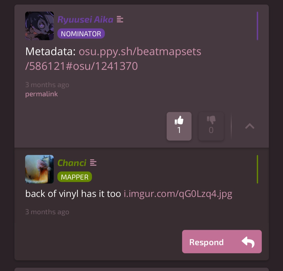
1) the username color for beatmap nominators
2) Post dates
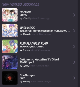
Lots of people are complaining about this too and this is on the main page, the ranked dates.
Also another thing to mention is the background color and the text color being similar (like the main page with blue bg color and blue text and modding page with purple text and purple by color) would severely decrease the readability of the texts for those who have visual impairment on particular colors.
 Cynplytholowazy
All 4 comments
i would suggest to make beatmap nominator color more brighter. ex: 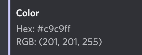

it seems good at dark theme, maybe need slightly more darker to fit with old web design, but idk
 Furozzu
on 12 Jul 2019
Furozzu
on 12 Jul 2019
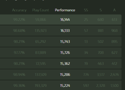
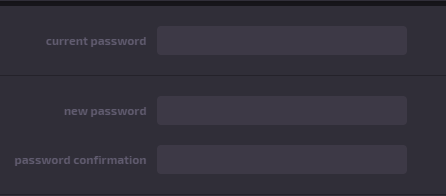
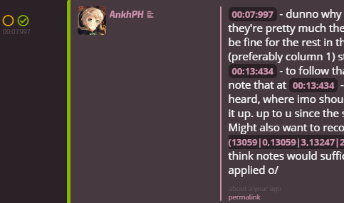
Went through probably most of the pages and compiled all hard to read texts below:
- Timestamps on beatmaps in the home page
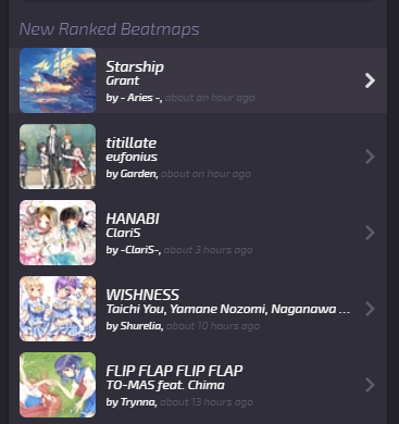
- Copyright sign

- Disabled Post button

- Timestamp (and manage buttons?) of comments

- Changelog user count
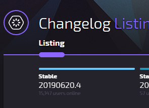
- Changelog description has same colour as the change

0count in beatmap scoreboards
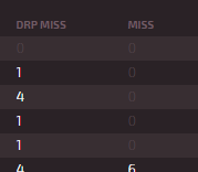
- Table headers (e.g.
max combo,total score)

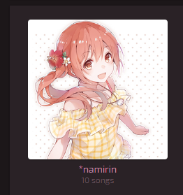
- FA song count
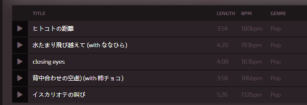
- Most of the track list on FA artist page
- Stats on rankings page
Contest ending date and type

Tournament registration date (and user count?)

- Settings text box labels
- Timestamp on best performance plays

- Comment type buttons on Modding page

- Modding beatmap timestamp and comment timestamp
 TPGPL
on 12 Jul 2019
TPGPL
on 12 Jul 2019
There are a couple issue in modding thread area too but I'm on mobile can't really do much so I asked TPGPL to help me list them out for me.
Cynplytholowazy
on 12 Jul 2019
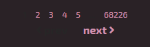
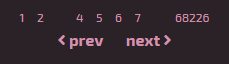
disabled links in the paginator of https://osu.ppy.sh/beatmapsets/events are even worse
 cl8n
on 17 Jul 2019
cl8n
on 17 Jul 2019
Related issues
 heagan01
·
5Comments
heagan01
·
5Comments
 venix12
·
3Comments
venix12
·
3Comments
 Xinnoh
·
3Comments
Xinnoh
·
3Comments
 gagahpangeran
·
4Comments
gagahpangeran
·
4Comments
 aticie
·
5Comments
aticie
·
5Comments
Most helpful comment
Went through probably most of the pages and compiled all hard to read texts below:
0count in beatmap scoreboardsmax combo,total score)Contest ending date and type

Tournament registration date (and user count?)