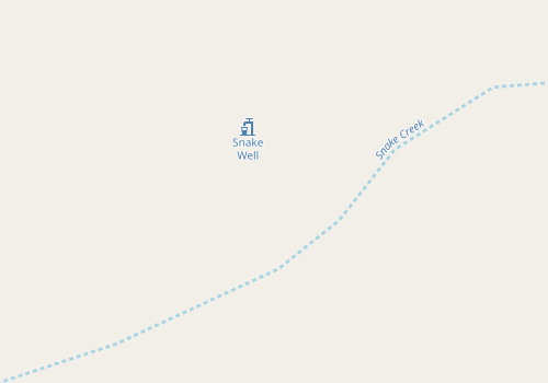
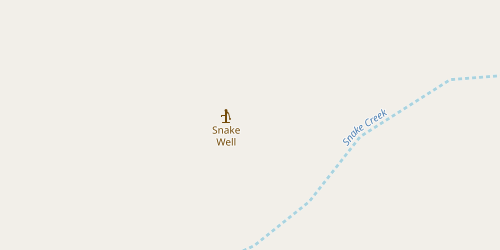
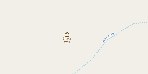
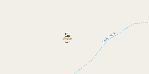
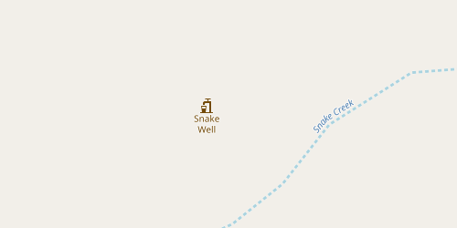
Openstreetmap-carto: Render man_made=water_well
Many famous mineral water sources are tagged as man_made=water_well so they should be rendered on OSM.
 zdila
zdila
All 51 comments
Can you give examples?
 matkoniecz
on 14 Jan 2015
matkoniecz
on 14 Jan 2015
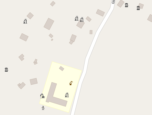
http://www.sazp.sk/slovak/struktura/ceev/DPZ/pramene/vt/hn-4.html (there is a manual pump inside a shelter, mineral warer)
http://www.sazp.sk/slovak/struktura/ceev/DPZ/pramene/po/pv-12.html (mineral water well)
http://www.freemap.sk/upload/gallery/0/388/20101109154829_nkuijhcbu6njsdsk5nf9if11s5.jpg (mineral water)
http://www.freemap.sk/upload/gallery/0/388/20101109154907_o2gcjjs2uvnv3q2t9blvlhcc03.jpg
zdila
on 14 Jan 2015
Sorry for being imprecise - can you give examples of OSM elements (node/way/relation)?
matkoniecz
on 14 Jan 2015
zdila
on 14 Jan 2015
Add amenity=drinking_water to them.
 maraf24
on 18 Jan 2015
maraf24
on 18 Jan 2015
maraf24, I think this would be mapping for renderer. Maybe man_made=water_well could imply amenity=drinking_water unless it has drinking_water=no. Same for springs.
I would also like to have different icons for mineral water sources, but for that there is no standardised tagging yet.
zdila
on 19 Jan 2015
I was merely stating the fact that your water wells lack tag for drinkable water. It could be drinking_water=yes or amenity=drinking_water. The latter has an advantage of being rendered.
However the main point is that man_made=water_well is not rendered at all. Certainly, if it has drinking_water=yes it should be rendered at the same zoom level as amenity=drinking_water, maybe even with the same icon.
The same goes for recently approved man_made=water_tap.
maraf24
on 19 Jan 2015
Now what about springs and water_wells with dirty - non drinkable water? Should they be rendered?
Hypotetically somebody coult even tag water source as amenity=drinking_water together with drinking_water=no. It could be some amenity really built to provide drinking water which has become (maybe temporailry) contaminated.
zdila
on 19 Jan 2015
Certainly, if it has drinking_water=yes it should be rendered at the same zoom level as amenity=drinking_water, maybe even with the same icon.
If it fits definition of amenity=drinking_water - it should be tagged also as amenity=drinking_water (it sounds like a good validator rule for JOSM). Also, drinking_water is currently not available in database.
water_wells with dirty - non drinkable water? Should they be rendered?
IMHO rendering it at general purpose map is a poor idea. First problem is that it would be hard to express that it is water well with dirty water, not fully usable water well. Second problem - this feature is of really limited importance - even for me it is borderline.
matkoniecz
on 19 Jan 2015
As far as I'm concerned, it could be rendered on the highest zoomlevels as part of the mapper feedback loop. From z19, or maybe from z18.
 matthijsmelissen
on 20 Jan 2015
matthijsmelissen
on 20 Jan 2015
2015-01-19 11:46 GMT+01:00 maraf24 [email protected]:
However the main point is that man_made=water_well is not rendered at all.
Certainly, if it has drinking_water=yes it should be rendered at the same
zoom level as amenity=drinking_water, maybe even with the same icon.
can also be interesting for historic wells, I have encountered quite a few
when mapping historic castles, mansions and the like. Sometimes they are
impressive structures, and they are nice to play for kids because of the
echo (they are usually secured by steel grates nowadays)
 dieterdreist
on 26 Feb 2015
dieterdreist
on 26 Feb 2015
Can we get back to this topic?
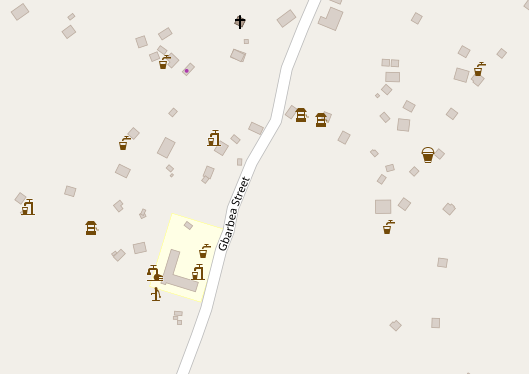
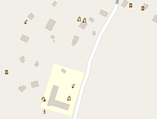
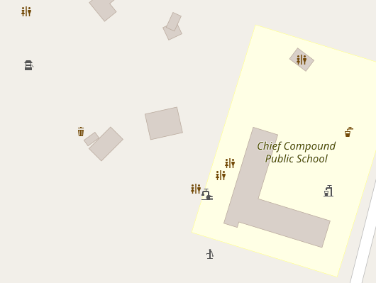
Now, there is over 81k of water wells. It's one of the most popular man_made=* values.
https://taginfo.openstreetmap.org/tags/?key=man_made&value=water_well
There is two options of potential icon shape:
-medieval well
https://i.pinimg.com/736x/a3/d7/db/a3d7dbb1eb1ca789debc8483ffaff993--water-well-zen-gardens.jpg
-modern pump
https://1.bp.blogspot.com/-wkrlDkQOq-U/UoJooKz_7VI/AAAAAAAAAVA/O8fDLx_PKok/s1600/SDC14667.JPG
What do you think? For me, a "pump" shape would be more universal and better.
 Tomasz-W
on 5 Jan 2018
Tomasz-W
on 5 Jan 2018
Note that icon must work in just 14 X 14 pixels.
matkoniecz
on 5 Jan 2018
Here's what I went with in a different style: https://github.com/SomeoneElseOSM/openstreetmap-carto-AJT/blob/master/symbols/water_well.png . If you want to see the effect on a map find a well you're interested in in UK or Ireland and then have a look at it on https://map.atownsend.org.uk/maps/map/map.html .
 SomeoneElseOSM
on 5 Jan 2018
SomeoneElseOSM
on 5 Jan 2018

14x14: 
What are your thoughts? Is it readable enough?
Tomasz-W
on 6 Jan 2018
I like this shape in general - it's very clear for me even with 14 px matrix. It lacks solid bottom, water output should be L-shaped and be probably attached a bit higher, but these are just details.
I think that pump symbol should be used only for man_made=water_well + pump=powered/manual(~11k). For other wells I'd like to show what you called a "medieval well". What do you think about it?
 kocio-pl
on 7 Jan 2018
kocio-pl
on 7 Jan 2018
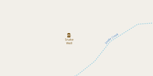
Updated pump vector:

14x14: 
Gist: https://gist.github.com/Tomasz-W/b55760c0b5db057e2b6046cc3935cb21
Medieval well icon project:

14x14: 
Gist: https://gist.github.com/Tomasz-W/04eefd0d1f2cc60cd19660c7450a5377
I'm not sure about making two icons. I'm worried that many of pumps are tagged without "pump=powered/manual" tag, and it doesn't mean these objects have a "medieval well" shape.
What about the colour? I would like to see a test rendering in two versions - man_made grey, and water blue (like fountains)
Tomasz-W
on 7 Jan 2018
Great, that's really promising!
I think pump bottom should be bigger, the output longer and with a curve, plus it could be attached higher. On 14 px it's mostly fine, but this time I'd like to tweak the general look.
The well shape is good for me, I would only add a "rope" and I hesitate if the roof is really needed. I would also try if the wrench arm could be longer (this means probably shorter axis).
I guess that split is OK - if this is really the pump, one needs just to add the tag and plenty of images show me that traditional well is still popular.
I would use brown - man made is about things not usable for general public (just visible) and brown is for amenities, including drinking_water, which is very similar kind of object. I was trying different colors for fountains and I remember that marine blue was special, as other colors were simply too dark on water circle, so too much attention was given to the fountains, but that was not what I planned originally - it just came out during testing that blue works the best.
kocio-pl
on 7 Jan 2018
@kocio-pl I've put both svg files on Gist. Can you do this final changes on your own hand? You are more experienced, so you know better which sizes of certain elements would work fine. For me, it would be a guesswork ;)
Tomasz-W
on 7 Jan 2018
We have also man_made=water_pump (760) - I bet there's not always well, it can also be attached to a city water pipes for example.
kocio-pl
on 13 Jan 2018
Water well:
3) 
4) 
kocio-pl
on 22 Jan 2018
Pump:
5) 
6) 
kocio-pl
on 22 Jan 2018
Water well: honestly, both icons are good enought, we can treat "3)" as little bit more readable, because it has less elements
Pump: I can see there is thicker line on the right side in "6)", but also, both icons are good enought, and I would choose "5)"
Tomasz-W
on 23 Jan 2018
2018-01-23 9:08 GMT+01:00 Tomasz-W notifications@github.com:
Water well: honestly, both icons are good enought, we can treat "3)" as
little bit more readable, because it has less elements
Pump: I can see there is thicker line on the right side in "6)", but also,
both icons are good enought, but I would choose "5)"
while I find the pump well readable, it might be missleading, because a
water well is simply "a facility created to access ground water from an
aquifer." i.e. it is a shaft or a duct, a pump is an additional feature
that can be present or not.
dieterdreist
on 23 Jan 2018
Water well icon is meant for general cases, pump icon is for https://wiki.openstreetmap.org/wiki/Key:pump (subcase of a water well).
kocio-pl
on 23 Jan 2018
@kocio-pl Could you publish Gist link with SVGs?
Tomasz-W
on 2 Jul 2018
Sure, here they are:
https://gist.github.com/kocio-pl/d915ce4049c49d6f52f1fd765a486fe0
kocio-pl
on 2 Jul 2018
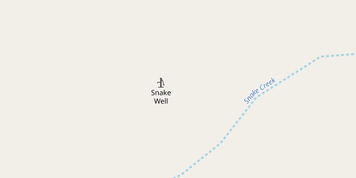
@Imagico proposed a very stylized icon for water wells which would be similar to his new spring design. The images also show similar stylized icons for water taps, hot springs, fountains and geysers:
z14-z16

z17

z18
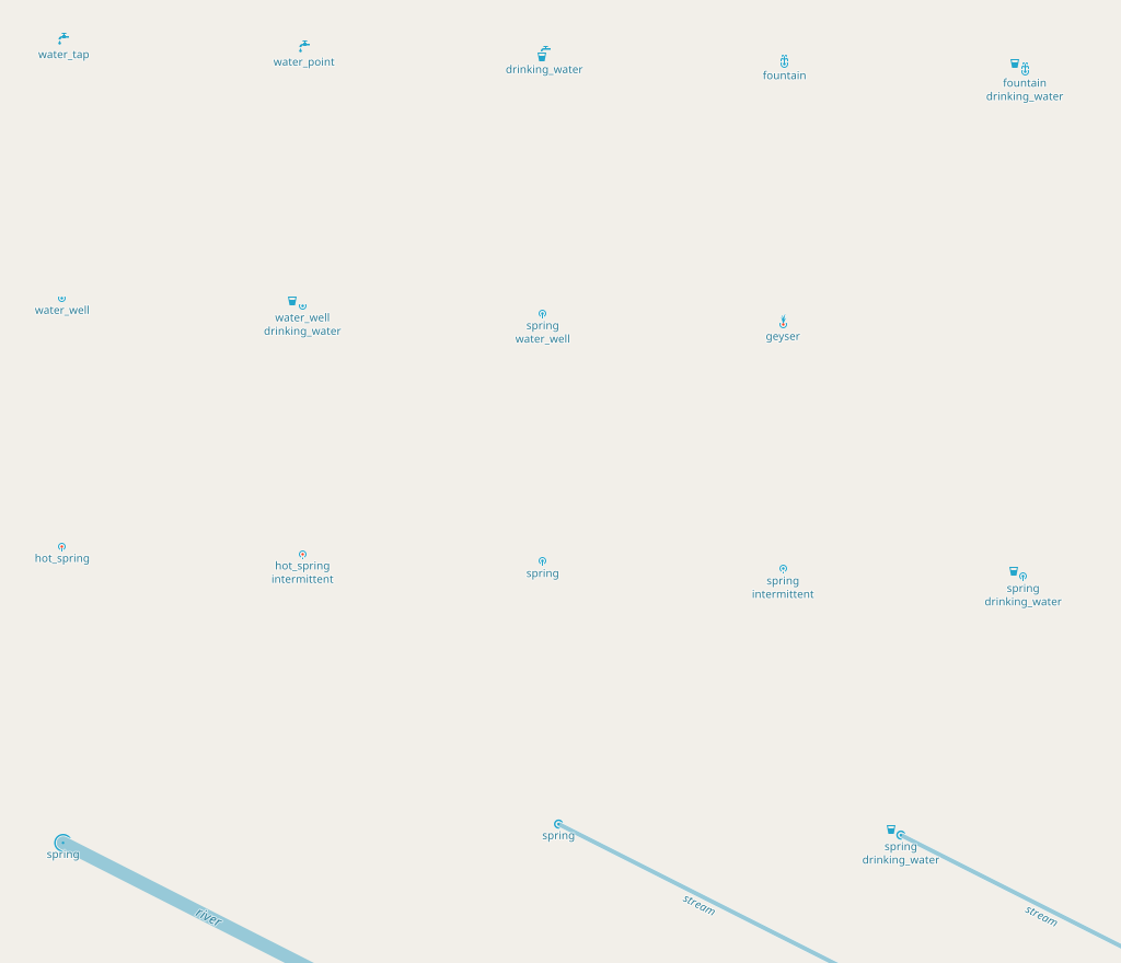
I'd be willing to make some test images with these icons as well as those above, if we can decide what shade of blue to use for wells, springs and fountains.
 jeisenbe
on 21 Oct 2018
jeisenbe
on 21 Oct 2018
I'm very skeptic about such broad unification. My short list of problems with this solution:
- poor visibility
- too small icons
- use of blue color for water features requires big changes in colors for transportation and accommodation
kocio-pl
on 21 Oct 2018
I wasn’t suggesting making all of those changes, but just trying the icons
for water wells, springs, hot springs and geysers, especially those last 3.
I don’t think we need to change the others, since we are using blue for
transportation as accommodation POIs.
What color were you thinking for the well icon? Amenity brown or man_made
instead of blue?
On Sun, Oct 21, 2018 at 1:26 PM kocio-pl notifications@github.com wrote:
I'm very skeptic about such broad unification. My short list of problems
with this solution:
- poor visibility
- too small icons
- use of blue color for water features requires big changes in colors
for transportation and accommodation—
You are receiving this because you commented.
Reply to this email directly, view it on GitHub
https://github.com/gravitystorm/openstreetmap-carto/issues/1224#issuecomment-431637954,
or mute the thread
https://github.com/notifications/unsubscribe-auth/AoxshLdmN7cvMdk1GbLdXAJjVBwM4QRhks5um_d7gaJpZM4DSKhw
.
jeisenbe
on 21 Oct 2018
I wasn’t suggesting making all of those changes, but just trying the icons for water wells, springs, hot springs and geysers, especially those last 3.
I thought that is your intention, because you posted it in this ticket.
What color were you thinking for the well icon? Amenity brown or man_made instead of blue?
Most probably brown.
kocio-pl
on 21 Oct 2018
@jeisenbe Anyway, if you plan some test renderings of water wells, please include also these icons: https://gist.github.com/kocio-pl/d915ce4049c49d6f52f1fd765a486fe0 in _amenity-brown_ and _man-made-grey_ versions.
Tomasz-W
on 21 Oct 2018
sent from a phone
On 21. Oct 2018, at 06:33, jeisenbe notifications@github.com wrote:
I wasn’t suggesting making all of those changes, but just trying the icons
for water wells, springs, hot springs and geysers, especially those last 3.
I do suggest to adopt Christoph‘s scheme for water sources, for me it is working great: from a superficial glance you see blue (or red) dots, and at closer inspection there is a typology encoded in fine details, such as the orientation of the point icon according to the way direction, it is subtle and shows the richness of the data in an unobtrusive way.
If you believe there is not enough contrast then the color could be tweaked.
dieterdreist
on 23 Oct 2018
TL:DR - _Water wells are important in developing countries and very rural areas, usually not important in western Cities. Different rendering for drinking water yes/no and pump manual/powered/no is a good idea; see Humanitarian style icons below._
I've researched this issue, and there is a wide variation in significance and appearance of water wells. This is a feature that is of low importance in European cities but high importance in other contexts.
https://wiki.openstreetmap.org/wiki/Tag:man_made%3Dwater_well
The wiki page suggests use of drinking_water=yes/no and
pump=* - How the water is drawn... (pump=powered, pump=manual, pump=no), which may help. Out of 100,000 wells there are 16,000 with pump=* and 14,000 with drinking_water
https://taginfo.openstreetmap.org/tags/man_made=water_well#combinations
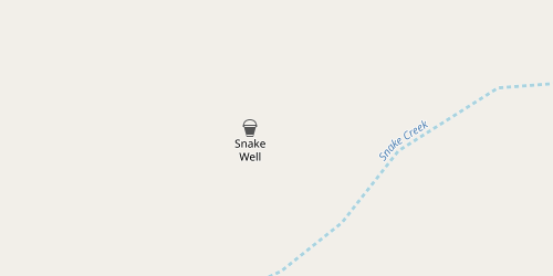
The "Humanitarian" HDM style shows four different icons for hand-draw wells, manual pumps, mechanized pumps, and wells that provide drinking water. @Imagico's alt colors style shows a cup icon with water wells and springs that supply drinking water, which is a nice idea.
Humanitarian icons:
https://github.com/hotosm/HDM-CartoCSS/blob/master/icons/poi/bucket.svg
https://github.com/hotosm/HDM-CartoCSS/blob/master/icons/poi/pump_manual.svg
https://github.com/hotosm/HDM-CartoCSS/blob/master/icons/poi/pump_powered.svg
https://github.com/hotosm/HDM-CartoCSS/blob/master/icons/poi/drinking_water_well.svg
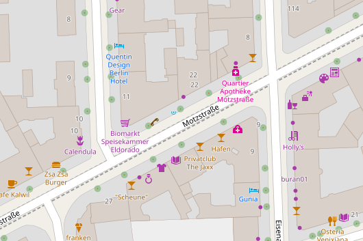
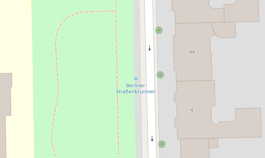
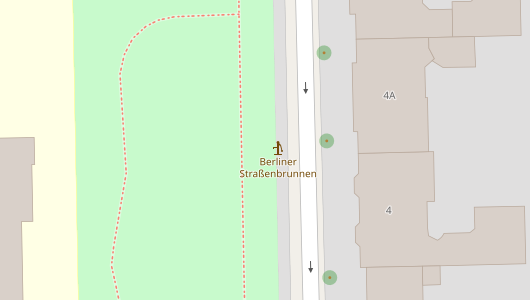
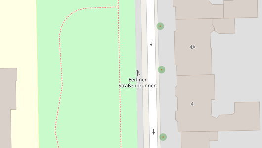
In Europe, there are a still a number of cute "medieval" style wells, complete with stone or brick wall, roof, bucket, rope and hand crank. There are also a number of early-modern pump wells, for example in Berlin there are 2100 "Berliner Straßenbrunnen" according to this page, https://wiki.openstreetmap.org/wiki/DE:Berliner_Straßenbrunnen , and over 1000 are mapped.
However, in the whole of the UK only 327 water wells are tag, because these features are no longer very important in Europe, where drinking water is universally available from every tap. http://taginfo.openstreetmap.org.uk/tags/man_made=water_well#overview
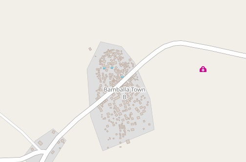
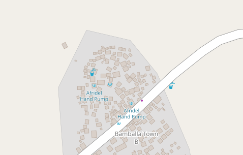
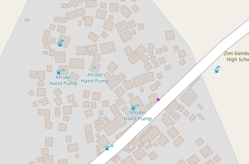
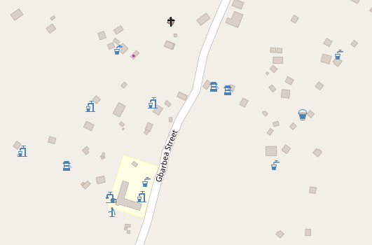
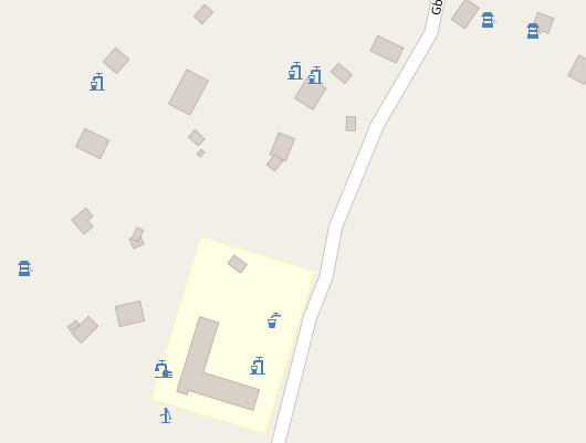
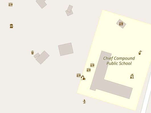
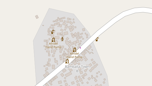
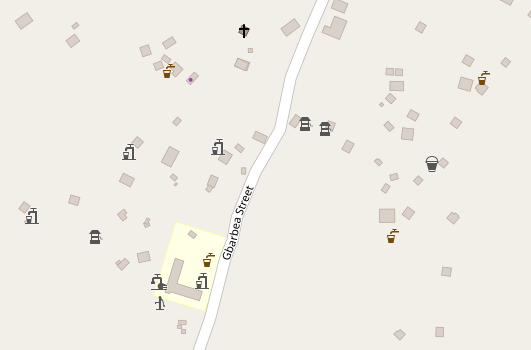
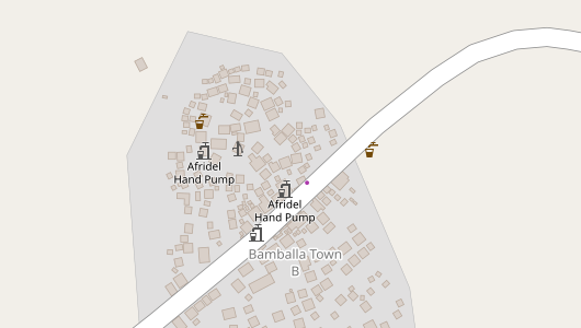
In contrast, water well are still extremely important in the developing world, especially in Africa and South Asia, where piped water supplies are still uncommon. Liberia has over 4000 water wells mapped, even though it only has 10MB of data, vs over 1 GB for the UK, suggesting that water wells are much more important in West Africa vs Great Britain. Haiti has almost 1500,
Often the well will be at the center of a village or hamlet. Many are still hand-dug wells, with water drawn by bucket, though they lack the cute medieval Euro-style roof and crank. But manual pumps are more common, especially in areas where the water table is low, so wells are now bored by machine. Some pumps are mechanized. Not all of these well provided safe drinking water. Especially hand-dug, open wells are at risk for contamination, but some bored or drilled wells with pumps provide safe drinking water.
Another consideration is that many people have private wells, with an electric or manual pump, meant only for the use of one or two families. For example, my Indonesian neighbors and I share a hand-dug well with an electric pump, and the new shop/house next store just bored a well for their exclusive use. And back home in the USA, many rural communities rely on private wells for each house, with an electric pump to provide piped water to the house. Fortunately, very few of these private wells are currently mapped, but the micro-mapping trend may be a problem in the future if there is no access restriction rendered.
The other areas with wells are drylands farming and ranching lands in developed countries, for example the North American West and Australian Outback, where a bored well may be the only feature for kilometers around. Some of these have a modern wind-powered pump, man_made=windpump, others have solar-powered pumps or are connected the electric grid in less remote places. In Northern Australia there are dozens of bored wells with unique names, which apparently are local landmarks (because one mapper was tempted to add place=locality to get them to render)
jeisenbe
on 9 Nov 2018
Thanks for your research, especially for the unique first hand evidence from Asia. This is basically what I have imagined and I'd like to see the rendering soon. Would you like to prepare a PR for that?
kocio-pl
on 9 Nov 2018
First color tests.
I'd suggest using an abstract symbol or a bucket or a manual pump for the default man_made=well icon. I like blue the best for these, however. If we have to use man-made gray or amenity-brown, I might go with the manual pump icon for default wells. I would use the "old fashioned" icon only for wells with an explicit "pump=no" tag, if at all.
I'm not thrilled with the powered pump icon that I borrowed from the HDM (humanitarian) style. Perhaps this could be improved?
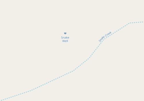
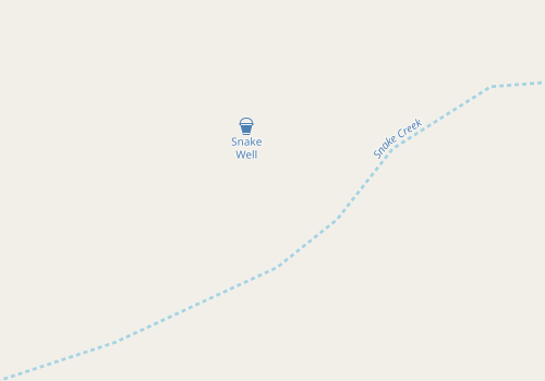
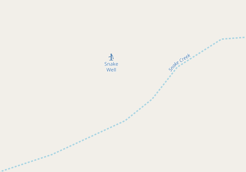
_Drilled water well in the outback of Australia, near an intermittent stream, but no other distractions:_
Water blue:
Abstract
Bucket
Old-fashioned

Pump-5
Pump-HDM

Powered Pump (HDM)

Drinking Water Well (HDM)
Man-Made Gray:


Amenity Brown:
Bucket

Old-fashioned
Pump-5
Manual Pump (HDM)
Powered Pump (HDM)
Drinking water well (HDM)
jeisenbe
on 9 Nov 2018
My first impressions:
- for me brown works the best
- I prefer Manual Pump (HDM) over Pump-5
- abstract does not work
kocio-pl
on 9 Nov 2018
@jeisenbe Thanks for tests!
- I like the idea of using medieval well icon only for combination with
pump=no - I would use
man-made-greybecauseamenity-brownmakes water wells looking much more important than they usually are - for generic icon I would use 'Pump-5' ('Manual Pump (HDM)' looks too caricatural for me)
- for combination with
pump=noI would use 'bucket' or 'old-fashionated' - 'Drinking water well (HDM)' icon may be a very good candidate for using it in https://github.com/gravitystorm/openstreetmap-carto/issues/3011
Tomasz-W
on 9 Nov 2018
Tests in Liberia and Berlin, first with improved abstract rendering. Before I had tried changing the color of the icon, but this caused it to render poorly. The abstract icon is the best option for rendering at lower zoom levels (z16 and z17), I believe. It also makes it easy to show drinking_water=yes.
Abstract
Simple design with supplemental cup icon for drinking water wells at z18.
Smaller icon used at z16 to allow rendering at this level without clutter.
Same water icon color used for drinking water amenity for consistency
z16 Liberia (multiple types of pumps, wells and drinking water sources)
z17
z18
z19
z16 Liberia closed ways (Pumps, drinking water)
z17
z18
z16 Berlin historic Well

z17
z18
Berlin Pump
z17

z19
jeisenbe
on 9 Nov 2018
Blue
Blue icons using current water-text color; slightly darker than fully abstract versions above.
Icons show pump, or historic well shape at z18
Same water color used for drinking water amenity for consistency
I've shown several icons in these images, but I don't think we would need to use all of them. The bucket may not work, and I'm not happy with the powered pump.
But it might be nice to have more ways to show drinking water.
Brown
Amenity-brown rendering; bucket shown for default but pump could be used instead
Gray
Man-made-gray rendering


FYI, if there is an amenity=drinking_water or natural=spring on the same point, it will render instead, as seen in several of the Liberia examples, and eg
jeisenbe
on 9 Nov 2018
Thanks for all the examples!
IMHO the abstract symbols work best. I do also like blue as a very intuitive water feature color. I'm not sure if there would be a conflict with transportation, tourism or office colours. The small size of the abstract symbols may be enough to avoid a real conflict.
Because of their size and complex shape, the more literal symbols are maybe too "loud".
Of course the abstract symbols have to be "learned" maybe a bit more than a "realistic" icon.
 daganzdaanda
on 9 Nov 2018
daganzdaanda
on 9 Nov 2018
Water-blue colour might be confusing as water well can be an abandoned or turned off just a free standing object.
Tomasz-W
on 9 Nov 2018
The abstract rendering is good for the basic sense of “water well”, which
literally means “hole in the ground that provides access to ground water”.
I also like how the small abstract icon looks on z16; it is still visible
in rural areas and developing countries but does not add “clutter” in
well-mapped cities. Christopher suggested rendering it at z15 too, but z16
is probably enough.
It will be intuitive if we use a similar color and style for springs, as I
recommended in that issue.
Re: “water well can be an abandoned/ turned off free standing object.”
Shouldn’t abandoned features be tagged differently?
I believe that only public, usable water wells should be rendered at most
zoom levels.
(Perhaps a broken or private pump could be rendered at z19 with man-made
gray as a minor orientation point)
On Sat, Nov 10, 2018 at 2:51 AM Tomasz Wójcik notifications@github.com
wrote:
Water-blue colour might be confusing as water well can be an abandoned/
turned off free standing object.—
You are receiving this because you were mentioned.
Reply to this email directly, view it on GitHub
https://github.com/gravitystorm/openstreetmap-carto/issues/1224#issuecomment-437440227,
or mute the thread
https://github.com/notifications/unsubscribe-auth/AoxshLpiMAsUV8nIXpmrUXmzEmoth2HYks5utcCSgaJpZM4DSKhw
.
jeisenbe
on 10 Nov 2018
Abstract shape is totally not understandable also for me.
Tomasz-W
on 10 Nov 2018
Perhaps @Tomasz-W can design a pump that is a compromise between pump-5 and the HDM manual pump?
HDM Manual Pump icon in Blue
Liberia z17

Liberia z18

Liberia z19

Berliner z17

Berliner z19

Liberia 2

Japan Temple z18

HDM Manual Pump icon in Brown
Liberia z17

Liberia z19

Berliner z19

Liberia 2

Japan z19

HDM Manual Pump icon in Gray
Liberia z17

Liberia z19

Berliner

Liberia 2

Japan Castle z18

Japan Temple z18

jeisenbe
on 10 Nov 2018
Abstract spring icon with drinking water supplement
Adding the water glass icon for wells with drinking water
Lower left
Liberia z18

z19

Liberia2 z18

Above

Upper left


This is done with a supplemental icon, which can be moved around to different locations relative to the main icon, as desired:
      [zoom >= 18][drinking_water = 'yes'] {
        supplement/marker-file: url('symbols/drinking.svg');
        supplement/marker-fill: @water-icon;
        supplement/marker-transform: 'translate(-9,5)';
        supplement/marker-placement: interior;
        supplement/marker-clip: false;
Hey, that's pretty snazzy. It might be a good solution to some other things also. Although, it might also give the false impression that there is another mapped poi next to the main one. Plus, it doesn't look like the position of the second rendered icon is consistent every time.
 Adamant36
on 11 Nov 2018
Adamant36
on 11 Nov 2018
As I very like dot-rendering for some features on z17, because it's the simplest possible shape, I consider different icons for the same feature at different zoom level as bad idea:
- as @Adamant36 said, "it might also give the false impression that there is another mapped poi next to the main one"
- in might give some bug or rendering-in-progress impression
- proposed smaller icon is not intuitive at all
Tomasz-W
on 11 Nov 2018
Do we have a common denominator to proceed?
I agree: showing same feature with different icons at different zoom level is a bad idea.
I just want to point to the fact, that the lack of a water well icon in Carto style obviously leads to "tagging for the renderer", where mappers just tag water wells as amenity=fountain or drinking_water. And as you know, there are currently >111 K objects tagged man_made=water_well in OSM. And it's mentioned in https://wiki.openstreetmap.org/wiki/Map_Features .
 sfkeller
on 19 Apr 2020
sfkeller
on 19 Apr 2020
Owing to the large abundance of this tag, why not using three distinct icons with regard to the tag pump (https://wiki.openstreetmap.org/wiki/Key:pump) which is also frequently used (26 799) if we only consider recommended values:
pump=no: old fashion wellpump=yes: Pump HDMpump=powered: Powered pump HDM
 jragusa
on 19 Apr 2020
jragusa
on 19 Apr 2020
For the record, there is a proposal related to pump features : https://wiki.openstreetmap.org/wiki/Proposed_features/Pumping_proposal
This also applies to man_made=windpump (#4149) and man_made=petroleum_well (#3494)
jragusa
on 24 Sep 2020
Related issues
 d3netxer
·
4Comments
d3netxer
·
4Comments
 wielandb
·
3Comments
kocio-pl
·
4Comments
wielandb
·
3Comments
kocio-pl
·
4Comments
 polarbearing
·
5Comments
polarbearing
·
5Comments
 jengelh
·
4Comments
jengelh
·
4Comments
Most helpful comment
2015-01-19 11:46 GMT+01:00 maraf24 [email protected]:
can also be interesting for historic wells, I have encountered quite a few
when mapping historic castles, mansions and the like. Sometimes they are
impressive structures, and they are nice to play for kids because of the
echo (they are usually secured by steel grates nowadays)