Openstreetmap-carto: Too many icons
Multiple people have mentioned that the style contains too many icons currently - however we don't have a central place to discuss this yet. As we still have more requests for adding icons coming in, this is something we should discuss.
For the people who think we currently have too many icons - could you tell us more about the reasons why you think currently there are too many icons?
 matthijsmelissen
All 116 comments
cc @pnorman
matthijsmelissen
on 11 Jan 2019
Does "too many icons" mean (1) too many objects cluttering the map, or (2) too many different symbols to remember?
For (1) the zoom level can be adjusted, and some effort was made e.g. to show dots instead of icons. For (2), there is ongoing effort to better group icons into colours, e.g. moving restaurant/food to a separate colour, and an ongoing discussion to separate transport from accommodation.
 polarbearing
on 11 Jan 2019
polarbearing
on 11 Jan 2019
Does "too many icons" mean (1) too many objects cluttering the map, or (2) too many different symbols to remember?
Both.
For (1) the zoom level can be adjusted, and some effort was made e.g. to show dots instead of icons.
We used to use more dots than we do now. I see dots as mainly helping with (2), not the too many symbols problem.
For (2), there is ongoing effort to better group icons into colours, e.g. moving restaurant/food to a separate colour, and an ongoing discussion to separate transport from accommodation.
But this won't reduce the number of icons, will it?
 pnorman
on 11 Jan 2019
pnorman
on 11 Jan 2019
But this won't reduce the number of icons, will it?
You act as if its a given that the only option to deal with icon clutter is by reducing the number of icons. Its not a given though (otherwise, just do a PR that guts the icons and call it a day). Or is it more about making a statement against the direction of the style lately and getting rid of the icons is an easy means to that end?
As the person who implemented a lot of the icons that now supposedly clutter the map,
I've only seen a few people complain about the icon issue and they were all maintainers who aren't really active in the development of the style anymore. It seems a little odd or something to not be involved in a project at all except to criticize a few choice decisions (especially considering the critics weren't involved in the discussions of if the icons should be implemented in the first place and only voiced their opinions after the fact). In my opinion it would set a bad precedence. Plus, its just a horrible policy to allow a few critical maintainers to get rid of things under those conditions.
I wonder where the opinions of those maintainers override the opinions of the many people, including a maintainer, that were involved in the original decisions to implement the icons. There's no point in participating in a project that doesn't have basic guidelines about how, when, and why things are removed from being rendered, or where a few maintainers opinions after the fact decide. "I don't like how it looks" defiantly shouldn't qualify as a valid reason for removal of a feature that's already been implemented. Even if it comes from a maintainer.
 Adamant36
on 11 Jan 2019
Adamant36
on 11 Jan 2019
@matthijsmelissen I wanted to discuss also "no new features" attitude, which is somewhat related, do you think this ticket could be made broader or it should be separate ticket?
 kocio-pl
on 11 Jan 2019
kocio-pl
on 11 Jan 2019
A few observations here.
According to the wiki history of the map key page (which might not be completely accurate) there are now 250 point symbol classes in this style, about 80 of which have been added during the last year. This is a completely unsustainable trend and so far none of the developers adding symbols has presented any idea how to transit this into a sustainable development despite the problem having been pointed out on multiple occasions.
Likewise i have seen very little interest in actually doing maintenance on the POI rendering in this style overall despite there being plenty of problems with that. The most fundamental issue with that, which has been a pressing problem for many years, is probably that the symbol prioritization is not in sync with the starting zoom levels. I know solving that is out of reach currently for most of the developers here but it is none the less a bad idea to keep adding icons and not addressing the base issues.
There are also tons of other issues with POI rendering like bad symbol selection logic. IMO there is simply way too much _lets add a symbol and then never look back_ attitude.
Also many of the newly added symbols are IMO not suited for this style because they are non-intuitive and often misleading to huge parts of the target audience. This is largely caused by the symbols being developed by people with an urban European/North American background and no serious consideration is given to the question how much sense this makes in other cultural and geographic contexts. I know this is hard to get right but approaching this with a _lets choose the least bad of all the bad options we have from our urban perspective_ paradigm is not helping.
After all the critique i also need to say i understand that for developers starting symbol additions obviously appear to be a sensible starting point to with out too much technical difficulty achieve a feeling of success by adding something to the map. But i would encourage new developers not to let themselves be lured by that because at this stage with 250 symbols already being rendered that might still be correct from a purely technical perspective but from a design perspective making a good symbol addition is much harder than many of the bug fixes and design adjustments that would be important to make in this style.
Long story short - my suggestions:
- develop and discuss sustainable concepts for the future of POI symbol rendering in this style.
- focus on maintenance of existing POI symbol rendering - fixing problems instead of adding new ones.
- remove symbols that are unsuitable for this style because of the reasons mentioned.
- aim for better balance by focusing new symbol additions on rural areas and regions outside Europe and North America and feature types that are useful there.
I would also be fine meanwhile with putting a cap on the number of symbols and allowing new ones only in a _quid pro quo_ fashion when removing another. I don't particularly favor such an approach but if this is the only way i would support it.
 imagico
on 11 Jan 2019
imagico
on 11 Jan 2019
I get straight into the propositions:
develop and discuss sustainable concepts for the future of POI symbol rendering in this style.
I agree that it's rewarding to add new icon for new developers and this is where it usually starts. But after some time and gaining more skills it just slows down. For example out of 20 open PRs only 2 of them are about adding icons. I don't see another new team emerging with urge to add 80 icons next year. It does not sustain this way and it happens without any extra effort.
focus on maintenance of existing POI symbol rendering - fixing problems instead of adding new ones.
This is what happens in parallel. When something needs improvements in POI rendering, it's being fixed, and if something is missing, it's being added.
I don't agree that adding objects means adding problems - it might happen, but it's not implication. There is a need expressed in tickets that lack of something is a problem and adding them is fixing this problem. The invisible number of "tagging (cheating) for rendering" gets lower then.
remove symbols that are unsuitable for this style because of the reasons mentioned.
Not being enough culturally diversed? Which ones do you mean?
aim for better balance by focusing new symbol additions on rural areas and regions outside Europe and North America and feature types that are useful there.
Why not, but there's very practical problem - I'm aware only about pumps/wells that would be needed there probably and it's close to being PR-ready, if I remember, but that's it. Could you give more examples? I believe @jeisenbe could be the best to tell what is needed in Asia for example.
kocio-pl
on 11 Jan 2019
Does "too many icons" mean (1) too many objects cluttering the map, or (2) too many different symbols to remember?
Both.
@pnorman Could you describe in more detail why you think these are problems? I think to resolve this issue, we must understand it better first.
Are you saying that there are currently user tasks that are hard to execute? Like, users can't find a major church (or even roads) on the map because all shop icons attract attention away from that? Or, people will be wondering what the perfumery icon is because they don't recognize it? Does your reasoning go along these lines? If so, could you give examples of tasks that you think are currently too hard?
More general - and this is a question for everyone: what do you think is the purpose of icons on the map?
It seems a little odd or something to not be involved in a project at all except to criticize a few choice decisions (especially considering the critics weren't involved in the discussions of if the icons should be implemented in the first place and only voiced their opinions after the fact).
@Adamant36 @pnorman and the other maintainers who voiced this critic have a lot of experience with map design, so we should be very glad that they are willing to give their input - and I'm convinced that their advice will help us in creating a better map.
@matthijsmelissen I wanted to discuss also "no new features" attitude, which is somewhat related, do you think this ticket could be made broader or it should be separate ticket?
@kocio-pl I think it's a very similar discussion, I think we could discuss it here as well?
remove symbols that are unsuitable for this style because of the reasons mentioned.
@imagico Do you have any concrete suggestions?
matthijsmelissen
on 11 Jan 2019
I've only seen a few people complain about the icon issue and they were all maintainers who aren't really active in the development of the style anymore.
As much as I don't like to make it personal problem, it strikes me that I don't remember hearing "there's too many icons" or "I can't recognize them" from anyone else from the whole OSM community. For example the most common problem I hear is about colors being "washed out" and more contrast wanted. And the next group of problems is... you guessed, lack of rendering something. Not a single time I remember that anybody else mentioned problems with too many icons (or other features). It's also my impression that last release, which was more feature rich than usual, brought also more happy voices from the community.
I don't know how to explain this, especially how big the contrast is. I find it very unfortunate however, for multiple of - personal and practical - reasons.
kocio-pl
on 12 Jan 2019
I don't remember hearing "there's too many icons" or "I can't recognize
them" from ... the OSM community
This may not be good evidence. People are usually more likely to comment or
complain about a specific problem that personally interests them. But the
overall number of icons increases slowly, and isn’t one obvious thing.
By analogy, when a bus operator in the USA wants to remove bus stops (which
are usually spaced 200m apart!), there are always people that complained
that they have to walk 100m farther, but the vast majority of bus riders
who will get a faster and more reliable ride do not have a personal reason
to comment.
On Sat, Jan 12, 2019 at 8:02 AM kocio-pl notifications@github.com wrote:
I've only seen a few people complain about the icon issue and they were
all maintainers who aren't really active in the development of the style
anymore.As much as I don't like to make it personal problem, it strikes me that I
don't remember hearing "there's too many icons" or "I can't recognize them"
from anyone else from the whole OSM community. For example the most common
problem I hear is about colors being "washed out" and more contrast wanted.
And the next group of problems is... you guessed, lack of rendering
something. Not a single time I remember that anybody else mentioned
problems with too many icons (or other features). It's also my impression
that last release, which was more feature rich than usual, brought also
more happy voices from the community.I don't know how to explain this, especially how big the contrast is. I
find it very unfortunate however, for multiple of - personal and practical
- reasons.
—
You are receiving this because you were mentioned.Reply to this email directly, view it on GitHub
https://github.com/gravitystorm/openstreetmap-carto/issues/3635#issuecomment-453684493,
or mute the thread
https://github.com/notifications/unsubscribe-auth/AoxshHOJAHuPkAAsVpN-zGTpSoNrs_iVks5vCRgPgaJpZM4Z6hb_
.
 jeisenbe
on 12 Jan 2019
jeisenbe
on 12 Jan 2019
overall number of icons increases slowly, and isn’t one obvious thing.
Well, "color washing" is also slow, general shift, but still it bugs people the most. Not that I claim anything measured in a scientific way and it might be just weak evidence as you suggest, but maybe there is some hidden key to understand and - hopefully - resolve the tension? I don't know, so I'll get back to more detailed question:
More general - and this is a question for everyone: what do you think is the purpose of icons on the map?
For me they are just a part of cartography (nothing special, better nor worse) which works the best for smaller objects, when area coloring/outlining and line patterns would be too general or not applicable, especially on nodes.
kocio-pl
on 12 Jan 2019
More general - and this is a question for everyone: what do you think is the purpose of icons on the map?
The purpose of point symbol rendering is (or more precisely: should be) the same as for all other things rendered in the map - fulfillment of the cartographic goals we have.
Doing so is IMO for point symbols much harder because the static symbol with no adjustment to its context as it is traditionally common in this map is very noisy, takes a lot of space for usually transporting very little substantial information, often covers other important information and is prone to being non-intuitive and culture specific. It is the bulldozer of cartographic design. Many are eager to ride the bulldozer but you can do a lot of damage and you can't do any delicate work with it.
remove symbols that are unsuitable for this style because of the reasons mentioned.
@imagico Do you have any concrete suggestions?
Yes, of course. But at this point i think discussing specific symbols would unproductively sidestep the discussion. My point is that the addition of symbols without an open ended assessment of the suitability of the symbol (that is no predetermined decision of adding the symbol in form of the least bad variant having been suggested) is counterproductive to the cartographic quality of this style. And where this happened in the past it therefore should IMO be re-evaluated.
The core idea for me is to move from a primacy of feature additions to a primacy of fixing existing problems and improving the map in its existing feature set (which is more than hard enough).
imagico
on 12 Jan 2019
To make it short for a start - when it comes to new features, I have no problem with this core idea, the problem is how to move there. As long as the fixing just increased a lot and become primal this way, that's OK for me.
However ban on adding new features would be bad for me. I think they both can coexist (no matter what the proportion is). The only moment when I think of a "feature freeze" is a temporary ban before release to avoid release problems, but most of the time don't see we have a problem with releases.
I also think that while one can make the difference between fixing bugs and adding features for example to make bugfix release simple (that is when a feature freeze is good), in general adding missing feature is also fixing bug. (And we can disagree what a bug is and what resolves them, of course.)
kocio-pl
on 13 Jan 2019
aim for better balance by focusing new symbol additions on rural areas and regions outside Europe and North America and feature types that are useful there.
Why not, but there's very practical problem - I'm aware only about pumps/wells that would be needed there probably and it's close to being PR-ready, if I remember, but that's it. Could you give more examples?
In rural areas: leisure=horse_riding (https://github.com/gravitystorm/openstreetmap-carto/issues/2344)
 Hufkratzer
on 15 Jan 2019
Hufkratzer
on 15 Jan 2019
aim for better balance by focusing new symbol additions on rural areas and regions outside Europe and North America and feature types that are useful there.
man_made=water_well
#1224
Regardless, if the water is drinkable: in some parts of the world any source of water is used, even for drinking :(
But you can boil or filter it ...
What shall I map in Niger?
"Needs for mapping are water wells, ..."
https://wiki.openstreetmap.org/wiki/WikiProject_Niger
 wilmaed
on 17 Jan 2019
wilmaed
on 17 Jan 2019
For icons there's amenity=feeding_place for farm animals is the only thing I can think of. Its got 1,510 uses. I noticed there's also amenity=watering_place with 5,979 uses. Both of those would be cool additions for rural people. Along the same lines is amenity=game_feeding, with 2,312 uses. The current sport icon PR would be good also.
Specific rendering for ford=stepping_stones maybe. Or different icons for normals fords versus ones that can be crossed on foot (almost 3000 of them have the foot=* tag. 2473 have the depth tag. That might be useful also).
On the landuse side would be improving the rendering of farmyards and meadows to make them more obviously a part of Agriculture infastructure. Along with more specific pattern rendering for different types of crops. Salt pond rendering. Shooting/archery ranges (I think icons are proposed in the sports PR).
Better rendering of paths and surfaces.
I dont know. I'm sure there's a lot more things out there for rural areas. It would be a good meta issue.
@imagico, btw do you have any thoughts about if having different icons depending on the zoom level constitutes map clutter or over complication? I've seen it brought up a few times as a solution to icon issues and supposedly the HOT map does it, but I'm unsure if its a good idea or not.
Adamant36
on 17 Jan 2019
there's a lot more things out there for rural areas
man_made=adit
man_made=mineshaft
wilmaed
on 17 Jan 2019
specific pattern rendering for different types of crops.
+1
Especially for orchards (bananas, oil palms) and bush crops like berries,
coffee, and tea, and some crops like rice - these are grown constantly in
the same place for many years.
On Thu, Jan 17, 2019 at 11:26 PM wilmaed notifications@github.com wrote:
there's a lot more things out there for rural areas
man_made=adit
man_made=mineshaft—
You are receiving this because you were mentioned.Reply to this email directly, view it on GitHub
https://github.com/gravitystorm/openstreetmap-carto/issues/3635#issuecomment-455189700,
or mute the thread
https://github.com/notifications/unsubscribe-auth/AoxshGO4ghxbYOOlXw6eAs-6exrqBOJ7ks5vEIgJgaJpZM4Z6hb_
.
jeisenbe
on 17 Jan 2019
As others have pointed out, some examples would be good to visualise problem areas.
Looking around at z15 and 16 the only new icons I can see are for masts/towers and castles. At z17 the amenity/office/shop icons are now dots though there are new icons for tourist info, artwork/statues and subtypes, internet cafes, amusements/10pin etc. Plenty of the icons added have more uses than other icons already on the map.
Wonder if it would be possible to draw up a list of icons added in say, the last 6-12 months? Maybe a list of all icons and their number of uses would be interesting as well... (can that be done on the wiki?)
 boothym
on 17 Jan 2019
boothym
on 17 Jan 2019
Australian asked about lacking features outside Europe told about lack of boundary=protected_area (just resolved #603) and landcover=* (closed #2548):
https://forum.openstreetmap.org/viewtopic.php?pid=734674#p734674
kocio-pl
on 19 Jan 2019
Though any particular amenities or facilities are usually absent I would like an icon for windsurfing/kitesurfing/standup-paddleboarding as these are places where enthusiasts usually gather at particular suitable spots and interest spectators.
 nevw
on 19 Jan 2019
nevw
on 19 Jan 2019
What are tags schemes for them (if any)?
kocio-pl
on 19 Jan 2019
sport=windsurfing|kitesurfing|sup tag and place as icon on the beach would be sufficient. Can share the one blue windsurfer icon.
nevw
on 19 Jan 2019
Icons for sports are being worked on. The original issue for them is #844 if your interested. Its still being worked on. Unfortunately there's a lot more popular sports being the queue at this point. They can be added to the list though. If you want to create icons for them in the mean time though they can be added to the original issue. I plan to do a PR for the top sports here soon and see if those get added to the map or not. Then go from there based on usage numbers. So it might be a while, unless someone does it in the meantime.
On second glance, I don't even think they are addable at this point. sport=windsurfing only has 80 uses and no wiki page. Whereas sport=kitesurfing only has 197 uses. That's way to low. sport=surfing only has 445 uses itself. So even it is probably not addable at this point.
Adamant36
on 19 Jan 2019
For the people who think we currently have too many icons - could you tell us more about the reasons why you think currently there are too many icons?
We are trying to render too many objects what requires using icons that are cryptic and hard to understand.
For example instead of using single icon for shops we are using many of them + dots. In cases where icons are readable (for some none of them are, for some all, for some part) it ads useful information.
But generic shop icon is better than a confusing shop icon.
Note that whatever icon is useful or confusing and more generic (or even not attempting to show some information) would be better varies from person to person.
And I am pretty sure that we reached point where adding more icons is frequently not improving map for a typical person and in some cases makes it worse. For example I see no chance of implementing #3632 without adding highly confusing icon (and it is one of reasons why I closed it - and closing issues that request adding unreadable icons is the best way to reduce increasing/introducing this problem).
Also, adding icon for one objects encourages to add icon for all objects that are at least as important - that is why I think that rendering amenity=waste_basket and amenity=bench was a mistake.
Note that I am not proposing ban on adding new icons, but I would encourage careful considering whatever new icon is clear for a typical person who has no hint what it is supposed to represent.
"I can't recognize them" from anyone else from the whole OSM community
Is there some existing tool for full text search of OSM mailing lists? Either my memory is faulty or Google and DuckDuckGo is unable to find mail that I remember well.
I run (really limited) test among random people (typically outside OSM community) asking some time ago to guess meaning of symbols on the map. The success rate was really surprisingly low - lower than my any expectations.
Also, mapping patterns of most people is that they map their favorite subject - and they typically want it rendered. While I think that typical person will not start complaining because they have no idea what some symbols are supposed to mean.
 matkoniecz
on 25 Jan 2019
matkoniecz
on 25 Jan 2019
I run (really limited) test among random people (typically outside OSM community) asking some time ago to guess meaning of symbols on the map. The success rate was really surprisingly low - lower than my any expectations.
@matkoniecz, I'm not trying to argue against anything you have said because I believe a lot of it is probably true, but it seems based on the idea that since people outside the OSM community don't understand something that it should it be changed to cater to them and I keep hearing different opinions who the target market for website is.
Although I think things should be as friendly possible to the average internet user, people like @woodpeck, along with others, are pretty insistent that they don't matter. Its hard to say if something should or shouldn't changed based on some judgement about the target market though if you don't have any idea who the market actually is. So is there anywhere that actually says who is being catered to on the website? It's been on my mind for a while now and I think its something that needs to be figured out if issues like this one are going to be resolved.
I think its telling that the style guidelines don't prioritize a single user group. It puts mappers and mapper feedback on the same on the same general level. Personally, id imagine there are way more mapping or cartography enthusiasts using the site, who would have no problem figuring out the icons, then there are just random people off the street that might be confused. Id assume random people off the street are using apps to access OSM. Id like to see data on it though if there is any.
Is the style a cartographic Swiss Army Knife or is it suppose to be a beautiful, concise representation of an online map? Personally, I think its a Swiss Army Knife. CartoCSS doesn't seem to be a good medium for amazing looking maps but its a good Utilitarian mapping feedback tool. Although this style has still worked good for everything I've seen it used in so far. Even with the extra icons (except maybe the new hospital rendering. Which is being worked on).
Adamant36
on 25 Jan 2019
I run (really limited) test among random people (typically outside OSM community) asking some time ago to guess meaning of symbols on the map. The success rate was really surprisingly low - lower than my any expectations.
Also, mapping patterns of most people is that they map their favorite subject - and they typically want it rendered. While I think that typical person will not start complaining because they have no idea what some symbols are supposed to mean.
Indeed. This is a case of perception bias. People confused, mislead or alienated by the map are relatively unlikely to complain - and even if they do they might not specifically complain about those things that are responsible for their dislike.
This also means the issue tracker has a significant over-representation of issues about lack of features compared to issues about the way features are shown or about features that should not be shown. See also https://github.com/gravitystorm/openstreetmap-carto/issues/1975#issuecomment-387319609.
Talking to people unfamiliar with the style and maybe with OSM in general about how they perceive the map can be an eye opening experience.
Regarding the target user of this style - this is fairly well documented in the cartographic guidelines:
https://github.com/gravitystorm/openstreetmap-carto/blob/master/CARTOGRAPHY.md
imagico
on 25 Jan 2019
This also means the issue tracker has a significant over-representation of issues about lack of features compared to issues about the way features are shown
According to the milestone tracker that's clearly not the case. It says there's 52 open and 249 closed issues for new features. Whereas, for bugs and improvements its 258 open and 692 closed. So the vast majority of issues are about bugs and improvements. Unless issues are being miss-labeled, but even then more then half of them would have to be for it to even be close. Which I highly doubt is the case.
There was a few months recently where a big chunk of new issues where about adding new features, but it still wasn't "a significant over-representation of issues." Unless its all your focusing on. Personally, I think its a combination of confirmation bias and the availability heuristic.
Issues having to do with adding new features just appear more prominent on the issue tracker for some reason and are easier to remember (more emotional/cognitive investment perhaps) . Plus, people tend to request them in "chunks." Then it dies down. Unlike with issues about bugs. Which tend to trickle out. So it seems like new features are the vast majority of requests. When in reality they aren't. As backed up by the milestone tracker. Its a 3/1 ratio in favor of bugs and improvements. Which seems reasonable to me.
Adamant36
on 25 Jan 2019
To avoid misunderstandings - when i talk about _new features_ i am talking about categories a1 and a2 according to https://github.com/gravitystorm/openstreetmap-carto/issues/1630#issuecomment-154371089 - which is unrelated to any github labeling.
And _over-representation_ is of course meant relative to the gravity of design problems for the goals of the style. Theoretically there would be millions of potential feature additions that could be suggested to implement in this style but the vast majority of them would be counterproductive for the goals we have.
imagico
on 25 Jan 2019
when i talk about new features i am talking about categories a1 and a2 according to #1630 (comment)
I think that should match the Github labelling.
matthijsmelissen
on 25 Jan 2019
Right now it does not, see for example #3592, #3594, #3591, #3527, #3398, #3244, #3155, #3124.
imagico
on 25 Jan 2019
Feel free to add and improve issue ticket tagging if you (or anybody else) wish to.
kocio-pl
on 25 Jan 2019
Although I think things should be as friendly possible to the average internet user, people like @woodpeck, along with others, are pretty insistent that they don't matter.
The term "people like $NAME" is always a bit impolite because it robs the person of its status as an individual, and instead treats the person as a generic representative of a class of people. You could have said "Many people, including @woodpeck", or "@woodpeck and others".
Also I haven't insisted that average internet users don't matter, just that they're not the target group of the OSM web site.
I'm in two minds about this.
On the one hand, the fact that openstreetmap.org doesn't intend to be an end-user web site like Google Maps is generally agreed in OSM. I'm not sure if it is actually written somewhere but I'm happy to write it down for you if that gives it more authority. From this, you could logically deduce that since the main user group is mappers, you'd want a map that gives the best possible feedback to mappers. That would likely include rendering more, not less detail, and would push cartographic considerations to the back. For ideal mapper feedback, it would be good to have one symbol for amenity=bank and a slightly different one for amenity=bank with atm=yes. And different street rendering depending on the surface tag. And all that. Someone who says that openstreetmap.org is mainly for mappers should likely welcome such development; of course this would be a cartographic nightmare that lets the Osmarender style look like fine art in comparison.
In other posts I have complained about the complexity of openstreetmap-carto; not primarily how many icons there are, but about how it's meanwhile hard to contribute to the style or modify it for your own purposes because you need to understand the huge code base first (or you're doomed to making minor tweaks without having a feel for the whole). I said recently that for most of my purposes, openstreetmap-carto was good enough years ago, and I stand by that. The changes that have been made in the past few years were improvements, but with diminishing returns, and not without cost either.
I do agree that while these two lines of reasoning aren't directly opposed, they're not orthogonal either; making the best possible map for mappers will bring some complexities with it, though these often stem from trying to avoid the cartographic nightmare. A pure "mapper feedback" map that looks ugly would probably be much easier to do.
Anyway, for what it's worth, in my commercial life I often deal with people who don't like openstreetmap-carto and who ask for "something less cluttered", "something a bit more like Google Maps", or - and this was only this morning and I found it a bit insulting - "something that doesn't look like a 1980s city map".
As a mapper, my main usability issue with the map is the unreliable and unpredictable icon placement. You look at the map at a scale that displays restaurant icons, you browse to an area you know, you find a restaurant missing, you fire up the editor to add it, and you see: It is already there, it just fell off the map because of conflict avoidance. And the matter becomes worse when this leads to different decisions on different zoom levels. Certainly not a new problem for you, and certainly difficult to solve, but as long as whether a certain POI displayed or not is essentially a matter of luck, I can't care much for how precisely the icon tells me what kind of POI it is.
Lastly, the OpenStreetMap web site and openstreetmap-carto aren't the same; even if the OSM web site had a certain set of goals, openstreetmap-carto could still define their own, different, goals. If they stray too far from what the OSM web site wants, the OSM web site could choose a different style to display prominently. Of course openstreetmap-carto could also definie it as their goal to be "the main style on the OSM web site". But it's not a given.
 woodpeck
on 26 Jan 2019
woodpeck
on 26 Jan 2019
More on topic - it's hard for me to find the core of the problem, there are just different pieces against more features/more icons/more shop icons (these problems are quite mixed). So I will try to also offer partial responses here:
Talking to people unfamiliar with the style and maybe with OSM in general about how they perceive the map can be an eye opening experience.
My (very limited) personal experience is they are happy with it. I can't imagine how to collect more such voices, but that could be good and useful.
People confused, mislead or alienated by the map are relatively unlikely to complain - and even if they do they might not specifically complain about those things that are responsible for their dislike
And how do you know how many confused people did not get there to tell they don't like something lacking? Maybe _their_ needs are seriously underrepresented? The tracker currently gives us at least some feedback from the outside world until we find anything more (see the reply above).
And over-representation is of course meant relative to the gravity of design problems for the goals of the style.
Adding features fits all general purposes very close IMO - as a feedback, as an example of what database offers, it helps to include many different items (not just for one specific use), and it really shows the face of OSM as growing project (not static).
For specific goals, like feature rich, adding is of course beneficial. But not only to that, we have added different diversity features for example (outdoor, industrial, leisure...). When it comes to maintainability, road code and SQL layers are the worst parts probably and tuning can even make it worse. On the other hand adding multiple shop icons does not pose a problem even similar in scale - which is easy to observe, since new developers start with it as the easy task. It also helps maintainability in the long run, since there are more people involved and experienced with touching code.
Its a 3/1 ratio in favor of bugs and improvements. Which seems reasonable to me.
I don't see "gravity" connected directly to adding or fixing anything. I believe both are important and I do both. But if one wants to make more fixes to make this ratio 10:1, I have nothing against it - please do. I just don't agree with making it x:0 for reasons other than pure lack of people willing to add features (which is not the case currently).
in my commercial life I often deal with people who don't like openstreetmap-carto and who ask for "something less cluttered"
Commercial world has all the tools to achieve it, so I don't feel their complaints are targeted at the right aim. See the Facebook maps using OSM data for example. There are multiple simple styles and they can afford to deploy their own servers, including vector maps or layers they need, they can also hire people to do whatever they want. OSM Carto might be good for them or not, but they have a lot of possibilities with OSM.
As a mapper, my main usability issue with the map is the unreliable and unpredictable icon placement.
"Too many icons" in the sense of "there are too dense areas"? There are, of course, and I see no general solution for that, because it's the reality and how well people added it to the database. We made gastronomy less aggressive at z17 exactly to help with this problem.
It's a long tail distribution - just a few old and well established icons do that, while adding multiple more new does not. If you take any "bread and butter" map with gastronomy icons, you will get the same unpredictability:
https://www.openstreetmap.org/#map=17/51.51754/-0.12462&layers=H
https://www.maptiler.com/maps/#streets//raster/17/-0.134142/51.514167
But generic shop icon is better than a confusing shop icon.
As long as we have specific color for shops, I don't agree. You don't have to know specific shape to know that it's a shop, so it's not worse, and when you do, it's better.
I don't know all the wetlands for example and I'm not interested in them, but as long as I see blue lines, it's enough for me to know it's kind of wetland, no matter what pattern is beyond that.
kocio-pl
on 26 Jan 2019
In regard to what map users may think / want / need, I recently had a conversation on another forum, with a lady who lives in a somewhat remote area of Australia & who commented that OSM, via Osmand, is fairly useless, as all it shows in her area is a blank map.
I brought this up for discussion on the Au list here: https://lists.openstreetmap.org/pipermail/talk-au/2019-January/012325.html
Since then, another person on that forum has said:
"just tried osmand.. searched for my workplace and no results lol"
When I've asked them for the address, so I could check why it couldn't be found, their response was:
"I shouldn't have to search by address.. I searched for the business name and only 2 places came up in south east qld. There should be 8 businesses. If it cant be reliable for basic search results then there is no way it could be used as an alternative to the usual navigation apps."
I then explained: "_Have the others actually been entered? OSM is not like Google that buys info – everything on the map has been entered by somebody looking at it & saying "Oh, such & such business isn't marked – I'll put it in now", just like I did with about 30 yesterday :-)
Did it work by searching via address?
Have a look at the map https://www.openstreetmap.org/#map=12/-28.0517/153.3971 & check your various locations to see if your business is marked.
Work in progress being done by volunteers / interested people. If everybody logged on, fixed their home block, the block they work on & their route between the two, it would be superb!"_, but so far, there's been no further response.
So, there are some thoughts / views about using OSM from 2 random people on the street / internet.
The problem (I assume) of things not being mapped, is, as I said, a work in progress & always will be :-(, but I don't know how to fix the problem of the map only showing blankness?
Do we simply lie by upgrading villages / hamlets to towns, & upping all the roads by 1 or 2 levels eg mark the main (dirt) road as highway=primary, then others as secondary instead of =unclassified etc?
Is there some technical way of changing what is rendered based on the number of items that "should" be visible on screen? eg Default so that "100" items are visible on the screen at any time, so if your looking at a city's inner CBD, https://www.openstreetmap.org/#map=17/-27.46958/153.02666, you would only see street names, but as you drill into smaller zooms, you see building names appear, then bus stops, followed by shop names etc, but if you're looking at a more sparsely mapped country area https://www.openstreetmap.org/#map=11/-17.2208/144.7254, then all the towns (that map actually "shows" 6 areas of habitation!), roads etc would all be shown right away?
 Fizzie41
on 27 Jan 2019
Fizzie41
on 27 Jan 2019
Is there some technical way of changing what is rendered based on the number of items that "should" be visible on screen?
See #1957
matkoniecz
on 27 Jan 2019
upping all the roads by 1 or 2 levels eg mark the main (dirt) road as
highway=primary, then others as secondary instead of =unclassified etc?
You might want to look at how roads are tagged in Scotland, Wales and
northern England, where the highway tags were first designed.
In Britain, “trunk” is used for any main road linking 2 towns or a town and
city, even if it is only 2 lanes wide (1 each way) and highway=primary is
used for the main road linking most villages to the nearest town (though
some villages only have a highway=secondary). Hamlets are usually connected
to a village by a highway=secondary or at least a highway=tertiary, while
=unclassified is only used for narrow rural lanes, usually only a few
meters wide.
Unfortunately, mappers in most other countries decided to limit
highway=trunk for “expressways” or at least dual-carriage way roads, and
many mappers are reluctant to tag an unpaved road as highway=secondary or
=tertiary, even when it is the only way to access a hamlet or neighborhood.
This leads to the map being empty at low zoom levels in the western USA,
Australia, Indonesia and many other countries. Even Poland looks odd at low
zoom levels where only trunks and motorways are shown, and it is a densely
populated, well-mapped country.
But if we started rendering highway=primary and =secondary sooner, this
would lead to the map of Britain being absolutely overrun with small
highways.
So it is quite difficult to design a single rendering style that is
appropriate for all parts of the world.
Currently we do not have special rules for different countries or rural vs
urban areas. While it would be a nice idea, implementation would be
difficult and it could look odd at borders, and especially at the line
between urban and rural areas, where roads would appear to change
classification and icons would appear/disappear.
On Mon, Jan 28, 2019 at 7:40 AM Mateusz Konieczny notifications@github.com
wrote:
Is there some technical way of changing what is rendered based on the
number of items that "should" be visible on screen?See #1957
https://github.com/gravitystorm/openstreetmap-carto/issues/1957—
You are receiving this because you were mentioned.
Reply to this email directly, view it on GitHub
https://github.com/gravitystorm/openstreetmap-carto/issues/3635#issuecomment-457961210,
or mute the thread
https://github.com/notifications/unsubscribe-auth/AoxshMGdRstj-5wcL-HCUi68nj7CX9sTks5vHirggaJpZM4Z6hb_
.
jeisenbe
on 27 Jan 2019
this would lead to the map of Britain being absolutely overrun with small
Note that displaying roads is quite unrelated to "too many icons" complaint. And it should be discussed in other issues.
matkoniecz
on 28 Jan 2019
Deciding to not render one icon type to reduce clutter isn't a sustainable decision in my opinion when its more a matter of an exponential increase in mapping of what's already being rendered. You can remove every icon except restaurants and the map will still be cluttered in areas where there's a bunch of restaurants mapped together. Things are going to inevitably going to mapped in greater and greater detail as technology improves. I don't see vector maps happening any time soon to improve things either.
The only solution I can think of is rendering down to z20 instead of z19 in the midterm. From research of maps that have rendering at that level it seems to be where things stop being rendered extremely close together. Things like restaurants etc will always naturally be a certain distance away form each other due to being in different buildings etc and I think z20 is good enough. I don't think the counter argument of "well, why not just render down to z21 or z22 then" could be made either (at least not for the foreseeable future) and it would give us some badly needed breathing room on what to render when. Plus, It seems to work well for maps that have it as an option and I can't think of any cons of doing it (although I'm no expert). There's no good solution to the "what features should and shouldn't be rendered" debate though. Its to contentious and to much up to interpretation. No two people will ever agree on it. The whole "render based on population or whatever" thing is a none starter also IMHO. So we need to look at other solutions.
The only other thing I can think of is putting way more time and effort as a team into getting vector maps off the ground, but I don't see that happening in the near future, if at all. Even if it did though, this style will be developed along side it for a longtime anyway. So things still need to be worked out either way.
Adamant36
on 31 Jan 2019
I think this discussion will lead to having zoomlevel 20.
 dktue
on 4 Feb 2019
dktue
on 4 Feb 2019
I think this discussion will lead to having zoomlevel 20.
I wouldn't get too exited about this. It would put a lot more load on the servers. I'm not sure openstreetmap.org could take it... Would be nice though.
 meased
on 4 Feb 2019
meased
on 4 Feb 2019
Given that problem is mostly not with to high density of icons (and even z25 would not solve multilevel shopping malls) but with icons getting unrecognisable z20 would not solve that.
matkoniecz
on 4 Feb 2019
"Given the problem is mostly not with to high density of icons, but with icons getting unrecongnisable."
Last I checked it both. More so though the density issue though probably. At least in this issue as its called "to many icons." I haven't actually seen any "I can't tell what this icon is" issues. If that were the problem, id think there would be a bunch of them and we'd be revising icons instead of focusing mainly on improving landuse colors like we have been.
Adamant36
on 4 Feb 2019
It would put a lot more load on the servers.
@meased, load as in the extra tiles taking up server space or load as in slower rendering?
Adamant36
on 5 Feb 2019
Space would be a problem for sure. See how filled are the servers currently - like 85-90%:
https://wiki.openstreetmap.org/wiki/Servers/tile
https://munin.openstreetmap.org/openstreetmap.org/orm.openstreetmap.org/df.html
In theory there would be 4x more tiles to render than on the previous zoom level. In practice above some level only some part of them are actually rendered, but we have no current data how much and it seems that this percentage grows over the years:
kocio-pl
on 5 Feb 2019
Hhhmmm interesting. I hadn't thought about how the size would exponentially increase like that based on the zoom level, but it makes sense. It would be interesting to see what the latest % stored on tile server numbers are. I see its hosted by University College London. Do you know if that means its their hardware or is it supplied by OSM and they just maintain it?
Adamant36
on 5 Feb 2019
See how filled are the servers currently - like 85-90%
Which would go a long way to explaining why I'm seeing more & more messages recently, when trying to save changes, that there's too many people using the site? :-(
Fizzie41
on 5 Feb 2019
Maybe. A few slow hard drives and a proccessor from 2010 that they seem to be running the server on probably doesn't help either.
94gb of ram also, but only 1066 DDR3.
Although the loading problems might be on the site and not the style. I think they are on different servers.
Adamant36
on 5 Feb 2019
Which would go a long way to explaining why I'm seeing more & more messages recently, when trying to save changes, that there's too many people using the site? :-(
We're talking about tile rendering servers, not main database, OSM is decentralized project.
kocio-pl
on 5 Feb 2019
I see its hosted by University College London. Do you know if that means its their hardware or is it supplied by OSM and they just maintain it?
There are 5 different rendering servers - look at the first link. They are probably in different locations, but I gave the link to just one as an illustration. I'm not sure if they are donated/bought for OSMF or just used by OSM.
It would be interesting to see what the latest % stored on tile server numbers are.
I asked about it, once in a few years it could be good to see the change:
https://wiki.openstreetmap.org/wiki/Talk:Tile_disk_usage#2019_update.3F
kocio-pl
on 5 Feb 2019
Please do not sidestep this discussion into one of rendering technology and additional zoom levels. @matthijsmelissen wanted to know about the reasons of those critical of icon additions for their opinion and none of those who answered indicated this to be about additional zoom levels.
Side note: Since z19 was added there was hardly any design work being done regarding specific design for this zoom level beyond simple extrapolation from z18 except for POI symbols. Until this happens and developers take actual interest in designing a well usable map at this zoom level that is not just a graveyard where POI symbols go when z18 has become too crowded discussion about z20 is fairly pointless.
imagico
on 5 Feb 2019
@matthijsmelissen Do you understand these reasons now? I still don't know what is the core and I would appreciate some summary, if you do.
I see this ticket as a bunch of different complaints, which deserve specific tickets at least. For example remark about z19 has no ticket and I don't feel it fits in the "Too many icons" subject too.
kocio-pl
on 5 Feb 2019
I'm quite busy now, but I will get back to this.
matthijsmelissen
on 5 Feb 2019
There should be separate tickets for the specific icons that need to be redesigned for clarity, if there are any.
@imagico I had an issue with the icons being cluttered at z19 originally that I've brought up before outside of this issue. For me the solution was adding rendering at z20 (although Im sure there's better solutions, but I have yet to see any proposed. Let alone a clear idea of what the actual issue is). The way you framed your comment its as if I'm not included in that group or allowed to comment because my solution is about "technology." Technology limitations can be real issues.
Second, there was design work done z19. It was just played in a bunch of seperate issues. Maybe it didn't workout well or turn out how you would like, but it doesn't mean it didn't happen or that the only thought @kocio-pl, me, or others put into it was to turn z19 into a graveyard for z18. Also, there's already plenty of "actual Interest in designing a well useable map."
It's like you think because we didn't consult you at every turn it didn't happen or we don't care about it. We just disagreed on things, there wasn't any easy solutions (its clear there still isn't from this ticket), and it went to the wayside in some cases. It didn't in others. The world doesn't stop just because a few things don't get worked out how you'd like. It doesn't mean people didn't try or care either.
Adamant36
on 5 Feb 2019
What i am saying is that discussing the possibility of a z20 zoom level is sidestepping the discussion here and therefore not helpful. If you want to discuss z20 from either a technical of a cartographic viewpoint you should open a new issue.
As far as z19 design work is concerned - looking at the mss code i count three cases of specific z19 design rules that are not related to point symbols - that is motorway width road widths, aerialway text size and power line width. With that in mind saying that so far there was hardly any work put into z19 cartography outside point symbols is actually an understatement.
I suggest to in this issue concentrate on contemplating the arguments why the current state of point symbol rendering is considered problematic by some. You are free to dismiss these considerations and say you disagree but that does not bring the project forward ultimately. Let those who are willing to argue and reason to possibly reach a consensus do so.
imagico
on 6 Feb 2019
I find it helpful to know that z19 is relatively new and that lack of
specific rules for this level is not intentional. When I was working on
highway=construction width and tertiary_link, I had noticed this but
assumed it was intentional.
On Wed, Feb 6, 2019 at 8:18 AM Christoph Hormann notifications@github.com
wrote:
What i am saying is that discussing the possibility of a z20 zoom level is
sidestepping the discussion here and therefore not helpful. If you want to
discuss z20 from either a technical of a cartographic viewpoint you should
open a new issue.As far as z19 design work is concerned - looking at the mss code i count
three cases of specific z19 design rules that are not related to point
symbols - that is motorway width, aerialway text size and power line width.
With that in mind saying that so far there was hardly any work put into z19
cartography outside point symbols is actually an understatement.I suggest to in this issue concentrate on contemplating the arguments why
the current state of point symbol rendering is considered problematic by
some. You are free to dismiss these considerations and say you disagree but
that does not bring the project forward ultimately. Let those who are
willing to argue and reason to possibly reach a consensus do so.—
You are receiving this because you were mentioned.
Reply to this email directly, view it on GitHub
https://github.com/gravitystorm/openstreetmap-carto/issues/3635#issuecomment-460843248,
or mute the thread
https://github.com/notifications/unsubscribe-auth/AoxshL9zx_BWR622ROAogq1WizgIRKzDks5vKhFVgaJpZM4Z6hb_
.
jeisenbe
on 6 Feb 2019
The only zoom levels that were designed entirely from "top down" perspective, were z5-z7 (see USECASES.md) and it was only recently. All the other zoom levels in OSM Carto were "bottom-up design", which goes along with incremental changes idea, team work and OSM size and way of growing. Discarding bottom-up approach does not mean that it's not valid nor effective, or more specific that it is "not designed". There was a lot of consideration put to different levels, including what and how should (or not) be rendered at z19. It's easy to find these discussions.
But discussing general development ideas is not about icons specifically (you mention roads as well for example), so please discuss them were they belong - be it #1975 or some other ticket to be created for zoom levels problems.
kocio-pl
on 6 Feb 2019
What i am saying is that discussing the possibility of a z20 zoom level is sidestepping the discussion here and therefore not helpful.
I was under the impression that the point in the issue was for people who had problems with there being to many icons to say why they think its a problem and for us to come up with possible solutions. So its not side stepping anything. Its just listing what my issue is. Your free to ignore it. Going by the thumbs up about it, other people agree with me and thinks z20 rendering would be useful. You dismissing them and me by saying not to bring it up here is rather uncalled for.
I'm not dismissing you or anyone else's opinions by saying what my issue is. In no way have I discounted what you have said either. I've just asked you to be more clear about it, as have others. Ultimately, there is going to be more then one problem with there being to many icons and multiple solutions to fix them. If you only focus on one aspect of it at the cost the others, your probably not going to solve anything. Which is fine, but everyone else here would like to including me. If its even a problem in the first place.
Further, I didn't see anything in @matthijsmelissen original post that mentioned "the current state of point symbol rendering." It was way more general then that. It sounds like something you could open another issue for though or you could continue talking about it here. I don't really care which you do. Just don't act like its the only thing that currently is or should be discussed in relation to the issue. You weren't even the one that opened it originally and its not addressed solely to you.
I think a list of what specific problems and solutions we have came up with so far would be good. I imagine it will be quit small and vague since most of the discussion so far has been, but it would still be helpful either way.
Adamant36
on 6 Feb 2019
I was under the impression that the point in the issue was for people who had problems with there being to many icons to say why they think its a problem and for us to come up with possible solutions.
Hm, so I also have some kind of problem with "too many icons" - on z17 there are still small objects, like phones, which clutter it. But that's well defined and I have specific ticket for it (#1745).
kocio-pl
on 6 Feb 2019
on z17 there are still small objects, like phones, which clutter it. But that's well defined and I have specific ticket for it (#1745).
Exactly
Adamant36
on 11 Feb 2019
So I've been thinking about this more. The increasing abstractness of the icons is defiantly a problem. Its hard to make completely recognizable icons for things though when we only have a 14x14 pixel canvas to work with. Its pretty restrictive even for the best graphics designers. Which know one here is. Is there any chance it could be increased to 16x16 or something? A little more pixels could make all the difference. Kocio-pl also mentioned somewhere about having backboards (or whatever they are called) for the icons. I think that would help to. Although backboards would probably work better if the map zoomed to z20.
A lot of these problems probably come from "technology limits" as much as they do "mistakes" by the maintainers or contributors. I don't think things will ultimately improve unless the underlining technology and other rules are also. Blowing genuine feedback about those things off by saying they are off topic and we should just deal with it isn't helpful either.
The reason I brought up and discussed the space limitations with @kocio-pl was because I was thinking if the only thing keeping the map from rendering at z20 was hardware space that id just donate some money to Gravitystorm for a couple of new hard drive. I was also contemplating the idea of doing a GoFundMe campaign where id match whatever we made from it up to a certain amount. I don't think it would take all that much money.
I noticed @kocio-pl had a similar question about an issue dealing with a contract that @pnorman might have had to fix something. Some of these underlining issues are pretty obscure and can only probably be dealt with by people that have specialized knowledge, by them being paid to work on things. Especially when it comes to the back end technologies that are more upstream, where there's no incentive for volunteers do the work, but more then just us here would benefit from it. Something like a Gofundme campaign and paying someone might work well in those cases to where its a single issue that can be done in an afternoon but that we don't have the knowledge or time to do ourselves. Otherwise we are stuck with the limits.
Anyway, those are my thoughts. Id like to see z20, more pixels for icons, and icon backboards. At least they are solutions.
Adamant36
on 16 Feb 2019
I'd like to see z20 as well and I'm willing to donate money.
dktue
on 16 Feb 2019
This is a question for OSMF OWG, since our primary deployment is on their hardware (OSM Carto is just a style project), so please open a ticket here to discuss it further:
https://github.com/openstreetmap/operations/issues
@Adamant36 What do you mean by backboards? I don't recall anything related.
kocio-pl
on 16 Feb 2019
I forget what its called. Shields, borders, whatever. The colored squares, triangles, or circles behind icons so they are easier to see. It might not work without the icons being clickable, but I thought you had mentioned it somewhere. I'll have to find an example and where it was discussed.
Adamant36
on 16 Feb 2019
Hufkratzer
on 16 Feb 2019
Shielded icons/larger icons would take up more space, and therefore there would be fewer of them on the map, so "Too many icons" would at least partially be alleviated by this.
Another problem shielded icons would solve is that labels have nice halos around them and icons do not. Also, icons with large voids in them (such as hospital) look strange on noisy backgrounds.
Shields don't, however, necessarily give you more room to draw in (they are space hungry themselves). Here is a mockup of our current 14x14 icons + 1 pixel colored border + 1 pixel halo border. Already 18x18 with no increase to the drawing area:
meased
on 16 Feb 2019
@Hufkratzer, I think it was another comment, but that's a good example of what I'm talking about.
@meased, thanks for the example. I really like how it looks. The icons are much easier to see and it makes the icon colors seem more cohesive. I think it would help people be able to tell what the icons represent a lot better. Especially when it comes to the more abstract or thinner ones. Although it might block some other icons out in some cases I think it would be worth it and z20 would remedy it. I rather have less icons that are easier to read then the opposite though. It would especially help in cases like the bbq icon or similar ones that have wholes where the background color shows through. Its kind of distracting when an icon like that overlaps a line or something. The halo's would be an improvement also.
As far as space goes, the shield makes the icons appear larger. At least in example above with the parking symbol. Unless its something else. So maybe its not that important. It still might help to add two or 4 pixels though and make it 16x16 or 18x18, but then with the border and halo your looking at the complete thing icon being 20x20, or 24x24 I think. Which would be to big in my opinion. Id take shields over a few more pixels to draw icons with though if it comes down to it.
Adamant36
on 16 Feb 2019
There is no need to change icons, we could just make the minimum distance between icons higher. But than the problem is that some icons will be be hidden in pretty random way. This is what other styles do and we can too if we decide that we don't want to show as many real objects as possible and get "unreliable and unpredictable icon placement".
Look at the aggressive, but random filtering there:
https://www.openstreetmap.org/#map=17/51.51754/-0.12462&layers=H
The same data, even more filtering:
https://www.maptiler.com/maps/#streets//raster/17/-0.134142/51.514167
versus pretty accurate number and distribution of objects we have now:
kocio-pl
on 17 Feb 2019
@kocio-pl, does that mean you aren't into the idea of shields for icons then?
I don't think id agree that some things not showing up make the map inaccurate. The things are still there. They just aren't being shown. I wish there was a better to prioritize what icons should be shown and which shouldn't at certain zoom levels better, but there just doesn't seem to be.
Looking at your last example, I think its clutter and bad cartography if your coming at it from the perspective of this being a front facing consumer map style. Like I think @imagico is. Its perfectly fine from the perspective of a mapper though. Who needs a cartographic Swiss Army knife that just works, but looks don't matter so much and clutter is a good indicator of how much the area is mapped or not.
I think de-prioritizing the style as a "good looking map for the average user" or whatever and making it singularly focused on providing mapper feedback would help. It would also be in line with the goals of @tomhughes and others over at the main sites github page. I've seen seen a lot of issues rejected over there because OpenStreetMap.com isn't meant to be a consumer facing website. Which I agree with. Making it a style mainly for mappers doesn't mean we would have to sacrifice good cartographic practices though. It just means things like map clutter from to many icons wouldn't be as much of an issue anymore, and we could focus on other things like bug fixes and rendering more things so mappers will map them instead.
Going by the decrease in activity on the repository in general and the out flux of contributors more specifically since this debate started, its clear that an outright ban on adding new features isn't helpful to the developer community around this. Its also clear that most people aren't concerned about map clutter caused by to many icons either. Since know one has really participated in this discussion since it started except mainly to agree its not really an issue.
So I think the next thing is to come up with some clear actions we can take, like adding shields and modifying the CARTOGRAPHY.md file to reflect the change in the projects priorities since @kocio-pl came along. Then we can all get back to development. I'd like it if @imagico was clearer about his criticisms and his solutions also, but since he's not going to be I'm not sure what can be done about it.
Can I open new issues for what's been brainstormed here so far at least? or is it better to wait for more comments and ideas or something? (I think if we should add shields or not could at least be its own issue if nothing else).
Adamant36
on 17 Feb 2019
too many different symbols to remember
This is a very important point. If you have some many icons that you cannot remember, is becomes too difficult to read and understand the map. But I think there are different situations which should be treated differently:
First case
Imagine you have a shop=* value that is currently not rendered with a specific icon. So it gets rendered as a dot in violet color. Which information is available on the map?
- There is a shop (violet color).
Now you add a specific icon for this shop=* value. That's okay. People who do not recognize the new icon will still be able to recognize it as a shop because the icon is violet. The change does not make the map harder to read. Which information is available on the map?
- There is a shop (violet color).
- This shop sells a specific good (icon; only for users that have learned this one icon).
Second case
Imagine you have a group of 4 different shop=* values that render all with the same icon. Which information is available on the map?
- There is a shop (violet color).
- This shop sells a group of goods (icon; only for users that have learned this one icon).
Now you decide to use 4 different icons. Which information is available on the map?
- There is a shop (violet color).
- This shop sells a group of goods (icon; only for users that have learned all 4 new icons).
- This shop sells a specific goods (icon; only for users that have learned all 4 new icons).
Now the map gives more information for users that are specialized in this sort of shops. But it gives less information for all users that are not specialized in this sort of shops and that have not learned the 4 new icons: The information number 2 is no longer available for these users. And with the increasing size of icons, it becomes more unlikely that a users recognizes a specific icon.
And the situation is worse for brown or black icons. With violet, you know at least that this is a shop (which is yet something not really specific). But with brown or black, the range of facilities is even broader, which makes the information even less useful. Example: Both, community centers and water taps are currently rendered in brown. If you don't recognize the icon, but only the color, which value does this information still have?
 sommerluk
on 24 Feb 2019
sommerluk
on 24 Feb 2019
too many different symbols to remember
I'm not disputing that this isn't a problem, but is a good general idea out there in cartography as to when to many icons become hard to remember? I would think its more about the look of particular icons then how many different ones there are. For instance, I don't have to "remember" that the shirt icon is for a clothing store every time I see it, because intuitive.
Also, most people are probably only coming into contact with a small number of the possible icons 99 percent of the time anyway. So realistically they don't have to remember all of them. Just the important ones that actually see. For instance, I've been doing a large amount of mapping in California for a few years now and I still run into icons I haven't seen before. There's also certain ones I only see once in awhile. It doesn't really matter if I remember them or not, because I ether see them to rarely for it to matter or they just aren't icons for objects I map regularly anyway.
And the situation is worse for brown or black icons. With violet, you know at least that this is a shop (which is yet something not really specific). But with brown or black, the range of facilities is even broader, which makes the information even less useful.
So theoretically its more important that icon colors are more specific and intuitive, then it is that the icons themselves are, because if someone doesn't understand what an icon means by shape immediately they can at least fall back to the color and infer it from that right?
A while back I had opened an issue about adding specific icons for the different cuisine types. That was before we had gastronomy color. It got rejected partly because the icons wouldn't be recognizable. So now that there's gastronomy color, it would mean making recognizable icons is easier to do because they would have a cohesive color between them when they didn't before right? Maybe?
Adamant36
on 24 Feb 2019
@meased, is your example of shielded icons from a style somewhere that I can clone and tweak around with or is it just a mock up?
Adamant36
on 5 Mar 2019
@Adamant36, Just a mock up. The process may be scriptable, though.
meased
on 5 Mar 2019
@matthijsmelissen - how do you intend to proceed here?
I don't want to rush this but i think it would be good at least to come to the conclusion to not exclusively suggest to new developers to focus on new icon additions on
https://github.com/gravitystorm/openstreetmap-carto/issues
with #3617 - because independent of the different opinions expressed here working on controversial changes is not a suggestion we should specifically give to newcomers.
imagico
on 22 Mar 2019
independent of the different opinions expressed here working on controversial changes is not a suggestion we should specifically give to newcomers.
Although it's questionable if its controversial in the first place, if it is its only that way because of the opinions (or more like opinion) here. Otherwise, where else outside of the few (or one) people in this issue tracker is anyone complaining about the amount of icons that are rendered?
Btw, I supper find the whole connection between people saying something should be changed or improved with there being a "controversy" around the subject a bit pedantic. While there might be a few people that there is to many icons, that doesn't mean its controversial or anything, and its massively misleading to insinuate as such and just drives the narrative that something should be done about it, or not, when neither might be the case in the real world.
The other day I got in an argument with someone who was mass re-tagging phone= to contact:phone= and he refused to stop because he was "just so tired of the controversy" about the tags that he thought it was better to continue doing the mass re-tagging then involve himself in something so controversial or argue about it. It was supper annoying. Although, it was clearly supper effective at closing down objections to what he was doing. Since I didn't message him again after that. Which I guess was the point, but it was still a massively insincere way of handling things.
Adamant36
on 27 Mar 2019
Probably entirely the wrong spot to discuss this :-), so apologies in advance, but it is vaguely related to the topic so here goes.
Was thinking about this idea of too many icons, & also the comment that was made recently about the servers being under heavy load, & was having theoretical thoughts.
Consider a generic park. You've got an area of several hundred sq m's marked as =park, containing several gardens, 10 trees, a playground, footpaths, a pond with a fountain in it, BBQ, picnic shelter, rubbish bin, water tap & so on, so lets say 30 individual, stand-alone icons in a fairly small area.
Outside the park, you've also got a bus stop with it's name, reference, operator, network, it has a shelter, bench, lit, concrete surface, wheelchair friendly & so on with all the possible options. So, that one node has 30 attributes listed against it.
Which one has the greatest impact on the overall system? 30 individual items, or 1 item with 30 attributes?
Thanks
Graeme
Fizzie41
on 28 Mar 2019
@Fizzie41 - yes, that is off-topic here but i will try to answer it quickly: If you are looking at rendering performance on the OSMF servers simply put the thing that matters most is number of features. In other words: look at taginfo. Your considerations about rendering a specific area in isolation do not really help when considering rendering performance because we don't render things in isolation, we render them from a world wide database with hundreds of millions of features in it. And determining that there are only 10 of the 11.6 million trees in the database in your rendering area can take potentially as much or more time than actually rendering these 10 trees.
But this issue and the discussion in it has - apart from the side topic of z20, which does not have much to do with the core topic - nothing to do with rendering performance. When it is being said that the addition of new symbol types during the past 1-2 years is not sustainable that has nothing to do with rendering but exclusively with cartographic and style maintenance considerations.
Again this is just an attempt at a quick answer to a question that does not really have much to do with the topic. If you have further questions or need for discussion about rendering performance and scaling characteristics the dev mailing list would probably be the right place.
imagico
on 28 Mar 2019
I'm very busy at the moment due to family circumstances. Would somebody else be able to draw up a conclusion to this issue?
matthijsmelissen
on 1 Apr 2019
Ok, lets try to bring this to a productive conclusion.
This issue has started as a question for those critical of point symbol additions and the number of different point symbols currently rendered by this style. This question has been answered - from the style maintainers @pnorman, @matkoniecz, @sommerluk and myself have all explained at least in parts a critical view of the current situation. But so far we have not made much progress towards developing a consensus on specific measures and decisions.
So i would like to turn the question around and ask everyone, in particular also those who see addition of new symbol types positively, a relatively simple question:
_As explained in https://github.com/gravitystorm/openstreetmap-carto/issues/3635#issuecomment-453498012 there are now about 250 different point symbol classes in this style with about 80 added during the last year. I would like to ask everyone's estimate on where you see for this style and its functions the maximum reasonable number of symbols classes we should allow. "Infinity" is a valid answer just in case you wonder._
I hope the answers to this question will provide a clearer picture on how developers view the future of this style and that reflecting on this question might help everyone better understanding what this issue is about. Note this is not some kind of vote, i will not go and average all answers given to determine our future target for the number of symbols classes. This is more to establish a baseline and to see if there is a common ground to build on.
Since in the preceding discussion there have been quite a few rather non-constructive contributions i would also like to remind everyone that finding consensus on the matter of icon additions/removals and the overall strategy of point symbol rendering is the purpose of the discussion here and accepting and trying to understand opinions and views you disagree with is essential for that. This is not a political dispute where campaigning is going to advance your interests.
imagico
on 4 Apr 2019
Judging from the growth of symbols over time and thinking back to when I felt we had too many, I'd guess about 100. Of course, symbols are hard to measure, but in general, about half what we have now would be my starting point.
pnorman
on 9 Apr 2019
I'm confused - I was waiting for some kind of summary what are the problems, because the subject sounds too vague to me. Yet it took many months and I still don't understand. Could someone sum it up, do you have a common view or this is a set of different problems?
If the thing is only about the number of icon shapes we use, I don't understand the underlying problem. If I get it right (I'm still just guessing, so I might be wrong) the main motivation is that the people won't be able to understand all the shapes. I don't think this is necessary, because in real life we don't need to understand all the signs around, just the ones we're interested in. For interested users there is a map key page. Of course we try to make icons as clear as possible, but there's always possibility of misunderstanding, even with short set of icons (latest example with "trophy" icon). If this is the real problem, any limit is not relevant in my opinion.
kocio-pl
on 12 Apr 2019
I'm confused - I was waiting for some kind of summary what are the problems, because the subject sounds too vague to me. Yet it took many months and I still don't understand. Could someone sum it up, do you have a common view or this is a set of different problems?
I don't think a subjective attempt at summarizing different arguments will help you understand if you don't understand the arguments individually. Please keep in mind there is a difference between understanding and agreeing with arguments. I perfectly understand the arguments people have for adding new icons in almost all cases but in most cases i disagree that these arguments weigh heavier than the arguments against adding further icons. If you have any problems understanding any of the critical arguments brought up here please say so and i think those who made them would be happy to explain.
The adverse effect of the large number of different symbol types on map readability is only one of many arguments brought up - and even that is already quite multi-faceted. And it ultimately does not matter if we fully agree on individual arguments. What matters is if we ultimately come to compatible overall conclusions that can lead to a consensus.
Therefore - since you are among the maintainers here the least critical regarding adding new symbols i would really be interested in your answer to my question.
imagico
on 12 Apr 2019
I just know for sure what helps me to understand the issue (like summary) and what works against (long time, missing answers for my replies when I was following discussion).
I don't know how would you translate "any limit is not relevant" into the number you are expecting to hear, but this is the most precise answer I have.
Regarding simplest problem with icon numbers, I have found interesting analogy with languages we render. Users have to ignore the names in languages/scripts one doesn't understand, while additional icon shapes help to not only increase richness and give better feedback, but also increase readability there.
kocio-pl
on 13 Apr 2019
Point symbols classifying features and labels representing individual identifiers of features are two completely different cartographic concepts and map users read them very differently.
The rendering of local names in locally used scripts in this style is yet another completely different matter.
I don't think mixing in these things into the discussion here helps working towards a consensus.
I would encourage you again to think about my question. Imagine the number of different point symbols classes in this style doubling to 500, or further increasing to 5000. Or to 50000. At what point do you think there would be troubles with either maintaining the style or for the map user in using it - or with any of the other goals and functions this style has?
imagico
on 14 Apr 2019
I believe reaching consensus is not about just keeping pushing me to get what you expect and ignoring what I said I expect, it's rather the effect of what all involved parties do.
kocio-pl
on 14 Apr 2019
I am not pushing, i am just trying to ascertain the possibility to come to a productive conclusion that everyone can agree with.
I have no stakes in this particular matter, there is no specific design decision related that i want support for. I see this mostly as something where an agreement could be beneficial for anyone who wants to work on POI symbol rendering to get an idea what the priorities are and where work is needed.
imagico
on 14 Apr 2019
I understand you and it sounds convincing to me what you say you want to end up with. Just please note, that I try to get the best solution, but I see a different way than by assigning - more or less - random numbers to ideas. I'm surprised that it's 250 shapes now, so my imagination is _already_ not following reality.
I trusted that @matthijsmelissen will be able to gather the views and explain them, unfortunately it's not going to happen now. Yet if anybody could make such a summary, it would be still helpful for me.
kocio-pl
on 14 Apr 2019
I would like to ask everyone's estimate on where you see for this style and its functions the maximum reasonable number of symbols classes we should allow. "Infinity" is a valid answer just in case you wonder.
I think this is a good approach, I would also be interested to hear different people's answers to this question.
matthijsmelissen
on 14 Apr 2019
One side of this argument is "We have a tons of icons, this leads to cognitive overload and maintainability issues."
The other side, interestingly, does not seem to be the opposite ("We don't have enough icons"), but seems to be "X is not rendered, and I would like X to be rendered."
My personal solution to this is to render more features using generic techniques (e.g. white listing a shop type so that it gets the generic shop dot), while at the same time being more critical of odd/rare/abstract/unimportant features getting special icons. In other words, I would like to see more work put into categorizing features and rendering the categories, and less work put into exhaustively drawing individual icons for every feature.
meased
on 14 Apr 2019
I'm quite happy seeing lot's of icons :-), but wondering if "hiding" most of them would help resolve things?
Identify those "important" icons that should always be visible eg hospitals, medical centres (not specialists), pharmacies that dispense medicine, petrol stations, public toilets, supermarkets etc - I'm guessing probably about a dozen or so?
Have everything else only visible by their respective coloured dot, until you zoom in (19?) & mouse over each dot, at which stage you get a pop-up to say it's a clothing store / butcher / baker named whatever. So you'd still have all your individual icons, you just wouldn't be able to see them.
Have seen it done on other online maps so shouldn't be impossible technically?
Fizzie41
on 15 Apr 2019
I'm quite happy seeing lot's of icons :-), but wondering if "hiding" most of them would help resolve things?
See https://github.com/gravitystorm/openstreetmap-carto/issues/3635#issuecomment-453388268 - this would help (1) showing too many icons at particular zoom levels (eg z17 and z18), but it would not solve (2) too many different symbols to remember overall - at least for map users who look at z19.
mouse over each dot, at which stage you get a pop-up
This style is used for rendering map tiles. Pop-ups and such would need to be implemented with different software by the particular website. While the map on openstreetmap.org is the main application of this map style, there are other users who want to to render map tiles with this style.
jeisenbe
on 15 Apr 2019
there are now about 250 different point symbol classes in this style with about 80 added during the last year. I would like to ask everyone's estimate of the number of symbols we should allow.
There are 4 main purposes of this map rendering style. These comments are all taken from CARTOGRAPHY.md. The 4 purposes are followed by more details. I've copied these under each of the 4 purposes based on my understanding of where they should fit.
(Or, _See TL:DR at bottom_)
1) _It's an important feedback mechanism for mappers to validate their edits and helps to prevent unfavorable fragmentation of tag use._
- A rich map - _showing a significant number of different features ... shows the richness of OSM data and gives a broad recognition to the mappers' work_
2) _It's a major part of the public face of OpenStreetMap, for many people the map on osm.org rendered with this style is OpenStreetMap._
- Legibility and clarity - _aim for the map appearance to be esthetically pleasing_
- Diversity - _represent the diversity of the OSM community and geography in general_
- Adaptability and ease of use - _not too difficult and costly to set up a tile server_
3) _It's used in many map applications as a general purpose map._
- Legibility and clarity - _The map should be intuitively readable by users with some general experience using maps without a map key ... A map key or more extensive experience using this map style can be required for clearly identifying minor differences ... aim for the map appearance to be esthetically pleasing_
4) _It's an exemplar stylesheet for rendering OSM data._
- Diversity - _represent the diversity of the OSM community and geography in general_
- A rich map - _showing a significant number of different features_
- Maintainability - _should not be too hard to maintain_
- Adaptability and ease of use - _The style should be easy to customize ... not too difficult and costly to set up a tile server_
(We should probably talk more about the meaning of 1) (feedback mechanism for mappers) in the goals that follow).
Considering these goals, it's clear that some are served by rendering more features, including more detailed rendering with specific icons, and others are better served by rendering few features.
1) If _mapper feedback_ were the most important goal, then we might render as many unique features as ID or JOSM. Many hundreds of unique icons used in these editors, as well as hundreds of line and area features.
Both these editors, used by mappers to add and edit map features, need to show a large number of features in unique ways so that mappers will know that they are adding a feature correctly. Generally, all approved or de facto features should get added to presets in these editors, and this usually means adding some sort of symbol. This looks ok at very high zoom levels, but zooming out to view a whole city in JOSM shows an unintelligible mess, and ID does not attempt to render the map data at mid or low zoom levels in the editor. Both editors use much large icon sizes that this map style, and because they are interactive it is possible for a mapper to click on any feature to find out what it is, if they do not recognize the icon. That's not necessarily the case for this style, so adding 1000 icons is feasible in JOSM, but not necessarily as useful for mapper feedback in this style.
On the other hand, since the vast majority of mappers use ID or JOSM, they are likely to recognize an icon in this style as long as it is similar to the icons used by ID and JOSM. This means we could add many more icons for the goal of mapper feedback, even though there is no widely-available legend, because ID and JOSM serve as the legend for mappers in this case.
Overall, the goal of mapper feedback suggests rendering the majority of point feature icons that are supported by both ID and JOSM (and are well documented in the wiki, have sufficient use, etc).
However, this is not the only goal.
2) _"It's a major part of the public face of OpenStreetMap"_
This second goal suggests aiming for Legibility and clarity, Diversity, and Ease of use in the specific context of the OSMF servers.*
(*East of use in this context means the database needs to be updated with minutely diffs, to quickly show changes in the map, but not require huge computing resources: the OSMF isn't rich. We also can't expect the database to be reloaded on all of the servers more than once every year or two, so changes to the database schema need to be done infrequently and in coordination.)
In this goal there is tension between adding new features and removing them. On the one hand, we need to add many more features which are common in places outside of Europe (and North America) to meet our goal of representing the diversity of OSM data.
Right now we have renderings for very English and European things like village greens, city walls, hedges, biergartens, wayside crosses, historic windmills, forts, castles, manors, chalets, alpine huts, etc.. Fortunately these icons are not confusing anyone here in Indonesia, because they don't show up on our local maps; we don't have them.
Similarly, adding specific renderings for coffee plantations, ojek stands (motorcycle taxi stands) and mushollas (prayer rooms) will not add any confusing symbols to the map in Europe, while it could be useful and intuitive her in Indonesia. In Japan, everyone would understand the symbol ♨ for an Onsen (hot spring bath house), and it might never be seen on the map in Europe.
On the other hand, legibility, clarity and technical ease of use point against adding too many unique symbols in any one place. Adding new, more specific types of shops and amenity, a few dozen sports icons, and dozen icons for each type of craft=* and office=*would slow down rendering at high zoom levels, and would reduce map legibility and clarity for most users of openstreetmap.org (except for power-mappers who know all of these symbols).
3) _Used in many map applications as a general purpose map_
The third purpose also requires legibility and clarity, and like 2) it requires the map to be subjectively aesthetically pleasing: easy on the eyes.
This purpose suggests we should not use too many unique or overly-specific icons, especially for rare or special features. There are a large number of very specific features tagged in Public Transit, Power infrastructure, and certain sports. We should probably avoid adding such features, because they are not useful for a general-purpose map. This point also pushes against the desire to show too much diversity: if he have a half-dozen different icons for different types of castles, manors and forts, it won't make much sense to people from other parts of the world where such distinctions are not understood. Also, while Japanese folks will instantly recognize ♨ = onsen, it might cause confusion for tourists visiting Japan, so using a more general symbol for bath houses might be better, even if in Japan an onsen is a very common and particular thing.
4) _It's an exemplar stylesheet for rendering OSM data._
This final purpose suggests several goals, some of which are in conflict when it comes to icons for point features: Diversity, A rich map, (mentioned already), and:
Maintainability - _should not be too hard to maintain_
- Adaptability and ease of use - _The style should be easy to customize ... not too difficult and costly to set up a tile server_
In particular, this last point suggests that we should not add renderings which are too computationally expensive or require very complicated code.
Usually icons are rather simple, and may be the easiest way to add rendering. For example, adding a new icon for each sport for pitches adds new lines of code but is pretty straightforward, while rendering the line markings on each type of pitch requires complicated code.
But adding a long list of new icons does make the code harder to maintain and slows down rendering at high zoom levels. In addition, most people who are adapting this style are not interested in having symbols for many different features. And if symbols are only shown at z18 or z19, then that code complexity is useless for adaptations or applications of this style which are meant for mid-zoom levels only.
On the other hand, there are simpler styles which can be adapted, such as OSM-Bright (and the HOT - Humanitarian style which is based on it), if someone wants a style with many fewer things rendered. And if we do not provide a symbol or a suggested rendering for a feature, then another renderer who wants to show that features will need to do the work to design an icon themselves.
I hope this discussion helps to show where the arguments for more icons and fewer icons are coming from.
TL:DR:
In general, adding more icons is consistent with:
1) providing mapper feedback - icons show that the mapper has added a supported feature
2) showing a rich map - shows more of the data
3) supporting the diversity of OSM - allows us to add more features from beyond Europe
(Especially for point features that are complicated to render in ways other than with an icon)
4) provides an example rendering that can be adapted for other renderings.
5) prevent fragmentation of tags and rendering - if we are consistent with showing similar to features to those suggested by the Wiki and supported by editors such as JOSM and ID.
Reducing the number of icons would help with:
1) Keeping this style as a “general map” - not too specific
2) Maintainability - by reducing lines of code and number of icon shapes that must be checked
3) Legibility and clarity - fewer icons to remember, less crowded at z19, perhaps prettier subjectively
4) Adaptability - in most cases, other map styles are not going to need more symbols that we already render, and would be happy with fewer.
5) ease of use - lower cost and time needed to set up a tile server or the render z18 and z19
jeisenbe
on 15 Apr 2019
Based on the analysis above, I'll try to answer with my "estimate of the number of symbols we should allow."
If all 4 goals are really equally important, then I think we can only consider adding or deleting specific icon symbols on an individual basis. Our goals are in tension ("contradictory"), like most important things in real life, and the answer will be different for each icon.
However, if I could pick one purpose as more important, I would note that the first purpose is _"It's an important feedback mechanism for mappers to validate their edits and helps to prevent unfavorable fragmentation of tag use."_ I don't think it's a coincidence that this is listed first: this is the purpose that no other map style is designed to fill.
While it's equally true that this style is "_a major part of the public face of OpenStreetMap_", there are 3 other styles that can be selected from that page, and most people looking at OSM-based maps now days are probably on an app like Maps.me or something produced by a commercial provider like Mapbox. While this style is "_a general purpose map_", it has been a very complex and feature-filled map for as long as Openstreetmap-carto has existed; there are alternatives for simpler general maps. And "_It's an exemplar stylesheet for rendering OSM data_" is important, but it's not the only example to follow. It's an example to use if you want to render a large number of features.
This is the only style that updates (high-zoom) tiles almost immediately after changes are made. Therefore it's the main one shown in JOSM (and ID) when mappers find an area to edit. This role of providing immediate mapper feedback is not intentionally filled by any other international style, and we have made many compromises to achieve it. We could make an aesthetically pleasing rendering by using "importance=*" to select major mountain peaks, or using way_area to render seas, but we don't do this because our choices affect mappers.
Because of this, I think we should consider continuing to add more icon symbols at z18 and z19, even though the map already has too many icon symbols (280?) from an aesthetic and general usability standpoint, because this helps mappers to know that their edits are using the correct tags.
Not every feature is going to get a symbol. Often, rendering a features in a general way is enough. If craft=* is rendered, all of the features can get a generic dot, like office=* (perhaps even in the same colour). I wouldn't necessarily oppose reverting the rendering of many shops to use the generic icon.
I'd support focusing on rendering symbols that will improve the diversity of the map. Perhaps we can cut down on the number of different ways that a castle / manor / fort / fortress / city gate can be shown (they all look alike to me), but start showing different types of crops and orchards with patterns: eg rice, coffee, tea, palm oil. And we can start rendering public baths, and perhaps motorcycle taxi stands. We can also add more rural features, most of which will not be icons, but we could consider wells, hot springs, geysers, mountain passes, etc.
I can't really give a estimate of how many symbols would be too many or not enough. To the nearest power of 10, I suspect 1000 would be too many, and 10,000 certainly too many. And 100 is probably too few - I don't think I could pick that few to keep. But I have not done research to test these assumptions.
jeisenbe
on 15 Apr 2019
Pretty excellent analysis of the issue @jeisenbe. I completely agree with it. I repeatedly hear from other places that the main OSM website isn't suppose to be for map consumers and is mostly to facilitate mappers being able to map well. I think that should be the main purpose style also. Its almost obligated to be since its the only style that directly interacts with iD Editor and gives instant feedback on edits done there. I think its born out by the fact that 99% of the issues here are opened by mappers that largely relate to things they are mapping.
Whatever could potentially be gained on the consumer side by removing icons or not rendering them anymore will probably be negated by the other projects on the main website not prioritizing map consumers themselves and its more then likely a mostly none exist market anyway. Since like @jeisenbe says they are all using apps like maps.me.
I also agree with his thing about adding more rural and "foreign" icons. Adding icons for things like Onsens as he suggests would be a good move toward bringing more none western mappers. Although they could be considered niche and might add to "clutter" it's worth it in my opinion. If you stop rendering icons at this point, the style will essentially be set for eternity as one that only appeals to European males from a few countries and will come at the cost of anyone else not in those demographics.
Which is why I think putting a hard number on how many icons there can be is a bad idea. Otherwise, to add more rural icons you'd have to remove more less rural ones which isn't fair to anyone. Plus, the amount of icons added should be proportional to how much they help improve mapping and tagging. You can't put a hard number on that. There shouldn't have to be a "what do we remove" discussion every time some one wants to render something new either. It's just unrealistic.
That said, I agree some current icons could be turned into dots or more generalized into categories better. The icons don't have to be ultra specific to be useful. It just has to show something is there so the mappers can tell the feature is mapped already and if its mapped wrongly or not. Although on the flip side id love to more specific icons for things like restaurants based on the cuisine tags so people will add them more and there's other little things like that, but it's not necessary.
I don't think this can be resolved in any meaningful way without deciding on the priorities of the style though and its going to have to come at the cost of at least a few of the current objectives. I don't think all of them can be satisfied simultaneously. Prioritizing mappers will inherently come at the cost of consumers and visa versa, but its clear mappers should come first. There's no other style they can realistically use as mapper feedback. Its questionable how many sources directly use the style to. Especially with leaflet and mapbox around now. I can only think of one and its not effected by anything that has been added in the style over the last couple of years. I take it the priorities for the style were created before all the better alternatives were around.
Adamant36
on 15 Apr 2019
Thanks @jeisenbe for the elaborate comments and the answer to my question - that was exactly the kind of answer i was looking for. Because of some of the things you wrote i would like to clarify however that with the question i was referring to static point symbols only - that is symbols that are shown at a point location the same way independent of context and without overlap with each other or with labels. This does not include other uses of pictorial and non-pictorial symbols in polygon and line pattern or line signatures in general for example.
Regarding your analysis of the documented goals - which is of course helpful to understand your answer - i would suggest to move any discussion of it or other discussions of the cartographic goals of the style beyond that to a different issue. With my question i was deliberately asking for a number based on everyone's individual interpretation of the goals. I think - based on multiple past discussion - that achieving consensus on interpretation of the goals would be much harder than finding consensus on the matter of icon additions and removals alone. So i don't think we should substitute that discussion here. If we can achieve consensus on the icons question that might be a starting point for looking at the cartographic goals in general of course.
It would by the way also be useful to learn about how many different symbols are used in the UIs of iD and the JOSM standard style as well as other OSM map styles. As you already pointed out an editor UI is not in any way comparable to a map like this but still it would be interesting as a point of reference. If anyone is interested in doing a bit of research here that would be great.
Looking at non-OSM maps - most have no more than 50 different point symbol types, hardly any more than 100. I would be very interested in pointers to any maps that feature more than 150-200 different point symbol types.
imagico
on 15 Apr 2019
@jeisenbe Thanks for this analysis. I expected some justification for removing icons, but this text is more balanced and probably even better than what I originally asked for, so - big :heart:.
My remarks to the conclusions:
supporting the diversity of OSM - allows us to add more features from beyond Europe
(Especially for point features that are complicated to render in ways other than with an icon)
I see diversity as more than just Europe vs rest of the world. Diversity is also those interested in natural areas versus city mappers.
Keeping this style as a “general map” - not too specific
This might mean "not too narrow", which means that it should cover at least basics from each use/object type. So I would repeat this also as a justification for adding more icons.
Maintainability - by reducing lines of code and number of icon shapes that must be checked
I would rather count not the lines, but code complexity if possible. Newbie coders have little problem with icons code, because it's simple and repeatable, so I see no practical problem here.
Adaptability - in most cases, other map styles are not going to need more symbols that we already render, and would be happy with fewer.
I would definitely count it as a "pro" for adding icons, not "against". It's much easier to tweak initial zoom level or remove features (or filter out tags during database import, for disk space and performance reasons) than design and add the code rendering icons you want.
ease of use - lower cost and time needed to set up a tile server or the render z18 and z19
Practical thing I observed: if you're not interested in details, there's no real need to zoom in above z17. And we've made it easier in this meaning by changing some initial zoom levels.
@Adamant36 I mostly agree with you, especially with unique position of this style in the OSM ecosystem (with some exceptions like - mentioned above - narrow definition of diversity). It's even the first sentence of our README ("These are the CartoCSS map stylesheets for the Standard map layer on OpenStreetMap.org."), but it's usually omitted in analysis and in our goals, though it's very basic context of this project. If we can have customized client-side stylesheets or even just switchable POI overlays on OSM.org, that would change a lot, but currently there's no such effort started. I also hope we can add more icons for rural/non-Western areas, but there were simply not much of such features proposed and designed, removing anything would not help with this.
kocio-pl
on 17 Apr 2019
Just for the note: I'm aware that some users can have an illusion that we started some limitless process of adding new icons last year, but I think it's more about resolving problem of not adding them in previous years (lack of designers, coders etc.). During 'highest' time I had Inkscape files for ~120 icons on my computer, meanwhile some of them was approved, some was rejected, anyway, now it's only ~35 icons, notice also that tickets "Add icon for..." are quite rare last time, so I believe we are very close to end that continous process of adding new icons.
 Tomasz-W
on 18 Apr 2019
Tomasz-W
on 18 Apr 2019
@Tomasz-W - a general remark: Considering people you disagree with to have illusions is not really helpful when working towards achieving consensus. I could think and say that people here who reject the idea that there might be limitations to how many different symbols you could reasonably have and manage in this style to have an illusion, but i don't do that but instead i try to understand what image those people have of the role of point symbols in the map and in style development and what vision they have for the future of the style - because that would immensely help with finding a common ground.
The problem of a non-sustainable unbalance between feature additions and feature removals in this style is not a new one. We discussed this at length in 2015 in #1630. The inflationary growth in the number of the number of symbol types in late 2017 and 2018 was the result of abolishing the consensus principle (https://github.com/gravitystorm/openstreetmap-carto/issues/2436#issuecomment-291008629). It aggravated the problem a lot, in particular since during that time hardly any maintenance and restructuring work was done (like #3712) so the problems just kept accumulating.
Since January we have re-established that consensus among maintainers is necessary for decisions here and as a result we don't have the inflationary growth in symbol numbers any more but we still have the situation that feature additions and feature removals are not anywhere near balance - which is non-sustainable in the long term. And the numbers as a whole and as a result the sum of all the individual and collective problems these cause are on a much higher level now.
@matthijsmelissen opened this issue in response to our change in decision making principles for establishing a consensus how to move forward in the field of point symbols. As already mentioned accomplishing that would be immensely helpful for developers to plan and coordinate their work in this domain. So if you are interested in point symbol display in this style moving forward and improving (whatever exactly you consider that to mean) - and i suspect this is what most people commenting here would like - you should look for common ground and work towards and support the work of others towards a consensus position.
imagico
on 18 Apr 2019
I could think and say that people here who reject the idea that there might be limitations to how many different symbols you could reasonably have and manage in this style to have an illusion
Know one here thinks that there aren't limitations to how many symbols the map can have. We just don't think its as black and white or as much of a problem as you do.
i try to understand what image those people have of the role of point symbols in the map and in style development and what vision they have for the future of the style
Yeah, it's pretty obvious your trying to understand the image other people have for the map by going off about how they are "campaigning" or shooting down most comments as not relevant to the topic.
The inflationary growth in the number of the number of symbol types in late 2017 and 2018 was the result of abolishing the consensus principle
I'm not sure why you keep repeating that when you know it's false. There was never an abolishing of the consensus principle when it came to adding new icons and @kocio-pl never went against of the bullet points in relation to them. It's in massively bad faith to keep saying there was or that he did when you know its not the case. Otherwise, point out a specific example. I can provide plenty where consensus was used.
Since January we have re-established that consensus among maintainers is necessary for decisions here and as a result we don't have the inflationary growth in symbol numbers any more
Those things have nothing to do with each other. The main reason's there isn't "inflationary growth" of symbols anymore is that 1. know one is opening new issues for them anymore 2. All the ones worth doing have already been dealt with 3. There was only three main people working on them in the first place and we are all busy with other things (one of the people broke there laptop). We got busy before January though and the laptop broke before that. All you have to do is look at the number of issues dealing icons over the last few months and the amount of comments on them to see that there just hasn't been any action in that area. It has nothing to do with "re-establishing consensus."
which is non-sustainable in the long term
According to you. Like @Tomasz-W and others have said though, that's with the false assumption that there is an endless amount of new icons requests that will be added and there just isn't. There never was. Most icons that have been added in the last year were from years ago. It only seemed like a lot at once because there was a huge backlog from years ago and we were intentionally trying to deal with it. It has zero chance of happening again though. So the whole idea of "endless inflationary growth of new point symbols" is simply false. In fact, even if you accepted every new icon request from now on it could potentially just be a small amount that gets added in a trickle. There's really no way to know. Those 100 icons @Tomasz-W said he had on his computer were from issues spanning over six years and only a small minority of them got accepted. So its highly doubtful there will ever be another "icon gold rush."
@matthijsmelissen opened this issue in response to our change in decision making principles
Actually he opened it because "Multiple people have mentioned that the style contains too many icons currently." It would have been opened if there was a change in decision making or not.
An important point, notice he said "multiple people." It seems like your doing a lot of talking for everyone else when maybe you shouldn't be. Although you might feel that some comments are "campaigning" or not productive to the discussion, other people who there are to many icons but just aren't as extreme as you about it might feel differently. You constantly calling people out for their messages only serves to cause people to not want to participate. Which isn't good. So you might want to rethink your rhetorical strategy if your really interested in "finding a common ground" with people and reaching a good resolution to this. It's just a thought.
Btw, I didn't close the sports icon PR because of this issue or anything anything you said, I just didn't like it in the end. There isn't really any other icons I feel need to be added either. It seems like the style has mostly peaked (or reached the end of life). Whatever is decided here, don't be surprised if there isn't that many new icon requests in the future. There isn't really much else that can be added that's not already in an app or some other style. The main reason I see this whole thing as a none issue is because I just don't see there being a darth of new icon requests in the future. There really wasn't in the first place. It just seemed like it.
Adamant36
on 18 Apr 2019
@Adamant36 As much as I agree with you on merits of this issue, please remember to not go with "bad faith" and similar claims. For example I see no direct connection between icon numbers and consensus rule, but maybe it can be seen as indirect one. Similarly, I don't see direct influence of it on opening this issue, but we also don't know what was the motivation of Matthijs to do so, so you might be right - but also wrong.
It's basically safer when one talks about his own knowledge and motivations, not someone else's, because he might be wrong and also damage the communication. I'm grateful to you for expressing disagreement, but I'm also grateful to Christoph for how gently he handles this discussion.
Part of my motivation to step back from active work on this style was that there should be more persons maintaining the code. It takes time to see, but it looks probable for me with current team. So I feel it's very important that we all are talking now, even with different expectations and explanations, and I'd like to keep it that way.
kocio-pl
on 18 Apr 2019
Since we're on the subject of icons and their over use, I've always had a problem with individual trees being rendered. They are fine in small amounts, but it seems like know one maps them that way. So in a lot of places there way over mapped to the point of flooding everything else out. They also don't really serve a purpose to anything either. Plus, they are often miss mapped. The tag is suppose to be for "a single tree, sometimes lone or significant" but seems to mostly be used for clumps of trees instead.
I'm not suggesting they be removed hole hog, but maybe a good compromise could be reached where they are removed while at the same time rendering for street lamps is added. Call it a trade. There seemed to be some support for their rendering in #3277, they serve an important purpose to power and road infrastructure, and they would be way more spread out in rendering than trees are. I also suggest that fire-hydrants be rendered with them. They serve similar importance in city and rural life. The map seems lacking without both of them as they are something we are always around in daily life and trying to avoid running into (or trying to get to under in the case of street lamps). Not to mention street lamps serve an important safety purpose for people in rural and poorer areas also. Along with helping woman stay safe at night when out walking alone.
So, I think its worth supporting people mapping them more by rendering the tags. Adding both wouldn't come close to the number of tree's currently rendered either. There's 11,844,254 tree's mapped. Versus 1,090 ,166 street lamps and 1,016 ,937. So the map could gain rendering of two new, more orderly and less densely mapped things, that have benefits to rendering. In exchange for 1/5th the cost of a badly mapped cluttered thing, that doesn't really serve a purpose by being rendered. It seems like a win/win to me.
Adamant36
on 23 Apr 2019
When asking my question in https://github.com/gravitystorm/openstreetmap-carto/issues/3635#issuecomment-480030146 i deliberately did not give my own answer right away but it is of course only fair that i also answer my own question so here it is:
Given the approach to POI selection for rendering, symbol design and design review used for the past two years i would say the maximum reasonable number is at most about 150-200 distinct symbols. In other words: Removing a significant number of symbols because they are misleading or confusing and because they overload a symbol and label prioritization system that is not working consistently would improve the map as it is.
With significant work on improving point symbol rendering (both technically - #3712 was just one step in that regard and design wise with a clear strategy for prioritization) and better scrutiny in POI selection and more systematic symbol design i could imagine up to about 250-300 different distinct symbols - many of which however would need to be minor variants of the same base symbol. Achieving this would be a lot of hard work.
In addition i see potential for rendering more feature classes with methods other than static point symbols, in particular context adjusted symbology as i for example demonstrated with the waterway barriers. From just the cartographic side i could imagine up to about 50 different feature classes being illustrated in such way but of course the limiting factor here would be the maintainability of the code.
It should be clear that pursuing 2. and 3. here fundamentally depends on our ability to find a common ground here. So in particular those who would like to see more feature types being rendered should be highly motivated to work towards a consensus.
imagico
on 5 May 2019
In other words: Removing a significant number of symbols because they are misleading or confusing and because they overload a symbol and label prioritization system
I found it interesting that https://castle-map.infs.ch uses castles icons from here. Including, I think, a ruined castle icon that hasn't been rendered (I could be wrong on that). If icons are systemically removed from rendering, it would be good if they were still available somewhere, like a directory in the code base or something. Since its clear they are being used by people in other projects and as inspiration for other icon sets. And while some might be to vague for a general map, they might be perfectly fine for a more specific one. So they should be preserved in some easily accessible way. Just in case other people want to use them. Maybe the alternative icons that were never rendered could be added to them also. So people will have more options. I almost feel like it warrants a side project/repository.
Adamant36
on 6 May 2019
Nice idea, I was also thinking about such directory. I guess you can use already created toolbox for this (and probably fork it, since this is a personal icon set designed by @nebulon42):
https://github.com/gmgeo/osmic#create-a-customised-collection
kocio-pl
on 6 May 2019
It should be clear that pursuing 2. and 3. here fundamentally depends on our ability to find a common ground here. So in particular those who would like to see more feature types being rendered should be highly motivated to work towards a consensus.
I get 1.&2. taken together to be basically a proposition to redesign some icons (the numbers would not change too much). This is really hard work, indeed (as seen with hospital icon redesign for example), but I don't remember any controversy about trying to improve our icon set, so from my point of view there is no problem that would need initial consultations.
3 sounds interesting to me and we may start discussing for example water barriers when the proper ticket will be opened (I have some questions and ideas about them).
The fact that I don't agree to the principle of setting a number limits does not mean I oppose any specific actiions. I just believe there are enough practical problems to create any other limits. I think the most crucial problem is lack of the active designer (especially somebody skilled, like @nebulon42 or @Tomasz-W), the other is lack of discussion on any icon-related ticket currently.
kocio-pl
on 7 May 2019
I get 1.&2. taken together to be basically a proposition to redesign some icons (the numbers would not change too much).
No, absolutely not. I think i explained this quite clearly. With the approach taken during the past two years on POI symbol rendering i think we are way past the point of a reasonable number of point symbol classes. Working on individual symbols under the premise of keeping rendering them in the current classifications is not going to make a real difference here. The number of problems with POI symbols that can be attributed to an individual symbol class and that could realistically be fixed by changing just the symbol design is rather small.
Seen from the other side: The current problems of point symbol rendering are IMO largely not the fault of unqualified symbol design. Most symbols on a technical level are drawn in good quality, they are a good quality depiction of what they are meant to depict. That however does not necessarily make them a good choice for representing the type of POI they are used for in this style with its target users and its goals and given the technical choices in priorities and display rules.
The main obstacles i see here are:
- that we can't come to a consensus for the direction in which POI rendering should go and that provides sufficient guidance to developers who want to work in this field.
- that at the moment no one is able and willing to work on the big technical issues - which is of course at least partly caused by 1.
imagico
on 7 May 2019
On Wed, 8 May 2019 at 05:15, Christoph Hormann notifications@github.com
wrote:
The main obstacles i see here are:
- that we can't come to a consensus
Unfortunately, I don't think that there's much chance of ever getting a
consensus.
There's one group that says "There are way too many icons, we need to get
rid of lot's of them & strictly limit any new ones"
Group 2 says "We want lot's of new icons & there should be no limit on
creating them"
& Group 3 says "The number of icons is fine at the moment & the current
situation of slow change as new icons are discussed & approved, or old ones
fall out of use & are removed is also good"
This is black; no it's white; it's actually mid-grey that may very, very
slowly lighten!
FWIW, I'm Group 3 shading towards 2 :-) - what we've got now is good, & if
new suggestions are discussed & agreed on by the majority!, then there
should be no reason why they can't be introduced.
Thanks
Graeme
>
Fizzie41
on 8 May 2019
Before responding I want to ask some questions about things I don't understand:
they overload a symbol and label prioritization system that is not working consistently
Could you briefly explain what problem do you mean? An example might help.
3712 was just one step in that regard and design wise with a clear strategy for prioritization
I was not aware of such effect of this issue, there are no goals nor effects stated. What is the change then?
That however does not necessarily make them a good choice for representing the type of POI they are used for in this style with its target users
Who do you think are they?
that at the moment no one is able and willing to work on the big technical issues
What do you mean? Any examples how it may relate to the lack of direction rules?
kocio-pl
on 8 May 2019
they overload a symbol and label prioritization system that is not working consistently
Could you briefly explain what problem do you mean? An example might help.
This has been discussed above here and elsewhere on multiple occasions. The current POI rendering system with separate and independent layers for symbols and labels is very crude and over time tons of new symbols were added without a conscious choice in prioritization so the sort order is not aligned with the starting zoom levels leading to symbols disappearing as you zoom in and due to the separate layers offset labels are rendered without a symbol which is highly misleading (one of our oldest open issues - #234 is discussing this). Adding more symbol types to this non-functional system is just aggravating the problem.
And during the past few years while many new symbols were added no one worked on the fundamentals. The last attempt in this field was #2597.
3712 was just one step in that regard and design wise with a clear strategy for prioritization
I was not aware of such effect of this issue, there are no goals nor effects stated. What is the change then?
Your selective quote lost the meaning of my statement - #3712 was a technical change that can help simplifying future improvements of point symbol rendering.
That however does not necessarily make them a good choice for representing the type of POI they are used for in this style with its target users
Who do you think are they?
Target map users are defined in CARTOGRAPHY.md by _This also means the target map user is the potential global map user and no special consideration is given to the current geographic distribution of actual map use._
imagico
on 8 May 2019
@imagico - could you open a separate issue about "symbol prioritization is not in sync with the starting zoom levels."
jeisenbe
on 10 Sep 2019
Solving #3880 would be the next step before considering adding more svg icons.
jeisenbe
on 28 Oct 2019
Hi all,
I'd like to contribute a couple of screenshots that I took of the OSM app on my smartphone (Honor 20, Android), in Paris 5e arrondissement.
Do note that this is _after_ having searched through all the options and disabled anything that might possibly appear as adding an icon.
I think you will agree that they are crowded. Yes, zooming out can decrease the number of icons, but then you can lose the names of the smaller streets.
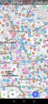
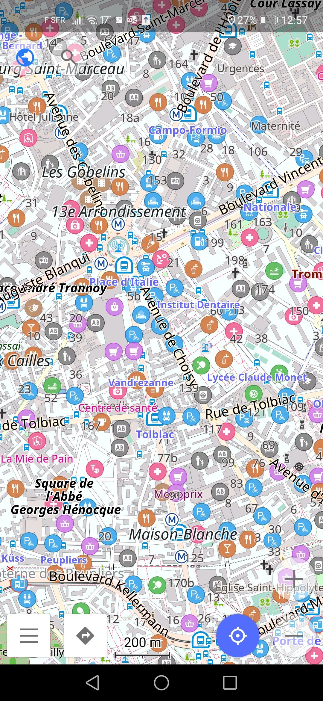
Personally, I don't mind if there are a lot of different types of icons, as long as I can chose which ones will be added to the map.
 FrancisVila
on 15 Aug 2020
FrancisVila
on 15 Aug 2020
Hi all,
OSM app
not comparable with osm-carto: pretty big icons on low zoom
wilmaed
on 15 Aug 2020
I'd like to contribute a couple of screenshots that I took of the OSM app on my smartphone (Honor 20, Android), in Paris 5e arrondissement.
Do note that this is after having searched through all the options and disabled anything that might possibly appear as adding an icon.
I think you will agree that they are crowded. Yes, zooming out can decrease the number of icons, but then you can lose the names of the smaller streets.
@FrancisVila , this is the repository for the maintenance of the "Standard" or default style as displayed on the OpenStreetMap website if you browse to "www.openstreetmap.org" in a web browser.
What individual mobile phone app developers do to display icons on styles that use OpenStreetMap data as data source for their specific cartographic rendering, like the one you are showing in the screenshots, is their choice, but is wholly unrelated to this style and repository.
You should contact the specific app developer instead, if you wish to submit issues or ideas for changes, not post them here.
 mboeringa
on 16 Aug 2020
mboeringa
on 16 Aug 2020
@mboeringa sorry for the confusion. As the mobile app is called OSM I assumed that was the same as Open Street Maps.
FrancisVila
on 16 Aug 2020
As the mobile app is called OSM I assumed that was the same as Open Street Maps.
Well, yes, at least part of the _data_ will be coming from OpenStreetMap, although the display of the POI icons might be based on a third party data source. But there are many maps and apps displaying OpenStreetMap data, and all make their own choices for _styling_ and display of the data.
mboeringa
on 16 Aug 2020
Related issues
 jengelh
·
4Comments
jengelh
·
4Comments
 Vort
·
3Comments
boothym
·
5Comments
Vort
·
3Comments
boothym
·
5Comments
 wielandb
·
3Comments
meased
·
3Comments
wielandb
·
3Comments
meased
·
3Comments
Most helpful comment
You act as if its a given that the only option to deal with icon clutter is by reducing the number of icons. Its not a given though (otherwise, just do a PR that guts the icons and call it a day). Or is it more about making a statement against the direction of the style lately and getting rid of the icons is an easy means to that end?
As the person who implemented a lot of the icons that now supposedly clutter the map,
I've only seen a few people complain about the icon issue and they were all maintainers who aren't really active in the development of the style anymore. It seems a little odd or something to not be involved in a project at all except to criticize a few choice decisions (especially considering the critics weren't involved in the discussions of if the icons should be implemented in the first place and only voiced their opinions after the fact). In my opinion it would set a bad precedence. Plus, its just a horrible policy to allow a few critical maintainers to get rid of things under those conditions.
I wonder where the opinions of those maintainers override the opinions of the many people, including a maintainer, that were involved in the original decisions to implement the icons. There's no point in participating in a project that doesn't have basic guidelines about how, when, and why things are removed from being rendered, or where a few maintainers opinions after the fact decide. "I don't like how it looks" defiantly shouldn't qualify as a valid reason for removal of a feature that's already been implemented. Even if it comes from a maintainer.