Openstreetmap-carto: Religious areas are rendered as massive building
Expected behavior
They may have a color
Actual behavior
But they look like a solid building
Links and screenshots illustrating the problem
https://www.openstreetmap.org/way/621570785

 uswoods
All 17 comments
Thanks for reporting the issue.
What is your proposed solution? Would you like to try to make rendering tests using some other color values?
 kocio-pl
on 17 Oct 2018
kocio-pl
on 17 Oct 2018
I disagree. The area just looks strange because nobody had taken care of mapping the features of the area.
After 3 minutes of mapping using Bing, the area looks as below. Could the OP please check the religion?

 polarbearing
on 18 Oct 2018
polarbearing
on 18 Oct 2018
Thanks polarbearing. I do think that the original poster has a point that
the dark landuse color is a little unusual. It’s more similar to quarry or
industrial land.
I would image that religious landuse should be most similar to social
amenities, since places of worship are similar to schools in their function
as community landmarks and meeting places.
I could do some test renderings if anyone has a good suggestion on a color
to try?
On Thu, Oct 18, 2018 at 8:54 AM polarbearing notifications@github.com
wrote:
I disagree. The area just looks strange because nobody had taken care of
mapping the features of the area.After 3 minutes of mapping using Bing, the area looks as below. Could the
OP please check the religion?[image: rel-landuse]
https://user-images.githubusercontent.com/8266355/47122785-a6bb4780-d278-11e8-95bc-401db4e7d9bc.png—
You are receiving this because you are subscribed to this thread.
Reply to this email directly, view it on GitHub
https://github.com/gravitystorm/openstreetmap-carto/issues/3457#issuecomment-430828811,
or mute the thread
https://github.com/notifications/unsubscribe-auth/AoxshMJfkMOLX7LPWiFFH9s6ENUoVEPFks5ul8MzgaJpZM4Xm1ck
.
 jeisenbe
on 18 Oct 2018
jeisenbe
on 18 Oct 2018
landuse=religious does not automatically mean it has a poW on it.
polarbearing
on 18 Oct 2018
I agree that it is probably a little too dark at the moment.
 meased
on 20 Oct 2018
meased
on 20 Oct 2018
Would it be ok to use the previous farmland color? Or are we saving that
for something else?
On Sun, Oct 21, 2018 at 3:56 AM meased notifications@github.com wrote:
I agree that it is probably a little too dark at the moment.
—
You are receiving this because you commented.Reply to this email directly, view it on GitHub
https://github.com/gravitystorm/openstreetmap-carto/issues/3457#issuecomment-431608914,
or mute the thread
https://github.com/notifications/unsubscribe-auth/AoxshN4Y6sehfc5RBI4HCoU8kaygwiiXks5um3HngaJpZM4Xm1ck
.
jeisenbe
on 21 Oct 2018
I think of using it for cultural and entertainment areas, see https://github.com/gravitystorm/openstreetmap-carto/issues/2704#issuecomment-430067030.
kocio-pl
on 21 Oct 2018
How about rendering landuse=religious with the same color as social
amenities (amenity=school, amenity=university, amenity=hospital...)?
In my experience most landuse=religious includes an
amenity=place_of_worship, but it can also include offices, school and
“Sunday school” buildings and gardens. Monastery and convent areas often
include these sorts of features too. So this is similar to what you may
find on a private university: classrooms, offices, gardens, pitches, and a
chapel or mosque or shrine (especially for private schools and
universities).
Another option would be to use a slightly different shade of orange-yellow
for landuse=religious, eg halfway between social amenities color and
proposed cultural areas color(old orange/brown farmland color)
I would be happy to make some test renderings if any of those sound
interesting
On Sun, Oct 21, 2018 at 10:54 AM kocio-pl notifications@github.com wrote:
I think of using it for cultural and entertainment areas, see #2704
(comment)
https://github.com/gravitystorm/openstreetmap-carto/issues/2704#issuecomment-430067030
.—
You are receiving this because you commented.Reply to this email directly, view it on GitHub
https://github.com/gravitystorm/openstreetmap-carto/issues/3457#issuecomment-431632043,
or mute the thread
https://github.com/notifications/unsubscribe-auth/AoxshNLOIjPythphjlgk9aTvNMfygb-zks5um9PRgaJpZM4Xm1ck
.
jeisenbe
on 23 Oct 2018
I would start with lighter gray, but of course any test is good as proof of concept.
kocio-pl
on 23 Oct 2018
Am Di., 23. Okt. 2018 um 02:46 Uhr schrieb jeisenbe <
[email protected]>:
How about rendering landuse=religious with the same color as social
amenities (amenity=school, amenity=university, amenity=hospital...)?
I already would see these quite different: kindergarten and schools are
usually closed objects, you cannot go there if you are not a pupil or a
parent who picks up their kid. Universities and hospitals are generally
accessible (at least around here).
In my experience most landuse=religious includes an
amenity=place_of_worship, but it can also include offices, school and
“Sunday school” buildings and gardens.
If it is a religious administrative facility, it should rather be tagged as
office, if it is a school, it should be tagged as school. You can add
religion and denomination tags to any object where it applies.
Monastery and convent areas often
include these sorts of features too.
not from my experience, but might be true for some of these places (e.g. an
ermitage hardly ever will have a school integrated ;-) ). It should be
tagged separately, IMHO
For landuse=religious, I would use a lighter version of the
amenity=place_of_worship color.
 dieterdreist
on 25 Oct 2018
dieterdreist
on 25 Oct 2018
Here are some test renderings. Currently landuse=religious is rendred with the same color and outline as amenity=place_of_worship for closed ways on land that is not also a building;
@place_of_worship: #cdccc9;
@place_of_worship_outline: #111;
z15 current rendering

z16 (most buildings hidden to show landuse better):
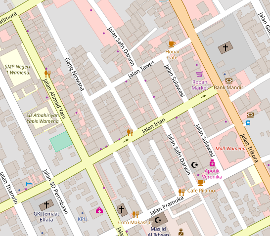
(http://openstreetmap.org/#map=17/-4.09339/138.94656 Wamena, Indonesia)

z16 with buildings:

With buildings at z17:

1. Lighter: fill color lighter shade of gray, #d0d0d0, with #aaaaa for the outline:
z16 no buildings

z16

z17

2. But that outline may be too light. Here is #d0d0d0 with the line darkened 30%:
z15

z16 no buildings

z16

z17
3. Line darkened 40% (fill #d0d0d0):
z15
z16 no buildings

z16

z17

4. Here is a orangish shade of gray f4e8d4, with the outline darkened 30% and saturated 20%:
z15

z16

z17

5. A Lighter shade of orange-brown: f2ecd9
z15

z16

z17

**6. Yellow-orange: f9f3d6
z15

z16

z17

jeisenbe
on 26 Oct 2018
I think 2 (#d0d0d0 with the line darkened 30%) is very good and I would use it.
kocio-pl
on 26 Oct 2018
Fine with me in general, d0d0d0. Would be interesting to see how good the line separates adjacent landuses of the same kind.
polarbearing
on 26 Oct 2018
The second one is also my favorite darkness for the outline. I would like to try lighter fill, but I'm not sure if it's possible to make the gray much lighter without becoming too similar to residential.
The fifth option, light orange-brown, looks nice to me too. Does anyone else like it, or a similar color?
The six one looks nice but is too similar to the current social amenities color, especially at zoom 15 and below:
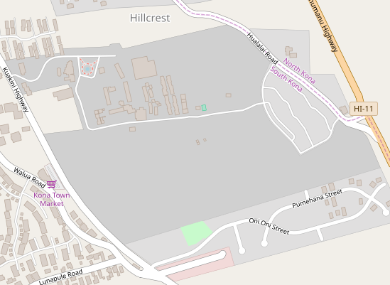
YWAM in Hawaii
(This is a large campus with a religious training center)
_(Current rendering) #cdccc9 fill, #111 line_
z15

_Option 2. #d0d0d0 with the line darkened 30%_
z15

z16
z17 Wamena - two adjacent religious landuse areas

z18

_Option 5. Light orange-brown: f2ecd9 (outline darkened 30% and saturated 20%:)_
My favorite
z15 YWAM Hawaii

z16

z17 Wamena - 2 adjacent religious areas

z18

_Option 7. New brown-orange option; similar intensity to residential but different color: #e2ddd0; outline darken 30% / saturate 20%_
z15 Hawaii

z16 Hawaii

z16 Wamena

z17 Wamena - two adjacent religious areas

z18 Wamena

jeisenbe
on 27 Oct 2018
v2 looks the best for me. v7 reminds me of landuse=garages.
kocio-pl
on 27 Oct 2018
Good idea to compare with garages.
(BTW, how did that become a separate landuse? Must be a British thing)
Option 7 with garages:
Yes, too similar.

Option 2 next to garages:
z16

z17

Option 5 with garages:
z16

z17

_I still like option 5 best, because option 2 is still quite similar to residential, just darker. _
jeisenbe
on 28 Oct 2018
I see. I find it more natural to just make religious area lighter and use light orange for other areas (like cultural/entertainment) than to use light orange for religious and use light grey for other areas.
kocio-pl
on 28 Oct 2018
Related issues
 Tomasz-W
·
4Comments
Tomasz-W
·
4Comments
 boothym
·
5Comments
polarbearing
·
5Comments
kocio-pl
·
4Comments
meased
·
3Comments
boothym
·
5Comments
polarbearing
·
5Comments
kocio-pl
·
4Comments
meased
·
3Comments
Most helpful comment
Thanks polarbearing. I do think that the original poster has a point that
the dark landuse color is a little unusual. It’s more similar to quarry or
industrial land.
I would image that religious landuse should be most similar to social
amenities, since places of worship are similar to schools in their function
as community landmarks and meeting places.
I could do some test renderings if anyone has a good suggestion on a color
to try?
On Thu, Oct 18, 2018 at 8:54 AM polarbearing notifications@github.com
wrote: