Openstreetmap-carto: Simple 3d rendering of buildings
This is a request for discussion.
I've been thinking about implementing 3D rendering of buildings using Mapnik (rendering buildings like simple cube-like objects) to give some feedback on building heights and to make them look more like buildings.
Initial results were promising - see a screenshot below. However, I hit two road blocks:
- Wall hiding doesn't work correctly. Most examples sort buildings by coordinates before rendering. That works fine in simple cases (uniform size rectangular buildings) but fails in more complex scenarios. In the example below you can see some internal walls that shouldn't be rendered.
- I've seen styles (e.g. osm-bexhill) that don't seem to have this issue, so perhaps a solution exists.
- If I render building below roads (as in the current openstreetmap-carto implementation) I get an unnatural effect of roads rendered on top of walls etc. If I render buildings above roads (like in the screenshot below), the buildings obscure roads. There is an option of making buildings semi-transparent, which would be a good solution to this problem, but it results in all internal walls being visible.
The example below renders buildings at a fixed height and does not support major buildings. This can be fixed with extra code.
 andrzej-r
All 10 comments
Here is a screenshot with semi-transparent buildings (building-opacity=0.3). A nice feature is that undeground objects (here railway on the left) or landuse areas are still visible despite buildings being rendered above them. Unfortunately, all these sidewalls look too distracting, at least to me.
andrzej-r
on 4 Oct 2018
It turns out that Bexhill OSM style uses a graphical trick to render drop shadows next to the buildings. That's a different technique from the one used in examples above (Mapnik building symbolizers).
Drop shadows look nice but because they require all buildings to be rendered at the same "height", so they don't improve mapping feedback. The feature can be implemented fairly easily, and has a minimum impact on the existing rendering. If there is an interest in having it, I can prepare a working PR.
Edit: There are some further limitations I have noticed:
- Roofs have to be opaque (otherwise we would see "shadows" under them), so they have to be rendered under roads
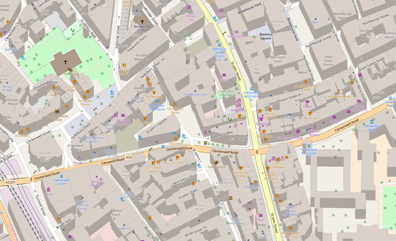
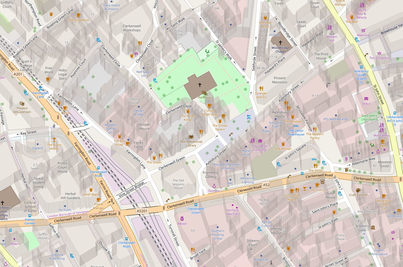
- The roads then occasionally obscure the buildings and their shadows. It's not different from what we have at the moment but because of the "3D effect" the roads look elevated. See for example Clerkenwell Close.
andrzej-r
on 5 Oct 2018
A modification to https://github.com/gravitystorm/openstreetmap-carto/issues/3425#issue-366979192
Buildings are rendered as opaque and then the whole layer is made transparent. That means we can see the roads and underground features but not internal and back walls of the buildings.

There are still issues with some internal walls showing up. Looks like this feature is being worked on https://github.com/mapnik/mapnik/pull/3969 so perhaps future versions of Mapnik will have this issue fixed.
andrzej-r
on 5 Oct 2018
With major buildings and building heights from the database:
Mapnik fixes would be needed to fix more complex z-order cases but it starts looking usable.
andrzej-r
on 5 Oct 2018
I see it as quite good for "check box" option for default map, but surely not for default map by itself.
 Tomasz-W
on 5 Oct 2018
Tomasz-W
on 5 Oct 2018
@Tomasz-W It's certainly a substantial change but it is not eye-candy. It fixes many visibility issues we have with landuses, platforms and tunnels and it improves mapping feedback.
I wouldn't dismiss it purely because it looks different.
I've cleaned up the code and pushed it in #3427. Please feel free to play with it. I was mostly focused on the implementation so the visual representation could use some tuning.
andrzej-r
on 5 Oct 2018
@andrzej-r, how exactly does it fix landuse visibility issues and improve mapping feedback? I'm my opinion it does the opposite by adding unnecessary clutter and complexity. Its good eye candy, but that's about it. Also, how does a person know by glancing at the map if an icon is part of a 3d building or a place behind it? Because its hard to tell in the last example you gave and icon position looks not good at all in the first example.
 Adamant36
on 5 Oct 2018
Adamant36
on 5 Oct 2018
At present landuse areas are simply not visible in dense built up areas. Another example is the stations, where buildings are obscured by platforms and tracks, producing confusing rendering.
As for the clutter and readability - I disagree. I purposely chose London City for a stress test. In my opinion it produces more readable results than a flat map. Flat map may indeed look less complicated but it is also less readable because it is missing key on the ground information that matters to the users. Later I will also post renderings of suburban areas, these look good, ad in uncomplicated and readable.
Onr important thing we would have to decide is a "viewing angle". At the moment it is set fairly low to demonstrate the concept. But a steeper angle (shorter buildings) may be a better compromise between realism and usability.
Note that if we make building heights zero, we end up with flat rendering, albeit one with transparent buildings. So there is a whole continuum of settings we can use, with the current design on one end, infinitely tall buildings on the other end, and an optimal design somewhere in between.
andrzej-r
on 5 Oct 2018
Hi, thanks for testing the idea. I was also looking at this feature some time ago and it looks cool, I would like to play with it for one of my personal styles, but this style is meant to be generic. I already try to make it less busy in the cities to show more of other generic POIs and maintain the balance between being rich and readable. I think OSM Carto needs to stay 2D, which probably means excluding underground facilities (except tunnels probably) and objects on levels >0 at some point.
This style is used as a background for multiple sites and services, it might have very different uses. I think 2.5D does not belong here, especially since there are separate styles for showing it.
 kocio-pl
on 5 Oct 2018
kocio-pl
on 5 Oct 2018
Thanks. I am going to clean up the code a bit and leave it in my repository.
andrzej-r
on 5 Oct 2018
Related issues
 jengelh
·
4Comments
jengelh
·
4Comments
 FTno
·
4Comments
FTno
·
4Comments
 Thorwynn
·
3Comments
Thorwynn
·
3Comments
 matkoniecz
·
5Comments
matkoniecz
·
5Comments
 Vort
·
3Comments
Vort
·
3Comments
Most helpful comment
Hi, thanks for testing the idea. I was also looking at this feature some time ago and it looks cool, I would like to play with it for one of my personal styles, but this style is meant to be generic. I already try to make it less busy in the cities to show more of other generic POIs and maintain the balance between being rich and readable. I think OSM Carto needs to stay 2D, which probably means excluding underground facilities (except tunnels probably) and objects on levels >0 at some point.
This style is used as a background for multiple sites and services, it might have very different uses. I think 2.5D does not belong here, especially since there are separate styles for showing it.