Openstreetmap-carto: Add rendering for amenity=bicycle_repair_station
A public-access stations equipped usually with air pump, screwdriver, wrenches, allen keys etc. Very useful feature.
https://wiki.openstreetmap.org/wiki/Tag:amenity%3Dbicycle_repair_station
About 2800 uses.
https://taginfo.openstreetmap.org/tags/amenity=bicycle_repair_station
Icon proposal:

 Tomasz-W
All 65 comments
It's a duplicate of #1353, let's discuss it there.
 kocio-pl
on 12 Feb 2018
kocio-pl
on 12 Feb 2018
Sorry, it seems that we had 2 PRs which were rejected then (#1353 and #1864), but no issue ticket before.
We already have the icon, so making a PR would be rather easy now:
https://github.com/gmgeo/osmic/blob/master/shop/repair-bicycle-14.svg
kocio-pl
on 12 Feb 2018
Notice that @nebulon42 icon include single-sided wrench, and it could be confused with the key from amenity=bicycle_rental.
https://github.com/gravitystorm/openstreetmap-carto/blob/master/symbols/rental_bicycle.svg
I don't know is the brown color (from PR test renderings) right for this feature. Bicycle parkings and rentals are blue.
Tomasz-W
on 12 Feb 2018
Rental has the thicker side on the left while repair has the thicker side on the right. This should work against confusion.
 nebulon42
on 12 Feb 2018
nebulon42
on 12 Feb 2018
Anyway, I would like to see a test rendering with my icon, so I'm putting Gist link:
https://gist.github.com/Tomasz-W/b4641535717e8b36ae8fcae4acae95a3
Tomasz-W
on 12 Feb 2018
Voila. Still quite similar on the first glance. I wonder if we might turn the repair icon 90 deg, so the bike comes in repair position, and the spanner easier to distinguish from the key. Or the bike upside down.


 polarbearing
on 12 Feb 2018
polarbearing
on 12 Feb 2018
For comparsion:


Tomasz-W
on 13 Feb 2018
The 90 deg in the middle works for me. Maybe with the wheels towards the spanner.
The wheels up might be too hard to guess when you see it first.
polarbearing
on 13 Feb 2018
Yes, the second one is good. But I would switch bike and tool (so you can read the symbol from left to right). Then it will also have the wheels towards the tool, which I agree should be better.
 geowas-github
on 13 Feb 2018
geowas-github
on 13 Feb 2018
I would switch bike and tool (so you can read the symbol from left to right)
Good point. Version with bike on the left side:

Gist link (with two versions of the icon): https://gist.github.com/Tomasz-W/9c66f9b37345fdb35f8f6cecce9fe925
Tomasz-W
on 13 Feb 2018
Wheels towards the spanner:

source
polarbearing
on 13 Feb 2018
Version with wheels to the edge reminds me wall hangs, so I like it more.
http://www.wirecrafters.com/images/products/bicycle-storage/bicycle-wall-rider/Bicycle-Wall-Rider-Bike-Storage-Hooks.jpg
http://coolamon.org/wp-content/uploads/2017/10/valuable-how-to-hang-a-bike-on-wall-with-best-25-storage-solutions-ideas-only-pinterest-shed.jpg
We should choose between this:
1 ) 
and this:
2 ) 
Tomasz-W
on 13 Feb 2018
It helps to use numbers as a reference if there are few propositions and they are changing into new versions.
kocio-pl
on 13 Feb 2018
I would go for number 2 (with bike in the left side)
geowas-github
on 13 Feb 2018
On GitHub hash+number links to some old issues. 😃
kocio-pl
on 13 Feb 2018
We already show car repair, for me it's better if they are similar and they are distinct enough for me (see https://github.com/gravitystorm/openstreetmap-carto/issues/3069#issuecomment-365061697), so I still prefer Osmic version.
I also think that brown is better (which also will make it visually different than rental) - blue is for direct transportation (like gas station), repairing is brown and car/bicycle shop is violet, because buying/repair is indirectly related to journey.
kocio-pl
on 13 Feb 2018
I just don't like this single-sided wrench. If you want, I can make a car repair icon with double-sided wrench, and both icons will match each other.
Tomasz-W
on 13 Feb 2018
Not sure about the colours. We need to distinguish a repair shop (where you have your bike repaired and pay money) from the repair-station (self service, more on-the-go). Thus I would see the repair-station in blue (as in the render test above), it is already distinguished from rental by the hanging bike. To summarize:
- shop=car, car-repair, bike, bike-repair --> violet
- car-rental, bike-rental, bike-self-repair, fuel, air (tyre pressure) --> blue
polarbearing
on 14 Feb 2018
I would prefer to show services (including repairs) in brown, selling things in violet and blue only when this is something you do to get the vehicle or (rental) let it rest (parking).
kocio-pl
on 19 Feb 2018
The only amenity=bicycle_repair_stations that I've ever come across have only had air pumps (service:bicycle:pump=yes). IMO this is as useful to a cyclist as a petrol station is to a motorist, therefore the icon should be in blue. This will also match amenity=bicycle_parking.
 lakedistrictOSM
on 17 Mar 2018
lakedistrictOSM
on 17 Mar 2018
Through past weeks I've been working in a bicycle service :) This time gave me few thoughts about this issue. First 4 icons are the current ones, and last 2 ones are my propositions.
- shop=bicycle

- shop=car

- amenity=bicycle_rental

- amenity=car_rental

- amenity=bicycle_repair_station

- a correct repairing position of the bike is horizontal
- I prefer 2-sided wrench to distinguish this icon from the
bicycle_rentalone - as this is public amenity feature I prefer amenity-brown colour for it
Gist link: https://gist.github.com/Tomasz-W/4607d7fcbb642d9538e04bd784fb5f01
* shop=car_repair

1. change wrench shape to match bicycle_repair_station icon and distinguish repair icon from a car_rental one
Gist link: https://gist.github.com/Tomasz-W/30bae143f810026cfad5d9cfe813319e
Tomasz-W
on 1 Jul 2018
I like the two "repair" icons from previous post. The same colour and very similar in shape they show, that the two transportation modes (car and bicycle) benefit from similar amenities.
 Martin-Lbg
on 5 Jul 2018
Martin-Lbg
on 5 Jul 2018
The non-drivable positions (upside, sidewards) were chosen somewhere above to distinguish repair from rental situations more clearly.
However we could also think about the spanner under the vehicle (being lifted for repair), while the rental key is above.
polarbearing
on 26 Jul 2018
@polarbearing repair icons with spanner under the vehicle:
- amenity=bicycle_repair_station

- shop=car_repair

I vote for 'above the vehicle' versions in both cases.
Tomasz-W
on 29 Jul 2018
Well I find your 'spanner under the vehicle' convincing. As said, symbolising 'lifted for repair'.
polarbearing
on 29 Jul 2018
Both versions are in Gist links in https://github.com/gravitystorm/openstreetmap-carto/issues/3069#issuecomment-401627495. We should choose better-fitting version after some test renderings.
Tomasz-W
on 29 Jul 2018
Today I discussed these issues with some friends, we came to the following suggestions
- the tool above the vehicle gives the icon a closer, square look (the tool under the vehicle might be confused with some other tag just showing a single tool (=some kind of generic workshop) --> we vote for "tool above bicycle"
to distinguish the "rental place" from the "service station" I suggest to use a brown color like
https://user-images.githubusercontent.com/25656654/42137842-cd4f6bb0-7d73-11e8-9417-33e5d1fdb921.png
- additionally the tool above the bicycle opens a little space on the right of the icon between the bicycle and the tool which we could use to put a green rectangle symbolizing an air pump (some of this unattended service stations provide air pumps (tagged with service:bicycle:pump), most do not provide compressed air thus not allowing for the tag "amenity=compressed-air"
I suggest to color this additional rectangle green, because pressured air is sold in steel-bottles with this color-code. All other color codes (ISO, ANSI) I researched this afternoon are for large pipes and facilities not for such small devices as a bicycle air pump. It is a light green (hex 00FF01)
Sorry, I'm still in the process of getting my Windows-box to run all of the parts of OSM-development, therefore I cannot help directly at the moment, but I hope to get this up and running in a few weeks (with a new computer I presume)
Martin-Lbg
on 29 Jul 2018
Did you try just running Linux (Ubuntu for example) in the VirtualBox?
kocio-pl
on 29 Jul 2018
I vote for "tool above". The spanner/key icons should provide enough distinction.
I don't think a green rectangle would mean "air pump" to anyone without further explanation. This is a use case for clickable POIs.
 meased
on 29 Jul 2018
meased
on 29 Jul 2018
This icon should not introduce little dots in other colours to symbolize something obscure.
On the map you won't have the rental and the repair side by side to spot the differences, so the only way to distinguish the key from the spanner is the gable-end of the spanner.
I would not rely just on colour to distinguish them since we also want to plan to differentiate between repair-as-a-service and self-repair stations.
polarbearing
on 29 Jul 2018
@Adamant36 If you are ready you can make test renderings with different icons versions (bicycle repair and car repair) from https://github.com/gravitystorm/openstreetmap-carto/issues/3069#issuecomment-401627495. Then we choose better one for PR.
Tomasz-W
on 1 Aug 2018
@Tomasz-W is it suppose to be amenity=car_repair up above or shop=car_repair? Because it seems that amenity=car_repair is depreciated and there are no uses of it. If its shop=car_repair, would you mind updating the posts referencing it? Thanks.
 Adamant36
on 1 Aug 2018
Adamant36
on 1 Aug 2018
Car repair with wrench above and below the car
Bicycle repair station with wrench above and below the bicycle
I prefer the wrench being above the bicycle and car
Adamant36
on 2 Aug 2018
@Adamant36 Can you also take care of https://github.com/gravitystorm/openstreetmap-carto/issues/2658?
Tomasz-W
on 2 Aug 2018
@Tomasz-W sure. I'm waiting for the shop=paint icon to get merged. Then I'll do this one and that issue to if there is feedback on which icon to use here by then. Otherwise I'll do leisure=outdoor_seating next.
Adamant36
on 2 Aug 2018
I prefer the wrench being above the vehicles (both bicycle and car)
Martin-Lbg
on 2 Aug 2018
I find the wrench being below the vehicles (both bicycle and car) easier to understand and to distinguish.
For the colour #2658, I still prefer shop=car, car-repair, bike, bike-repair --> violet
polarbearing
on 2 Aug 2018
We shouldn't be glued to colours in this way. Yeah, it's shop=car_repair, but it's not a place where you go to buy some goods but to get some service. It makes this feature closer to amenity key than a shop one. Rendering it in amenity-brown will be intutive, and violet could be confusing for map users.
Tomasz-W
on 2 Aug 2018
Yes it's a service, like hair dresser and nail studio, which we do purple:
(The image is from above and shows blue for the bike repair, which should only be used for self-repair stations)
Brwon has amenities like bar, restaurant, museum, which do not compare to car/bike-repair.
polarbearing
on 2 Aug 2018
Would blue really be that crazy? (For both bike and car repair.) They're transport related, and (based on the above comments) they don't seem to cleanly fit into either the amenity or shop categories.
We render fuel stations in blue and I could make a pretty good argument that they should be violet.
meased
on 2 Aug 2018
@meased See https://github.com/gravitystorm/openstreetmap-carto/issues/3069#issuecomment-365296071
Tomasz-W
on 2 Aug 2018
I would agree with @Tomasz-W about shop=car_repair being more like an amenity. A lot of times car repair places are often a part of a larger business that provides other services which can be car related or not. Like all the car shops in Walmart, Les Schwab Tires, or gas stations with both a convince store and a place to get your car checked up on. Also, places that do things like oil changes and check tire pressure exclusively are more like an amenity then anything.
Adamant36
on 2 Aug 2018
sent from a phone
On 2. Aug 2018, at 18:07, meased notifications@github.com wrote:
Would blue really be that crazy? (For both bike and car repair.) They're transport related, and (based on the above comments) they don't seem to cleanly fit into either the amenity or shop categories.
I agree with blue for bicycle repair stations
 dieterdreist
on 3 Aug 2018
dieterdreist
on 3 Aug 2018
I feel we need different colors to differentiate things from the same category a bit. I would use blue only for things directly related to journey, like gas/electric station, parking or bus stop. Repair station is not directly related, just like embassy for example, so brown looks better.
kocio-pl
on 3 Aug 2018
@Adamant36 After discussion summary, I think you should use amenity-brown 'wrench above' versions in both cases.
Tomasz-W
on 3 Aug 2018
@kocio-pl As we are adding more and more brown icons to the map, your idea of chnging gastronomy objects to orange seems reasonable. Can you open an issue with it, just to have it on mind and test it someday?
Tomasz-W
on 3 Aug 2018
I don't get the system. You argue for the repair services to use the same colour than tourism-brown, but propose to move tourism-related gastronomy to a different colour? Maybe we should have a meta-ticket first to clarify the colour schemes and what concept they relate to, before shuffling individual cases around.
polarbearing
on 3 Aug 2018
tourism-related gastronomy
Going to a restaurant or some fast food in your own city makes you a tourist then? Interesting...
Tomasz-W
on 3 Aug 2018
The problem of classification is that many objects can belong to multiple categories. It might be a problem, but it also gives us some space to tune the things a bit. Maybe we could discuss the system, but we have too few colors available to make it strict and rich, color reuse is already necessary (see the problem with offices - https://github.com/gravitystorm/openstreetmap-carto/pull/3163#issuecomment-378745427).
I'm currently not interested too much in object colors (including gastronomy), so if anyone is interested, please open the issue and - more important - lead the discussion about it.
kocio-pl
on 3 Aug 2018
@Tomasz-W OK. I'll probably do this next after outdoor seating gets merged. I also think it would be a good idea to open a meta ticket in order to discuss @polarbearing's concerns and the system in general though. Then we can change the color again later if need be. I don't know what to think about it at this point myself though, because like Kocio-pl says, lots of objects can belong to multiple categories. Plus, it seems like there's other priorities. So I rather get the icons on the map now in brown at least and deal with the color thing as a separate issue.
Adamant36
on 4 Aug 2018
I’ve always opposed the idea to associate museums or artwork with tourism, but that’s how we tag them (me included), it is just a word (that doesn’t hit it nicely), seeing food related amenities as tourism related neither is helpful from my point of view (although for some it is the case). Therefore I would not insist in brown for tourism related stuff.
Bicycle repair stations to me are a feature similar to the compressed air facilities you find at petrol stations, a place you can go to do basic fixes “on the go”/ while you are not at home.
dieterdreist
on 5 Aug 2018
What do you think on this one @Tomasz-W? Wrench above and amenity brown for both? It seemed like it was mixed on what to go with, but the discussion appears to have stalled out. So id like to do the PR and get it rendered already if its possible.
Adamant36
on 10 Sep 2018
Surely wrench above in both icons, but as we have around 50:50 for amenity-brown/ transportation-blue, please make test renderings with both colours to compare. It would be good to see how these both colours matches bicycle/ car parkings/rentals placed nearby.
Tomasz-W
on 10 Sep 2018
@Adamant36 Are you willing to write code for this feature in a week (before https://github.com/gravitystorm/openstreetmap-carto/issues/3370)? I'm asking because near my church where I'm every Sunday there is one bicycle repairing station, and every week when I see it, it reminds me OSM and lack of this icon. If it won't show on map till october (when most of people in Poland hide their bikes to the basement), I will consider it as my fail as unofficial icon-issues manager here ;) ;) If you have some other plans or you just don't have time for it, I will fully understand, so don't worry.
Tomasz-W
on 13 Sep 2018
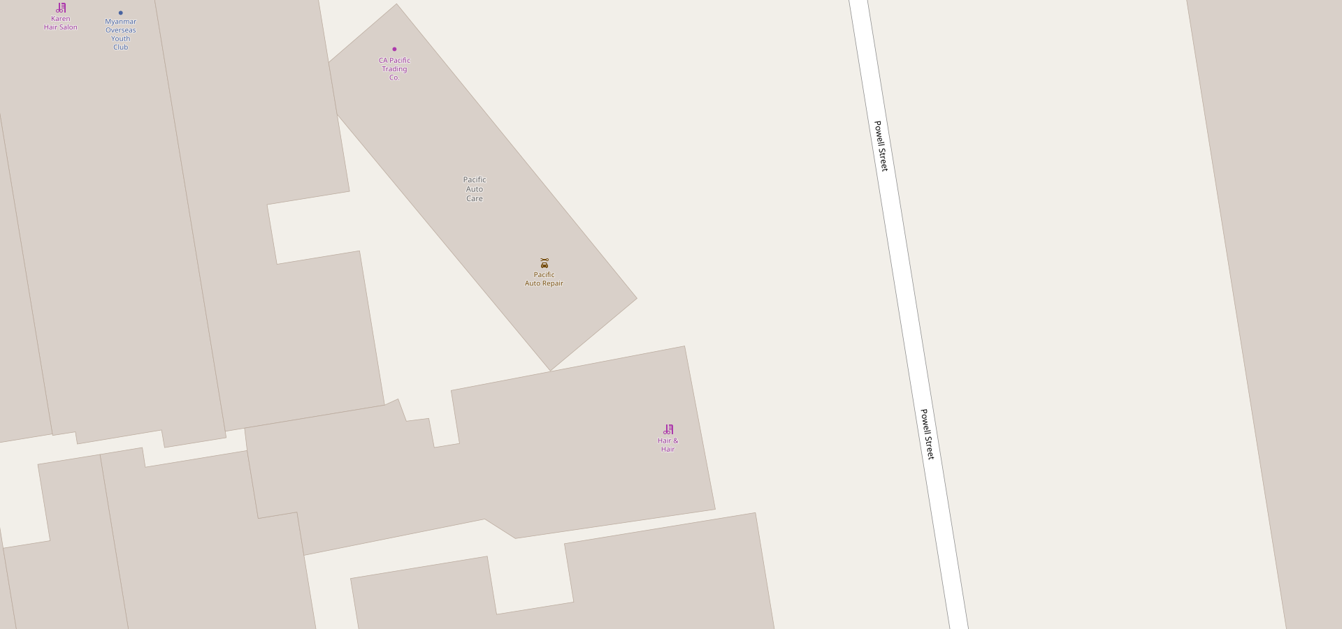
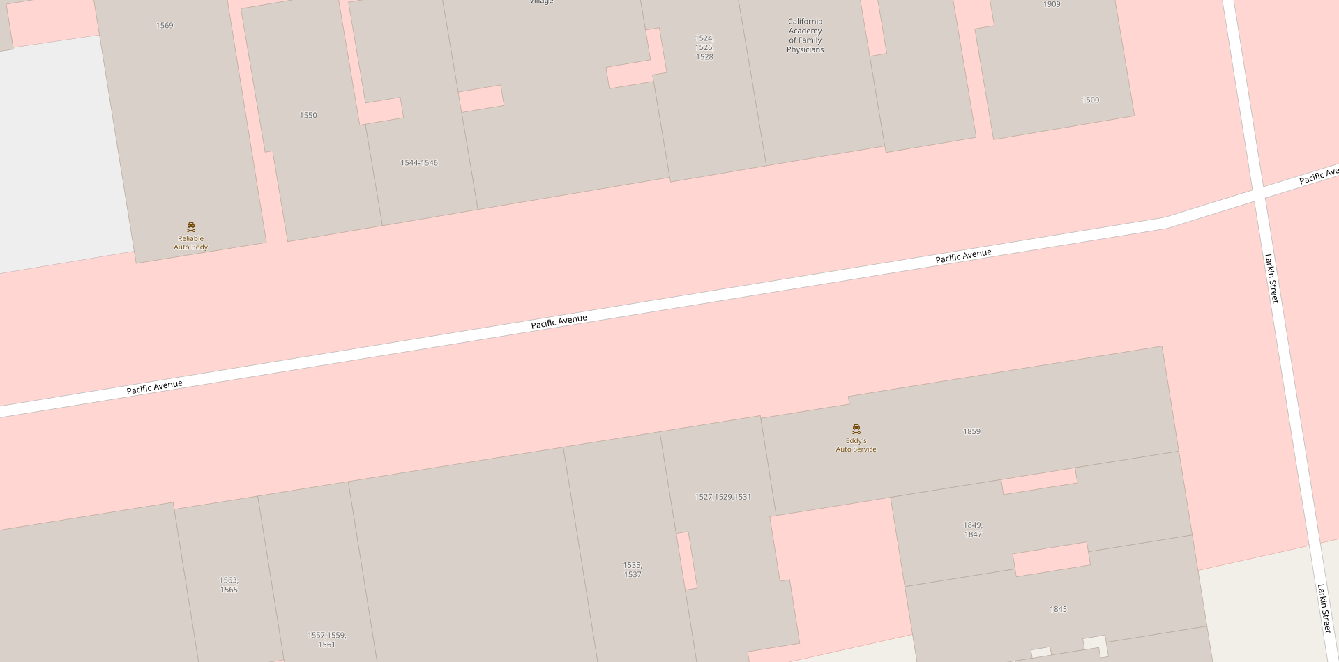
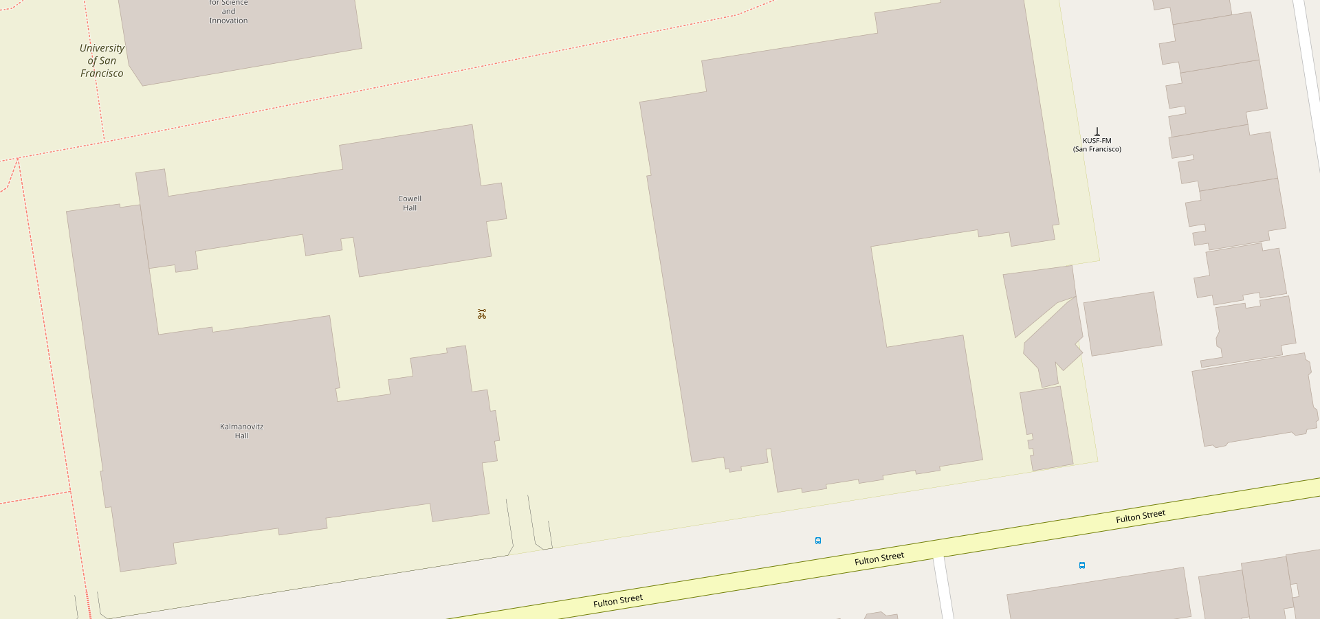
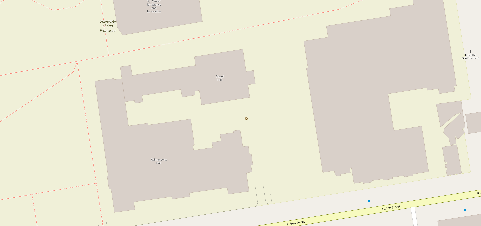
@Tomasz-W, sorry about that. I really wanted to get it through before now myself. I was waiting for the conversation to figure itself out and it took longer then I expected. Plus, I got distracted with other stuff. I did some looking around with car repair and seems that it has some weird code and is render as a purple icon with brown text for some reason. So id like to just leave it as is except for updating the icon, and deal with it in another PR. That way we can get this done before #3370 at least. Here's some test renderings of bicycle repair stations in the mean time though, with both brown and blue. I don't know if they are the best spots, but I can find more if necessary. I'll do a PR for it as soon as its figured out and maybe @kocio-pl can fast track it if need be. Since there's already been a lot of discussion here. Otherwise, I'll feel a little like I failed on it too.


I think brown makes the most sense. Especially in the pictures with the car wash next to the gas station. Where it is more associated with the car wash by being brown then the gas station or hotel. Which makes sense. Plus, it makes it slightly easier to see in the first picture next to the blue bike path by being brown.
Adamant36
on 13 Sep 2018
I think this feature in blue looks like more important than it actually is. As this is free-standing non-interactive small amenity, it should be in _amenity-brown_.
As https://github.com/gravitystorm/openstreetmap-carto/issues/2658 may be hard to resolve but on the other hand it would be nice to have bicycle repair stations on map, you are right to do at least icon update and left colour inconsistency fixing for later (btw. there is the same problem with shop=massage, it's propably because we don't have _amenity-brown_ generic dot and also no _leisure-green_ generic dot)
Tomasz-W
on 13 Sep 2018
@Tomasz-W, I agree. I'll wait awhile to see if anyone else chimes in and then do the PR with amenity brown later tonight if there is no major objections.
Adamant36
on 13 Sep 2018
Given that this icon is one of the more detailed fiddly ones, it is more readable in a darker colour, so brown wins this time.
lakedistrictOSM
on 14 Sep 2018
Ok, brown is it for me
Martin
Am 14. Sep. 2018, 00:31 +0200 schrieb lakedistrictOSM notifications@github.com:
Given that this icon is one of the more detailed fiddly ones, it is more readable in a darker colour, so brown wins this time.
—
You are receiving this because you commented.
Reply to this email directly, view it on GitHub, or mute the thread.
Martin-Lbg
on 14 Sep 2018
Given that this icon is one of the more detailed fiddly ones, it is more readable in a darker colour
Sorry but I cannot consider this as a criterion for selecting an icon colour. There has to be a logic for the map reader. If the icon is not recognisable, it would need to be tuned, not moved to another colour.
That said, I could agree on brown; as long as it - being a self-service amenity - is not the same colour as the serviced car-repair. See related discussion in #3126 (crafts).
polarbearing
on 14 Sep 2018
@polarbearing The colour choice was already between blue and brown based on logical reasoning, and I was just saying that it stood out better in brown. Of course blue might be better in other areas, but my comment was based on the example rendering above.
lakedistrictOSM
on 14 Sep 2018
If it won't show on map till october (when most of people in
Poland hide their bikes to the basement), I will consider it as my
fail as unofficial icon-issues manager here ;) ;)
@Tomasz-W You can consider it your victory then. :smile:
Of course meeting this goal (or any other single goal) is just kind of coincidence, but it's hard to measure coordinating work, so this symbolic win and the fact that things go smooth is quite good benchmark. I consider you not only good icon designer, but also talented project manager. Thanks! :heart:
kocio-pl
on 21 Sep 2018
Hello
You are my hero and made my Sunday, the icon did just now appear for my
hometown. Thx for the great work
I did not yet hide my bicycle
Martin
Am 21. Sep. 2018, 03:22 +0200 schrieb kocio-pl notifications@github.com:
>
If it won't show on map till october (when most of people in Poland hide their bikes to the basement), I will consider it as my fail as unofficial icon-issues manager here ;) ;)@Tomasz-W https://github.com/Tomasz-W You can consider it your
victory then. 😄Of course meeting this goal (or any other single goal) is just kind of
coincidence, but it's hard to measure coordinating work, so this
symbolic win and the fact that things go smooth is quite good
benchmark. I consider you not only good icon designer, but also
talented project manager. Thanks! ❤️—
You are receiving this because you commented.
Reply to this email directly, view it on GitHub
https://github.com/gravitystorm/openstreetmap-carto/issues/3069#issuecomment-423383881,
or mute the thread
https://github.com/notifications/unsubscribe-auth/Am-e5h9rDSNeLek3gDK5SRsSMbgp39uMks5udD9bgaJpZM4SCwwJ.
Martin-Lbg
on 23 Sep 2018
That's the one which was annoying me all the summer because I see it every Sunday, and it was reminding mi lack of the icon on and on: https://www.openstreetmap.org/node/5404985083
If I would have some bicycle accident in the last week of my summer break and I will loose my memory. I would can at least find bicycle repair station on the map :sweat_smile: Thanks to all involved!
Tomasz-W
on 23 Sep 2018
Have a subborn little tile here. Dirty! Dirty! Dirty!.
Tile is due to be rendered. Last rendered at Tue Sep 18 08:13:26 2018. Last accessed at Sun Sep 23 10:25:25 2018.
I guess it has ADS.
polarbearing
on 23 Sep 2018
Related issues
 Vort
·
3Comments
Vort
·
3Comments
 d1g
·
4Comments
d1g
·
4Comments
 dktue
·
3Comments
dktue
·
3Comments
 HolgerJeromin
·
3Comments
HolgerJeromin
·
3Comments
 jengelh
·
4Comments
jengelh
·
4Comments
Most helpful comment
@Tomasz-W, sorry about that. I really wanted to get it through before now myself. I was waiting for the conversation to figure itself out and it took longer then I expected. Plus, I got distracted with other stuff. I did some looking around with car repair and seems that it has some weird code and is render as a purple icon with brown text for some reason. So id like to just leave it as is except for updating the icon, and deal with it in another PR. That way we can get this done before #3370 at least. Here's some test renderings of bicycle repair stations in the mean time though, with both brown and blue. I don't know if they are the best spots, but I can find more if necessary. I'll do a PR for it as soon as its figured out and maybe @kocio-pl can fast track it if need be. Since there's already been a lot of discussion here. Otherwise, I'll feel a little like I failed on it too.


I think brown makes the most sense. Especially in the pictures with the car wash next to the gas station. Where it is more associated with the car wash by being brown then the gas station or hotel. Which makes sense. Plus, it makes it slightly easier to see in the first picture next to the blue bike path by being brown.