Openstreetmap-carto: Add rendering for leisure=horse_riding
Could you add rendering for the leisure=horse_riding tag?
Example: 323603669.
 gszy
gszy
All 81 comments
I guess this could be rendered similar to dog park with horseshoes instead of paws or with a solid background and a horseshoe icon (like in playground).
 kocio-pl
on 13 Sep 2016
kocio-pl
on 13 Sep 2016
Why do riders need another tag (used 3800 times) ?
The wiki page does not explain why sport=equestrian with sports centre (used 2000 times) is not enough.
With this problem I am not sure if we should render it special.
 HolgerJeromin
on 13 Sep 2016
HolgerJeromin
on 13 Sep 2016
Maybe the difference is between sport and leisure? This is not intended for horse racing, for example.
kocio-pl
on 14 Sep 2016
@kocio-pl, that’s what I think (but please note that there’s separate sport=horse_racing tag).
I mean, we can go to leisure=horse_riding to learn riding basics and practise (spare time activity). And in sports centre we can take part in riding competitions (professional activity). While it may be the same for a small riding stable, I think there can be a clear separation for bigger ones:
Wiki (Riding) doesn’t tell what is the exact difference between sport=equestrian (+ some sports centre tag) and leisure=horse_riding (just ‘exercise’ versus ‘practise-in-spare-time’), but here I’ve written what I think about it.
gszy
on 14 Sep 2016
We don't have such a difference for any other sport, do we?
HolgerJeromin
on 14 Sep 2016
I think the wiki descriptions for both tags are just too short to know.
There's some clue on a Riding page:
- leisure=pitch + sport=equestrian is for "riding ground" (A place to exercise horseback riding.)
- leisure=horse_riding is for "riding stable" (A place where people go in their spare time and practice horseback riding.)
but my English is not good enough to know what it really means.
kocio-pl
on 14 Sep 2016
One more thing I’ve just read on German wiki: leisure=pitch with sport=equestrian is considered to be a fragment/subarea of leisure=horse_riding. In other words, leisure=horse_riding includes all facilities like stables (buildings), buildings where you practise riding (‘Riding hall’) _and_ leisure=pitch if such exists.
gszy
on 14 Sep 2016
BTW: the mentioned combination leisure=sports_centre + sport=equestrian (2k of uses) does not have its own definition (at least I didn't find it) and is less frequent than leisure=pitch + sport=equestrian (14k of uses).
I guess equestrian tags need some work before we can render them. Please use Tagging list probably to discuss it and make wiki definitions more clear.
kocio-pl
on 14 Sep 2016
sent from a phone
Il giorno 14 set 2016, alle ore 11:40, gscscnd [email protected] ha scritto:
Wiki (Riding) doesn’t tell what is the exact difference between sport=equestrian (+ some sports centre tag) and leisure=horse_riding (just ‘exercise’ versus ‘practise-in-spare-time’), but here I’ve written what I think about it.
clearly there are several quite different leisure things and sports you can do with horses, like horse racing, rent horses for people "going for a walk", halls for kids to go riding, people jumping with horses, etc. and rendering them differently can be justified.
 dieterdreist
on 14 Sep 2016
dieterdreist
on 14 Sep 2016
After my research the leisure=horse_riding should be the complete outline containing multiple buildings, pitches and so on. So it is equivalent to a leisure=sport_centre which contains buildings and pitches, too.
But yes, a thread on tagging if someone thinks leisure=horse_riding should survive is useful
HolgerJeromin
on 14 Sep 2016
... and equivalent to a leisure=golf_course. Why render leisure=golf_course and leisure=horse_riding not?
(Here is a good photo of auch a leisure=horse_riding area:
https://commons.wikimedia.org/wiki/File:Warendorf,_Reitanlage_Josephshof_--_2014_--_8591.jpg?uselang=de )
 Hufkratzer
on 15 Sep 2016
Hufkratzer
on 15 Sep 2016
golf course is an interesting example.
leisure=golf_course is probably a pitch and no sports_centre. thanks dieter
horse_riding and golf_cource have both "in use" status in wiki.
HolgerJeromin
on 15 Sep 2016
sent from a phone
Il giorno 15 set 2016, alle ore 23:00, Holger Jeromin [email protected] ha scritto:
Golf is an interesting example.
Leisure = golf course is probably a pitch and no sports centre.
-1, we are looking here how people do tag, not discussing how they should. A leisure=golf_course comprises more than just the 9/18 holes course, typically people use it for the whole area, possibly comprising driving range, putting area, parking, club house etc.
dieterdreist
on 16 Sep 2016
sport_centre is for venues with a range of sports (exception: natatorium). For venues with only one sport an own tag should be used when possible.
 jojo4u
on 18 Sep 2016
jojo4u
on 18 Sep 2016
I often surround many tennis courts with a sports centre which gets the name and address.
HolgerJeromin
on 18 Sep 2016
This is probably just because the wiki strongly discourages to use leisure=tennis, see
http://wiki.openstreetmap.org/wiki/Tag:sport=tennis (scroll down)
For horse_riding it is the opposite: The wiki clearly recommends to use leisure=horse_riding, see
http://wiki.openstreetmap.org/wiki/Riding ("Riding stable")
This is probably because not everyone sees / practices horse riding as a sport, see
http://en.wikipedia.org/wiki/Pleasure_riding
So in the wiki horse_riding is handled more like golf and not like tennis, compare
http://wiki.openstreetmap.org/wiki/Tag:sport=golf
Maybe you can render leisure=sports_centre + sport=* too if it is used for just one kind of sport?
Hufkratzer
on 21 Sep 2016
sport_centre is for venues with a range of sports (exception: natatorium). For venues with only one sport an own tag should be used when possible.
I don't agree. The distinction of what is a single sport or leisure=sports_centre is often very blurry. Even for sport facilities that may apparently be easy to distinguish as belonging to a single "sport", that sport may have varieties being regularly played on the same pitches, or on another type or part of the pitch or another facility within the perimeters. E.g. soccer or field_hockey may switch to indoor varieties in winter months.
 mboeringa
on 21 Sep 2016
mboeringa
on 21 Sep 2016
Please check if this discussion doesn't belong to Tagging list, since we have too many questions regarding tagging before we can even start talking about rendering. There's already a thread started by @gscscnd:
https://lists.openstreetmap.org/pipermail/tagging/2016-September/030134.html
kocio-pl
on 21 Sep 2016
What about this issue future? Is an icon project needed here?
 Tomasz-W
on 11 Jan 2018
Tomasz-W
on 11 Jan 2018
I don't remember the output of the Tagging discussion, you should probably check it first.
kocio-pl
on 11 Jan 2018
If you need an icon perhaps you can take one of the two possibilties from https://github.com/gravitystorm/openstreetmap-carto/issues/844:  or
or 
Hufkratzer
on 12 Jan 2018
I don't remember the output of the Tagging discussion, you should probably check it first.
The output was to stay with this tag, and use sport=equestrian only in combination with leisure=pitch to map certain riding areas.
I thought about an icon with horse jumping above obstacle. What do you think?
Tomasz-W
on 12 Jan 2018
JOSM uses these icons:
 for sport=equestrian (+pitch) (equestrian.svg)
 for leisure=horse_riding (horse_riding.svg)
I think this makes sense,
looks more sporty, it may even try to symbolize a jumper (compare photo in wiki)
looks more relaxed, symbolizing a pleasure rider
So I think the horse jumping above obstacle could better be used for sport=equestrian (https://github.com/gravitystorm/openstreetmap-carto/issues/844)
Hufkratzer
on 12 Jan 2018
Here is another possible icon: https://github.com/mapbox/maki/blob/master/icons/horse-riding-15.svg
Tomasz-W
on 15 Jul 2018
I prefer JOSM’s icons, they’re very clear, at least for me. That Mapbox’s looks like ‘i’ on a horse — it’s caused by those white jodhpurs which additionally make the icon look two‑colored instead of single‑colored.
gszy
on 15 Jul 2018
I think the JOSM icons would need refinement before they can be used on the standard map.
Perhaps these similar looking alternatives can be used:
 for leisure=horse_riding (from here)
 for sport=equestrian (from here, this is dressage and not jumping, but in 14px it looks quite similar; and dressage is sport too)
Compare current JOSM icons:
horse_riding.svg
equestrian.svg
Hufkratzer
on 18 Jul 2018
@Hufkratzer We can't use this icons due to their licences. There are also some technical requirements: https://github.com/gravitystorm/openstreetmap-carto/blob/master/CONTRIBUTING.md#map-icon-guidelines
Tomasz-W
on 21 Jul 2018
AFAICS the icons are in the public domain. What is wrong wirh that?
They are a bit complex, but perhaps it's easier to remove some complexity than to draw new icons..
Hufkratzer
on 21 Jul 2018
@Hufkratzer Can you refine JOSM icons due to your remarks?
Tomasz-W
on 28 Jul 2018
Perhaps, I don't know. I am not experienced with icons. It will take time, I assume it is not urgent.
Hufkratzer
on 30 Jul 2018
I can try to edit and make those JOSM icons better, but you have to explain what is wrong with them in your opinion, beceause for me they look ok.
Tomasz-W
on 30 Jul 2018
@Tomasz-W Any idea where this one is at and what icon we are going with?
 Adamant36
on 23 Aug 2018
Adamant36
on 23 Aug 2018
I have some drafts meanwhile, but they are not finished yet. (It's not so easy to draw hores and riders correctly.) How urgent is it?
Hufkratzer
on 23 Aug 2018
@Hifkratzer Not urgent at all. Take all the time you want. I just got the impression there was a usable icon up there somewhere in all of them, but I wasnt sure what one. I'm glad someone is working on a different though. Since none of them seemed to really work for me.
Adamant36
on 23 Aug 2018
Here are drafts of how I would draw the horse icons:
 equestrian.svg
 horse_riding.svg
Some other icons for comparison
 JOSM equestrian.svg
 JOSM horse_riding.svg
 golf.svg
 handball.svg
 picnic.svg
 playground.svg
 running.svg
 sauna.svg
 sports.svg (shop)
 toys.svg (shop)
 veterinary.svg
Some of them a bit larger (70px):


JOSM icons - what was improved?

- unclear what they are doing (I assumed they try to jump)
- rider sits too far back on the horse
- legs of horse not correct
Compare other icons:
- https://www.shutterstock.com/es/image-vector/riding-horse-silhouette-equestrian-sport-equipment-482507050
- https://www.shutterstock.com/es/image-vector/overcoming-obstacles-horse-symbol-vector-102902240
Compare photos:
- https://commons.wikimedia.org/wiki/File:ILHS_2016_-_20160909_-_Donovan_Ber_et_Virtuose_du_Faubourg_2.jpg
- https://www.dreamstime.com/royalty-free-stock-image-horse-show-jumping-image27446276
- https://static1.squarespace.com/static/52092d15e4b0f89d3271e4d3/t/595f6c4c6b8f5b29ad818b2f/1499425872877/?format=500w

- rider sits too far back on the horse
- legs of horse a bit strange
- head of horse too high for pleasure riding
Compare other icons:
- https://publicdomainvectors.org/en/free-clipart/Woman-riding-horse-silhouette/68010.html
- https://www.shutterstock.com/es/image-vector/silhouette-rider-trotting-on-horse-779951746
Compare photos:
- https://encrypted-tbn0.gstatic.com/images?q=tbn:ANd9GcRJxRLBleliGSOh9wT68boYWxz0IidbUGbwn2UF3sgEwI-PYrrY
- https://encrypted-tbn0.gstatic.com/images?q=tbn:ANd9GcTMCnWp9NsJk-zXXLZzw7A8oe6EzssIELqO1y5NLBy8yAeVxPVOUg
- https://encrypted-tbn0.gstatic.com/images?q=tbn:ANd9GcS9jq5zU-eTQsGbWbMqj62A-6p4obA4O39tlQdZZ0bj5FOBMTbvdQ
@Tomasz-W :
My horse icon drafts were drawn by hand (on paper), scanned and svged automatically in Inkscape, so they are not exact yet, just drafts! I have tried to place at least the hooves and noses of the horses in the center of a pixel. Is this helpful for you to improve the JOSM icons or to create new ones that meet all requirements? Do you need anything else or what do you propose?
Hufkratzer
on 25 Aug 2018
@Hufkratzer I made icon designs based on your drafts (they were not useful for OSM at all, we need to have a complete project made in Inkscape from the beginning):
- equestrian

- horse_riding

If you want to make this shapes better, I'm putting a raw Inkscape files which you can edit etc.: https://gist.github.com/Tomasz-W/911d68c20f95320e1e5f97bccf90114d
Tomasz-W
on 25 Aug 2018
@Tomasz-W Thanks, we can continue with your drafts, I will have a closer look at them.
But you exchanged equestrian and horse_riding. Was that on purpose? I propose to use the jumper icon for sport=equestrian like it is in JOSM. (This has already been discussed in these posts above: 1 & 2.)
Hufkratzer
on 26 Aug 2018
Sorry for the switch, I was uploading these icons on the evening, when I was quite tired, of course jumper one is for equestrian and the second one is for horse_riding.
When you will work on these icons in Inkscape, remember about trying to pixel align certain shapes to the grid (but it's not the priority here, because they are quite complicated icons), it makes icon sharper on the map. When you finish, export designs as 14x14px *.png files and post them here to discuss.
Tomasz-W
on 26 Aug 2018
@Tomasz-W
Here is my second draft for the horse icons, based on what you did.
The 14px exports look like:
 for sport=equestrian
 for leisure=horse_riding
The black icons (on the left) are yours, the brown icons (on the right) my.
The same a bit larger and with grid:


Changes:
for sport=equestrian:
- head and neck of horse lower, more like in photos given in post above
- hooves and nose of horse put in center of pixel, lower part of horses front leg longer
- obstacle lower, compare photos, horse will hardly get over the high one in this manner
- riders head smaller, should be smaller than horses one
- horsetail leaner
for leisure=horse_ridng:
- rider leaner, looked really fat. Yes, pixel aligned lines look less blurry, but nevertheless the proportions should not be distorted too much IMHO; compare picnic.svg, the icons should still look ok if scaled a bit larger, eg. in the wiki
- riders head smaller, should be smaller than horses one
- hooves and nose of horse put in center of pixel
- horsetail leaner
Maybe I changed something that you did for some good reason just because I didn't know the reason; feel free to correct it.
Hufkratzer
on 17 Sep 2018
Thanks! Looks ok for me. When you are posting Gist link with SVG file these steps should be done at the end:
- select all elements and click "path"->"union"
- delete all needless nodes (eg. when there is 3 or more nodes on a square/ rectangle side)
- save file as "Clean SVG"
You can download one of my SVGs and use it as template (delete my design from it, then paste yours, do the steps described above and save the file as clean SVG). It should be easier than changing your file settings.
You can wait with it for a few days, because some new suggestions may happen, and it's always annoying to save/ upload file again and again.
Tomasz-W
on 17 Sep 2018
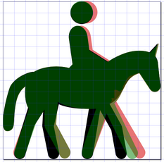
Here are the new horse icons:
 equestrian.svg
 horse_riding.svg
I couldn't find an option to save a file as "Clean SVG" in Inkscape 0.91, only "Normal SVG" what is without Inkscape-specific stuff, but still with other things that looked unnecessary; so I opened picnic.svg als a template in a text editor and replaced d= and id= with the ones of the horse icons. Seems to work this way.
Hufkratzer
on 19 Sep 2018
I've fixed them a liitle bit (bigger heads, more pixel alligning)


@Adamant36 It's ready for testing:
https://gist.github.com/Tomasz-W/911d68c20f95320e1e5f97bccf90114d
Tomasz-W
on 20 Sep 2018
@Tomasz-W OK. I think I'm only going to do leisure=horse_riding though and save sport=equestrian for issue #844. Since @kocio-pl ocio-pl says its better not to mix things in a single PR in case one gets rejected. Plus, I'm still working on how to add a whole new rendering category to the code like is needed for the sports stuff. Maybe @kocio-pl can point me in the direction of some information on how to do that.
Adamant36
on 20 Sep 2018
@Tomasz-W
I've fixed them a liitle bit (bigger heads, more pixel alligning)
Extremely bad, IMHO! Please explain the purpose of your "fixes" in more detail. How can an inclined line be more pixeö-aligned than a vertical one? I wonder why we discussed my drafts previously.
Here is your horse_riding icon (black) compared to my (brown):

Your rider is much too big compared to the horse. He is also tilted forward without reason, was is clearly wrong and looks really awful, compare the photos above.
If you explain what you want and why I can try to make a new version of icons.
Hufkratzer
on 20 Sep 2018
Please don't compare icons in Inkscape scale, but in 14x14 scale, as we use them in OSM-Carto in this one. We shouldn't be "glued" to natural proportions of some objects, because sometimes it leads to lower readability of the icon. There have been voices that with vertical line it looked more like some "i" letter (see: https://github.com/gravitystorm/openstreetmap-carto/issues/2344#issuecomment-405082224), I also think it looked more like some stick than a human.
Tomasz-W
on 20 Sep 2018
That Mapbox’s looks like ‘i’ on a horse — it’s caused by those white jodhpurs which additionally make the icon look two‑colored instead of single‑colored.
Please have look at this vidio, 3rd miunute:
https://www.youtube.com/watch?v=-w8As0gln6o
and at the photos above
Hufkratzer
on 20 Sep 2018
There have been voices that with vertical line it looked more like some "i" letter
but
it’s caused by those white jodhpurs
gszy
on 20 Sep 2018
Jodhpurs or not, the guy is still barely visible/looks like a stick in @Hufkratzer version. Also, in @Hufkratzer's version the rider looks sunk into the horses midsection. Whereas, @Tomasz-W''s version just looks more natural because the rider appears to be up a little more and would be more inclined to lean forward with the horse as he rides, instead of sitting straight up. Its more "kinetic" that way and gives the icon a sense of movement that is missing otherwise. Really, a person wouldn't be sitting up straight on the horse unless they are either standing still or riding for show, which is covered by the other icon. But "riding" insinuates movement and the icon should reflect it.
Adamant36
on 20 Sep 2018
@Adamant36
We are talking here about the icon for leisure=... In the other icon for sport=... the rider leans forwards because he has his ass out of the saddle; this is something else. When you ride relaxed just for fun, most of the time the horse walks and there is no need to get your ass out of the saddle and no need to lean forwards. The horse moves and the rider sits on the horse and should not to annoy it. Even in a car you don't have to lean forwards all the time although it moves much faster. If a horse walks it isn't much faster than a hiker, and also a hiker doesn't have to lean forwards, a typical hiking icon looks like this:

If you sit on your horse like in Tomasz-W*s icon for some hours you will probably get back pain. This and other disadvantages of leaning forwards are explained in the video to what I linked in my previous post. If you don't watch videos and prefer to read something about it you may try these articles:
- http://www.equine-world.co.uk/riding_horses/rider_position.asp Rider Position
- http://www.happy-horse-training.com/sitting-on-a-horse.html The Error of Leaning Forwards
Hufkratzer
on 20 Sep 2018
@Hufkratzer, I mostly agree with you. Except that the forward slant is not that profound and is still less then for the sport icon. No person unless they are a professional Spanish horse rider is going to be able to stay at a straight angle 100% of the time. They just don't have the muscles for it. So there will always inherently be a slight tilt to how they sit. In fact, in the second link you provided, the riders are positioned leaning slightly back due to putting the weight on their seat bones. As the article says "it is important to keep the upper body well back, in order to help keep the weight on the back of the seat-bones." So if anything @Tomasz-W's icon should be adjusted back more, but still not be straight up like your say.
Anyway, whatever complaint you might have about the riders position in @Tomasz-W's version, at least it looks like a rider and not a stick. If you want to create a better icon in the same position that looks more like a person go for it, but at this point I think @Tomasz-W's is the best one. I'm perfectly willing to give your revised one a chance though if you create it.
P.S. Watch this video of pro Spanish horse riders. Rarely if never are they at a straight angle. Except maybe as a function of the horse jumping, but not because of sitting position. 99% of the time they are in a leaned back position. https://www.youtube.com/watch?v=6DWC3mIyDqQ
Adamant36
on 21 Sep 2018
@Adamant36
Yes. they lean back a bit; it is better than leaning forwards. This can also been seen on some of the photos to that I linked above. Here is another video where the riding instructor explains that the rider should sit straight, but when she rides she often leans back a bit: https://www.youtube.com/watch?v=vVzXdLm-Eyg
So I made a new version of the horse_riding icon with the rider leaning back a bit. The head is larger (imagine the rider wears a helmet) and its position is in front of the now inclined axis of the rider, like in the hiker icon above. I hope this solves the "stick problem". Both, horse and rider, have become larger (horse higher, rider taller) to make the icon square.
The jumper icon has been adapted, so that both icons again show horse and rider in similar sizes, just doing different things.
14px (left/black @Tomasz-W's, right/brown my icons):

double size:

This is just a draft for discussion.
IMHO the readability is the same in both versions and, of course, I would prefer to see icons on the map that show riders in correct postures.
Hufkratzer
on 23 Sep 2018
@Adamant36 The best solution in situations like here is to make test renderings with both versions of icons to not ignore anybody, and then decide. There are some things which we can approve/ reject with BW 14x14 images only, but finally we always need to rate how would it look filled by certain colour throwed on a map. I provided my designs in https://github.com/gravitystorm/openstreetmap-carto/issues/2344#issuecomment-423053362, if you need some files from @Hufkratzer , ask him.
Tomasz-W
on 5 Oct 2018
@tomasz-W, OK. The fact that @Hufkratzer said it was a "draft discussion" made it sound like it wasn't at the testing point yet and that it was still being debated. I'm fine testing two people's icons to see which looks better on the map, but I don't want to waste my time or anyone else's testing an icon pointlessly that's just a "draft" and isn't done yet. Especially if we are doing the tests to decide what icon should be used, which wouldn't be a fair comparison since its not done yet and yours is. So, if both icons are ready to be tested, i'm fine testing them. Otherwise, I guess we wait on @Hufkratzer.
As a side to that, you do have a tendency to over estimate when issues are test ready. Not that I have a problem with that necessarily though, because it helps things move along better sometimes. I don't want people to feel pressured into making a decision on something when they aren't ready to though. A few people got kind of flustered before when I jumped the gun on things, based partly on your recommendation. So I'm trying to be more mindful of it.
Adamant36
on 6 Oct 2018
I did my last draft as a basis for further discussion and there was no further dicussion yet. Test renderings will not make the icons look different, you will just have the same in green:

What is your opinion about my last draft? I would like to know this to possibly improve the draft and make a new version. Which of the problems you had (see here and here and here) are solved and which not? Does the rider still look like a stick? Does he now look natural enough, enough like a human? (I had tried to draw the rider more detailed but it was not visible in the 14px export, so left these details out.) Is the rider still sunken too much into the horses midsection? Do you think that riders are able (have enough muscles) to sit on a horse like that? Do you see any new problems? Can you explain what you mean by linking to trustwothy thirdparty information about how to sit on a horse correctly?
Is the readability or the pixel-alignment still worse than in @Tomasz-W's version, as far as you can see without test renderings? If so, why?
Hufkratzer
on 6 Oct 2018
@hufkratzer, how do you know doing test renderings wont make the icons look different? And why are us testing them? It helps to seem them in context, outside of a tiny green square. Plus, mapnik puts its own color filters on icons that make them look different when rendered. Why not just provide the .svg files? Otherwise, I'm not going to have an opinion different then I already had. Yeah, the new icon is an improvement, but that still doesnt mean its better then @Tomasz-Ws and we have no way to decide unless its test rendered first. Nore will we, because its almost a requirment. There wont be further discussion until then and more then likely we will just go Tomasz-Ws icon eventually if no alternative is provided. So, just get it in a state that you think is good enough, provide the SVG files of your individual icons, and we will go from there. There's no reason you cant just modify them later if need be.
Adamant36
on 6 Oct 2018
The horse jumping the gates looks like a carousel horse to me.
 meased
on 6 Oct 2018
meased
on 6 Oct 2018
@meased , can you explain that a bit more in detail? Are you referring to my version or to @Tomasz-W's or to both? I have tried to draw it how it looks on the photos given above, here are the same links again:
- https://commons.wikimedia.org/wiki/File:ILHS_2016_-_20160909_-_Donovan_Ber_et_Virtuose_du_Faubourg_2.jpg
- https://www.dreamstime.com/royalty-free-stock-image-horse-show-jumping-image27446276
- https://static1.squarespace.com/static/52092d15e4b0f89d3271e4d3/t/595f6c4c6b8f5b29ad818b2f/1499425872877/?format=500w
And I think the icon really looks similar. Why not? What is wrong? Is it perhaps because you think the obstacle should be drawn differently? Can you provide some photos to explain what you mean? That would perhaps be better than just words.
EDIT:
Is this better? :

Hufkratzer
on 6 Oct 2018
Just saying that putting a stick through a horse turns it into a carousel horse. Nobody will ever see these icons at double size. 14x14 is all that matters.
I like the walking versions better. I also thing there is potential with a horseshoe pattern to tie into dog parks.
meased
on 6 Oct 2018
This with the carousel can be seen like that and this should be avoided. I made a draft (14px export) with thicker obstacles for discussion:

I think at least the one on the right can hardly be confused with a carousel horse.
I think @imagico may not like the horseshoe pattern for equestrian sport because something like this was already discussed some time ago here (you can insert "horseshoe" here instead of "horse"). I think the jumper expresses quite well that the icon is about equestrian sport (what else could be used to do that?) and if all the other pitches get an icon it may be irritating if just the one for sport=equestrian gets a pattern instead. Perhaps the horseshoe pattern can rather be used for leisure=horse_riding (in analogy to leisure=dog_park)?
Hufkratzer
on 6 Oct 2018
I think the one on the right (the fatter one correct?) is an improvement, because it looks like more a cone being jumped over then a carousel horse. Maybe it could be shrunk down on the top a tad though to create some space or something. Also, The tail and the back leg looks to similar and like a crabs claw. Plus, the way the head is it looks like the person is wearing a helmet that sticks out in the back (am I nitpicking? Probably, but that's how I feel like being). Finally, it would be good if they were in SVG format like they should be. Since it could look different that way, with the way it handles filters etc. Plus, as individual icons instead of side by side. Draft or not., that's the proper way to do it, as outlined in the contributing guidelines. As I have said already. Also, they should be uploaded to gist.
Oh yeah, I don't think a horseshoe pattern would be a good idea. As it might be confused with a horse shoe game area. Plus, patterns are a pain to implement anyway.
Adamant36
on 7 Oct 2018
Here is a new draft of the jumper icon for your test renderings if you like:
 equestrian.svg
The obstacle is really low now, looks a bit like in the title photo of
https://wiki.openstreetmap.org/wiki/Tag:sport=equestrian
I hope the horsetail is better now. I didn't understand the complaint about the helmet; if the rider sits on the horse leaning forward that much and wants to look straight forward (what he should) he has to lift his head.
It's a draft, but in case there are no more complaints, I think it could be used without further changes.
With the horse_riding icon I will not continue, it's a waste of time (for both of us). For test renderings that show the context you have @Tomasz-W's version.
Hufkratzer
on 8 Oct 2018
@Hufkratzer, thanks. I appreciate you doing that. It looks a lot better now in my opinion. It also looks more like the picture in the wiki. Which was what I was going off of.
Adamant36
on 8 Oct 2018
Any updates on this? Calling it a draft and then not working anymore kind of makes it not a draft. Id like to do PR on it and get it through before the sports icons.
@Tomasz-W, any opinions? Do you think @Hufkratzer's last version is good enough to go with?
Adamant36
on 2 Dec 2018
@Adamant36 Can you test both icons versions to compare?
Tomasz-W
on 2 Dec 2018
Sure, your's was in comment https://github.com/gravitystorm/openstreetmap-carto/issues/2344#issuecomment-423053362 right?
Adamant36
on 2 Dec 2018
@Adamant36
What are you complaining about? I don't understand. Is it about the equestrian or about the horse_riding icon?
Hufkratzer
on 2 Dec 2018
Where am I complaining? I was just asking what comment Tomasz-Ws icon was in so I can test both of them. We do that around here.
Adamant36
on 2 Dec 2018
@Adamant36
Calling it a draft and then not working anymore kind of makes it not a draft
sounded like a complaint to me.
Hufkratzer
on 3 Dec 2018
Oh yeah, I can see that. I was just commenting on the fact that you said it was a draft and then didn't do any more work on it. Kind of like a "nudge nudge" thing. So you'd come back and say if you were done with it or not.
Adamant36
on 3 Dec 2018
You can take the equestian icon from above
Since meanwhile there was new thumb up here I now made a new file for
 horse_riding.svg with minor changes from my last draft
If anyone has suggestions for improvements I will see what I can do.
Hufkratzer
on 3 Dec 2018
I hate the legs. They look to much like a saw horse. Its to symmetrical. Maybe that's why they are called that though.
Adamant36
on 17 Dec 2018
I will make an icon with a walking horse instead of a trotting one if you think that may help, it will take a bit of time.
Hufkratzer
on 18 Dec 2018
Hufkratzer's icon
Tomasz-W's icon
@Tomasz-W, area leisure green fill or pitch fill? I thought I had coded it in already, but I guess not. So I thought id double check.
Adamant36
on 18 Dec 2018
Its cool. Its barely noticeable and isn't different then Tomasz-W's icon anyway. The only difference I can tell between the two is that yours a little cleaner looking and the legs are slightly more proportional. So I vote for yours as is. Unless @Tomasz-W wants to do a little more work on his or something. I'm fine waiting.
Adamant36
on 18 Dec 2018
@Adamant36
- area leisure greeen fill as it's kind of sport centre
- I'm ok with Hufkratzer's icon
Tomasz-W
on 18 Dec 2018
@Adamant36
A new version with a walking horse:
 horse_riding.svg
inspired by https://commons.wikimedia.org/wiki/File:The_horse_in_motion_as_shown_by_instantaneous_photography_BHL19590462.jpg, with less symmetrical legs than in the previous version (as requested here). Is this better?
Why didn't you test-render the equestrian icon(s) yet, neither here nor in the PR 3578?
Hufkratzer
on 28 Dec 2018
Thanks. I think the other icon is fine though. The back legs on this one look weird and the other one is fine.
Did you check the sport PR? It has its own issue that need to be worked out. Equestrian is part of the sport icons. So I'm handling it separately. As it takes different things on the coding side and is a separate issue. I'm still going to get to it eventually though. Once the sport pitches get fixed and merged. Feel free to ping me about it after that if I forget.
Adamant36
on 28 Dec 2018
https://github.com/gravitystorm/openstreetmap-carto/pull/3578 is for pitches and the equestrian icon is for pitches too, like the tennis icon, see
https://wiki.openstreetmap.org/wiki/Tag:leisure=pitch#Riding_arena and https://github.com/gravitystorm/openstreetmap-carto/issues/844#issuecomment-276772643 ff
I will try to improve the legs of the horse_riding icon.
Hufkratzer
on 28 Dec 2018
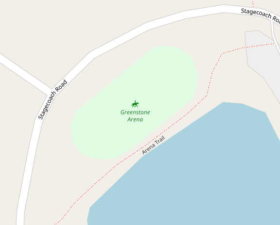
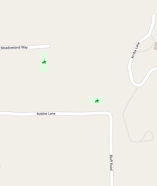
Rendering with areas for anyone that's interested. The icon starts displaying at z17. Outlines were never discussed so I didn't add them. Personally, I don't feel like the area needs an outline because it usually has fences that can be mapped. Plus its usually clear what the boundary is. I guess I can always add outlines if need be though.
I'll probably do a PR on it tomorrow. Feel free to provide any feedback in meantime.
Adamant36
on 27 Jan 2019
I could not make a good-looking icon with very asymmetrical legs, I can only offer a 2nd version with a walking horse who has a bit asymmetrical legs that look less like saw horses:
 horse_riding.svg, compare illustration in http://swphorses.com/understanding-horses-gait-part-2/
I you nevertheless prefer the trotting horse I can offer a new version with improved pixel-alignment:
 horse_riding.svg
Here is a comparison of these 2 icons (black and green) and the previous trotting version (red):
Additionally the new icons no longer have a 14px canvas because here @Tomasz-W recommended to use a sample without one.
Hufkratzer
on 27 Jan 2019
Thanks. Your original icon that I used in the sample rendering is fine. Plus its the one other people approved. So I think I'm just going with it. I don't want to nitpick over a one or two pixel difference here or there.
Adamant36
on 28 Jan 2019
Related issues
 dktue
·
4Comments
dktue
·
3Comments
Tomasz-W
·
4Comments
dktue
·
4Comments
dktue
·
3Comments
Tomasz-W
·
4Comments
 MarkusStue
·
4Comments
kocio-pl
·
4Comments
MarkusStue
·
4Comments
kocio-pl
·
4Comments
Most helpful comment
JOSM uses these icons:
 for sport=equestrian (+pitch) (equestrian.svg)
 for leisure=horse_riding (horse_riding.svg)
I think this makes sense,
 looks more sporty, it may even try to symbolize a jumper (compare photo in wiki)
 looks more relaxed, symbolizing a pleasure rider
So I think the horse jumping above obstacle could better be used for sport=equestrian (https://github.com/gravitystorm/openstreetmap-carto/issues/844)