Openfoodnetwork: [mobile ux] Restyle Order cycle and page title header section on edit cart and checkout screens
In a feature branch or master?
This can be merged directly to master 🎉
Description
- As a: shopper
- On page: the edit cart and checkout pages
- I want to be able to do: see the order cycle detail when I'm on my mobile, and have the pages look the same as the rest of the shop so it doesn't feel so disjointed.
Acceptance Criteria & Tests
Key changes / call outs for order cycle section:
- [x] Left align message in OC module (done in #5073)
- [x] Update OC module background colour to light grey (consistent with the current edit cart and checkout table design in production) (done in #5073)
- [x] Remove tabs from shop header (user can navigate back to the shop through the 'continue shopping' button (done as part of the shop tabs epic #4567)
Styling the rest of the pages:
- [x] Remove the left/right arrows in buttons -- they're taking up precious space in mobile #5189
- [x] Correct the positioning of the buttons in mobile so they fit in one single row #5189
- [x] Correct the positioning of the buttons in desktop so they're left / right aligned with the table #5189
- [x] Update the button colour to orange (because red indicates error) #5189
- [ ] Improve the alignment/layout of the checkout fields and order summary to fit better with the new design
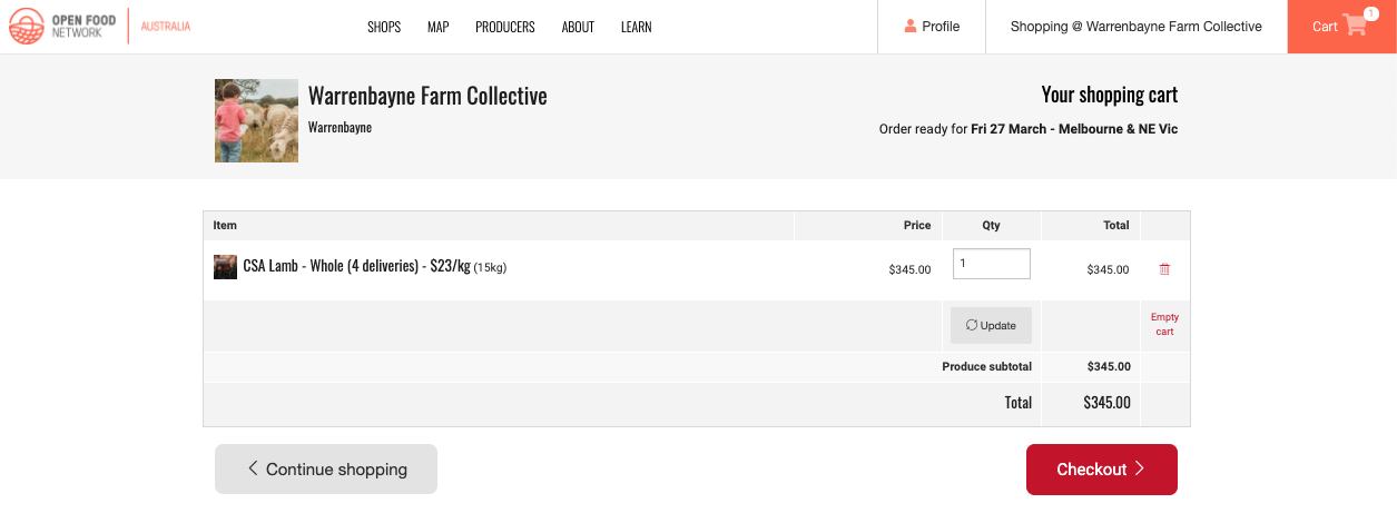
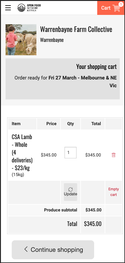
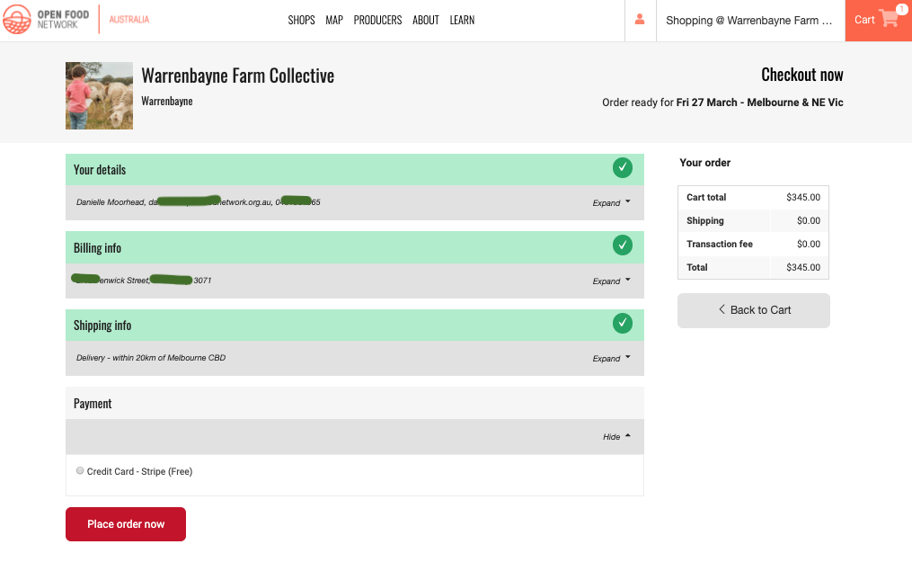
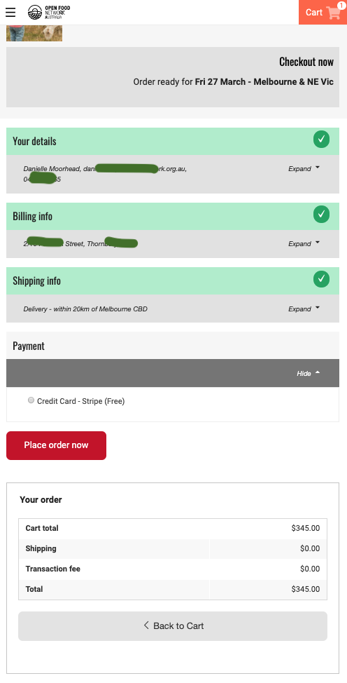
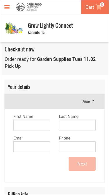
HOW IT LOOKS NOW
EDIT CART
CHECK OUT
HOW IT SHOULD LOOK
_Design Notes:_
OC message has variable content (ie. wrapping onto two lines in mobile)
- Produce Wednesday 12.02.20 Pickup
- Thursday Night 7pm
- THUR 13th FEB - DELIVERY + MARKET
- 17/01/2020
_Mobile_
_Edit Cart_
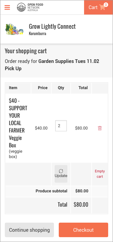
_Checkout_
_Tablet_
Use mobile as a reference
_Desktop_
_Edit Cart_
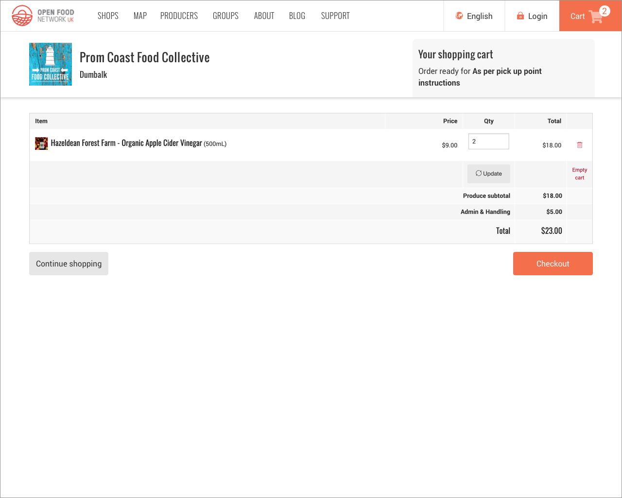
_Checkout_
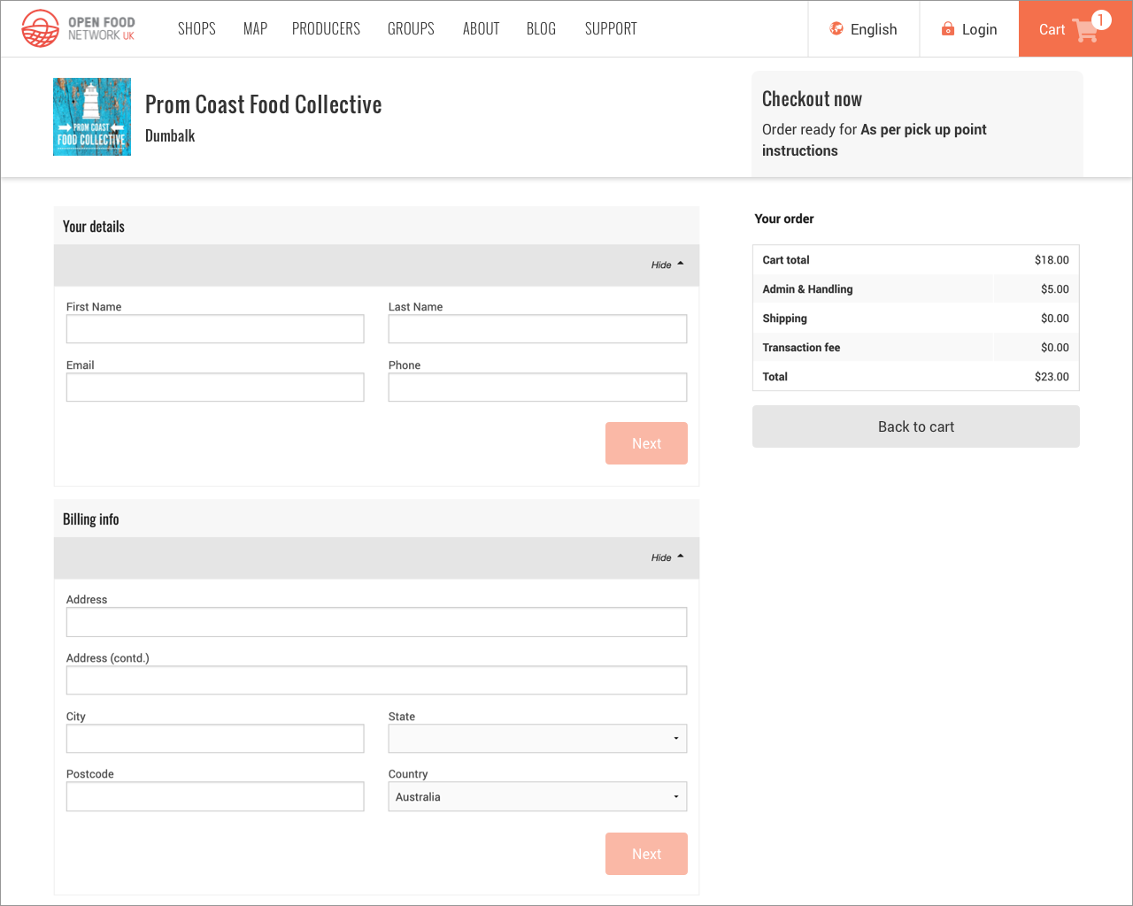
Design details are kept in our Zeplin account:
- Mobile Edit Cart: https://zpl.io/2veGK47
- Mobile Checkout: https://zpl.io/an4WdDQ
- Desktop Edit Cart: https://zpl.io/aBDYyML
- Desktop Checkout: https://zpl.io/29RYoLy
 daniellemoorhead
All 11 comments
Hey @Matt-Yorkley, given you've done the other work on the order cycle changes it would be awesome if you could pick this one up early next week. Shouldn't be too difficult to make these changes to the styling of the page, and I'm free to test most days so we should have it ready to go by Thursday.
If you can't then perhaps @sauloperez? @mkllnk has picked up the product listing changes so it would be great if he could continue with those changes while someone else fixes the edit cart/checkout stuff.

daniellemoorhead
on 22 Mar 2020
Taking over @Matt-Yorkley . I'll start today's afternoon
 sauloperez
on 25 Mar 2020
sauloperez
on 25 Mar 2020
I've started on this already...
 Matt-Yorkley
on 25 Mar 2020
Matt-Yorkley
on 25 Mar 2020
LOL ok, all yours then. Let me know if is there something else I can do for mobile.
sauloperez
on 25 Mar 2020
There are standalone mobile issues in Dev Ready, #1299 #4772 #4535.
I guess you could pick one of those if you don't want to embark on one of the bigger epics :)
 sigmundpetersen
on 25 Mar 2020
sigmundpetersen
on 25 Mar 2020
Thanks, @sigmundpetersen. I got some pointers from @daniellemoorhead as well but it looks like some bugs came in just before that.
sauloperez
on 26 Mar 2020
Hey @Matt-Yorkley, it'd be great if the phone field and the email field changed to the relevant keyboard format on focus for mobile. Should I add another card to the backlog or is this something you could do as part of this story? I'm cool either way, your choice.
daniellemoorhead
on 27 Mar 2020
@daniellemoorhead Maybe a new issue for that would be good. There might be fields on other pages that need looking at as well? Login form?
Matt-Yorkley
on 27 Mar 2020
@Matt-Yorkley there's one acceptance criteria not ticked - but I think it's done?
- [ ] Improve the alignment/layout of the checkout fields and order summary to fit better with the new design
daniellemoorhead
on 23 Apr 2020
Hey @daniellemoorhead I wasn't sure about that last point. Is it all good, or do we need a little issue for it? I'll leave that up to you.
Either way I'll close this main issue now :+1:
Matt-Yorkley
on 28 Apr 2020
@yukoosawa that last dot point was yours, added on Feb 12 according to the version history :) I assume it has something to do with the order summary being at the bottom of the checkout screen (it's on the side on desktop, but it displays at the end for mobile), can you give any clarification on what this AC actually meant?
daniellemoorhead
on 1 May 2020
Related issues
 kirstenalarsen
·
3Comments
kirstenalarsen
·
3Comments
 shen-sat
·
3Comments
shen-sat
·
3Comments
 RachL
·
3Comments
RachL
·
3Comments
 kristinalim
·
3Comments
kristinalim
·
3Comments
 HugsDaniel
·
3Comments
HugsDaniel
·
3Comments
Most helpful comment
Hey @Matt-Yorkley, given you've done the other work on the order cycle changes it would be awesome if you could pick this one up early next week. Shouldn't be too difficult to make these changes to the styling of the page, and I'm free to test most days so we should have it ready to go by Thursday.
If you can't then perhaps @sauloperez? @mkllnk has picked up the product listing changes so it would be great if he could continue with those changes while someone else fixes the edit cart/checkout stuff.