Openfoodnetwork: [Performance] POC Edit Order Cycle
Description
As an enterprise I want to be able to create/edit an order cycle with 10000 products in an acceptable length of time.
After iterations on discussions in the #performance channel we have decided that our main UX strategy will be to minimise the disruption to the users in terms of experience.
From an implementation perspective we know that the angular in the page is so complex that a rewrite is favourable.
There are two areas of implementation for which we have questions:
1) Will it be better to split the page into steps or to keep as a single page as it is now?
(See here for overview of steps)
2) Will it be better to implement infinite scroll or paged results when loading products per enterprise?
Acceptance Criteria & Tests
This is a Proof of Concept. We are looking for something that roughly works, but won't stand up to thorough testing. The point of this issue is to give devs the opportunity to explore and understand the merits of different implementations. Then Product team can play and potentially run by users to understand pain points of the new design.
- Products list will be sorted alphabetically.
- 10000 product OC can be loaded in under 3(?) minutes
 lin-d-hop
All 16 comments
I think this POC needs some more thought on the technical implementation. I'm not sure yet if splitting the page into 3 parts is necessary or not. The main issue is saving the user selections of included/excluded variants per supplier.
If we imagine an OC with 5 suppliers and each has 2000 products, this interface would be swamped in thousands of these boxes in each tab:
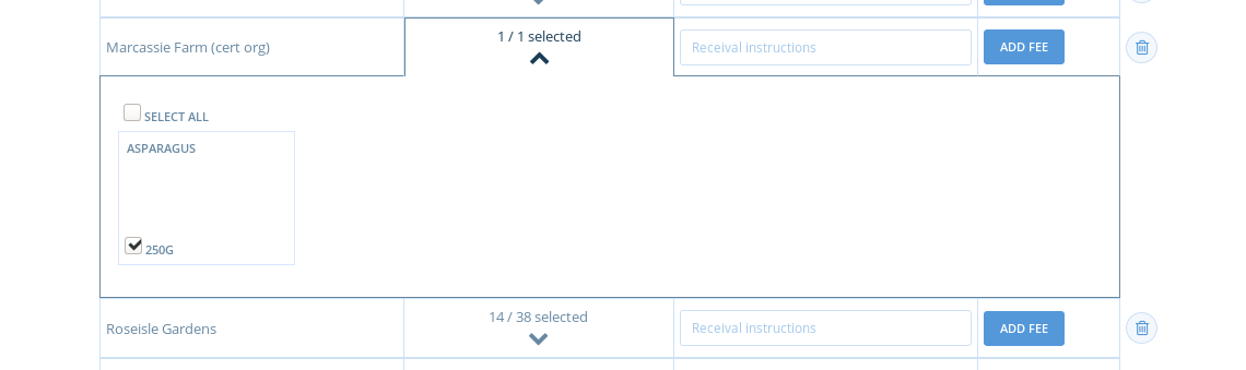
The main issue is that every time we hit the save button we would need to post an array with 10,000 items to the server, and save them all at once. I think we'll have to move to a more asynchronous strategy where each time the user selects or deselects a variant, a request is made that saves the value for that single variant, and we don't have a big save button at the end. I suppose the "select all" button would need to make a slightly different request, and we can handle it with different logic on the server side.
Does that sound good?
 Matt-Yorkley
on 22 Oct 2019
Matt-Yorkley
on 22 Oct 2019
We also now have some very streamlined services for rendering paginated products in the shopfront, and I think we could potentially re-use some of them for rendering available products in an OC on the admin side.
Matt-Yorkley
on 23 Oct 2019
And this isn't something for the POC, but it might be good if we also show select all buttons for product categories (per supplier) at some point. So for instance, the user could select all products in Vegetables and Fruit, and deselect all products in Meat. I imagine this would be incredibly useful in managing this selection process across 2000+ products.
Matt-Yorkley
on 23 Oct 2019
Okay, I think splitting the page into three pages is probably a good place to start. We can implement that as a first step, and it should help to break this work down into smaller pieces. So I'd propose:
Phase one: we keep things more or less as they are, but split the General Settings, Incoming Exchanges and Outgoing Exchanges sections into three separate pages.
Phase two: we rework the Incoming and Outgoing pages to handle large amounts of products in a POC.
Matt-Yorkley
on 23 Oct 2019
ok, I am taking this on.
After a few hours of investigation I am feeling more at home with this code... even managed to delete 77 lines of it 🤣 #4408
I am now pretty sure the best first step is to, following what Matt suggests above, split the page in 3 steps. This way we will break the dependency of incoming and outgoing exchanges. The incoming and outgoing steps will have to read and write to the server. The major change is that the outgoing part will READ from the server, everything will look much better after this.
I think that as I start doing this I will have a better picture of what are the easier alternatives to make the list of variants managable in case there are 10k products...
 luisramos0
on 28 Oct 2019
luisramos0
on 28 Oct 2019
Thanks @luisramos0 I can feel your resistance and am grateful that you are diving in.
lin-d-hop
on 28 Oct 2019
the resistance is not mine. the resistance is in the code itself, in the bad design. That's what you are feeling.
But I am happier about this now, I can see how this can be significantly improved if we break it in 3 steps.
luisramos0
on 29 Oct 2019
Luis taking on the OC edit issue, like:

Matt-Yorkley
on 29 Oct 2019
I am making it look like the subscriptions flow (and reusing the CSS code):
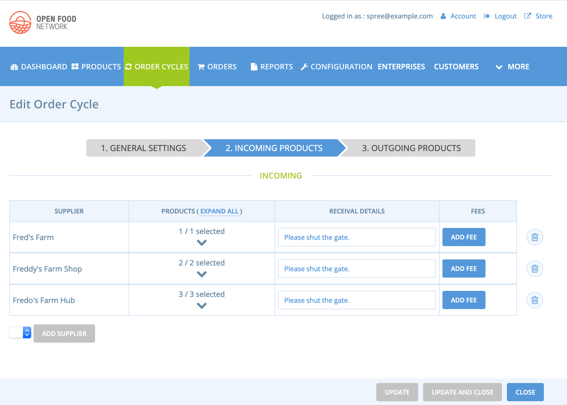
the incoming part is pretty straight forward, I will now need to rebuild the outgoing page. Now we can make the Outgoing page load from the server with the data coming ready to be displayed instead of the messy JS process we have right now with permissions and other things...
luisramos0
on 30 Oct 2019
one thing you can already feedback on are the action buttons: probably we need to switch from Update to Continue.
Shall we keep the "Close" option? I really dont like the verb close (it's like we are not on the web, we are still closing windows...).
luisramos0
on 30 Oct 2019
I think this needs a little discussion..... moving to Slack -> #performance
lin-d-hop
on 30 Oct 2019
The update/continue issue needs some thought. I imagine when creating anew OC we would want "continue", but when editing an existing OC the user will not necessarily be editing the pages in sequence?
Matt-Yorkley
on 30 Oct 2019
@luisramos0 I've noticed that I accidentally wrote the issue https://github.com/openfoodfoundation/openfoodnetwork/pull/4359 fixes with the producer shop scenario. While the PR adds a red star for the name for the Hub scenario as well, it does not add a red star next to the "ready for" field. Something we can ship in here or shall I create a dedicated issue for this?
 RachL
on 31 Oct 2019
RachL
on 31 Oct 2019
@luisramos0 I also noticed that the 'Seleccionar Tudo' checkbox on outgoing products does not seleccionar tudo. Probably you are aware but noting here just in case.
lin-d-hop
on 5 Nov 2019
@lin-d-hop yes, I just fixed that, it's now redeploying to katuma staging with that problem fixed.
luisramos0
on 5 Nov 2019
So, we have PR #4422 that breaks the OC create and edit pages in 3 steps.
On top of this PR there are 3 smaller PRs with 3 requests:
- Sort products alphabetically in OC edit page #4454
- Make "Ready for" field show a red border when added to the list of outgoing exchanges #4452
- Clickable steps on the OC edit page #4447
luisramos0
on 10 Nov 2019
Related issues
 HugsDaniel
·
3Comments
HugsDaniel
·
3Comments
 kirstenalarsen
·
3Comments
lin-d-hop
·
3Comments
Matt-Yorkley
·
3Comments
kirstenalarsen
·
3Comments
lin-d-hop
·
3Comments
Matt-Yorkley
·
3Comments
 andrewpbrett
·
3Comments
andrewpbrett
·
3Comments
Most helpful comment
I am making it look like the subscriptions flow (and reusing the CSS code):

the incoming part is pretty straight forward, I will now need to rebuild the outgoing page. Now we can make the Outgoing page load from the server with the data coming ready to be displayed instead of the messy JS process we have right now with permissions and other things...