Open-shell-menu: New Skin contribution enquiry
By @bonzibudd, posted on Discord in general channel
Apologies if this isn't a good place to put this, but I figured it was better than nothing.
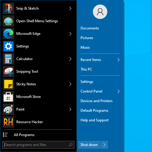
I am currently working on a new skin, which I think would be a very good addition for Open-Shell on Windows 10. If the maintainers are interested, I think this would be a good upgrade from the old Metro skin as the default. These will be the main improvements:
-Updated iconography. Current icons/arrows are an inconsistent mix of Win7 to Win8, and some custom.
-Ability to change main menu color using "Override" in OSM Settings. This is a downside of the current Metro theme.
-Modern color schemes. The new skin will use the Windows mode to determine some aspects of the menu, including sub-menus and search boxes. I might add this to the main menu as well.
-Improved scalability of icons and paddings. In fact, many items in Metro theme don't scale at all.
-Consistency between elements of opaque and transparent modes (Separators, selectors, etc.)
-Better implementation of Large font option
-More modern fonts (ex. SegUI semibold) in some areas
-More options, some ported from other skins (black text, white submenu, etc.)This would not involve removing the Metro theme entirely, but just changing the default. Obviously, the maintainers could review it just to make sure there aren't any issues.
Thank you for your consideration.
@ge0rdi @Ibuprophen @XenHat @coddec
Thanks a lot for you interest and contribution BTW 😊
 coddec
All 25 comments
Thanks for this! I'll continue to give updates on the status here.
This will be for the classic and 7-styles, so switching between the interfaces will be seamless for users.
What I've made so far is basically a more "unified" metro theme, I've updated the selectors and some colors, and adjusted bitmaps accordingly to look a bit nicer.
Something else about the Metro theme, it tends to have some contrast issues on some colors, due to the mix of some colors that sometimes overlap. I'll probably have to change those out.
 bonzibudd
on 20 Nov 2020
bonzibudd
on 20 Nov 2020
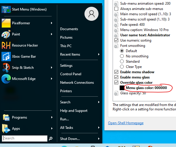
Improvements so far. Background color now respects the "Override glass color" setting to improve customization. Next will probably be adding the "Immersive" colors in the search box and submenus.
Of course there's quite a few other small improvements, mainly to padding and separator size/colors.
bonzibudd
on 21 Nov 2020
Added the immersive colors to submenu, now supports auto light-dark. Bitmap updated to accommodate.
bonzibudd
on 21 Nov 2020
Win7 style so far. I'll need to fix up the search bar quite a bit, but the auto colorization does work now. I'll probably give it a border, either accent color or gray, and the magnifier icon color will probably be changed.
Overall, still looks kinda bland, but it is coming along. I'll be working on adding some more Win10 glyphs next.
bonzibudd
on 23 Nov 2020
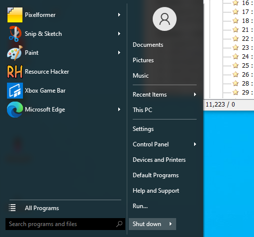
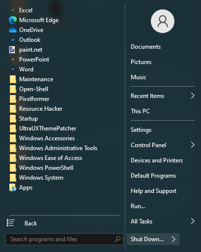
Here's what the 7 style currently looks like:
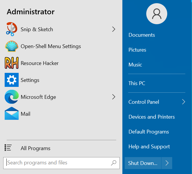
So far, I've done all of this:
- Updated all existing icons controlled by the skin. This includes the arrow, magnifier, pin, all programs, and pager icons, which are now the same versions used in Windows 10.
- Added automatic dark/light to submenu and search box
- Gave high DPI options to more icons
- Switch from black background bitmap to #FF0000, allowing for custom color overrides to be set
- Made all aspects of menu scalable, excluding those which rely on a bitmap (separators, user image)
I still have a few things I would like to do before this could be added natively:
- More options, including multiple transparency modes, custom font sizes, reduce glass color, black text on glass, and white sub-menus (possibly)
- Bitmaps for 120DPI
- More tweaks for "Small icons" option
While I'm here, I'll go ahead and upload the files:
Win10 Skin.zip
They should be fully functional as of now.
bonzibudd
on 24 Nov 2020
Few personal comments:
- I find that blue border of search box quite distracting. Can't it have the same color as other separators?
- "Back" icon is blue too (was that intended?)
- Scrollbar is too bright imo
- Also the "Shutdown" button looks too bright (comparing to the rest of menu)
I'm using Tenified skin (can be easily googled) that fits Win10 really nicely.
 ge0rdi
on 24 Nov 2020
ge0rdi
on 24 Nov 2020
@ge0rdi
- I can definitely change the color of the search box border to be a more similar gray. I'm still experimenting with some of the colors, so some items are subject to change.
- Yep, I've also fixed that. It's a remnant of when I changed the programs bitmap and mask colors.
- Yeah, the scrollbar looks pretty bad right now, it currently uses a Windows 8 style color scheme from the Metro theme. In theory this should match the native Start menu.
- Should be an easy fix.
I appreciate the input.
bonzibudd
on 24 Nov 2020
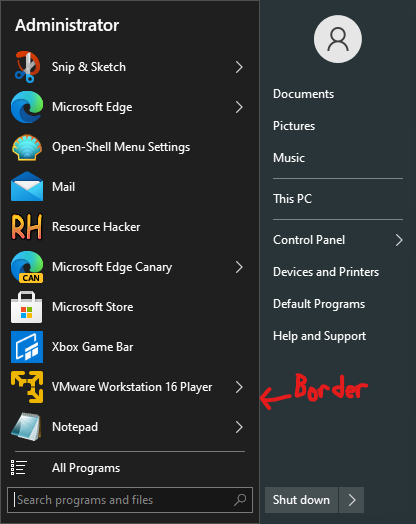
Couple tweaks, search box border is now separator color and shutdown button is less bright. There might need to be an in-between color for the shutdown box to make sure it stays visible on lighter colors. I may also choose to remove the border completely.
bonzibudd
on 24 Nov 2020
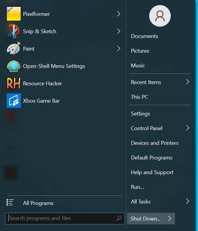
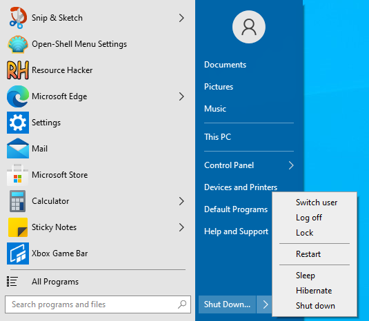
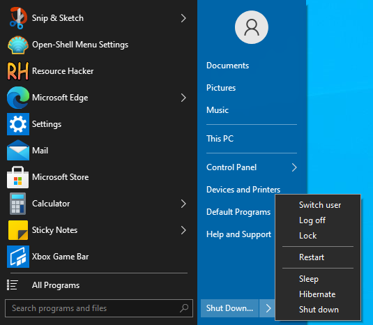
Possible issue with some people.
The closeness of the magnifier and "X" area is a bit scary.
It's ok to have close in 2 columns style as the search submenu covers up the shutdown selector.
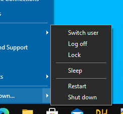
On 7 style, it's too easy for sloppy mouse actions to miss the X and hit the shutdown button!
 CTVCAM8
on 25 Nov 2020
CTVCAM8
on 25 Nov 2020
@CTVCAM8 good call. That is definitely one scary shutdown button...
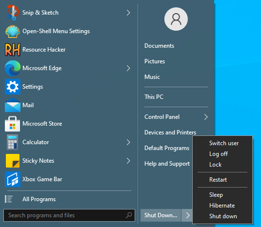
I'm actually making all of the separators taller/wider overall, so this will go well with that change. If I need to, I will add some of that horizontal search padding back.
bonzibudd
on 25 Nov 2020

I changed the overall width slightly, and that padding now scales better. It will still require more spacing, but I'd like to keep it in line with the other vertical separators for now.
bonzibudd
on 25 Nov 2020
Another way is to push the shutdown button away with a few pixels using shutdown padding.
CTVCAM8
on 25 Nov 2020

Scrollbar background will look about like this. Currently matching opacities and colors to match Win10's native scrollbar.
bonzibudd
on 26 Nov 2020

Scrollbar is improved. Should fit in well with the rest of the OS, however transparency seems wonky with glass disabled. I might have to look into that later.
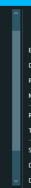
bonzibudd
on 26 Nov 2020
Here's another updated version, I've changed some paddings and introduced better support for 120DPI.
 bonzibudd
on 26 Nov 2020
bonzibudd
on 26 Nov 2020
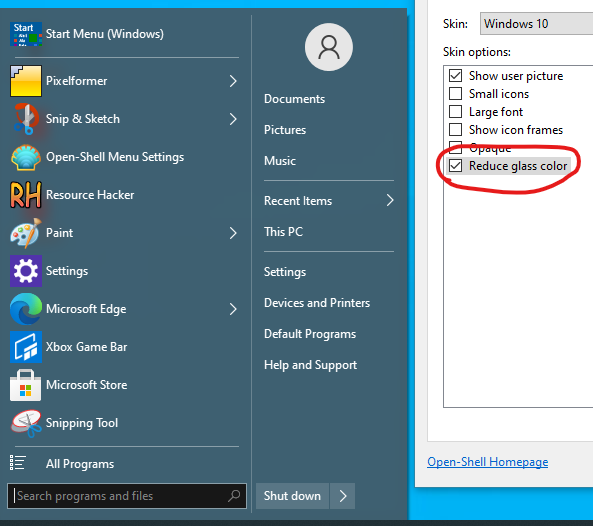
I added a new "Reduce glass color" option, it should behave similar to the same option in other skins.
This gives the menu a Vista-like color bleed, and users of the Win7/8 skins will be familiar with this.
Next, I am planning on adding an option for dark text/icons/selections in the main menu using the labels of existing string resources. This will effectively allow users to choose a light theme in the main menu.
Another option I am considering is a two-tone style layout, in which the left-hand column follows the dark/light theme. However, this may require some padding changes to look good, so I will hold off on this for now.
bonzibudd
on 27 Nov 2020
Here's that light theme I was talking about:
bonzibudd
on 27 Nov 2020
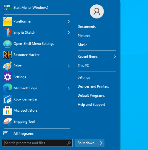
Classic style for reference:
This allows for more flexibility for customizing the color scheme.
bonzibudd
on 27 Nov 2020
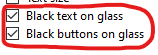
This version has more options, including black text/selectors, custom font size, and reduce glass color. I also made some changes for higher DPIs.
bonzibudd
on 27 Nov 2020

Slight change: Main and submenu arrows are now a different color until hovered over or selected. This is more similar to how Win10's menus behave, and it looks a bit less jarring. I also did something similar to the search bitmap on the classic style, as I thought it stood out too much.
bonzibudd
on 28 Nov 2020
Not too much different in this version, just a couple fixes for a setting and improvements to the arrows as previously mentioned.
I still have a few things I want to change (paddings and options), but I think it's in a good spot right now. If the maintainers are actually interested in adding this at some point, I would be interested to hear some feedback.
bonzibudd
on 3 Dec 2020
I've begun work on the "Two-tone" option I previously mentioned. For reference, the part that is currently black will automatically change with light/dark, similar to the submenu.
Can't say if I will end up keeping this, but it's definitely doable. However, the classic style will be more work, since it will involve a custom background when User_image and User_name are in use. Speaking of User_name, I might try to get that to work on the Win7 style as well.
Edit: This is the option it is utilizing:
Currently, (Default) is the Two_tone option.
bonzibudd
on 10 Dec 2020
New "User name" and "Center user name" options for the 7-style.
Something I noticed is that you can't override the user name while in the Windows 7 mode, you have to change it in the Classic styles and come back again. This is probably because the user name isn't "officially" supported for the 7-styles.
bonzibudd
on 12 Dec 2020
Demonstration of light/dark modes:
You can't override the background color of left-hand side in this mode, but the right-hand side acts the same as before. You can still switch back to the fullglass "Metro" style as well.
bonzibudd
on 15 Dec 2020
I've been trying to decide on a sleeker outline for the two-tone style. For now, I've added a thin border which is a similar color to the separator, which is in a more similar design to Win10.
Just to see what would happen, I tried the skin on High Contrast mode:
Not terrible actually, and even this will be improved with time as I add better selectors and button masks.
Other changes: Text padding/height/width. The goal is to have more Win10-like padding without sacrificing how many items can fit in a similar area. Submenus and lists will remain the same.
bonzibudd
on 18 Dec 2020
Related issues
 nyanpasu64
·
22Comments
nyanpasu64
·
22Comments
 ImSpecial
·
21Comments
ImSpecial
·
21Comments
 buddybu
·
20Comments
buddybu
·
20Comments
 Brummolix
·
15Comments
Brummolix
·
15Comments
 DragoCubed
·
15Comments
DragoCubed
·
15Comments