Open-event-droidgen: New Tracks Fragment UI proposal
I have made some mocks to discuss a new, and more material UI for tracks fragment. Let's discuss if they are better than the current one.
UI 1 :

UI 2 :


UI 3 :


Personally, I like UI 3 the most. Please let me know what you guys think
 iamareebjamal
All 25 comments
@the-dagger @mananwason @mariobehling What is your take on this?
iamareebjamal
on 3 Jun 2017
i would prefer ui3. looks good to me
 arp95
on 3 Jun 2017
arp95
on 3 Jun 2017
@iamareebjamal We could also add a small detail at the side indicating the number of sessions of each track on the track card.
 shreyasnbhat
on 3 Jun 2017
shreyasnbhat
on 3 Jun 2017
@shreyasnbhat Yeah sure
And about the difference, the dark and light colors are inverted in both
iamareebjamal
on 3 Jun 2017
UI-3 looks good I think.
 mahikaw
on 4 Jun 2017
mahikaw
on 4 Jun 2017
@iamareebjamal I think there should be an option in the action bar to select a grid layout or list layout. Not everyone prefers to look at grids.
mahikaw
on 4 Jun 2017
@mahikaw right. Just like Google drive app. UI should be flexible.
 Shailesh351
on 4 Jun 2017
Shailesh351
on 4 Jun 2017
Also, @iamareebjamal since the tracks, alongwith their descriptions consist of primarily textual content, it will be better to continue with list layout. According to guidelines, grid layouts should be used when the content has distinguishing image icons with very little or no text.
The Google I/O 2017 app too consists of just a list layout for tracks.
mahikaw
on 4 Jun 2017
@iamareebjamal We could have something like the google play store design where we have a track and under the title of the track we have a horizontal recycler view with cards of the sessions of each track.
And this could a vertical recycler view for all tracks
shreyasnbhat
on 4 Jun 2017
@mahikaw The problem is that the current UI looks very ancient. If you could propose a good list based design, it'd be great
@shreyasnbhat Wouldn't it be unmanageable for big events where lots of sessions are present in the track. I think it'll confuse the users and make track detail activity obsolete
iamareebjamal
on 4 Jun 2017
@iamareebjamal We could have it similar to the Google PlayStore as I said. Just load the first 4-5 sessions within a track and then add a button like MORE above the track card so as to access the other sessions
shreyasnbhat
on 5 Jun 2017
@iamareebjamal The mock ups that you have created are good enough but I feel that the current UI looks good and is very similar to the latest Google I/O as well as WWDC event apps. The maximum we can do is change the font to jazz it up a bit.
There is a need to focus on more critical issues than changing UI. However, this is just my view.
@mariobehling @mananwason @the-dagger @niranjan94 will surely be able to guide better.
I can work on making it look more similar to the I/O app if it is intended by the mentors. 😄
mahikaw
on 5 Jun 2017
@mahikaw I guess we can have a separate design which would be influenced by the I/O app and the WWDC app.
shreyasnbhat
on 6 Jun 2017
@Hariofspades Please recommend what would be the better approach
iamareebjamal
on 14 Jun 2017
Thanks for including me. Will study the app completely and will get back in
couple of days here.
On Wed, Jun 14, 2017, 8:20 PM Areeb Jamal notifications@github.com wrote:
@Hariofspades https://github.com/hariofspades Please recommend what
would be the better approach—
You are receiving this because you were mentioned.
Reply to this email directly, view it on GitHub
https://github.com/fossasia/open-event-android/issues/1649#issuecomment-308455783,
or mute the thread
https://github.com/notifications/unsubscribe-auth/ALoBBapDNznO9iAwpwM5K_0hT12Kv5dgks5sD_M1gaJpZM4NvKip
.
 Hariofspades
on 14 Jun 2017
Hariofspades
on 14 Jun 2017
Based on all of your inputs in this thread, I have created a design with couple variations. For tracks, I took the following use cases.
- User should be able to browse and find the item
- They can also search.
- Returning user: who has already visited the track (should be able to find it easier)
So for a list display, including the choice of grid and list is a good option(somebody suggested here).
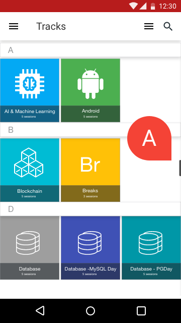
Here's the sample on the grid style.
Grid design
Design specs
- Attractive look with small icon images
- Can be dedicated colour for each(random is also okay)
- Sticky header (already present)
- Grid, can showcase more items in a single viewport
- If images is not given, a text item with 2 letters (breaking monotonous)
- Sessions (good to have)
- As sorting is by alphabetical order, keeping the intelligent scroller is a good option (returning user can easily find it, rather than searching and finding, Eg: if he wants to find an item which is at the last, he has to search or type. With this, it will be flexible)
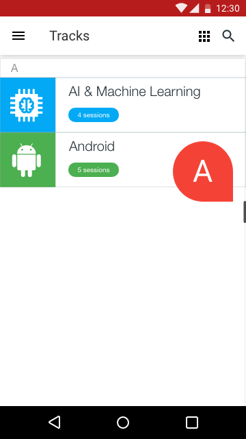
List design - variation 1
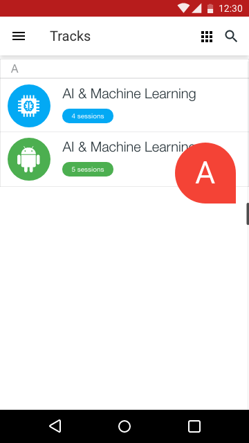
List design - variation 2
Design specs for List Design
- Attractive look with small icon images
- Can be dedicated colour for each(random is also okay)
- Sticky header (already present)
- List, can showcase less items with more detail in a single viewport
- If images is not given, a text item with 2 letters (breaking monotonous)
- Sessions (good to have), added as tags
- As sorting is by alphabetical order, keeping the intelligent scroller is a good option (returning user can easily find it, rather than searching and finding, Eg: if he wants to find an item which is at the last, he has to search or type. With this, it will be flexible)
- For variation 1, its square and for variation 2 it's circle (we can choose anyone)
General Notes
- I have made the toolbar white, giving more professional and clean UI. Red does not signify much of an event and pleasant colour for me (not sure, whether it is configurable when generating event apk) ; feel free to correct me.
- I have added the images because, having only text drawable will be very monotonous. Also, if you're using this library ; then there is a memory dump happening. Refer to this issue
Let me know if you guys like this. If not can bring up something as well.
Thanks.
Hariofspades
on 16 Jun 2017
@Hariofspades Nice mocks!! Go ahead
And for toolbar color we are going to add feature to customise app (primary color / secondary color etc) in future https://github.com/fossasia/open-event-android/issues/1552 Thanks
Shailesh351
on 16 Jun 2017
We cannot use icons as it is not supported by the API, that's why we use TextDrawables. Other than that. Nice mocks :+1:
iamareebjamal
on 16 Jun 2017
@iamareebjamal We can use track_image_url
Shailesh351
on 16 Jun 2017
That's a full bleed real life image, not an icon. Besides we do need to provide support for it. Please create a new issue for that. We miss that because most of the time it isn't present
iamareebjamal
on 16 Jun 2017
@Shailesh351 We don't have support for a track image yet. And not planned anytime soon.
 niranjan94
on 16 Jun 2017
niranjan94
on 16 Jun 2017
@niranjan94 tracks json file.
arp95
on 16 Jun 2017
@arp95 I'm not sure when and how these things got into the samples and API in the first place. But, as of now, we do not have support for track images.
Also, see https://github.com/fossasia/open-event/wiki/%5BNextgen%5D-Open-Event-Universal-Format-Specification for the updated Open Event Universal spec that will be used along with the new API.
niranjan94
on 16 Jun 2017
@niranjan94 In the response of server for tracks it as attribute track-image-url
https://eventyay.com/api/v1/events/6/tracks
Shailesh351
on 16 Jun 2017
@Shailesh351 it probably crept in during the very initial stages of the API a year back. But as of now, there is no plans of supporting it and it will not be available in the nextgen API.
niranjan94
on 16 Jun 2017
Related issues
 mayank8318
·
4Comments
mayank8318
·
4Comments
 dr0pdb
·
5Comments
dr0pdb
·
7Comments
dr0pdb
·
5Comments
dr0pdb
·
7Comments
 heysadboy
·
3Comments
iamareebjamal
·
8Comments
heysadboy
·
3Comments
iamareebjamal
·
8Comments
Most helpful comment
@Shailesh351 it probably crept in during the very initial stages of the API a year back. But as of now, there is no plans of supporting it and it will not be available in the nextgen API.