Open-event-droidgen: Improve UI of ViewHolder in SpeakersList RecyclerView
Actual Behaviour
Currently the UI of ViewHolder is not good. The details of the Speaker is displayed on top of the Image of the Speaker. In some cases it leads to a problem as the face of the speaker is hidden completely by the description.
Expected Behaviour
The description shouldn't block the face of the speaker.
Screenshots of the issue

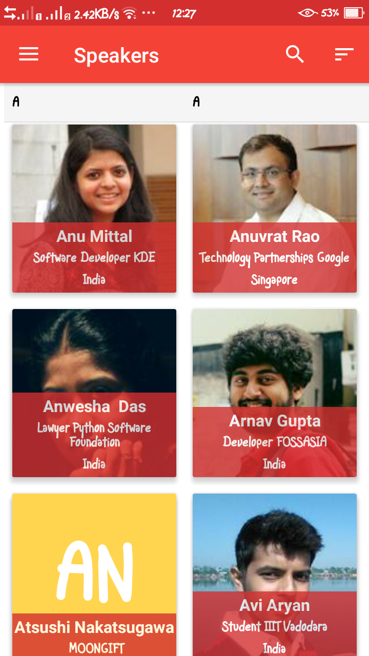
One can see that in case of Mr. Alex Curreton Griffiths in the first image and Mrs/Miss Anwesha Das in the second image, the description almost completely blocks the face which makes having the image useless.
Would you like to work on the issue?
Yes
Proposed Changes
I believe we can move the description below the image of the speaker to avoid this issue.
@iamareebjamal Views ?
 dr0pdb
All 7 comments
@srv-twry why not we use google's contact app UI, what are your views on that?
 simarsingh24
on 17 Jan 2018
simarsingh24
on 17 Jan 2018
@simarsingh24 Can you add a screenshot of what you want to propose ?
dr0pdb
on 17 Jan 2018
Yes, I was thinking of the same problem. We can have a staggered grid UI with the textual information below the image and its background color calculated via Palette
 iamareebjamal
on 17 Jan 2018
iamareebjamal
on 17 Jan 2018
I wish to work on this issue ? May I? @srv-twry
 SparshWadhwa
on 17 Jan 2018
SparshWadhwa
on 17 Jan 2018
@SparshWadhwa Actually i am working on it. You can claim #2122 if you want. Thanks :smile:
Drop a comment at that issue in case you want to.
dr0pdb
on 17 Jan 2018
@iamareebjamal Can i use Staggered Grid view ? The issue with normal grid layout is variation in the size of the Speaker's textual information.
- I need to have the same size of image of each speaker
- I also need to have same height of speaker's textual information.
- I also need to have the whole item of the same size for all the speakers.
Satisfying all the three is difficult. Instead we can use Staggered Grid layout which will look good and also allow some differences in the heights.
dr0pdb
on 19 Jan 2018
Yes, I already suggested that above - We can have a staggered grid UI
iamareebjamal
on 19 Jan 2018
Related issues
dr0pdb
·
5Comments
 Shailesh351
·
6Comments
Shailesh351
·
6Comments
 mariobehling
·
6Comments
mariobehling
·
6Comments
 PareshMayani
·
5Comments
PareshMayani
·
5Comments
 harshitagupta30
·
8Comments
harshitagupta30
·
8Comments