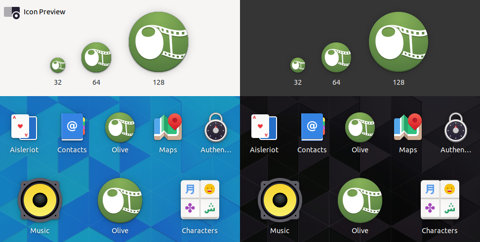
I'm sorry, but in my opinion the current Olive icon looks really dated.
And it does not help that it is still png.
That's why I tried to create a modern icon with Inkscape, because I've seen that you were recently porting the icons into vector graphics.
I hope you like it:
https://workupload.com/file/DrBXsCZc
symbolic:
https://workupload.com/file/GFEwaLGj
It would be so nice if this one or another one would be merged into the master branch.
Thank you in advance and keep up the great work!
 libalis
All 39 comments
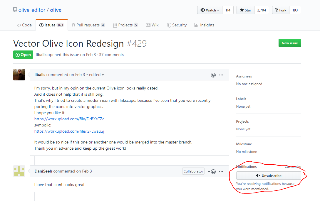
I love that icon! Looks great
 DaniSeeh
on 3 Feb 2019
DaniSeeh
on 3 Feb 2019
@libalis
Why not add a macOS-like circle to it. In my opinion it fits to all platforms.

 naj59
on 3 Feb 2019
naj59
on 3 Feb 2019
It already has an outline, it just needs drop shadow to make it apparent.
And I think a gradient would make it look nicer.
 oc1024
on 3 Feb 2019
oc1024
on 3 Feb 2019
Yes, it would really look better with that shadow.
But I am total beginner in that space.
Therefore feel free to modify my icon until it fits your needs.
And don't forget to reply with the new link for the developers!
libalis
on 3 Feb 2019
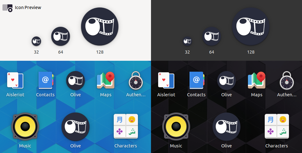
Added a drop shadow to icon, added gradient, made reference image invisible and extra outlines.
https://workupload.com/file/8ZrZVst5

oc1024
on 3 Feb 2019
I personally dislike the gradient on the green, but everything else looks great!
DaniSeeh
on 3 Feb 2019
I like the outline but the outter green line should be removed. The gradient is ok but the path should be from top right to bottom left (in my opinion).
naj59
on 3 Feb 2019
Hi, thanks for putting the effort in to make a new logo, but I actually don't really like the modern flat UI trend and have been fairly intentionally avoiding it. The source is vector-based too (the source vector graphic doesn't package with Olive because most icon systems utilize raster images).
 itsmattkc
on 4 Feb 2019
itsmattkc
on 4 Feb 2019
This is an idea for a complete re-design:

- Design clearly shows an Olive in center, and a spiral that creates a lower case 'e'
- Leaves at bottom of 'e' indicate the olive branch (in original logo)
- Clearly visible at small resolutions
I understand that this icon could be interpreted as being 'flat', and is a completely new logo, however my main concern is visibility at low resolutions, (in Docks, start menu etc) and also to clearly communicate Olive editor
Example of Icon without background:
Disclaimer: While I have supplied this logo and idea, please feel free to play with it, develop it, or disregard it.
 alcomposer
on 4 Feb 2019
alcomposer
on 4 Feb 2019
Thinner design, with mesh gradient.

Both FCPX & Resolve use a color gradient to communicate video editing:

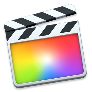
https://en.wikipedia.org/wiki/Final_Cut_Pro_X
https://en.wikipedia.org/wiki/DaVinci_Resolve
alcomposer
on 4 Feb 2019
@alcomposer The one with mesh gradient is awesome!
naj59
on 4 Feb 2019
Either way its only an idea, and it would still need more work from a professional graphic designer to be usable. (I think there are a few here... and already contributed)
But personally I am not fussed either way, mainly for 2 reasons:
- We can add our own icon if we want.
- An Olive by any other icon edits as sweetly
That said, I do know that people judge books by their covers, and having a modern icon can go a long way to convincing users that the software is worthwhile their time / monetary investment.
Unfortunately, that normally means riding the tide of fashion, currently everything is flat, may not be in the future.
My idea could easily be 'de-flatted' and made to look a bit more like Resolve (the reflective inner due drops), maybe that would look better.
alcomposer
on 4 Feb 2019
I think Resolve uses color gradients to indicate their focus on color grading since that was the main focus of their suite for so long.
DaniSeeh
on 4 Feb 2019
I couldn't get the idea out of my mind. Here is my 2nd attempt :)
 Gustavekkj
on 5 Feb 2019
Gustavekkj
on 5 Feb 2019
Big Matt is Watching
While I do think associating an olive with a camera was clever, I'm put off the this eye looking me sideways.
oc1024
on 5 Feb 2019
Here is the App Icon guidelines for Gnome (updated Jan):
http://jimmac.musichall.cz/blog/2019-01-23-the-big-app-icon-redesign/
It's a very good read, and coming from one of the oldest FOSS projects, I think the historic context is there.
alcomposer
on 5 Feb 2019

Gustavekkj
on 5 Feb 2019
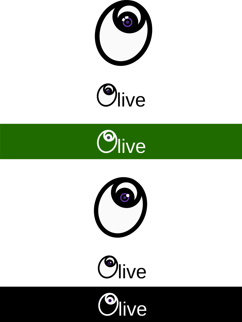
Here is a slightly different version based on @oc1024 idea. In my opinion it fits more into that macOS world although it would look nice on Windows and Linux too.
 naj59
on 16 Feb 2019
naj59
on 16 Feb 2019
@alcomposer I know this is not strictly regarding the Olive program, but could you maybe make a version of that alternative rainbow Olive icon with an expanded background? It would be nice as the Discord server's icon (the icon of an open Discord server expands from a circle to a rounded square, so having a square picture with the same dimensions would be lovely).
EDIT: Just for the record, it's with regards to #543.
 elsandosgrande
on 26 Feb 2019
elsandosgrande
on 26 Feb 2019
Hey @elsandosgrande,
Here is the logo as PNG & SVG:

olive_discord.zip
I used Inkscape, and its a standard SVG file.
@itsmattkc hope this is ok, I am making it available as an SVG so it can be easily adjusted etc.
alcomposer
on 26 Feb 2019
used inkscape
olive-editor.svg.zip
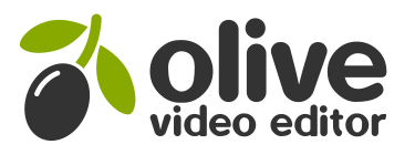
 brotenet
on 2 Apr 2019
brotenet
on 2 Apr 2019
AWESOME! Really like this variant!
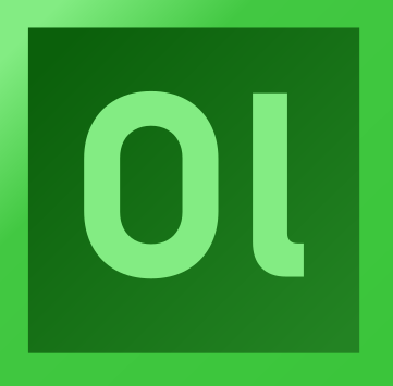
FTR, What about "Adobe style" (Ol) icon by Tux Designer?

 Symbian9
on 2 Apr 2019
Symbian9
on 2 Apr 2019
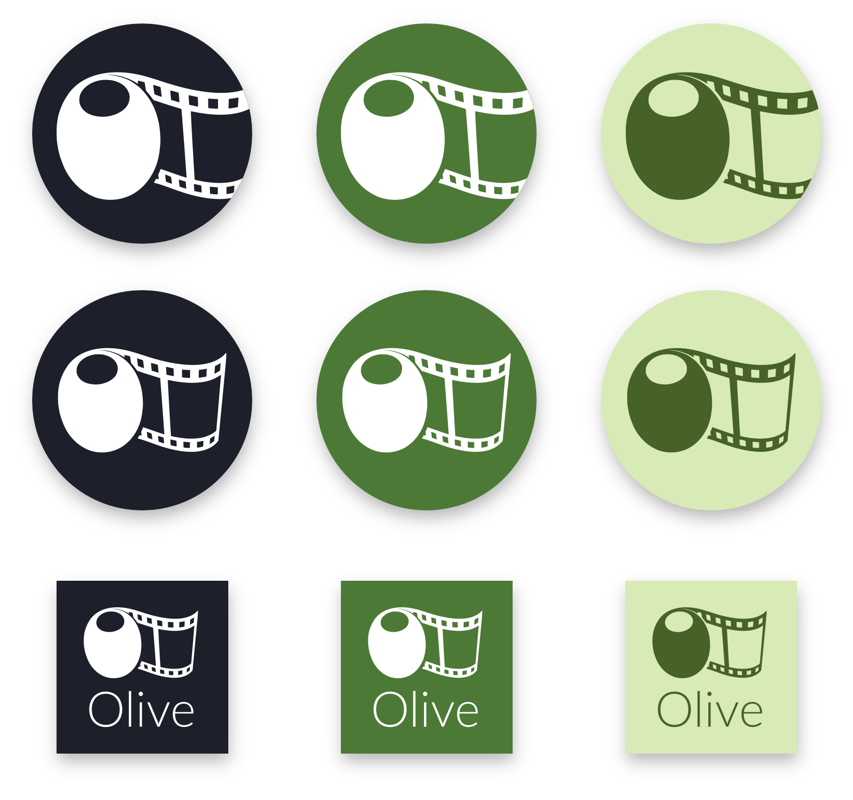
brotenet's is the only one so far that doesn't look busy (edit: except for Gustavekkj's v2).
Too much detail and busyness are the main problem of the current official logo and many of the submissions here. I'm stating this as a user and somebody who has experience with using logos of applications to draw attention in video thumbnails, not as somebody who could even dream to create a better design on his own.
naj59 - yours is gorgeous but as an icon it has empty space and the detail is a problem. Maybe it would be possible to crop a section of the branch but I doubt it would be still recognizable.
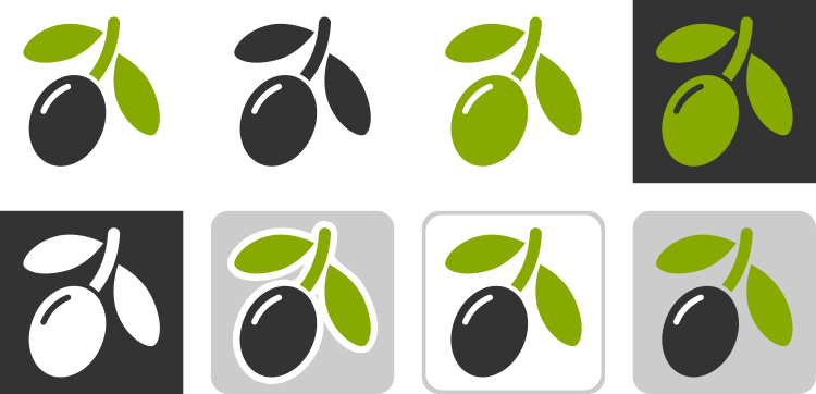
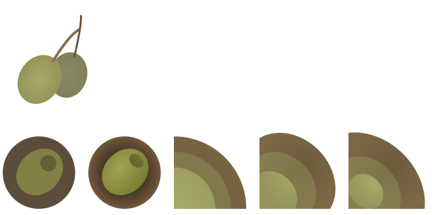
brotenet - the film clip is too cartoony and generic. In general any design suffers from people not being familiar with the look of an olive on a branch, so without the dark olive/green branch/white bg colors it's hard to identify (looks like a weirdly lonesome grape to me when it's white on dark grey). Still my favorite though. Here's the ones from the svg that i like:
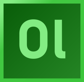
Since Sony Vegas also uses the "adobe style" I would figure that its concept is free for grabs
If the project owner wants to actually consider these, somebody please improve them. Neither is 100% square: olivelogos.zip (SVG)
 qubodup
on 5 Apr 2019
qubodup
on 5 Apr 2019
I agree with @qubodup and want to add, that the logo should be recognizable at small sizes because it will be used in several places where it matters:
- favicon of website:
- 32x32 pixels appears to be common, although tab icons are displayed in Chrome on Windows at a scale of 16x16
- application icon on Windows (info):
- 16x16 in Window title bar and in Explorer in list view mode
- 24x24 on taskbar, but typically generated by the OS from the 32x32 icon it seems
- 32x32 in Explorer's properties dialog
- 48x48 by default on the desktop?
- larger sizes on desktop and in explorer possible, computed from a 256x256 image
- on macOS (info):
- 16x16
- 32x32
- 128x128
- 256x256
- 512x512
- all of the above at 2x, so twice the size as well (32..1024)
- on Linux (info):
- 16x16 GNOME menu icon size
- 24x24 primary size for GNOME toolbar icons
- 48x48 primary size for GNOME application icons
- various sizes with KDE (16, 22, 32, 48, 64, 128, 256)
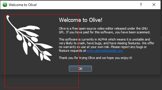
Anything larger than 256x256 pixels doesn't seem very useful to me. The olive branch in the startup message box is around 170 pixels, the red outline is 256:
The logo should be created as SVG regardless, so that it can be scaled to whatever size. The grid alignment is important however, to get good results for the tiny icon sizes. For the 16x16 version it might be better to create a raster graphics variant by hand for optimal quality, but that highly depends on the icon itself.
I tweaked one of @brotenet's designs and it renders pretty well for 16, 32 and 256 pixel sizes:


A few remarks:
- 32x32 canvas as base
- increased the margins between elements (2-3px)
- increased the size of the light streak (otherwise it gets a bit lost at 16x16)
- 1px border margin
- made the green color a bit less vibrant
- branch terminal at the top is no longer rounded
- main elements are grid-aligned, although this isn't all that important for this icon because there are very few vertical or horizontal shapes which should be pixel-perfect
This was just an initial experiment. It's a great starting point, but it needs more tweaking in my opinion.
- The leaves look a bit too disconnected and out of place with the increased margins, but it is somewhat necessary have such a gap between the elements so that they their pixels don't touch at 16x16.
- could be even more "reclined", for a more pronounced J shape to fill the space better. Might also help to solve above problem.
- at large scale, it looks rather boring and @itsmattkc doesn't like flat design. Might be worth to explore something more skeuomorphic, but I my suggestion is rather to go for a flat 2.0 style by adding some shadows and details similar as seen in many material design illustrations for instance. Subtle details shouldn't affect the recognizability at small sizes but make it more interesting at large sizes.
- not sure about adding a background or outline. I don't like the monochrome variants and a white outline is too much in your face if it's on a dark background like the black Windows 10 taskbar. Would it make sense to create different versions for macOS and other OSes to better fit the typical app icon style of the platform?
 Simran-B
on 23 Apr 2019
Simran-B
on 23 Apr 2019
I think one can go even further in simplifying the logo and overall UI of Olive. Here's one quick proposal using a more simple approach to the Olive:
I understand that it may be to simple for some, but I'd at least recommend moving away from the current screaming green colour, embossing and way to detailed logo. I think Gustavekkj and brotenet are on to something, but they could be simplified even further, in my opinion. And the colour scheme can be adjusted further as well.
Just my opinion.
 2JYkqQkem3
on 2 Aug 2019
2JYkqQkem3
on 2 Aug 2019
Personally I really like your direction. Not sure if I see an olive in that logo, but it's a nice design. The green color is great, but not sure if it works on black in terms of contrast (we should check WCAG 2.0 accessibility) - in a logo it's not much of a concern, but to use the same color on a website might not work.
An idea I had the other day was to perhaps make the logo look a bit like a node graph to emphasize that future core aspect of Olive. Not sure if this is a possible in a minimalst design however.
Simran-B
on 2 Aug 2019
@brotenet's idea is my favourite. Logos and icons should be recognisable and distinctive at a small size. Most of the other logos fail this.
I didn't even realise that the logo in the April 2019 release is an olive branch, I through that it was some strange character!
 rubenwardy
on 28 Aug 2019
rubenwardy
on 28 Aug 2019
Some toying around with shapes and colors:
Simran-B
on 29 Aug 2019
I really like the second one on the second line. It's probably my favourite so far
rubenwardy
on 29 Aug 2019
FTR, Once when I tried to search Olive on Twitter discovered that there are few users (that also has "Olive" word in their names) with nice icons & colors:
- «Olive Garden» (@olivegarden on Twitter)

- «OliveTreeBible»(@OliveTreeBible on Twitter)

Symbian9
on 30 Aug 2019
What we need is a logo which is recognizable at small scales, so that it can be used as app icon, favicon, server icon on discord etc. Making an extended version with text is easy, and thus secondary. Your images have a way too high visual complexity and too thin elements. One olive and a leaf might work though.
Simran-B
on 31 Aug 2019
Making an extended version with text is easy
Fully agree! Sorry me, I was unclear - icons above I referenced only for colors example; Olive icon of course should not include text objects.
Symbian9
on 31 Aug 2019
Hi everyone, I made an icon using inkscape. It's a standard svg.
Here's the result:

There's also an alternate colored version, but I prefer the monochrome one
I also made animation out of it:

 timkrief
on 27 Sep 2019
timkrief
on 27 Sep 2019
OK I'm back with new proposals:
EDIT: Here's the animated version:

EDIT: The icons in action
Here with a gradient:
Here with a dark-blue-grey background:
(colors TBD. By the way, do olive have a proper color palette yet?)
Other possible uses:


timkrief
on 27 Sep 2019
These are hideous. Please no. Stop.
Open source and design is truly an oxymoron, with emphasis on the moron.
 sobotka
on 28 Sep 2019
sobotka
on 28 Sep 2019
Icon concept felt right, it gets the message across (Olive Video Editor), recognizable as a tiny icon, unique. So I spent a day on this concept and I tried my best. I actually used a day in my life to make that without asking anything in return, so please be respectful.
@sobotka I'm not sure we'll go far with that kind of comments. However, if you have actual constructive comments to improve or try new concepts, please share them.
timkrief
on 28 Sep 2019
Constructive comment: Don’t assume time spent is valuable.
sobotka
on 28 Sep 2019
It doesn't look like any of these are liked by contributors enough to create a pull request, so it still will be useful as reference of what is not good enough. Eventually something good enough might emerge. Kdenlive's new (2016) logo wasn't its first iteration: https://forum.kde.org/viewtopic.php?f=265&t=131250
Anybody annoyed by this ticket, can simply unsubscribe:
About using film rolls in icons: as opposed to floppy disk's meaning "save", film roll's meaning "video" seems to be dying out in modern video editors' logos.
qubodup
on 28 Sep 2019
@timkrief's design is my new favourite, it combines both context (this is a video editor) and the name (olive) better than any other design so far, whilst being modern and minimalistic
rubenwardy
on 28 Sep 2019
Related issues
naj59
·
33Comments
 frink
·
16Comments
frink
·
16Comments
 pgilfernandez
·
15Comments
sobotka
·
35Comments
pgilfernandez
·
15Comments
sobotka
·
35Comments
 LeandroStanger
·
25Comments
LeandroStanger
·
25Comments
Most helpful comment
I think one can go even further in simplifying the logo and overall UI of Olive. Here's one quick proposal using a more simple approach to the Olive:
I understand that it may be to simple for some, but I'd at least recommend moving away from the current screaming green colour, embossing and way to detailed logo. I think Gustavekkj and brotenet are on to something, but they could be simplified even further, in my opinion. And the colour scheme can be adjusted further as well.
Just my opinion.