Notepad3: Thinning a bit Direct2D rendering
I really love to use your Notepad3 as much as I love using font with ligatures.
The only way to use them is thru Direct2D rendering.
I have found that the font gets "bolder" and it's a bit annoying.
Can you tune parameters a bit, if possible, to have the same aspect of GDI rendering?
 tormento
All 11 comments
Here are the examples.
GDI
Direct2D
As you can see, it's not a problem of visual impact but formatting too.
P.S: Font is Cascadia Code PL
tormento
on 26 May 2020
As the naming says, this are 2 different rendering technologies. So the display will be rough similar but not the same. For the DWrite (Direct2D) technology, you may try to finetune the rendering by selecting another fontweight and fractional pointsize naually (Customize Schemes...):
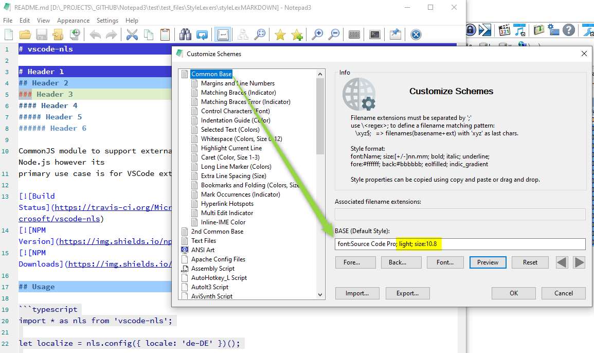
Possible Font Weights are (if the selected font family supports this):
- thin       (100)
- extralight (200)
- light      (300)
- normal     (400)
- medium     (500)
- semibold   (600)
- bold       (700)
- extrabold  (800)
- heavy      (900)
The fractional Point-Sizes may not have a corresponding visual effect for each granularity.
(Granularity may be 0.3 or 0.5 steps - you have to experiment a bit).
Using the font selection dialog will change this manual settings back to chosen values (fractional point sizes are not possible in the dialog).
Feel free to find the sweet spot for your preferred font family.
 RaiKoHoff
on 26 May 2020
RaiKoHoff
on 26 May 2020
@RaiKoHoff unfortunately the font has the 4 major attributes, not light.
I have googled around and two interesting links arose:
https://stackoverflow.com/questions/8612266/why-cant-directx-directwrite-direct2d-text-rendering-be-as-sharp-as-gdi towards the end you can read about _pRenderTarget->SetTextAntialiasMode(D2D1_TEXT_ANTIALIAS_MODE_CLEARTYPE)_
and the related
P.S: Would it be possible to add Variable Font support?
tormento
on 26 May 2020
Ok, I have tried variable font TTF FiraCodeGX.ttf from official repository on GitHub and at least I can see the "major families" even thought it would be nice to be possible to set the width and the height. It gives better results too on Direct2D display mode.
tormento
on 26 May 2020
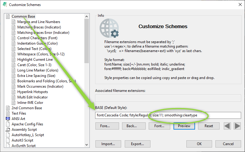
For the TextAntialiasMode(D2D1_TEXT_ANTIALIAS_MODE_CLEARTYPE) you can add the attribute
; smoothing:cleartype (possible values for smoothing are: none, default, standard, cleartype)
Font width and height can not be specified, just the weight (related to font-style) and fractional point-size (which is in fact the font's height).
The width would correspond to the DWrite stretch factor (https://docs.microsoft.com/en-us/windows/win32/api/dwrite/ne-dwrite-dwrite_font_stretch), but this seems not accessible through Scintilla's Font Setting API (https://www.scintilla.org/ScintillaDoc.html#SCI_STYLESETFONT)
Further Reading:
https://www.scintilla.org/ScintillaDoc.html#SCI_SETFONTQUALITY
https://docs.microsoft.com/en-us/windows/win32/directwrite/introducing-directwrite
RaiKoHoff
on 26 May 2020
@RaiKoHoff what about showing the SCI_SETFONTQUALITY(int fontQuality) into the Tecnology settings in Notepad3? Perhaps one of these method could provide better results.
Obviously asking Scintilla authors to implement a new feature, now that variable fonts are getting common, would be the best thing.
tormento
on 26 May 2020
@tormento the SC_SETFONTQUALITY is exposed by the attribute ;smoothing:
smoothing:none->SC_EFF_QUALITY_NON_ANTIALIASED->D2D1_TEXT_ANTIALIAS_MODE_ALIASEDsmoothing:default->SC_EFF_QUALITY_DEFAULT->D2D1_TEXT_ANTIALIAS_MODE_DEFAULTsmoothing:standard->SC_EFF_QUALITY_ANTIALIASED->D2D1_TEXT_ANTIALIAS_MODE_GRAYSCALEsmoothing:cleartype->SC_EFF_QUALITY_LCD_OPTIMIZED->D2D1_TEXT_ANTIALIAS_MODE_CLEARTYPE
Ed: we should discuss:
if SC_EFF_QUALITY_LCD_OPTIMIZED == D2D1_TEXT_ANTIALIAS_MODE_CLEARTYPE
(; smoothing:cleartype) instead of D2D1_TEXT_ANTIALIAS_MODE_DEFAULT for DWrite technology should be the default settings (since LED screens are common use?).
But I would like to base the decision on some more visual impression feedbacks.
RaiKoHoff
on 27 May 2020
@RaiKoHoff could you please tell me where to find that setting?
I looked into Notepad3.ini but can't find it. Have I to add manually?
tormento
on 27 May 2020
Yes:
RaiKoHoff
on 27 May 2020
I see no options to configure Microsoft's Rendering Technology - seemms, we can't have a closer matching font display between GDI and DirectWrite.
RaiKoHoff
on 29 Jul 2020
Hello @tormento ,
As far as I'm concerned, I think you (requester) can close this issue...
 hpwamr
on 29 Jul 2020
hpwamr
on 29 Jul 2020
Related issues
hpwamr
·
4Comments
 dlong500
·
3Comments
hpwamr
·
3Comments
dlong500
·
3Comments
hpwamr
·
3Comments
 zb-z
·
3Comments
zb-z
·
3Comments
 wmsrww
·
3Comments
wmsrww
·
3Comments
Most helpful comment
As the naming says, this are 2 different rendering technologies. So the display will be rough similar but not the same. For the DWrite (Direct2D) technology, you may try to finetune the rendering by selecting another fontweight and fractional pointsize naually (
Customize Schemes...):Possible Font Weights are (if the selected font family supports this):
The fractional Point-Sizes may not have a corresponding visual effect for each granularity.
(Granularity may be 0.3 or 0.5 steps - you have to experiment a bit).
Using the font selection dialog will change this manual settings back to chosen values (fractional point sizes are not possible in the dialog).
Feel free to find the sweet spot for your preferred font family.