Nodejs.dev: Active tabs extended even when the tab is not active
Description
When trying to use the site on mobile the active hover tabs get extended and the styling does not work properly 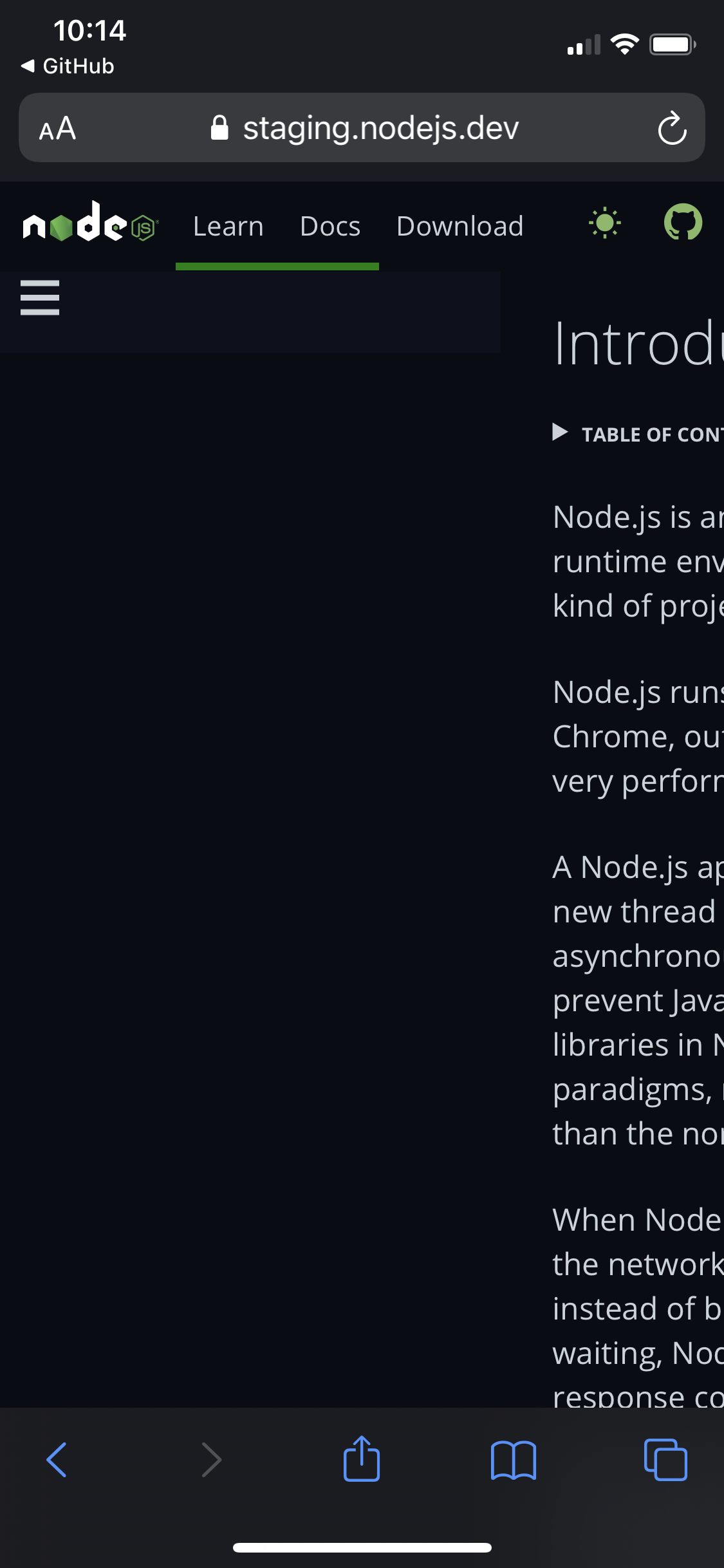
This is a bug even in prod version of the site.
We have had a discussion on what the problem is in issue #852. If further context is needed please look into it kindly
 designMoreWeb
All 2 comments
Thank you @designMoreWeb -- I've gone ahead and opened #888 to add a little spacing between these nav items on mobile, per the discussion in #852.
However, I also wanted to point out that I think it would be helpful if the "active" nav item styles were different from the hover styles. Currently, because both styles are the same, there's no styling when you hover over an active nav item. 😅 I'm happy to adjust that as well -- just let me know! Thank you!
 jendowns
on 18 Aug 2020
jendowns
on 18 Aug 2020
@jendowns that's a great suggestion, I would suggest if you have better ideas for the styling it would be wonderful if you can make one I am sure it will be nice 😊
designMoreWeb
on 18 Aug 2020
Related issues
 giankotarola
·
4Comments
giankotarola
·
4Comments
 talarviv
·
4Comments
talarviv
·
4Comments
 antsmartian
·
3Comments
designMoreWeb
·
3Comments
antsmartian
·
3Comments
designMoreWeb
·
3Comments
 benhalverson
·
3Comments
benhalverson
·
3Comments
Most helpful comment
Thank you @designMoreWeb -- I've gone ahead and opened #888 to add a little spacing between these nav items on mobile, per the discussion in #852.
However, I also wanted to point out that I think it would be helpful if the "active" nav item styles were different from the hover styles. Currently, because both styles are the same, there's no styling when you hover over an active nav item. 😅 I'm happy to adjust that as well -- just let me know! Thank you!