Nextcloud-vue: Sidebar tabbed navigation normal / hover / focus / active states.
I think we should apply the same rules that are going to be implemented in the app navigation ( #425) since what we have now looks a bit confusing.
What do you think @nextcloud/designers?
 ma12-co
All 4 comments
@ma12-co current sidebar does not look like that and have already been updated a bit, it now have a far better contrast and usability :)
But We could definitely see how we can improve it a bit further!
 skjnldsv
on 22 Sep 2019
skjnldsv
on 22 Sep 2019
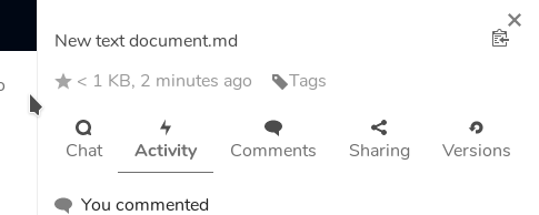
You're right @skjnldsv, this is the current sidebar:

I still think that bringing the appnavigation behavior here would be a nice improvement!
ma12-co
on 22 Sep 2019
Do you mean we should do the whole background stuff? Not sure if that would look nice on the tab bar since it has an "open top" and it would look a bit boxy, no? If you have mockups for that we can look at it for sure though. :)
 jancborchardt
on 23 Sep 2019
jancborchardt
on 23 Sep 2019
Those new colors are very light, but yeah there's that risk.. Maybe we should see it with a live example, it will be easier to try out the behavior! I'll put that on my todo list ;)
ma12-co
on 23 Sep 2019
Related issues
 nicolad
·
4Comments
nicolad
·
4Comments
 roadrunnerjb
·
5Comments
jancborchardt
·
3Comments
roadrunnerjb
·
5Comments
jancborchardt
·
3Comments
 ChristophWurst
·
6Comments
ma12-co
·
5Comments
ChristophWurst
·
6Comments
ma12-co
·
5Comments
Most helpful comment
You're right @skjnldsv, this is the current sidebar:

I still think that bringing the appnavigation behavior here would be a nice improvement!