Nextcloud-vue: AppNavigationCaption / Caption
We currently have 2 components that do the same thing in the navigation. As said in today's components call we should chose one and go forward with it In all instances. Personally I would go with the talk version with slightly more padding on the left as done here https://github.com/nextcloud/nextcloud-vue/pull/1740#issue-585470701.
cc @nextcloud/designers
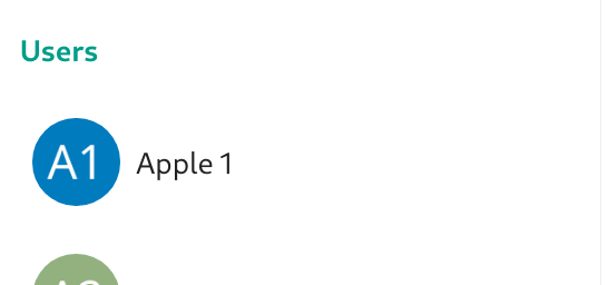
Talk version: Caption
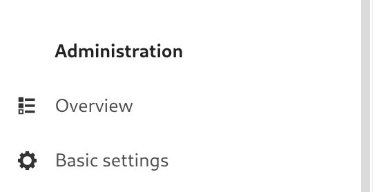
Admin settings version AppNavigationCaption
 ma12-co
All 5 comments
If this is a request for opinions: I like the second version from the Administration more. It seems to be easier to read from top to bottom for me when the text is aligned (and i think it is already well recognizable as a caption because it is bold and has some white space on its top).
 stefan-niedermann
on 9 Mar 2021
stefan-niedermann
on 9 Mar 2021
I think if we want to align the text all the time we can't have a generalized component for this as it would require special tweaking depending on whether there's a big avatar, small avatar, or icon on the left of the next navigation item.
Personally I really don't mind the fact that the text is slightly indented here, especially because hierarchically they belong to two different orders, so in theory one first "scans" the captions and then goes to find whatever he needs in the list.
ma12-co
on 9 Mar 2021
E.g if you take talk's case, the captions would have to have way to much padding to be aligned with the text:

ma12-co
on 9 Mar 2021
Let's just have @jancborchardt take the decision here, easier done.
Let's wait for his return from vac
 skjnldsv
on 16 Mar 2021
skjnldsv
on 16 Mar 2021
I also much prefer the way we do it in settings with the text all left-aligned to the same position.
Granted, in Talk the indent is much larger because of the big avatars and further list item padding. But it seems very far off to the left. Maybe it makes sense to left-align it with the placeholder of the Search field instead, since otherwise we have 3 separate lines of alignment.
 jancborchardt
on 13 Apr 2021
jancborchardt
on 13 Apr 2021
Related issues
 roadrunnerjb
·
5Comments
jancborchardt
·
3Comments
roadrunnerjb
·
5Comments
jancborchardt
·
3Comments
 ChristophWurst
·
6Comments
ChristophWurst
·
6Comments
 rullzer
·
7Comments
ChristophWurst
·
7Comments
rullzer
·
7Comments
ChristophWurst
·
7Comments
Most helpful comment
Let's just have @jancborchardt take the decision here, easier done.
Let's wait for his return from vac