Multi-account-containers: New tab long press UI
As mentioned in email @ChenMorpheus we have some UI issues with the new tab button.
- This is currently not in platform and implemented in SDK so needs to be removed before 57
- Too many containers are an issue (some people have suggested hidden containers)
- UI doesn't have the same look and feel as the rest of the browser or updates we plan either (photon)
- Isn't themed for dev edition, nightly etc.

 jonathanKingston
All 8 comments
Sorry for the late reply. Before we dive in for the solutions, there are several questions I might need your clarification. Please find my comments inline.
This is currently not in platform and implemented in SDK so needs to be removed before 57
Based on your following questions, it seems the UI can still survive before 57? Does this mean that we can't have this UI forever after 57?
Too many containers are an issue (some people have suggested hidden containers
For this issue, I believe Mark had provided a solution in #115.
UI doesn't have the same look and feel as the rest of the browser or updates we plan either (photon)
Right now Photon is still WIP, but we'll check if we can have a new look for this UI to fit in with other elements.
Isn't themed for dev edition, nightly etc.
Do you mean this UI can change themes based on different versions?
 ChenMorpheus
on 13 Apr 2017
ChenMorpheus
on 13 Apr 2017
Based on your following questions, it seems the UI can still survive before 57? Does this mean that we can't have this UI forever after 57?
Yeah as soon as SDK dies, if we don't make it into platform then it has to be removed.
For this issue, I believe Mark had provided a solution in #115.
Yeah the more button would be pretty cool. We probably would want reordering then.
It would also solve my desire for "hidden containers" where this new tab button and some of the others wouldn't show all containers. Only the menu would show the full list. (this is something containers making loads of containers need).
Do you mean this UI can change themes based on different versions?
Yeah seems a little odd with the white on black etc.
Thanks!
jonathanKingston
on 25 Apr 2017
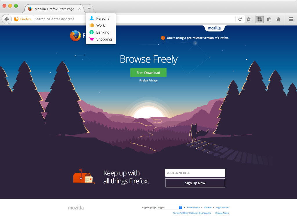
After discussed and review with other designers, we have updates for the new tab hover UI.
It becomes more of the same look and feels as the rest of the browser.

And the dev edition / dark theme

Thanks!!
 fangshih
on 1 Jun 2017
fangshih
on 1 Jun 2017
Thanks again @fangshih!!!
jonathanKingston
on 1 Jun 2017
Discussed the idea of moving this to long press like it is in Nightly now with the new UX shown. We can make the box scrollable etc.
jonathanKingston
on 6 Jun 2017
Hey @jonathanKingston, I have slightly updated the new tab UI to sync up with current Photon style.
So the spacing and the font size is slightly different compared to the current build.
Let me know if you need anything else. Thanks!
visual measurement
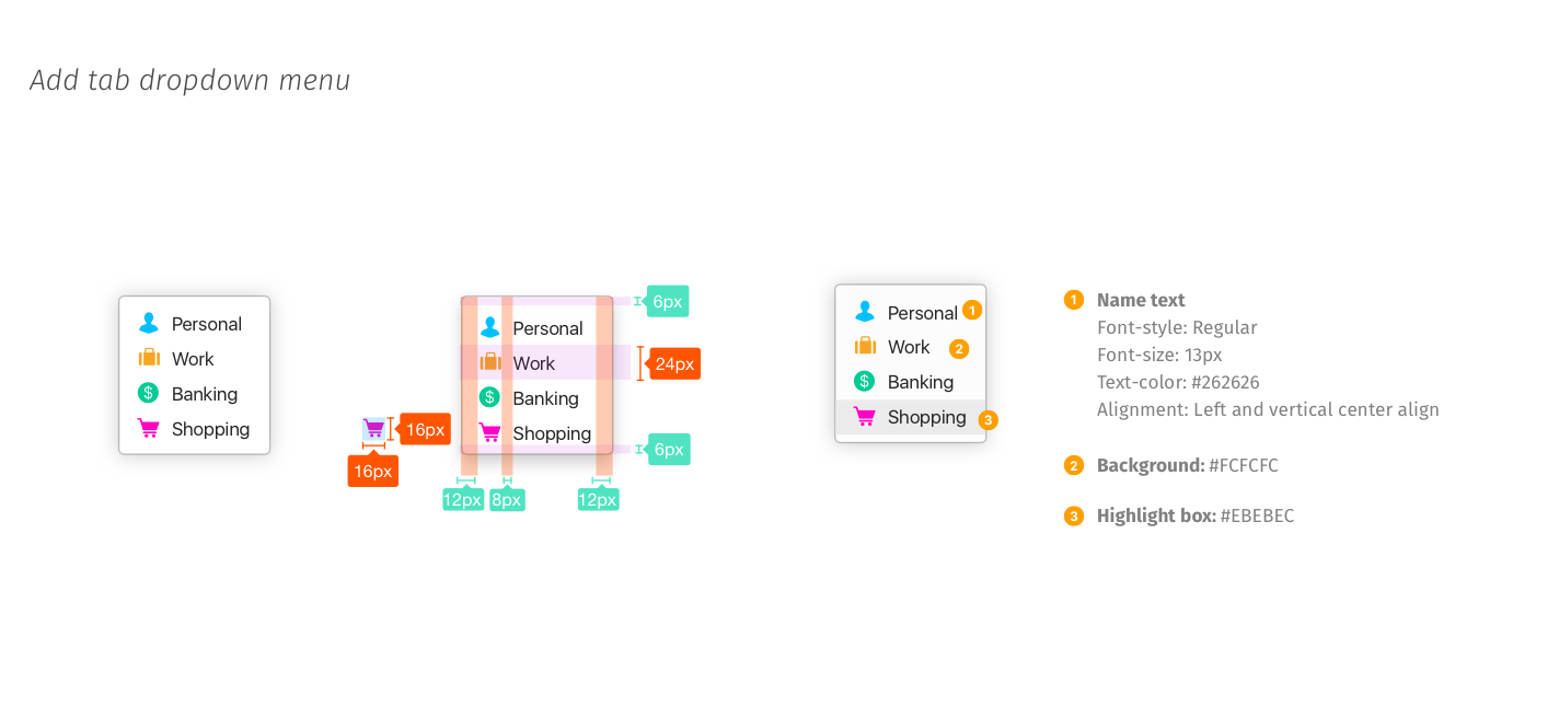
https://www.dropbox.com/s/ghk51j203zc8sts/Dropdown%20panel%20spec.png?dl=0
fangshih
on 21 Jul 2017
Hey @fangshih we have just reverted back to the code that is in Nightly at the moment and didn't get time to update these. I think that we might get these styles for free when XUL panels are updated as it should be have like a standard context menu. However I will check closer to the time.
Thanks again for this!
jonathanKingston
on 21 Jul 2017
Got it! Thanks @jonathanKingston
fangshih
on 24 Jul 2017
Related issues
 fire9901
·
3Comments
fire9901
·
3Comments
 ericlathrop
·
3Comments
ericlathrop
·
3Comments
 krishnanunnir
·
3Comments
krishnanunnir
·
3Comments
 CircleCode
·
3Comments
CircleCode
·
3Comments
 o-l-a-v
·
4Comments
o-l-a-v
·
4Comments
Most helpful comment
After discussed and review with other designers, we have updates for the new tab hover UI.
It becomes more of the same look and feels as the rest of the browser.
And the dev edition / dark theme
Thanks!!