Mini-graph-card: dynamic line colour bug
type: 'custom:mini-graph-card'
entities:
- sensor.upstairs_plant_temperature
show:
labels: true
color_thresholds: - value: 0
color: '#0000ff' - value: 10
color: '#00ff00' - value: 35
color: '#ff0000'
hours_to_show: 168
points_per_hour: 10
tap_action: none
show_fill: true
with the above setup, I get a brown rendering. My sensor range is currently 20.6-27.3. I would expect the whole rendering to be green, since it should be blue below 10, green between 10 and 35 and red above 35. If I add a lower bound of 0 then I get the rendering as expected - I just don't like the shape of the graph as much. But I do not think this is expected behaviour, I would expect the colour to be correct even with dynamic ranges.
 analogmonster
All 9 comments
I noticed exactly the same thing. Here is the config to reproduce.
      - type: custom:mini-graph-card
        name: NO BOUNDS
        hours_to_show: 24
        points_per_hour: 2
        hour24: true
        entities:
          - sensor.temperature
        show:
          labels: true
          extrema: true
          average: true
        color_thresholds_transition: "hard"
        color_thresholds:
          - value: 24.5
            color: !secret color_warm
          - value: 21.5
            color: !secret color_normal
          - value: 20
            color: !secret color_cold

      - type: custom:mini-graph-card
        name: WITH BOUNDS
        hours_to_show: 24
        points_per_hour: 2
        hour24: true
        entities:
          - sensor.temperature
        show:
          labels: true
          extrema: true
          average: true
        lower_bound: ~20
        upper_bound: ~25
        color_thresholds_transition: "hard"
        color_thresholds:
          - value: 24.5
            color: !secret color_warm
          - value: 21.5
            color: !secret color_normal
          - value: 20
            color: !secret color_cold
The one with bounds behave, but the one without bounds get a strange transition effect.
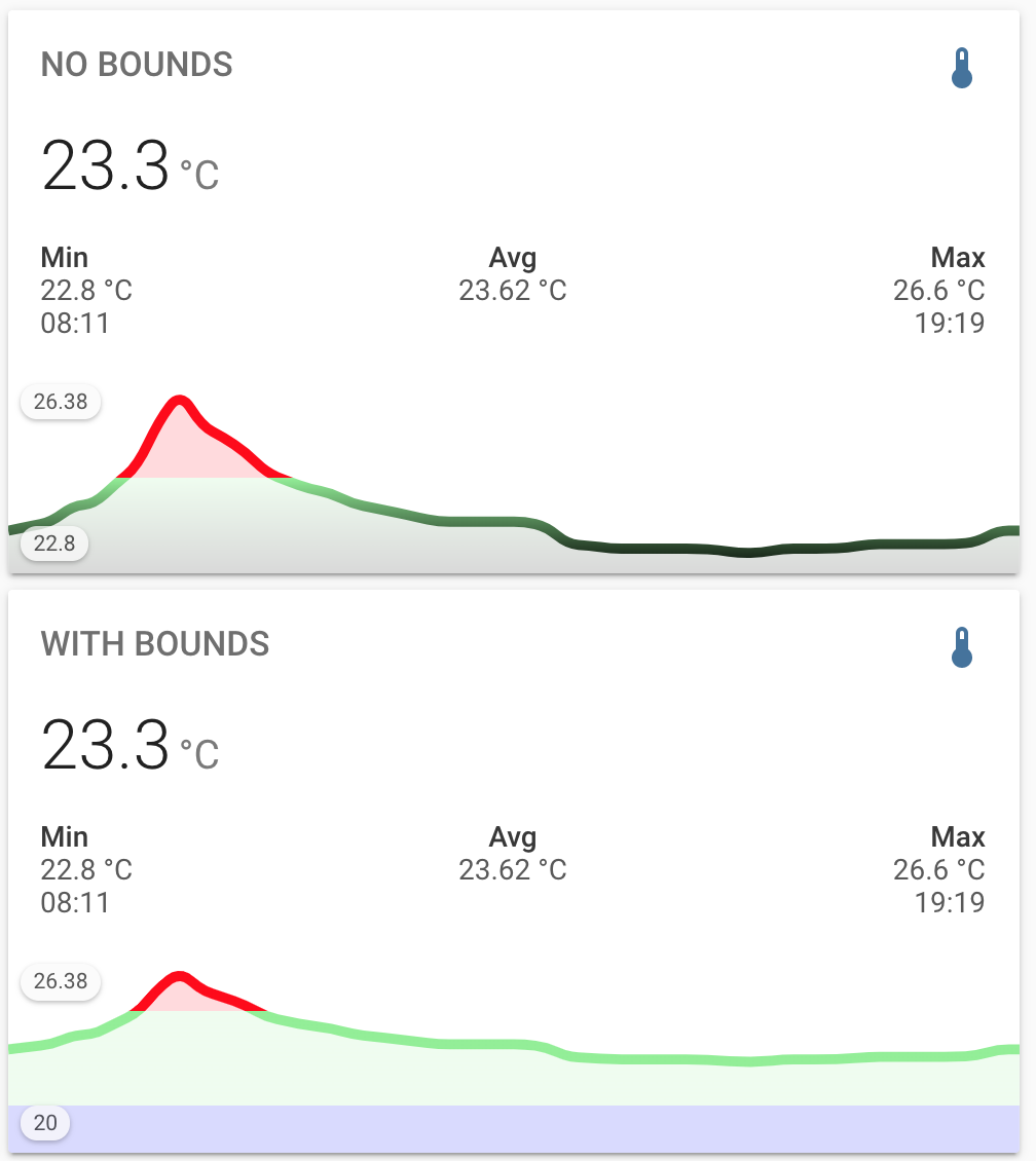
 jannylund
on 12 Jul 2020
jannylund
on 12 Jul 2020
I ran into this issue and with me the problem seemed to be named colors.
If I use hex colors instead of named colors the problem doesn't happen.
 petermnt
on 12 Aug 2020
petermnt
on 12 Aug 2020
I ran into this issue and with me the problem seemed to be named colors.
If I use hex colors instead of named colors the problem doesn't happen.
That's actually expected and is unrelated to this issue.
Only colors in hex format are supported with the color threshold feature, this is stated in the documentation.
 kalkih
on 12 Aug 2020
kalkih
on 12 Aug 2020
That's actually expected and is unrelated to this issue.
Only colors in hex format are supported with the color threshold feature, this is stated in the documentation.
I see. I didn't catch the implicit requirement from the docs, but technically it's there yeah.
Never mind my comment then, then this issue is probably unrelated.
petermnt
on 12 Aug 2020
with the above setup, I get a brown rendering. My sensor range is currently 20.6-27.3. I would expect the whole rendering to be green, since it should be blue below 10, green between 10 and 35 and red above 35. If I add a lower bound of 0 then I get the rendering as expected - I just don't like the shape of the graph as much. But I do not think this is expected behaviour, I would expect the colour to be correct even with dynamic ranges.
So I looked into this some more and I think what you're seeing is the intended behaviour, the graph will transition smoothly (blend) between the colors. If you blend red & green you should get a brownish color at the 25 range.
You can set the option color_thresholds_transition to hard to get a hard transition between colors, that should give you the effect you're looking for.
I noticed exactly the same thing. Here is the config to reproduce.
Are your color variables specified in HEX format (color_warm, color_cold e.t.c.) ?
Only hex format is officially supported as color value, since color interpolation has to be made on out of bound color values to calculate the correct color at the y-axis bounds.
Other color formats will work as long as all of them are within the y-axis range, that's probably why it works as expected when you set the bounds manually.
kalkih
on 12 Aug 2020
Hi, my use case is for an AQI graph (what with major fires going on and all that). Here's my YAML:
            - animate: true
              color_thresholds:
                - value: 50
                  color: '#0f0'
                - value: 100
                  color: '#0ff'
                - value: 150
                  color: '#aff'
                - value: 200
                  color: '#f00'
                - value: 300
                  color: '#fff'
              entities:
                - '${vars[0].entity_id}'
              lower_bound: 0
              upper_bound: ~50
              color_threshold_transition: hard
              show:
                average: true
                fill: fade
                icon: false
                name: false
                state: false
              type: 'custom:mini-graph-card'
When using this configuration, the top zone of the chart is not colored correctly because the threshold is outside of the axis (unless I make the chart 300 units tall, which makes the variation in the line invisible).
How would I ensure the top part of the chart is colored correctly without expanding the graph limits, which makes the graph really hard to read?
 fezzik02
on 21 Sep 2020
fezzik02
on 21 Sep 2020
This is something that passes for a workaround for me, because it computes a suitable upper bound on the fly to apply to the graph, and then bring the minimum up to keep the graph tight:
            - animate: true
              color_thresholds:
                - value: 50
                  color: '#0f0'
                - value: 100
                  color: '#ff0'
                - value: 150
                  color: '#fa0'
                - value: 200
                  color: '#f00'
                - value: 300
                  color: '#808'
              entities:
                - '${vars[0].entity_id}'
              lower_bound: ~300
              upper_bound: '${parseInt(vars[0].state) + 50}'
              color_threshold_transition: soft
              name:
              show:
                average: true
                fill: true
                icon: false
                name: false
                state: false
              type: 'custom:mini-graph-card'
this helped: https://github.com/iantrich/config-template-card
fezzik02
on 21 Sep 2020
I ended up having to boost the upper bound to current + 100 which still left me with a mostly empty chart. I'm going to see if I can call in a favor from a buddy who's better with JS than me to get a PR going.
Are you merging this with issue #391 ?
fezzik02
on 23 Sep 2020
Related issues
 WhistleMaster
·
6Comments
WhistleMaster
·
6Comments
 QkulleQ
·
7Comments
QkulleQ
·
7Comments
 skarfacegc
·
7Comments
skarfacegc
·
7Comments
 NapalmCandy
·
4Comments
NapalmCandy
·
4Comments
 tomlut
·
4Comments
tomlut
·
4Comments