Mini-graph-card: Feature request: hours_to_show as real number
I would like to be able to show 5 min cpu load graphs.
But this means the hours_to_show option should be of type real number (0.083333) instead of integer.
Could this be made possible perhaps?
Love this very nice card btw :)
 QkulleQ
All 7 comments
I actually think this should already possible, If I remember correctly I removed the integer check a while back, but there were some issues with the tooltip timestamps back then when hours_to_show < 1, but I think that should be fixed now as well.
A config like this should give you a data point for each minute.
hours_to_show: 0.083333
points_per_hour: 60
Give it a shot and if it works we could probably update the docs.
 kalkih
on 22 Oct 2019
kalkih
on 22 Oct 2019
We could do something as follows:
- instead of
hours_to_showhave a settingtimeframe_to_show - user should be able to specify unit after the number e.g.
1h,5m,7d - the default option would stay as hours (when there is no unit)
- we could make this setting backward compatible - so take hours_to_show if it is present (but remove it from documentation)
The above should be fairly simple, right? I'd like to have such option for "point_per_hour", though it can be harder to implement.
@kalkih I can work on it next weekend as long you like the idea
 maxwroc
on 22 Oct 2019
maxwroc
on 22 Oct 2019
Sure, that would be great and improve usability.
As you said points_per_hour, is tougher, not sure how we would go about changing it, will have to think about that one. 🤔
Something like points_per_unit maybe, but you would want to be able to specify a different unit than the one in timeframe, so maybe format like this: 6/h, 10/m, 1/d etc... ?
kalkih
on 22 Oct 2019
@kalkih hours_to_show: 0.083333 is working! But the graph is plotted from left to right somehow (current time is on the left):
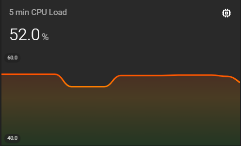
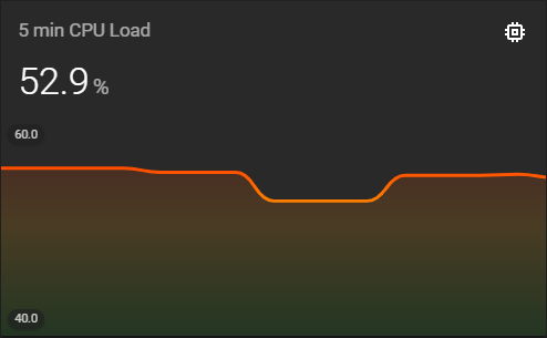
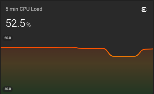
Also the time is written backwards (and without seconds):

Thanks so far, I can live with the small issues!
QkulleQ
on 22 Oct 2019
@kalkih yes I was thinking about something like this as you suggested 10/h etc
@QkulleQ I think graph is plotted correctly it is just the time which is shown not correct. Possible that I have introduced this bug recently as I remember I was adjusting this time by reducing the val by one min. Can take a look on the end of the week.
maxwroc
on 22 Oct 2019
@maxwroc there's definetely something wrong with the timestamps.
For an individual point the displayed time is changing every minute, like below snapshots.
After a minute the same point is displayed with a different timestamp:

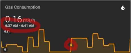
@QkulleQ I think graph is plotted correctly
Are you sure? The first graph of that post is the oldest snapshot. Snapshots 2 and 3 were taken after the first one. The newer points on those snapshots are added on the left side. Shouldn't that be on the right side?
I think this behavior is only happening with values below 1 for the hours_to_show option.
For example the Gas Consumption graph has a 24 hour value.
Here is the same graph somewhat later, new points are added to the right:
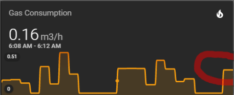
(BTW. notice the timestamp of the point has changed again)
QkulleQ
on 22 Oct 2019
Yeah, there's definitely something funky going on when going below 1 hours_to_show.
The timestamps and the graph is calculated separately and both seem wrong so probably more than one bug.
Another issue is that the graph only update/re-render when the entity state change, and in smaller timeframes like this it's def an issue, unless the sensor entity updates very frequently.
We have the update_interval option that could solve it, but that requires the user to actually set it.
The timestamps does however update on every card re-render.
kalkih
on 24 Oct 2019
Related issues
 phardy
·
3Comments
phardy
·
3Comments
 brezuicabogdan
·
5Comments
brezuicabogdan
·
5Comments
 Joezi79
·
4Comments
Joezi79
·
4Comments
 yadenisenko
·
4Comments
yadenisenko
·
4Comments
 pejotigrek
·
6Comments
pejotigrek
·
6Comments
Most helpful comment
We could do something as follows:
hours_to_showhave a settingtimeframe_to_show1h,5m,7dThe above should be fairly simple, right? I'd like to have such option for "point_per_hour", though it can be harder to implement.
@kalkih I can work on it next weekend as long you like the idea