Mattermost-server: Allow collapsing in-line images over 100px in height
Original report: https://github.com/mattermost/mattermost-server/issues/9451
This ticket is to introduce the ability to collapse inline images. Users can currently create inline images using syntax:
\!\<alt text>(URL)
Proposed functionality:
- Any inline image >= 100 px in height displays a collapse/expand arrow on hover. Collapsing the image shows the alt text with an expand arrow next to it. If no alt text is provided, then fallback to displaying the URL.
- Any inline image >= 100 px in height should not display inline, but show on its own line adding line breaks before and after the image (see github markdown for an example)
- Any image < 100 px in height does not display the collapse/expand arrow on hover.
- Any image < 100 px in height will display inline with the text
- the default expand/collapse state of the should be based on the users account preference for default appearance of link previews.
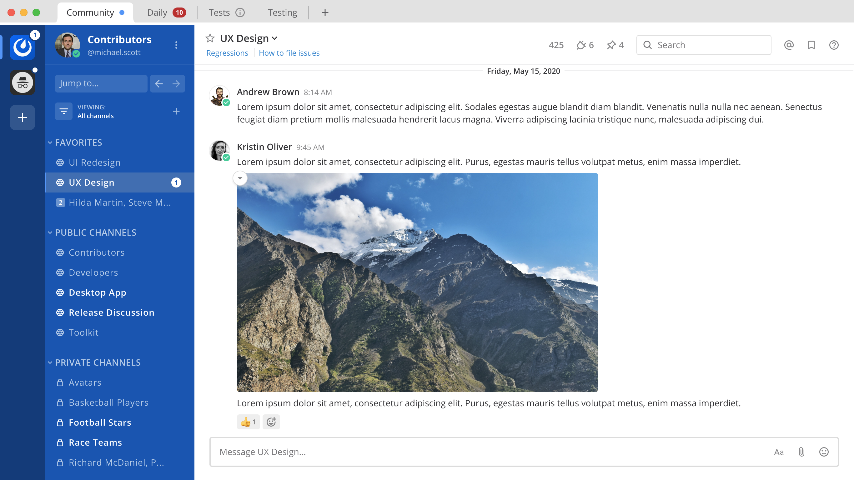
On hover over the markdown image >100px in height:
Notice the circle button with the down arrow
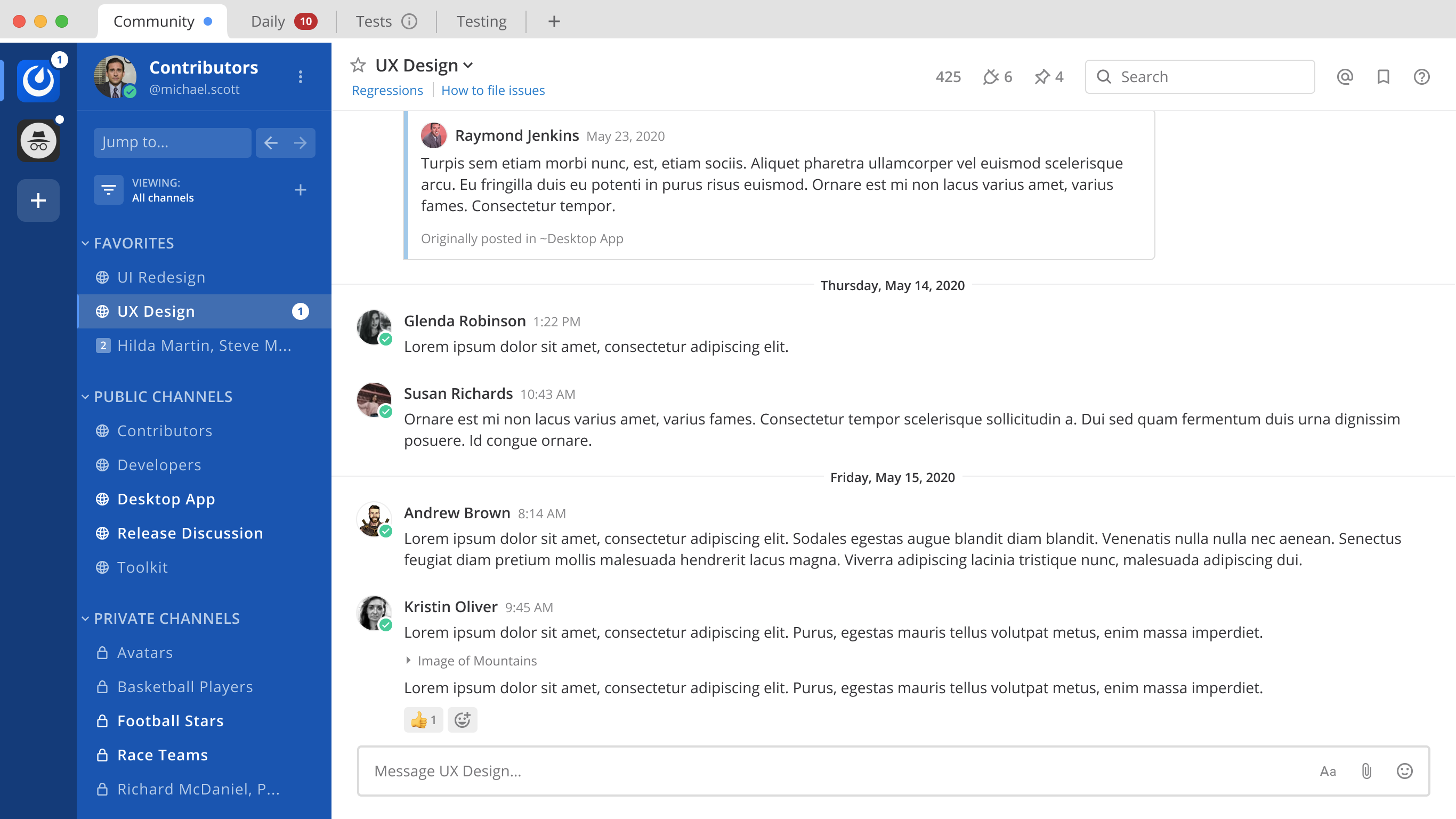
Collapsed state of the markdown image >100px in height:
Notice the ‘Image of Mountains’ with an arrow to the left of it
Design files:
Other notes:
- Once this is complete, we should update the \
(https://docs.mattermost.com/administration/config-settings.html#enable-gif-picker)) to use in-line image syntax of - The 100px limit should be made as a constant in case we're changing this in the future.

If you're interested please comment here and come join our "Contributors" community channel on our daily build server, where you can discuss questions with community members and the Mattermost core team. For technical advice or questions, please join our "Developers" community channel.
New contributors please see our Developer's Guide.
 mattermod
All 12 comments
I would like to take this one if you don't mind.
 TheDarkestDay
on 11 Jan 2021
TheDarkestDay
on 11 Jan 2021
For me both of these Figma links lead to nowhere - perhaps I have insufficient permissions or something like that.
TheDarkestDay
on 11 Jan 2021
For me both of these Figma links lead to nowhere - perhaps I have insufficient permissions or something like that.
FYI @matthewbirtch
 amyblais
on 11 Jan 2021
amyblais
on 11 Jan 2021
Apoligies @TheDarkestDay. I forgot to change it to a public file. Should be good now: https://www.figma.com/file/GLJNWGOW1OMfK4QykcL915/MM-12290-Collapse-Markdown-Images?node-id=0%3A1
 matthewbirtch
on 11 Jan 2021
matthewbirtch
on 11 Jan 2021
Hey, guys, just a small clarification here.
This ticket describes inline image syntax in the following way: \!\<alt text>(URL).
On the other hand, it mentions original user report where the same syntax for embedding inline images is described as simple as .
Is there some discrepancy between descriptions or am I missing something?
TheDarkestDay
on 13 Jan 2021
Should we also add some slight hover effect for collapse button itself to give it some feel of interactivity?
TheDarkestDay
on 13 Jan 2021
Should we also add some slight hover effect for collapse button itself to give it some feel of interactivity?
@TheDarkestDay yep, good call. I'll add that to the Figma file
matthewbirtch
on 14 Jan 2021
Figma file now shows hover state for the expand button: https://www.figma.com/file/GLJNWGOW1OMfK4QykcL915/MM-12290-Collapse-Markdown-Images?node-id=157%3A11252
And the collapse button: https://www.figma.com/file/GLJNWGOW1OMfK4QykcL915/MM-12290-Collapse-Markdown-Images?node-id=123%3A14784
And here's the prototype: https://www.figma.com/proto/GLJNWGOW1OMfK4QykcL915/MM-12290-Collapse-Markdown-Images?node-id=122%3A654&viewport=1011%2C-1059%2C0.5831851363182068&scaling=min-zoom
matthewbirtch
on 14 Jan 2021
Hey, @matthewbirtch , thanks! However, I think there might be some problem with one particular layout - hover effect for collapsed Markdown image (https://www.figma.com/file/GLJNWGOW1OMfK4QykcL915/MM-12290-Collapse-Markdown-Images?node-id=157%3A11252).
The issue is that this highlighted area kinda pops out a little from the main post grid - it does not align with other post elements such as title or reactions. Which makes it kinda challenging for us to implement, especially because its parent element has overflow set to hidden - which will actually cut the highlighted area if we try to move it somehow with things like relative positioning.
Another concern which might probably arise - let's imagine a use case where we have an inline image going as the first element of our post. In the sense of above mentioned mockup - let's imagine that message from Kristin Oliver starts right from the collapsed Markdown image of mountains, without any text.
For me it feels as if there will be too low spacing between this hover highlight and the user picture. May I kindly ask you to check, whether this is going to be an issue or is there some sort of misconception of mine?
TheDarkestDay
on 15 Jan 2021
The issue is that this highlighted area kinda pops out a little from the main post grid - it does not align with other post elements such as title or reactions. Which makes it kinda challenging for us to implement, especially because its parent element has
overflowset tohidden- which will actually cut the highlighted area if we try to move it somehow with things like relative positioning.
ok, that's fine. Why don't we simplify the hover state then so this element doesn't have a background color at all...we can just increase the opacity of the text/icon on hover. I've updated the Figma file to reflect this.
matthewbirtch
on 16 Jan 2021
The issue is that this highlighted area kinda pops out a little from the main post grid - it does not align with other post elements such as title or reactions. Which makes it kinda challenging for us to implement, especially because its parent element has
overflowset tohidden- which will actually cut the highlighted area if we try to move it somehow with things like relative positioning.ok, that's fine. Why don't we simplify the hover state then so this element doesn't have a background color at all...we can just increase the opacity of the text/icon on hover. I've updated the Figma file to reflect this.
Right, this should work just fine. Thanks a lot.
TheDarkestDay
on 17 Jan 2021
TheDarkestDay
on 20 Jan 2021
Related issues
 esethna
·
3Comments
esethna
·
3Comments
esethna
·
3Comments
esethna
·
3Comments
esethna
·
3Comments
esethna
·
3Comments
 harshilsharma2
·
3Comments
esethna
·
3Comments
harshilsharma2
·
3Comments
esethna
·
3Comments