Mattermost-server: Improve the Main Menu popover position/placement
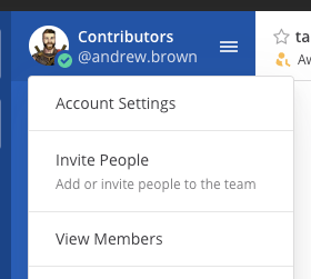
Opening the Main Menu places the popover menu in what seems to be a random location. It's not under the menu icon or the LHS header. This creates confusion since the entire header is clickable in the LHS.
Improvement
- Align the dropdown menu with the users avatar in the sidebar
- Remove the main menu tooltip on hover, the hover state is enough of an affordance
If you're interested please comment here and come join our "Contributors" community channel on our daily build server, where you can discuss questions with community members and the Mattermost core team. For technical advice or questions, please join our "Developers" community channel.
New contributors please see our Developer's Guide.
 mattermod
All 12 comments
Hi, could I work on this issue?
 Qovaros
on 10 Apr 2020
Qovaros
on 10 Apr 2020
Sure, that would be great @Qovaros :+1:
 hanzei
on 10 Apr 2020
hanzei
on 10 Apr 2020
While solving this issue, I had two thoughts.
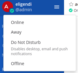
Set status dropdown should probably also be moved to align with user icon. Right now it is not aligned the same as main menu should be as the output of this story.
Current:
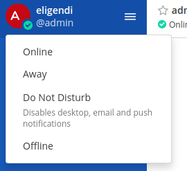
Expected:
Maybe set status dropdown should display tooltip on hover. Right now it only changes icon in lower right corner.

Qovaros
on 10 Apr 2020
@andrewbrown00 Do you have thoughts on this?
hanzei
on 13 Apr 2020
Hi @Qovaros thanks for taking on this improvement 😄
- I agree, we should be consistent and align both the main menu and the status menu to open in the same position. The are some close with this improvement anyway.
- Because the
status dropdownis generally interacted with quickly, I would avoid using the tooltip as an additional affordance. Plus, the control is small and the tooltip may be intrusive in this context.
One thing we could improve, _if it doesn't impact the scope of this ticket_, is to hide the native tooltip with the icon name 😉
 andrewbrown00
on 15 Apr 2020
andrewbrown00
on 15 Apr 2020
Thanks for response @andrewbrown00. I feel like it could be included in the scope of this ticket.
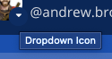
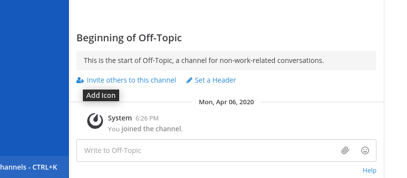
During development I had some other thoughts. With other chevrons there also is a tooltip on hover.
For example in mobile view

or in member modal
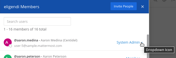
Should it be like that?
Qovaros
on 15 Apr 2020
Welcome @Qovaros and no, those tooltips shouldn't display. They can be removed like you did for the status chevron.
andrewbrown00
on 15 Apr 2020
Thanks @andrewbrown00 for review. I think it would be better to create a separate PR for other chevrons. I can take care of that.
Qovaros
on 16 Apr 2020
@andrewbrown00 while removing this tooltip from dropdown menu chevron I noticed, there are some other icons which also have this tooltip. Shouldn't those be removed too? If yes, maybe we should create an issue about taking care of all such things in webapp?
Qovaros
on 10 May 2020
Thanks @Qovaros for bringing this to our attention 👍
Would you be interested in creating a separate issue and removing all tooltips from the icons? Not sure of it's easier for you to find them in the code or you'd like us to take an inventory of where they are in the product first?
cc @esethna this would be a nice improvement to clean up unnecessary tooltips
andrewbrown00
on 11 May 2020
I can find and remove them myself. I would just need some confirmation which should and which shouldn't be removed. If you want me to I can create an issue, link it here and list all unnecessary tooltips I found.
Qovaros
on 11 May 2020
Sure, thanks @Qovaros!
 esethna
on 11 May 2020
esethna
on 11 May 2020
Related issues
 jwilander
·
3Comments
esethna
·
3Comments
esethna
·
3Comments
jwilander
·
3Comments
esethna
·
3Comments
esethna
·
3Comments
 chengweiv5
·
3Comments
esethna
·
3Comments
chengweiv5
·
3Comments
esethna
·
3Comments