Materialdesigninxamltoolkit: Request: Outline button style
I would like a new style for a flat button with an outline. This style is described in the official guidelines.
Suggested style name MaterialDesignOutlinedButton
Reference
https://material.io/design/components/buttons.html#outlined-button
 mgnslndh
All 3 comments
Turns out this is all that needs to be added if we're OK with everything else being same as a flat button. It is not entirely in line with the specs. For that we probably need to modify the control template.
<Style x:Key="MaterialDesignOutlinedFlatButton" TargetType="{x:Type Button}" BasedOn="{StaticResource MaterialDesignFlatButton}">
     <Setter Property="BorderThickness" Value="1"/>
     <Setter Property="BorderBrush" Value="{DynamicResource MaterialDesignFlatButtonClick}"/>
</Style>
mgnslndh
on 19 Oct 2018
@mgnslndh That looks like a pretty good start. It does look like the spec calls for the ripple to follow the primary color.
This may be as simple as adding (would need to test to see which):
<Setter Property="wpf:RippleAssist.Feedback" Value="{DynamicResource PrimaryHueMidBrush}" />
<!-- or -->
<Setter Property="wpf:RippleAssist.Feedback" Value="{DynamicResource PrimaryHueLightBrush}" />
 Keboo
on 19 Oct 2018
Keboo
on 19 Oct 2018
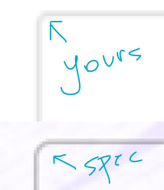
Those outline buttons look slick. The corners of the ones in the spec are a tiny bit more rounded however. CornerRadius 3 or 4.
 jamesport079
on 25 Oct 2018
jamesport079
on 25 Oct 2018
Related issues
 Tyrrrz
·
4Comments
mgnslndh
·
4Comments
Tyrrrz
·
4Comments
mgnslndh
·
4Comments
 gitjsdr26
·
4Comments
gitjsdr26
·
4Comments
 MoshiMoshi0
·
4Comments
MoshiMoshi0
·
4Comments
 Awsmolak
·
3Comments
Awsmolak
·
3Comments
Most helpful comment
Turns out this is all that needs to be added if we're OK with everything else being same as a flat button. It is not entirely in line with the specs. For that we probably need to modify the control template.