Mapper: Enhancement: Android: New colors for scribble mode
Steps to reproduce
The realization of issue #1242 is big fun. You can now draw the line features as contours before drawing the area features in the background. Features drawn in background mode will not cover anything else but only filling the voids.
Actual behaviour

fig.1. scribble layer, digitized point & line features and base map.
This leads to field notes as depicted in fig.1. Though, the background & area mode was only applied for green and yellow, while brown and magenta areas were just filled as in the older days.
This is due the actual color palette is not really ready for the progress already made. There are light colors like green and also dark colors like blue and black and inbetweens like red, magenta and brown. This results in many color line&area combinations with to little distinction.
Expected behaviour
The pen colors must be distinguishable in between each other but all be held a darker tone, while the area colors also must be distinguishable in between each other, but be held in lighter tone all together.
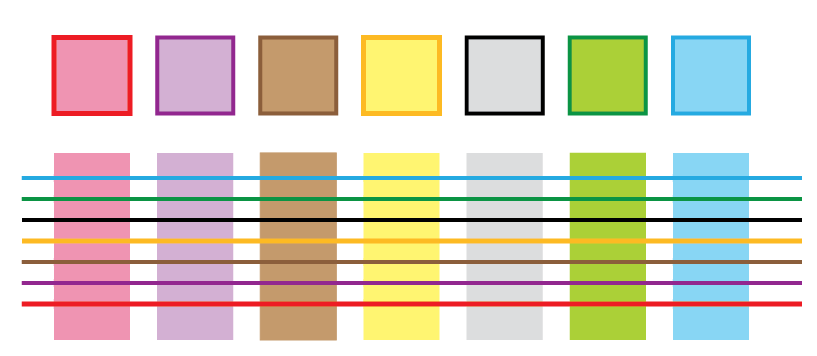
fig.2. Possible area and line color palette. Just a sketch. Call for people with real graphical talent :-).
Two possible solutions:
1) Use this combo as the default. The palette changes to the lighter set, the instant you change to the area mode.
2) Pack the combo into a "lighter" -mode in addition to "solid" and "pattern". The palette does not change, but the lighter set will be applied in area mode
 mlerjen
All 8 comments
I am looking forward to try the new scribbling :)
Bigger color choice in Paint-on-template is also mentined in issue #945.
 ollesmaps
on 22 Sep 2020
ollesmaps
on 22 Sep 2020
The code adding the possibility of defining custom colors is sitting in PR #1738. This ticket might be a good place to discuss how we want to change the defaults.
 lpechacek
on 25 Sep 2020
lpechacek
on 25 Sep 2020
A test build is available from http://liborpechacek.wz.cz/oomapper/OpenOrienteering-Mapper-refs_pull_1738_merge_v20200925.1-Android-armeabi-v7a.apk
lpechacek
on 25 Sep 2020
Thanks for the test build. It is great fun to optimize the palette according ones own needs.
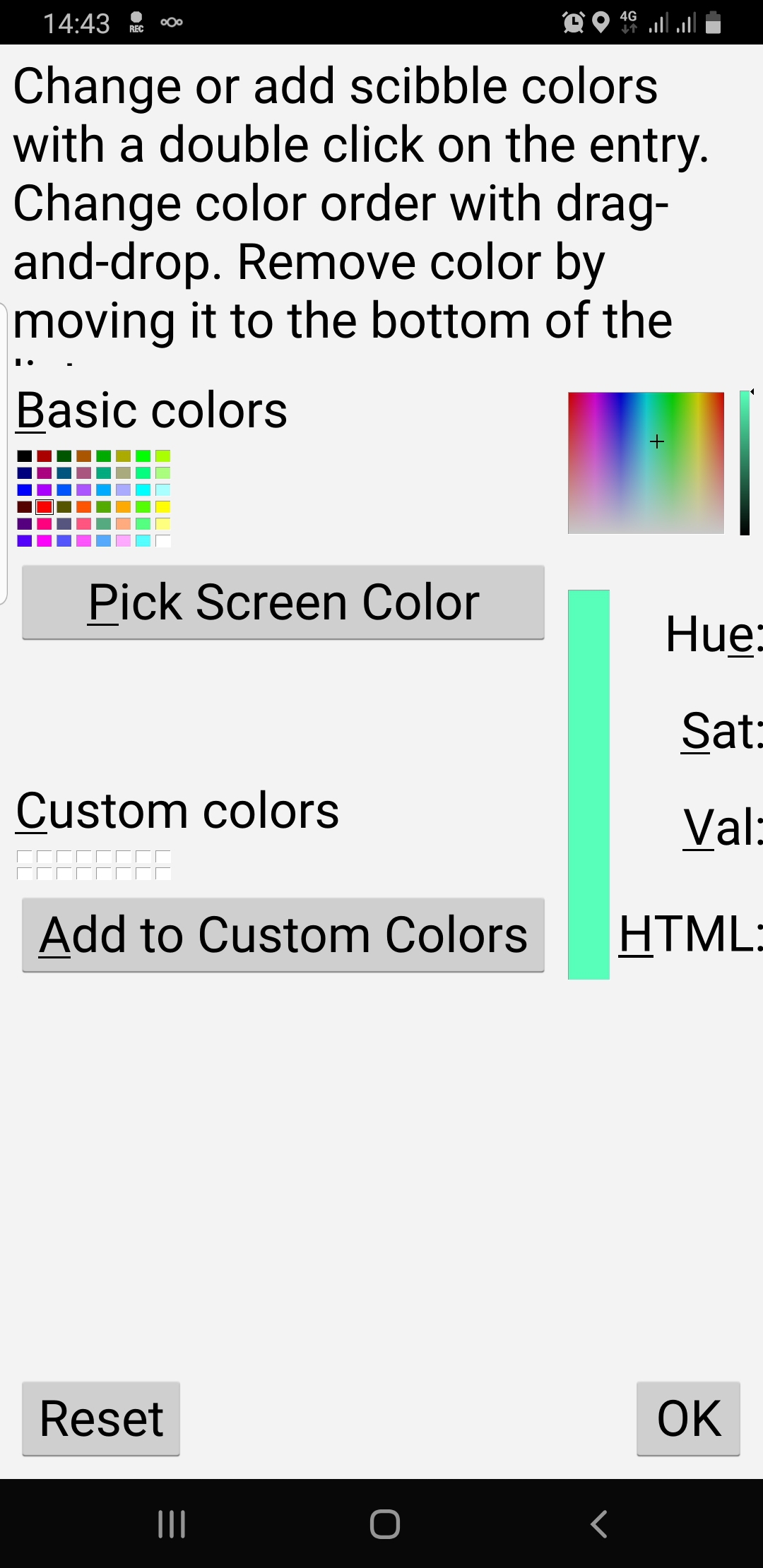
fig.1. You get to see the entire dialog if switching to landscape mode before open it.
Two reflections on this. As it is now the palette will only be adapted after a restart of the app. IMO there should be the possibility to change colors while the app is running. This I see for two cases.
a) As it is now, I have a palette of 7 colors to compose. If I want to use the full potential of the area features I would have to portion these into 3 resp. 4 line colors and 4 resp. 3 area colors. see fig.2. The non plus ultra though would be to have 7 colors of each switching from a line to an area color palette or back if changing the pen mode.
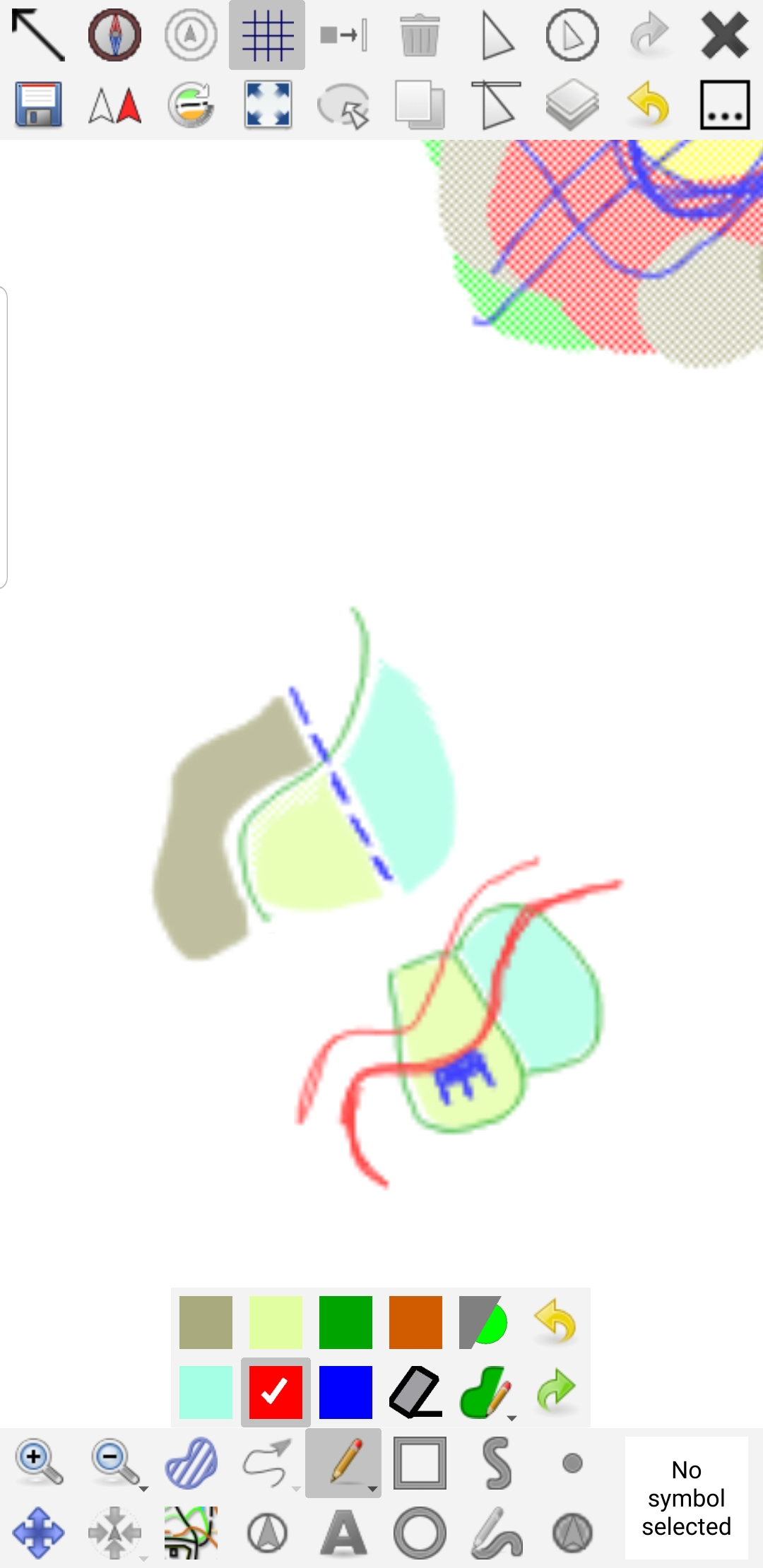 fig.2 Three area colors, four line colors.
b) To allow both a simple and a sophisticated solution at the same time I would propose that we developed a mature default palette kind like the one proposed above and then allow the user up to two custom color palettes, one could smoothly switch in between. Though I propose introducing the palette as a container for a set of colors.
mlerjen
on 28 Sep 2020
AMAZING! I can add colours. Pink is there! It is perfect :D
Thank you @lpechacek :1st_place_medal:
Also the tweak that shows which scribble template you can use is very efficient!
Thank you @dg0yt :1st_place_medal:
ollesmaps
on 24 Nov 2020
Now that we have the infrastructure in place, time has come for the actual color definition.
lpechacek
on 3 Feb 2021
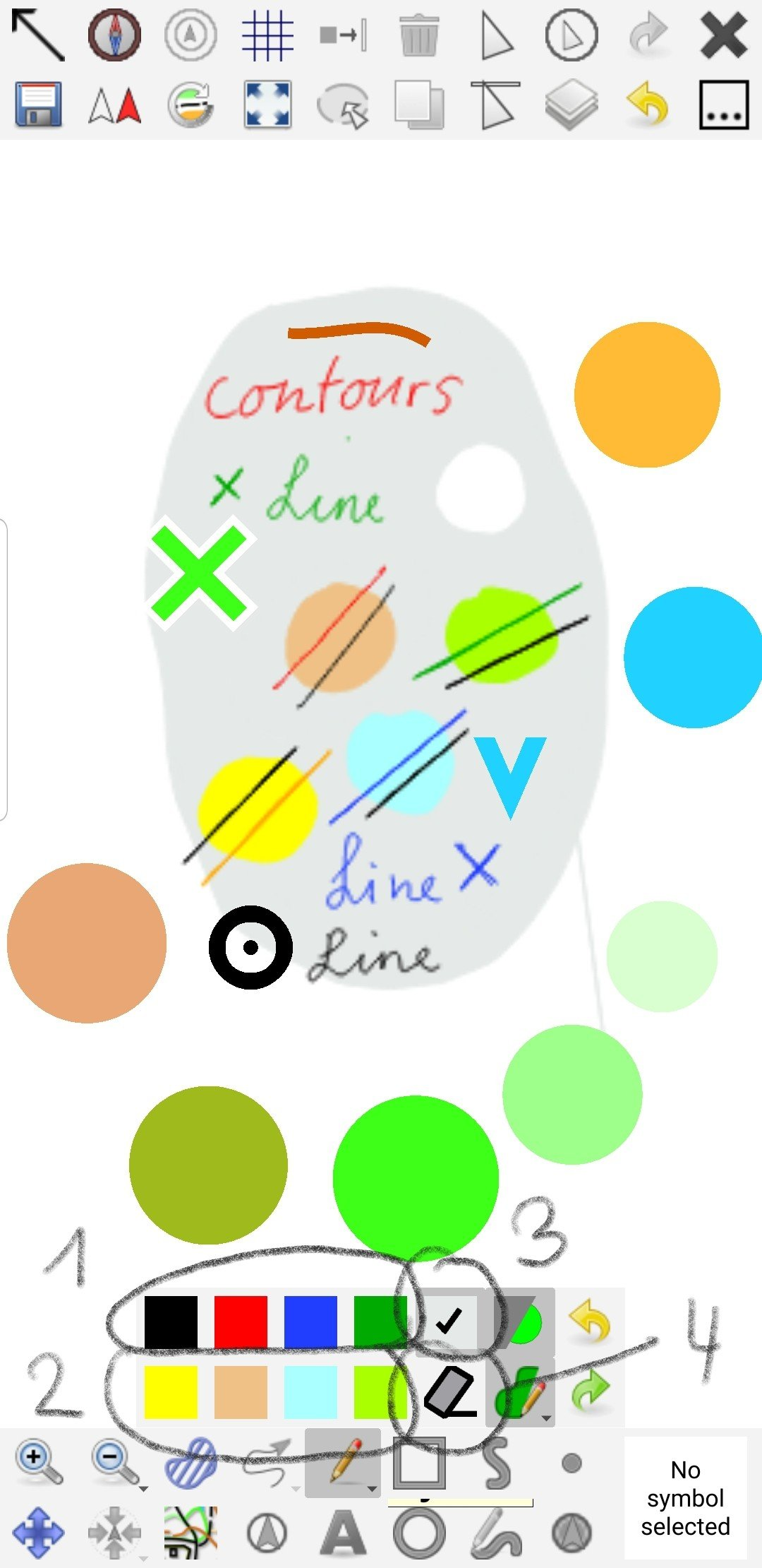
I will test this palette the next days. In this case the palette is intended to be used for hybrid mapping. The colors thus shall also be distinguishable to the IOF symbol colors. Here I work with four line colors (1) and four area colors (2), the neutral background to cover template (3) and the eraser (4).
btw. really cool side effect of the area-eraser.
mlerjen
on 4 Feb 2021
The palette @mlerjen suggests seems pretty good.
The rule "_colors shall be distinguishable to the IOF symbol colors_" is a good one.
In that respect I would maybe shift a little the definition of upper blue, green and lower yellow. Blue, green and yellow object drawn in ISOM vectors shall stand out from the scribble layer.
I might be testing later in February, my latest palette here
https://www.facebook.com/ollesmaps/photos/a.164754419675/10160553998984676/
FIY @lpechacek
ollesmaps
on 8 Feb 2021
Related issues
 Abbe98
·
9Comments
Abbe98
·
9Comments
 MartinHore
·
4Comments
MartinHore
·
4Comments
 reinisberzins
·
7Comments
mlerjen
·
5Comments
reinisberzins
·
7Comments
mlerjen
·
5Comments
 sfroyen
·
6Comments
sfroyen
·
6Comments
Most helpful comment
The code adding the possibility of defining custom colors is sitting in PR #1738. This ticket might be a good place to discuss how we want to change the defaults.