Magisk Manager: Some UI issues on small-screen devices
I've encountered some layout issues in the new UI of Magisk Manager app on my (probably too) small screen phone (a Samsung Galaxy S3 Mini, 4" 800x480px).
First, a serious usability issue: here the floating app bar covers the FAB, making the latter difficult to click on.
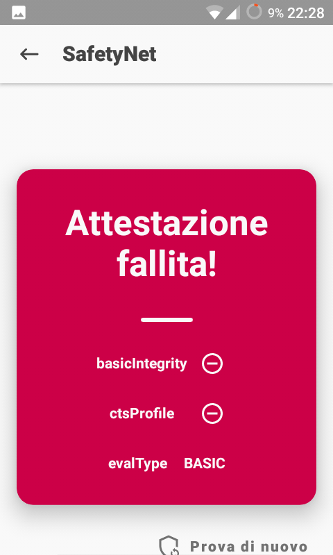
SafetyNet test result is not vertically centered and does not use all the available space.
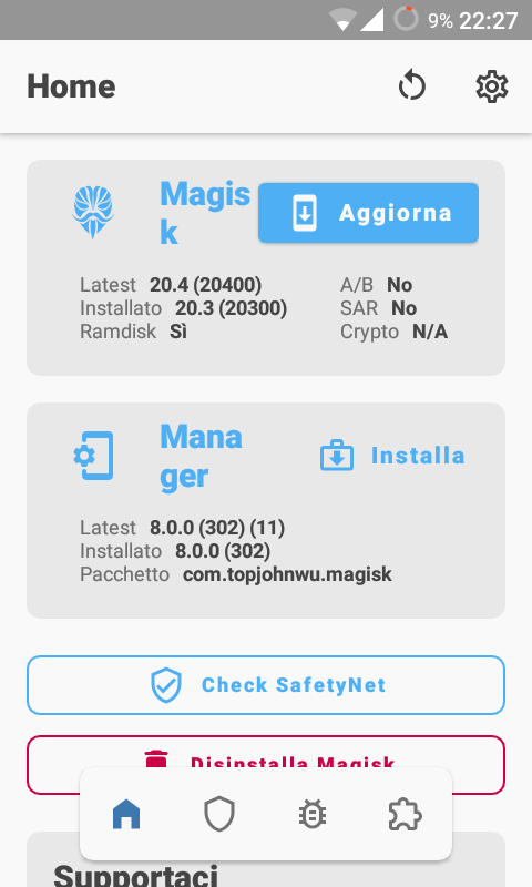
Lastly, "Update"/"Install" buttons in the home screen should probably be positioned on a new line when the screen width is too small for them to fit.
 Fs00
Fs00
All 3 comments
Is your dpi jacked up or something? It doesn't look this bad on my Galaxy Nexus last time I checked, so.. 🤔
 osm0sis
on 4 Oct 2020
osm0sis
on 4 Oct 2020
Nope, I haven't changed my DPI scale. Galaxy Nexus has a bigger screen with a higher resolution, so that's why the app doesn't have these issues.
Fs00
on 5 Oct 2020
This is well known and code contains information that some elements do not fit neatly on some devices. Although the placement of these elements is not ideal it's still reachable but will be eventually fixed. Thanks.
 diareuse
on 5 Oct 2020
diareuse
on 5 Oct 2020
Related issues
 KaMyKaSii
·
3Comments
KaMyKaSii
·
3Comments
 auanasgheps
·
4Comments
auanasgheps
·
4Comments
 Nanolx
·
4Comments
Nanolx
·
4Comments
 georgekav2
·
3Comments
georgekav2
·
3Comments
 ananjaser1211
·
4Comments
ananjaser1211
·
4Comments
Most helpful comment
This is well known and code contains information that some elements do not fit neatly on some devices. Although the placement of these elements is not ideal it's still reachable but will be eventually fixed. Thanks.